

Finding two typefaces that work well together can be a challenge, but how about five? The new French magazine Carto does just that, in a design that’s as ambitious typographically as it is editorially (Figure 1). Its subline, “The World in Maps,” tells you three things right off the bat:
- It’s going to be graphically rich;
- It’s going to take on geography in its broadest sense: topography, sociology, economics, history, and ecology;
- Being of high French seriousness, it’s going to contain a lot of text.
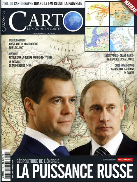
Figure 1. Belying the typographic diversity inside, the cover of Carto–apart from the logo–relies almost exclusively on the venerable Alternate Gothic.

Structurally, Carto is a fairly conventional magazine, being divided into departments (editorial, news, events) and features (longer, in-depth articles). But Carto also has a regular “dossier” feature, a special section that’s almost a magazine within a magazine, containing many short articles on a single subject. Separate, themed feature sections treat topics that include breaking news stories, ecological issues, and historical studies. Each of these is viewed using maps of all kinds, and each section has its own table of contents. There are lots of sidebars and lengthy map captions, with callouts and labels galore. Its many content elements create a field day for typographic expression (Figure 2).
Figure 2. One page, four typeface families: Gill Sans (title); Arno Pro (running head and foot, deck, drop cap); Kievit Pro (text); and Myriad Pro (map title and labels). Features in the History section use Arno for heads, giving them a more academic, less newsy feel. Click the figure below to open a larger version in a separate window.
The page layout follows a classic “Swiss” approach: clean arrangement of type and graphic elements, a rigorous adherence to the page grid, and a generous use of white space. Carto‘s designers have opted for a complex typographic structure to add visual order to what could easily become a riot of textual information. Their choice of typefaces and sizes successfully meets the typographic imperative of page construction: unifying the design while differentiating its content elements.
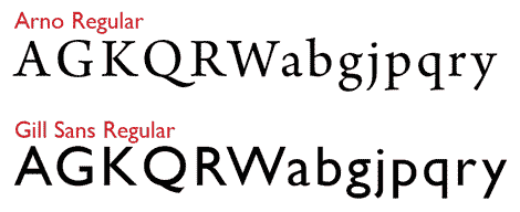
Inside, the display type work is shared between Gill Sans and Adobe Arno. They’re an interestingly compatible pair, although the only time you see them side-by-side on the page is in highly contrasting sizes, when Arno is used for the 12-point decks that follow the Gill Sans heads and introduce feature articles. While Arno is used in roles from subhead to article titles, Gill Sans appears only in feature article titles.
Gill Sans is an interesting fusion in itself. Commissioned from Eric Gill by Monotype in 1928 to compete with popular geometric sans serif faces such as Futura, it borrows the monoline aesthetic of Futura but tempers it with a humanistic lettering approach, and the stroke weight of many characters is finely modulated (Figure 3, below).

The proportions of its capitals are modeled loosely after those of the famous inscription on Trajan’s Column in Rome.
Arno, Robert Slimbach’s 2007 design for Adobe, draws its name from the river that passes through Florence, capital of the Renaissance (Figure 4, below).

It’s a loving evocation of early Italian humanistic types from the turn of the 16th century, expressed in faces such as Bembo and Jenson.
A close-up, head-to-head look at some of Gill Sans’ and Arno’s characters shows why these faces complement each other so well (Figure 5).
Figure 5. In the lower case, Arno and Gill Sans share, among other features, the highly arched “eyebrow” of the a, the upward-bulging bowl of the b, the two-story g, a short-hooked j, the drooping bowls of the p and q, and the high crotch of the y.
The text face used throughout Carto is Michael Abbink’s FF Kievit Pro, created in 2004 (Figure 5a, below).

Generously spaced and amply leaded (9 on 12), the Medium weight used here is extremely readable. Click Figure 6 below to open a larger version in a separate window.

Figure 7, which compares Kievit’s letterforms to its colleagues on the page, reveals many of the same points of similarity, of compatibility.

Although Kievit comes in an extraordinary nine weights (thin through black), it has no condensed versions, so to create yet another point of typographic contrast, Carto has enlisted Adobe Myriad Condensed for such roles as section TOCs and map titles. While it’s normally a good idea to avoid using very similar faces together for fear of creating a muddle between them, Carto‘s designers turn this idea on its head and use Myriad as a sort of kissing cousin for Kievit. In its limited role, Myriad acts as sort of a distant Kievit family member, but to avoid confusion, the two are never seen side by side (Figure 8, below).

On the cover, apart from the logo (set in Arno), all display type is set in Alternate Gothic, the granddaddy of the Carto ensemble, created by Morris Fuller Benton in 1903 (Figure 9). It’s a sans serif classic that’s always up to date, and its self-effacing design makes it a great mixer. Once you come to recognize it, you’ll see it popping up everywhere.
Figure 9. Carto uses Alternate Gothic for cover type, map-caption titles, sidebar heads, and headings and subheads in the editorial and table of contents pages.

Alternate Gothic is used inside the magazine for lesser display roles, such as sidebar headings (Figure 10). In these roles its difference from the other faces on the page suggests an editorial distance between the sidebar and the article it accompanies, creating a visual sense of independence. Carto makes adept use of such typographic signposts to help the reader quickly grasp the relationships among the content elements on the page and navigate articles efficiently.
Figure 10. Sidebars that elaborate on points in an article’s text are set using the text faces, Arno and Kievit. But a full-page sidebar like this one, which provides a story that stands well apart from the main text, gets a distinctive titling treatment using Alternate Gothic. Click the figure below to open a larger version in a separate window.

Part of the success of Carto‘s design derives from the generous spaces that separate page elements in contrasting types, in addition to their contrasting sizes. Arno subheads, for example, are set in 11-point caps, in color, and preceded by a line space, which sets them clearly apart from the 9-point Kievit text among which they appear. They pop, as they should. Less contrast would be typographically dull, graphically less impactful, and from a practical standpoint, less successful as seductive points of entry on the page, which good subheads should be.
Running heads, likewise, are always surrounded by enough white space to draw the eye to them as independent text elements on the page. Often running heads are set so apologetically small that they’re overlooked by the reader.
The richness of the typography in Carto has one more very practical effect: It creates a graphic balance between the text–always prone to a grey, blocky dullness–and the busy, colorful, and engaging maps. As inviting as the maps are to study, the text says, “Read me, please,” in a most effective way.
Typography doesn’t get any better than that.
This article was last modified on December 12, 2025
This article was first published on September 20, 2010
Commenting is easier and faster when you're logged in!

Recommended for you

How to Solve Typographic Widows and Orphans
Discussions of typographic widows and orphans normally start with an argument ab...
TypeTalk: Hyphens at Your Discretion
TypeTalk is a regular blog on typography. Post your questions and comments by cl...
InDesign Webinars for Type Lovers and for Beginners
InDesignSecrets is proud to announce two new upcoming eSeminars: Typography Deep...