
Making Variable Bar Graphs in InDesign with Data Merge
Learn how to make bar graphs in InDesign, using an Excel formula, Data Merge, and a character style

This article appears in Issue 26 of CreativePro Magazine.
If I told you that InDesign has offered the ability to make variable bar graphs since CS2 without the use of a plug-in, special font, or GREP style, would you believe me? It’s true! All you need is an Excel formula, Data Merge, and a character style. Intrigued? Read on for all the details of how I came up with the method and how it works.
Backstory: Experimenting with GREP Styles for Variable Bar Graphs
Regular CreativePro readers may be familiar with my efforts to create variable bar graphs in InDesign without using a third-party plug-in or the font FF Chartwell Bars.
- The first version worked using a series of 50 GREP styles within a paragraph style.
- The second version applied the same principle with fewer GREP styles.
- The third version used a method similar to the second version, but with a script to automate the process of creating the GREP codes.
- The fourth version was an experiment with an Excel formula to make the bar value into a binary number. The idea worked but it wasn’t any more practical than previous versions.
While they did work to create variable bar graphs using GREP styles, I wasn’t fully satisfied with these solutions for a few reasons. First, no one wants to hand-code complicated GREP styles every time they need to create a variable bar graph. The script definitely helped speed things up, but a critical roadblock still remained: GREP styles don’t work in text variables. The content in a text variable isn’t “real” text. Instead, it acts like a single special character that represents the entire text block. So, you can’t have mixed text formatting inside a text variable. If you’d like to encourage Adobe to address this issue there’s a
rel=”noopener”>long-standing feature request you can vote for over at the InDesign UserVoice site. But in the meantime, values represented as text variables can’t use the GREP graph technique.
Roman Numerals to the Rescue?
I contemplated a fifth GREP version that employed a different counting method, using Roman numerals. Initially this seemed like a workable idea. You can represent any number with various combinations of the seven Roman numerals (I, V, X, L, C, D, and M). So you’d need at least seven GREP codes. The trouble was that some Roman numerals such as IV (4) and IX (9) would display incorrectly unless you employed further GREP codes to deal with them. And even though you can convert Base-10 numbers to Roman numerals in Excel using the formula =ROMAN(), I felt that the solution was still too complicated. But then I it occurred to me: What if I just took the number that I wanted shown as a bar graph, and used an Excel formula to transform it into an equal string of Roman Is? For example, 14 would become IIIIIIIIIIIIII. Furthermore, I realized that I didn’t have to use a Roman I. It could be any character, preferably one that I would be unlikely to type by mistake. I settled on the pipe symbol, | (the character above the backslash key on your keyboard).
At Last, GREP-free Solution!
Eventually, I realized that I could accomplish what I wanted without using GREP at all. For this new technique, I started by using the Excel formula for repeat, REPT(). I made two-column graph in Excel. The first column contained the actual data, and the next column contained the value =REPT(“|”,A2) which tells Excel to take the whole number in cell A2 and replace it with the same number of pipe symbols. 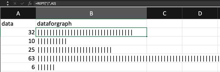 The formula worked. But I knew that this new column would be unwieldy whenever it contained large numbers, unless I formatted the text to make it smaller. So, I selected the column and changed the font size to 3 pt.
  From here, I exported the text from Excel as UTF-16 Unicode Text so InDesign could use it in a data merge operation.
 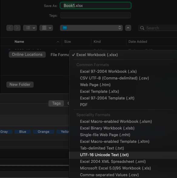 In my InDesign test file, I selected the text file as my data source and set up the placeholders.
 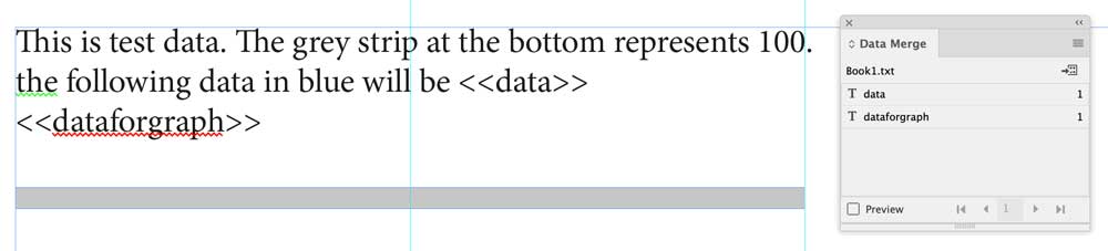 In the Data Merge panel, I turned Preview on and I got my line of pipe symbols.
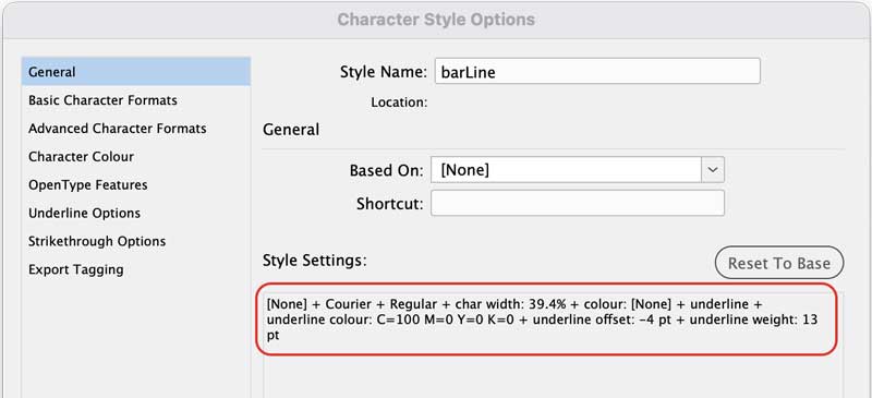
 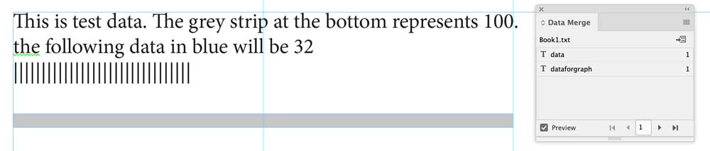 Then, I turned these symbols into a bar graph by applying a character style with the following options:
- A fixed-width font, such as Courier Regular
- A reduced Horizontal Scale to fit the space where the graph appears. In this instance I determined the Horizontal Scale had to be 39.4%.
- A fill of [None]
- An underline to create the bars themselves. I set the Weight to 13 pt, Offset to -4 pt, and the Color 100% Cyan.
 With the character style applied, the pipes disappeared and in their place was a bar that accurately represented the data.
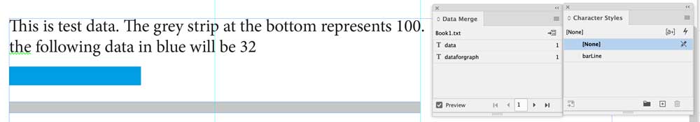
Better Than a GREP Bar Graph
This technique offers a few advantages over the GREP methods.
- Because the character style is only applied to the pipe characters, you can type elsewhere on the same line as the bar and get regular text.

- You can make a stacked bar graph by creating variations of the character style with different colors applied to the underline.

- It works in other programs. You can apply the same idea in Affinity Publisher, Quark XPress, Corel Draw, Microsoft Word, and potentially any other program that allows you to perform a data merge, and control the appearance of an underline, highlight, or strikethrough to the point where it resembles a bar graph.
Variable Bar Graph in Affinity Publisher
More Than Just Bar Graphs
While this is a technique to create a bar graph, it has other potential uses. For example, if you set the color of the underline to [None], you have a variable “push-stick” that you can use to do the following:
- Push an item out of the way. There are plenty of uses cases for that, such as moving a side-tab so only one parent page is required rather than many, making creative infographics, or pushing artwork on or off a pasteboard so that the correct image appears in context.
- Move an item to specific X-Y coordinates, as shown in the graphic below that uses two anchored objects containing “clear” bar graphs to move the pointer to the correct location. See this post for the full technique.
The Best Technique, Bar None
So there you have it: variable bar graphs in InDesign without using plug-ins, GREP, or special fonts. This technique opens up new possibilities in Data Merge that I hope will inspire you to add single or stacked bar graphs to your variable data campaigns.
Commenting is easier and faster when you're logged in!

Recommended for you

InReview: Cacidi Charts CC
Jamie McKee reviews a tool that gives InDesign users the ability to make and edi...

Split Up Data Merged PDF Files into Smaller Files
Splitting up a PDF file into "every N pages" is easy with one of these cool util...

InDesign Magazine Issue 78: Tables and Charts
We’re happy to announce that InDesign Magazine Issue 78 (October, 2015) is now a...