
Making a Magazine Cover with Affinity Photo and Designer
Get to know this state-of-the-art design and production workflow

This article appears in Issue 16 of CreativePro Magazine.
Are you suffering from SSS: Subscription Software Syndrome? Symptoms include chafing from one-size-fits-all offerings, a feeling of lethargy due to stagnant feature sets, and a sense of déjà vu as the same charges appear on your credit card month after month. Whether you’re actively looking at alternatives to Adobe’s Creative Cloud, or simply curious to see what the Affinity tools can do, you’ve come to the right place. In this article, we’ll look at how to make a magazine cover by enhancing a portrait in Affinity Photo before taking it into Designer to add headlines and a background with vector graphics.
Affinity Photo: Cutting Out the Image
The portrait in Figure 1 will make a great cover for the magazine—with a little work. We need to get rid of that gray background, and the overall image is too dark to make a compelling cover. So, let’s go through the steps of how to correct those issues in Affinity Photo.

Figure 1. The starting image is a good portrait, but it’s too dark to use on a magazine cover.
Select the subject
Start by taking the Selection Brush tool (W), which works much like Photoshop’s Quick Selection tool. Drag over the woman to select her. By holding Alt/Option you can subtract from the selection, which enables you to remove areas such as the space between the neck and the strand of hair on the left (Figure 2).

Figure 2. Selecting the subject with the Selection Brush tool shows the familiar “marching ants” around the selection.
Refine the selection
In the Affinity Photo window, just above the image you’ll see a Refine button in the Context Toolbar (akin to Photoshop’s Options bar), displaying options and settings for the tool you’re currently using. Click the Refine button to bring up the Refine Selection dialog box. Drag over the edges of the hair, and Affinity Photo will do its best to separate the foreground from the background (Figure 3). You can experiment with settings in the dialog box but leave the Smooth setting at 0 px. Any higher value will prevent Photo from selecting the hair correctly. When you’re done, choose Mask from the Output menu at the bottom of the dialog box and click Apply (Figure 4).

Figure 3. Use the Refine Selection tool to perform a better cutout, especially when hair is involved.

Figure 4. The Refine Selection tool does a good job of separating wispy hair from the background.
Clean up the mask
The Refine Selection controls do a fairly good job, but the results are rarely perfect. Because the cutout was output as a mask, you can paint on that mask with the Paint Brush tool (B) to edit it: Paint in black to hide areas and in white to reveal them. For best results use a soft-edged brush, varying the size of it as required.
Finessing the Details
The portrait needs to be brightened to make it pop on the magazine cover. We’ll use several steps to enhance it.
Fix the shadows
Choose Layer > New Adjustment Layer > Shadows/Highlights. In the resulting dialog box, push the Shadows slider to the right to brighten the image. The hair and the side of the face, in particular, need attention (Figure 5). When you’re done, click the button to close the dialog box.

Figure 5. The Shadows/ Highlights adjustment can recover dark areas seemingly lost in deep shade.
Make it crisper
The Shadows/Highlights adjustment does a good job of brightening the image, but it leaves it rather dull and lacking in definition. To fix this, add another adjustment: Choose Layer > New Live Filter Layer > Sharpen > High Pass. This will create a gray overlay that matches the shape of the cutout image below (Figure 6).

Figure 6. When you first choose a Live High Pass filter, all you’ll see is a gray shape.
From the Blend Mode menu at the bottom of the Live High Pass filter, choose Overlay. Now, you can see through the filter to the image below, as 50% gray becomes transparent in Overlay mode. Drag the Radius slider to the right, and as you do so it will increase the definition of the image without changing the colors (Figure 7).

Figure 7. Changing the mode of a Live High Pass filter to Overlay allows you to see through it to the layer beneath.
Soften the skin
The High Pass filter does enhance the image, but it also brings out too much detail (Figure 8). In this case, the pores in the skin are too visible. You can fix this by adding another filter: Choose Layer > New Live Filter Layer > Sharpen > Clarity.

Figure 8. The High Pass filter can add unwanted detail in skin texture,
exaggerating the pores.
The Clarity filter is normally used to enhance the definition between contrasting areas, but we’re going to use it the other way around. Drag the slider to the left, and the pores will merge into the skin and be much less visible (Figure 9). Click the button to close the dialog box when you’re done.

Figure 9. Giving the Live Clarity filter a strong negative value smooths out the pores.
Although you want the pores softened, you don’t want to remove the detail from the hair, mouth, and eyes. Because the Clarity filter is a live layer, it comes with its own mask: Paint on it in black, using a soft-edged brush, to hide the effect selectively. In Figure 10 I’ve also painted over the mouth in the mask attached to the Shadows/Highlights live filter to hide its effect there as well.
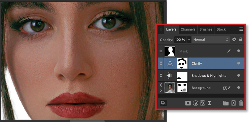
Figure 10. The Live Clarity filter has a built-in mask, so you can paint out the effect where you don’t want it to show.
Brighten the whole image
We’ve made good progress, but the entire portrait still needs to be brighter. Choose Layer > New Adjustment Layer > Curves, and drag up the middle of the curve to brighten the image. The image is now much too red. From the middle menu at bottom of this dialog box, choose the Red channel, then click in the middle of the red line and drag it down a little bit. Only a fine adjustment will be needed to take out some of the over-saturated red cast (Figure 11).

Figure 11. The Curves adjustment can be used to brighten or darken images with fine control.
Group all the layers
At this point all the adjustment and filter layers are stacked up on top of each other in the Layers panel (Figure 12). This is appropriate in Photo, but when you switch apps you usually want the image to appear as a single layer, rather than multiple layers. See the sidebar “Grouping Layers” to learn why this is a concern and to see how to nest them.

Figure 12. The treated image, after all the adjustments have been applied
Adjustment layers and Live Filters
You can apply any of Photo’s filters directly to an image layer. But if you do so, the filter will be burned into the layer and the effect will be permanent. Instead, use a Live Filter layer (similar to Photoshop’s Smart Filters). Like adjustment layers, these are effectively separate layers above the original. And since they’re discrete layers, you can turn them on and off at any point, or select them and adjust their settings. This gives you much more flexibility than using regular filters.
Refining the Image in Affinity Designer
One remarkable difference between Adobe and Affinity is that you can switch between the different Affinity apps with the same document, rather than having to import the image from one into another. This seamless workflow offers many significant advantages because you can see exactly what you’re working on at all times.
To move to the Designer environment, choose File > Edit in Designer. The Affinity Designer app will open, with the image inside it looking exactly as it did in the Photo app.
Fix the size
The image in Photo was the size at which it was supplied (in this case, by a photo library). But now you want to make it into a magazine cover, so choose File > Document Setup (Figure 13). Choose the size of your publication, such as Letter for a standard US magazine, and click OK to apply the new size.
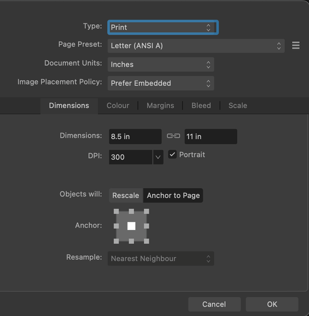
Figure 13. When taking the image into Designer, you’ll need to adjust the document size.
Add a background
Use the Rectangle tool (M) to draw a rectangle the size of your document or slightly larger. Fill it with your desired background color using the Color Picker or the Swatches panel. In the Layers panel, drag the rectangle beneath the image layer so the image appears on top of it (Figure 14).

Figure 14. Layers can be moved up and down in Designer, allowing this background to be placed behind the subject.
Paint a background
This magazine is all about paint, so it makes sense to add some paint strokes behind the woman. Choose the Vector Brush tool (B), which is grouped with the Pencil tool in the toolbar, and pick a brush from the Brushes panel. Paint a squiggle in the color of your choice (Figure 15).

Figure 15. In Designer, you can choose from many brushes and use them to draw editable vector shapes.
Continue to paint more squiggles, choosing a different color for each one. Because each one is a separate vector object, you can move them around, change their color, and scale them at will, until you achieve a pleasing effect (Figure 16).

Figure 16. Each object drawn in Designer is a separate layer, making it easy to move them around.
Building a Nameplate
No magazine cover is complete without a title at the top, and this magazine’s title is Creative Paint. The magazine’s logo consists of a large text Paint, with a smaller, all-caps CREATIVE nested above it. Here’s how to create it.
The first word
Start by taking the Artistic Text tool (T) and typing the word Paint in a font of your choice (I chose Georgia Bold). Make it white so it stands out. Then size it so it fits the width of the cover (Figure 17). You don’t need to change the font size manually: Drag the corner handles to resize the text. This is one advantage of using the Artistic Text tool: The bounding box is always exactly the size of the text.

Figure 17. This bold nameplate element is set in Georgia and given a white fill.
The dot on the letter i has to be removed, because that’s where the word CREATIVE will go. To do this, you first need to convert the text into outline paths. Do that by choosing Layer > Convert to Curves. You’ll be switched to the Node tool. With it, you can select the dot in the i by dragging over it (Figure 18), and press Backspace/Delete to remove the dot (Figure 19).
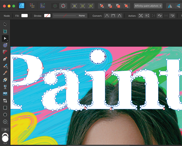
Figure 18. By converting the text to curves, you can access the individual points.

Figure 19. It’s easy to select and delete the dot on the letter i.
The second word
Type the word CREATIVE in caps in a suitable font (I used Baloo 2), and position it above the word Paint. In our example it’s a little too tall for the effect we want, so select the P of Paint and drag the top handle to stretch it vertically. (This is possible because the text was converted to curves in the previous step.) The word CREATIVE is now neatly nestled inside the word Paint (Figure 20).

Figure 20. Because the text has been converted to curves, you can stretch a single letter independently of the rest of the word.
Add a shadow
We can make the nameplate stand out from the background by adding a small drop shadow. To do this, choose Outer Shadow from the Quick FX panel. Adjust the offset so that the shadow appears slightly to the side. Set the Radius to 0 px, as a hard shadow will look better than a soft one here (Figure 21).
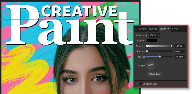
Figure 21. A drop shadow helps to lift the nameplate off the background.
Completing the Cover
Move the nameplate behind the woman by dragging her layer above it in the Layers panel. At this point, you’ll need to adjust the size and position of the woman so that the word Paint is partly hidden behind her but still legible (Figure 22).

Figure 22. Judicious placement of the image means the nameplate is still legible, even though it is partly obscured.
Again using the Artistic Text tool add your cover headlines, sizing them and adding manual returns so that they wrap around the shape of her head. Setting alternate cover lines in a different color will help to make them stand out (Figure 23). I could have switched to Publisher to access its text wrap tools instead of inserting manual returns, but that seemed like overkill in this case.

Figure 23. Alternating colors for cover lines help the text to stand out.
Finishing Touches
The woman on our cover has good eye contact with the viewer, which will help to draw people to it on the newsstand. But she doesn’t have much to do with the subject of the magazine, so let’s add a smudge of paint on her cheek.
Back into Paint
Choose File > Edit in Photo and the Designer toolset will disappear, to be replaced instantly by the Photo toolset. You’ve switched apps, but you’re still in the same document: all the cover lines, nameplate and paint swirls are clearly visible in the Layers panel (Figure 24).

Figure 24. When you take the image back into Photo, all the Designer layers are still visible.
Add a paint smudge
Make a new layer above the woman layer, and switch to the Brush tool. Hold Alt/Option and click to sample a color from the background swirls. Use this color to paint a daub of paint on her cheek (Figure 25).

Figure 25. Adding a blob of paint on a separate layer, sampled from the background colors
Change the layer mode
As it stands, the paint doesn’t look at all convincing. But change the mode of this layer from Normal to Multiply, using the menu at the top of the Layers panel, and it looks much more like it’s really painted on.
Use the Smudge tool (S) to smear the paint edges so it looks more like she’s wiped her cheek with a paint-stained hand (Figure 26).
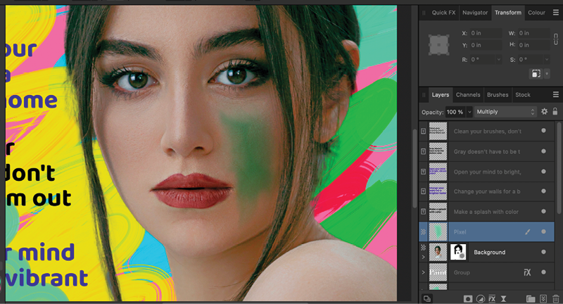
Figure 26. Changing the mode of the paint layer to Multiply lets it blend in with the image.
The end result
Figure 27 shows the final image, back in Designer. The paint daub on the woman’s face is clearly visible as a separate layer, so you can turn it on and off or change its opacity all without leaving the Designer interface.

Figure 27. The final cover
Grouping layers
When you create a new Live Filter layer or a new adjustment layer in Photo, the layers will appear stacked above the current layer. If you then take the document into Designer, you’ll have to deal with a whole load of layers, which can make such tasks as moving or scaling the image a tricky process. To avoid this problem, grab all the additional layers and drag them over the layer to which they apply. When you release, they will disappear from the panel; but click the tiny arrow to the left of the thumbnail, and it will open the group, revealing all the additional layers nested within it (Figures 28–30).
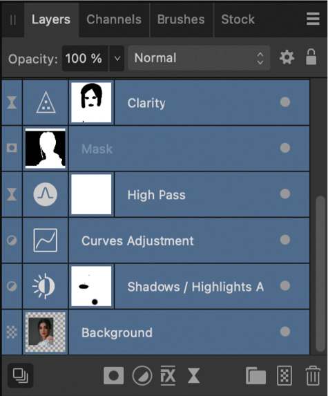
Figure 28. Additional layers stack up on top of the original layer.

Figure 29. Grouping the layers together hides them all…

Figure 30. … but you can pop them open to see the group’s contents.
Kerning text
The main masthead word, Paint, will initially appear too spaced out when you type it: There’s too big a gap between the P and the a, as well as between the n and the t. To kern the text manually, click with either text tool between a pair of letters, then hold Alt/Option and tap the Left Arrow key to nudge that pair of letters closer together in 10% increments. Alt/Option tapping the Right Arrow key increases the space between the letters. You can then scale the resulting word to the right size (Figures 31–33).
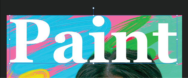
Figure 31. Some headlines need to be manually spaced.

Figure 32. Use Alt/Option with the Left Arrow key to squeeze up the space between pairs of letters.

Figure 33. You can then scale the result to the right size.
To Affinity… and Beyond
I hope this article has given you a sense of the power packed into the Affinity programs, as well as the innovative ways they work in tandem to help you achieve maximum efficiency. But above all, I hope I’ve conveyed the joyful ease that comes with doing everything in the same window. It’s so intuitive and frictionless that it feels almost magical, especially after you’ve spent decades switching back and forth between Adobe’s programs, placing files, updating links, and so on. And even if you’re a satisfied Adobe customer, the remarkably low cost of entry means there’s very little risk in seeing what you can accomplish with the Affinity tools. If you are transitioning from Adobe, though, be aware that the tools and filters behave somewhat differently in the Affinity apps. You’ll have to expect something of a learning curve as you get used to the new approach.
Commenting is easier and faster when you're logged in!

Recommended for you

Using Blend Modes in Affinity Designer
Learn how to alter the appearance of a layer in Affinity Designer, using what's...

Working with Strokes in Affinity Designer
Learn how to use the Stroke panel in Affinity Designer to control attributes suc...
Using Quick FX in Affinity Designer
Learn how to stylize objects in Affinity Designer with effects like Bevel/Emboss...