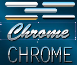
Make Text Look Like Chrome

Excerpted from InDesign FX on lynda.com.
A highly reflective chrome effect may look like it was tricky to create, but in reality, all you need is a simple gradient fill, using as few as three color stops to create a convincing chrome effect in InDesign.
The key is to create a point somewhere in the gradient where the colors abruptly shift. When you have contrast, you have chrome.
I’ll show you five different chrome examples, from basic to elaborate. You’ll see how I set up each of them and how they change the look of text when I apply the gradients.

Watch the video below to learn how to bring text to life, changing it from plain, flat white to something that’s made out of shiny metal that reflects things.
If you’re not sure how to create gradients in the first place, read this primer from Adobe.
Visit InDesign FX to watch more videos of effects projects you can complete in ten minutes or less.
This article was last modified on January 18, 2023
This article was first published on January 23, 2012
Commenting is easier and faster when you're logged in!
Recommended for you

Style Flocker for InDesign CS3 Released
RogueSheep Incorporated announced the immediate availability of Style Flocker™,...

InDesign Template: Certificates
This template contains four different certificate designs that you can modify to...

dot-font: Electoral Typography
dot-font was a collection of short articles written by editor and typographer Jo...


