A Love Letter to Letters
So there we were, my two sons and I taking a trip up to San Francisco for a members’ preview of the new California Academy of Sciences in Golden Gate Park. My kids were less than enthusiastic.
“I don’t wanna go to the City.” “C’mon, it’ll be fun.” “We’ve already been to that museum.” “We’ve been to the old one a bunch of times but this is brand new, completely rebuilt. Very sophisticated. Green roof. Energy efficient.” “Why’d they paint the roof green?” And so it went.
On the long drive to San Francisco, we stopped at Krispy Kreme. (A friend once said to me, “Parenting is all about threats and bribes.” Amen.) Then we drove around Golden Gate Park for 40 minutes trying to find a place to park… completely negating any savings the new Academy’s “green roof” was providing to the environment. And the kids were getting bored. “We’ve already been DOWN this street. There’s no parking spaces.” We finally found a space many blocks away (“We have to WALK all the way there now?!?”). As we slogged through the Park the kids were in near-mutiny. Then we walked up to the main entrance of the Academy. As we moved through the stunning glass entrance, my older son, age 11, stopped in his tracks, turned to me, and said, “Wow. This is actually pretty cool.” I almost wept, such was my sense of accomplishment — and relief.
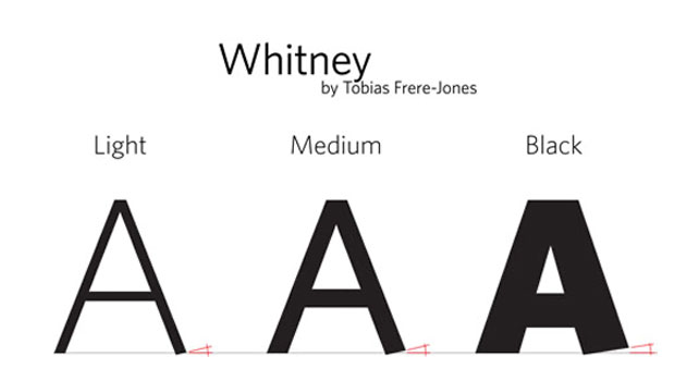
We wandered around a bit, and then I started noticing the type on the signage. Some really very cool sans serif… it might be, uh… hmm, what is this? Look at the way those terminals are cut… I have no idea what this face is. But look at that right hand stroke on the uppercase A, the way that bottom is, what, actually angled UP?! Man, what is this typeface?! “Hey kids, c’mere, look at this type. Look at that terminal on the uppercase A! It angles UP! And, oh my God, look at the LOWERcase a!! Look at the way the bottom of the stroke sort of tapers! What IS this typeface?!? Oh man, look at the tops of that lowercase v, the way those terminals are angled back, too!!!” The boys started to get a little, uh, shall we say, edgy. They’d seen this before; they knew that Dad’s in a “type moment”. They looked around to gauge the crowd, to see if anyone had a concerned look on their face, mirroring the looks of concern coming over their own faces.
After returning home I did some research and found that the typeface is Whitney, originally designed for the Whitney Museum by Tobias Frere-Jones, the wonderfully talented type designer and partner at Hoefler & Frere-Jones. RISD-educated and former designer at The Font Bureau, Frere-Jones has designed a boatload of type, among which are Interstate (a longtime favorite of mine) and the blockbuster (for type, anyway) Gotham.

And at the California Academy of Sciences, the beautiful Whitney was splendidly implemented by Kit Hinrichs and Laura Scott of a little boutique design firm in San Francisco (with offices in Austin, Berlin, London, and New York) called Pentagram. You may have heard of it. And what is it about Whitney that I find so interesting, that makes me have a “type moment,” that embarrasses my kids in public? One word: Personality.
I dearly love type and I particularly love sans serifs. Sure, I love to see a beautiful serif face come along, something that will look great and be easy on the eye in long blocks of running text. But sans serifs… ahhhhh, there’s something about them that just… I don’t know, I really can’t explain it. They just light me up like nothing else, type design-wise.
Whitney is different from many other sans serifs. If you look at Helvetica Neue Light, you can see that its terminals (the ends of strokes) are cut either horizontally or vertically. Also, looking at its lowercase c, for instance, you can see that it looks as if a lowercase o was taken and a section of it was chopped out to create the lowercase c. You can take a pencil and fill in that gap and have yourself a lowercase o:
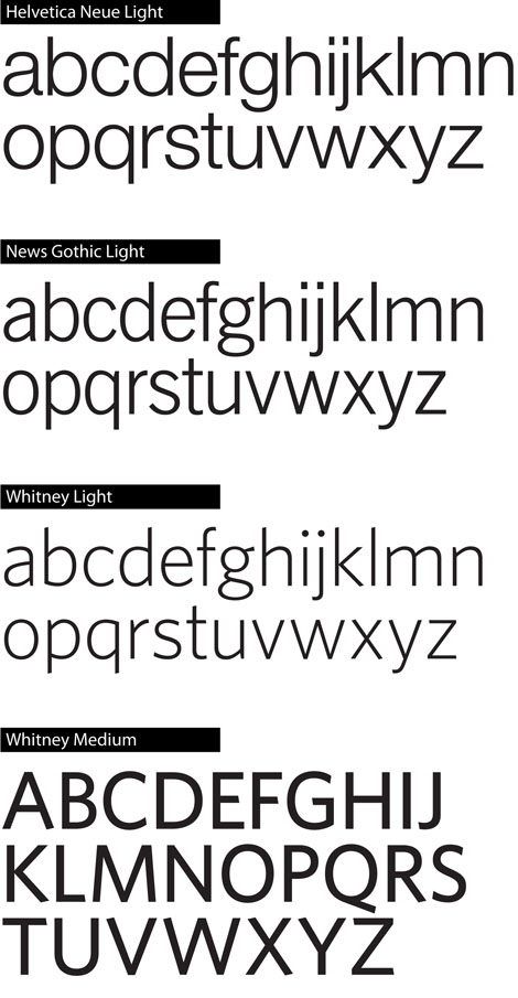
Is that wrong? No, but all the Helvetica Neue characters have a sameness to them that I don’t care for (and don’t get me started on Helvetica). Then, take a look at News Gothic Light, which I think was used as a reference by Frere-Jones in designing Whitney. Look at the lowercase c — whoa, those terminals are not going to seamlessly butt into each other. They tilt out and, if extended, they’ll cross but they’re not going to reconnect. The same applies to the News Gothic Light lowercase e — that terminal is barely going to graze the bowl if extended. And look at the bottom of the vertical strokes in the lowercase b and d: They’re tapered, as is the upper part of the vertical stroke in the lowercase p and q. And I say, right ON! We have personality! We move away from the way so many people think of sans serifs: boring, monoweight strokes.
Now, look at Whitney: the tapering of the terminal in the lowercase a, and the top of the vertical stroke in the lowercase r; the slope of the tops of the vertical strokes of the lowercase b, d, h, k, l, and t; that same sloping, angled idea in the left hand terminal of the lowercase v, while the right hand terminal is parallel to the baseline.
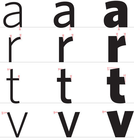
You find the same angling of some terminals in the uppercase A, E, F, and G to name just a few. The tapering of strokes, the angling of some terminals — this variety is what brings interest, movement and life to this typeface; it’s what gives it personality. Typographically, for me, this is way, way cool. If the architect Mies van der Rohe was correct when he said, “God is in the details,” then Whitney is in the promised land.

Thanks to Pentagram and Tim Griffith for the use of the images; many thanks to Hoefler & Frere-Jones for the use of Whitney.
This article was last modified on August 19, 2021
This article was first published on June 1, 2009
Commenting is easier and faster when you're logged in!
Recommended for you

Be Creative with Bullets
Ilene Strizver shows how to spice up your next list with custom bullets.
Hail to the Glyph: Hillvetica is a Typeface with Presidential Ambitions
Hillary Clinton’s announcement that she was officially running for Preside...
Typographic Letterpress Poster
The Typography Deconstructed letterpress poster is the result of several months...


