
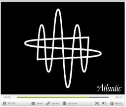
In the May 2011 issue of The Atlantic, Michael Bierut talks about the process of designing a logo for the New World Symphony. And he doesn’t just talk: He shares early sketches from his notebook and the notebooks of Frank Gehry (who designed the symphony’s new hall) and conductor Michael Tilson Thomas.
The full article (“Project: First Drafts”) is worth a look, but if you only have a few minutes, at least watch Michael Bierut’s video and see how he was inspired by sounds waves and the movement of a conductor’s baton to create a logo that feels like music.
Click the screenshot below to open the video in a separate window:
This article was last modified on December 14, 2022
This article was first published on April 20, 2011
Commenting is easier and faster when you're logged in!

Recommended for you

Edit a Shape’s Frame
I created a text frame, filled it with text, gave it a fill and stroke... it's p...

Creating an Animated Christmas Banner in Photoshop
Learn how to make a simple banner that can display any text you like with subtle...

Tip of the Week: Controlling Ruler Guide Visibility With View Threshold
How to make guides automatically appear and disappear based on your zoom level i...