
We usually think about letters of the alphabet as things to be seen, but sometimes letters are meant to be touched.
You can find the most common “touchable” letters in every public elevator. These are the tactile letterforms primarily used by visually impaired people: Braille is a writing system whose characters consist of different patterns of raised dots.

Braille in the elevator
Braille can be written by hand with a slate and stylus (Laura Ingalls Wilder even wrote about this in her 1943 book These Happy Golden Years), or produced on a typewriter or by a Braille embosser. Now companies like HumanWare and Freedom Scientific sell refreshable Braille displays, which connect to mainstream computer applications; the Braille dots move up and down, and reconfigure, as you read with a fingertip.

Whitehouse & Company, an environmental graphic design firm in New York City, conducted a research project around 1995 for The Lighthouse for the Blind. They evaluated the relative legibility of letters in relief on public signs, comparing capital letters to lowercase letters, various letter sizes, and different amounts of letter spacing; and they investigated stroke thickness, also a critical issue with tactile letterforms.

Roger Whitehouse working with Betty Bird, a blind staff member of The Lighthouse for the Blind, exploring the tactile legibility of alternative letterforms
Eone, a small company of industrial and product designers, is marketing a wristwatch with a tactile face. Called “The Bradley” after a young ex–naval officer who lost his eyesight in Afghanistan in 2011, the watch has raised hour markers and two ball bearings which move in circles to indicate the hour and the minute.

The raised hour markers on the face of an Eone wristwatch
Letters we can touch are also for those of us who can see. What might first come to a graphic designer’s mind are the now-rare cast metal and engraved wood types of letterpress printing.


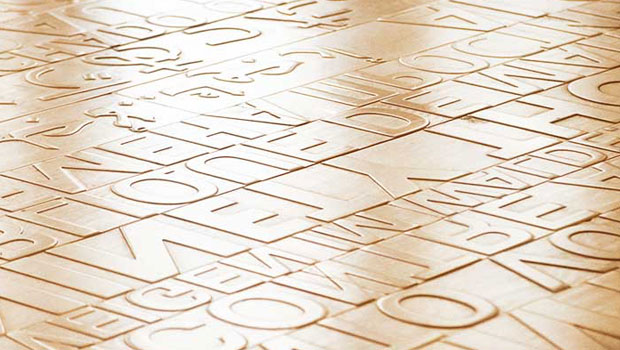
In 2004 the artist Ann Hamilton created a reference to traditional typographic technology in her wood floor project for the downtown branch of the Seattle Public Library, located in the Linguistics, English as a Second Language, and World Languages section of the building, adjacent to the children’s department. Library visitors walk over the first sentences of books in 11 languages, routed (backward-reading) from the floorboards.
In fact, a longtime CreativePro contributor lent a hand in that project. Keith Gilbert assisted by setting phrases in Arabic in InDesign. You can see a bit of that work in the image attached to this tweet by Keith.


Letters routed from the wood floorboards of Seattle’s downtown library
Montessori schools use sandpaper letters and moveable alphabets in early childhood education, to provide students with a tactile experience of letters. At home and at the library, children play with engraved alphabet blocks and with brightly colored plastic and wood letters.

Lowercase alphabet blocks handcrafted by Uncle Goose
In my kitchen there are canning jars on which I can feel gently rounded raised letters cast in the clear glass. Ghirardelli chocolate bars are cast so that the capital letters “GHIRARDELLI” seem to be carved out of the chocolate. After I unwrap a new cake of soap, I can feel raised letters under my wet hand the first few times I wash my face.

I live in Pittsburgh. It’s an old city, and stone is a vernacular building material. Street names have been sandblasted out of the granite curbstones downtown; the empty Clarendon letter shapes hold water when it rains. Simple capital letters that spell a dedication in Latin are incised in the cornerstone of Saint Casimir Church on the South Side. And near roof level of the Carnegie Institute in Oakland is a long sequence of names of artists, writers, musicians, and scientists, hand-cut in the stone entablature around 1895 and 1907 by skilled letter carvers.
There are letters you can touch, read, play with, walk on, learn from, and eat . . . letters that make an image when you ink them and press them onto paper . . . letters (and symbols) that help you navigate a space or the length of a day.
This article was last modified on July 10, 2021
This article was first published on July 9, 2021
Commenting is easier and faster when you're logged in!

Recommended for you

The Ghent PDF Workgroup Launches the Soft-Proofing Ticket
The Ghent PDF Workgroup (GWG), an international organization comprised of users,...

Package Multiple Documents Quickly
Have a bunch of documents you want packaged all at one time? Here's one method f...
PIA/GATF Workflow Conference Features a Revolutionary Printer
Building successful graphic arts companies requires innovative thought. One of t...