

I’ve just finished reviewing two rounds of printed page proofs from the second edition of my book The Complete Manual of Typography (Adobe Press/Peachpit Press), in the course of which I hand-kerned some 150 passages of display type as well as scores of instances in text and captions. I am in the perfect frame of mind to expound on kerning, going well beyond the “Kerning 101” basics I outlined 18 months ago in the article One Good Kern Deserves Another.”
First, you have to put the process in perspective: The goal of kerning is not to establish perfect spacing between every letter pair in a passage of type. The incongruent shapes of the letters of our alphabet that make kerning necessary also assure that perfectly consistent spacing is an impossibility. The goal, rather, is to create a sense of visual harmony in which distracting points of discord are eliminated. In other words, don’t aim for perfection, just for the elimination of imperfections. Ultimately, if it’s not eye-catching, it’s not a problem.
When you start looking, though, imperfections abound, whether your program bases its automatic kerning on a font’s internal kerning tables or on some kerning algorithm (such as Adobe InDesign’s “optical” kerning). There is always much to refine.
All of the following examples are based on The Complete Manual of Typography‘s chapter titles (24-point Perpetua, tracking set at 0) and Level-A subheads (18-point Perpetua, tracking at +25/1000 em). In all cases I used high-resolution plain-paper proofs as my reference standard and then reconstructed each title in InDesign (the software used by the publisher) using exactly the same specs as the designer and layout artist. I didn’t have access to the live page-layout files, so I then sent back kerning “recipes” that looked like this:
H[-30]o[-10]w O[-30]p[-10]erat[+10]in[-10]g
Sys[+10]tems M[-10]anag[+10]e F[-30]onts
In the illustrations that follow, I’ve tried to pick examples where the kerning changes are fairly obvious, but keep in mind that the low resolution of the computer screen you’re using to view this article works against an accurate representation of the book’s printed pages.
Lesson One
Kerning onscreen without a high-resolution proof on which to base your judgments is a waste of time. You can work this way, it’s true, but it takes a lot longer. The proof of the pudding is in the printing. Onscreen, you have to grossly magnify the text to accurately gauge the subtleties of intercharacter spacing. My preferred view for the 24-point type was 600%; for the 18-point type it was 800%. This was the maximum that allowed me to see complete lines across the entire 25.5-pica measure of the book’s pages.
The problem with this view, of course, is that the characters thus enlarged appear about an inch tall, and at such a size the overall spacing of the type looks much looser than at its real, printed size. The trick is to reconcile the reality of the print proof with the distorted simulacrum onscreen. I spent a lot of time scooting back from the monitor in my wheeled chair for a longer view of the proceedings.
Lesson Two
The reconciliation starts with looking at the entire passage of text to be kerned and finding the segment that best represents what you feel to bear the appropriate spacing that the rest should match. There will be loose bits and tight bits, and even whole loose words and tight words. You have to establish the happy medium.
In cases where two pieces of type with the same specs appear on the same page or spread and are likely to be compared, you have to take both into consideration simultaneously, to avoid having their spacing schemes clash. When a title or subhead like this stands alone, you have the luxury of focusing only on its internal consistency. It’s not important that the spacing of every subhead in a book have identical spacing, as long as they don’t vary widely (that is, obviously).
Figure 1 shows a subhead whose words appear to march to different drummers. “Issues” sets with fairly normal spacing, while “Naming” is obviously looser, with “Typeface” somewhere in between. This is largely because of the natures of the component letters themselves.
Figure 1. In this subhead, “Issues” is dominated by characters whose shape can be described as rectangular (only the e is round) and which have very similar widths. Such words almost kern themselves.

I chose to use “Issues” as my benchmark, as the following recipe indicates:
T[-20]y[-20]pef[+10]ace-N[-30]a[-20]m[-10]in[-20]g Issue[-10]s
Lesson Three
Note that all of the adjustments above are in multiples of 10/1000. Kerning brings out the obsessive in a diligent typographer, but there’s rarely a need to use a finer increment than this. I set my copy of InDesign (in Preferences/Units and Increments) to use 10/1000 em as the basic unit for keyboard-driven kerning adjustments; in QuarkXPress I use the pre-set 5/1000 em minimum adjustment in pairs. Using keyboard commands is far faster than typing values into a dialog box.
Adjustments smaller than 10/1000 em are rarely noticeable in smaller point sizes and too small to make a difference at larger sizes. Fussing with tiny adjustments yields little apart from mental distress.
Lesson Four
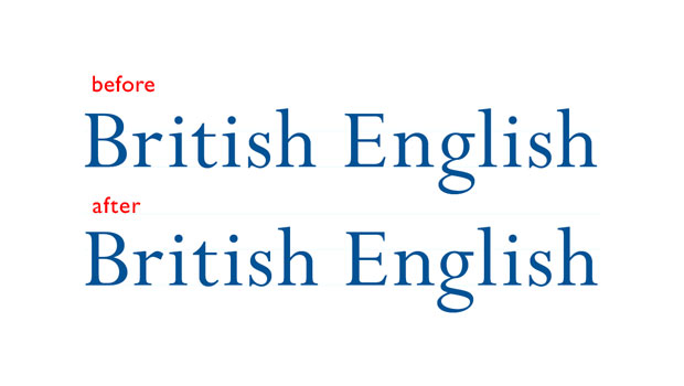
It’s a curious fact that a kerning adjustment to open a pair seems to have more relative impact than one to tighten a pair. Although 90% of the kerning adjustments I made in my book were to tighten, the other 10% were very powerful and influential, and in only a handful of cases was more than a +10/1000 em adjustment called for. If you start looking closely, you’ll see that in many cases a judiciously placed positive kerning adjustment can obviate the need for many negative ones, as in Figure 2.
Figure 2. In this subhead, most of the unevenness has been ironed out with positive kerns to open certain pairs: Br[-10]i[+20]tish E[-10]n[-20]g[+10]lis[+10]h. Suddenly, much of what looked to be in need of tightening looks perfectly normal.

Lesson 5
There is rarely a need to manually kern body copy, whose small size camouflages most spacing irregularities. But there are some important exceptions:
• Parentheses: The spacing between the first two characters in a parenthetical phrase and that between the last two can be distractingly different, as seen in Figure 3.
Figure 3. When you can see the opening and closing parentheses at the same time, differences in their spacing can jump out at you (top). The tighter pair should be kerned open (middle). This is especially dramatic where the letter before the closing parenthesis is set in italics (bottom pair).
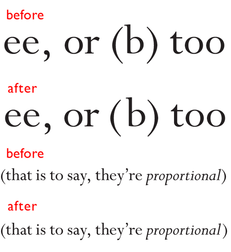
• Italic dashes: Em and en dashes can look particularly unevenly spaced in italic matter, as shown in Figure 4.
Figure 4. These en dashes seem to sprout out of the characters that precede them (especially in print, at 11-point) while the characters that follow them lean away. These spaces need to be balanced through manual kerning.

And finally, this miscellaneous fun fact I uncovered: If (a) you’re using the Macintosh version of InDesign CS5 and (b) you have Unicode Hex Input selected from the Input Menu, the small-scale manual kerning keystroke shortcut (Option-left/right arrow) will not work. The far less useful Command-Option-arrow command (for a 5x adjustment) will, however.
This article was last modified on August 2, 2021
This article was first published on June 29, 2011
Commenting is easier and faster when you're logged in!

Recommended for you

Scanning Around with Gene: The Islands and Bridges of Stencils
Anyone who has redecorated a child’s room or has a fondness for blue-and-white c...

Fixing the Keyboard Shortcut for Typographer’s Quotes on the Mac
When the InDesign keyboard shortcut for curly quotes stops working on your Mac,...