


This article appears in Issue 101 of InDesign Magazine.
An alphabet or typographic portrait of your hometown can capture its essence at a particular moment in time. I’ve made several over the years, and each is a love letter to a place I hold dear. (Fair warning, there’s aren’t any InDesign specifics until later in the article, but if you’re reading InDesign Magazine, I’m sure you’ll agree that there’s only one or two degrees of separation between InDesign and pretty much everything else in life.)
My odyssey with hometown alphabets began back in the mid ’90s when I took Alistair Johnston’s excellent typography course at UC Berkeley Extension in San Francisco. One of the class assignments was to create an environmental alphabet: students made letters from pretzels, wool, images of shadows, and so on. My own, now sadly lost, was photographs of driftwood. Some years later, when I was teaching typography myself, I adapted Alistair’s assignment. The project caught the students’ imagination, and I noticed that those who had formerly worn glazed expressions when suffering my explanations of kerning and baseline grids became enthused at the prospect of making their own alphabet—one memorable submission was constructed from Star Wars action figures.
This was around the time when I was leaving San Francisco, the city I’d called home for more than a decade. Partly as a way of providing an example to my students, and partly as a way of saying goodbye to my neighborhood, I made my first alphabet—of the Mission district (Figure 1).

Figure 1: Mission District alphabet
It included the laundrette where I had my shirts ironed, the unprepossessing corner store where I bought my beer and other sundries, the hole-in-the-wall takeout where they made a never-to-be-equaled falafel, as well as
local institutions like the Roxie Cinema. To say that it tapped into the zeitgeist would be an overstatement, but it got positive feedback and several friends requested copies, which I regarded as a measure of success. People enjoyed identifying the letters without resorting to the small key I’d provided to their source. Anyone who knew the area had seen them before. They were, to appropriate a quote from typographer Lars Muller about Helvetica, “the perfume of the city.” These familiar letters—some flamboyant, some prosaic—were friends and acquaintances, even if you sometimes had to wrack your brain to remember their names.
What I hadn’t anticipated was how, more than a decade on, the poster of that alphabet became a snapshot in time. As more and more expensive restaurants and stores moved into the neighborhood, the old signs and letters disappeared. Like so many of my friends, the likes of Anna’s Danish Cookies and Yum Yum House couldn’t afford the spiraling rents of San Francisco.
If my San Francisco alphabet was a parting gift, then my Brighton alphabet (Figure 2) was a welcoming gift.

Figure 2: Brighton alphabet (2006)
I’d lived in Brighton as a student 20 years before, but the place had been transformed since then. The picturesquely shabby seaside town I remembered had become a cosmopolitan, year-round destination. To get to know my new old town, I took my camera and photographed its letters. My scope this time was broader: rather than try to capture just my own slice of Brighton, I aimed to make the alphabet appeal to anyone who knew the city, either as resident or visitor.
Making (and breaking) the Rules
With such an open-ended goal, I need some guidelines.
First: no chain stores. It’s not that I wear hair shirts and eschew all chain stores, it’s just that chains don’t convey local identity: they could be anywhere. The homogenization of our Main Streets and High Streets really cuts down on our options for unique type and signage, and there are times when the rules need to be relaxed. For example, my Lewes alphabet (Figure 3) wouldn’t have been complete without the B for Bill’s—a now popular restaurant chain (with fantastic hand-lettered signage and a beautifully designed menu) of more than 80 branches nationwide. My loophole: Lewes came first—it was the birthplace of Bill’s.
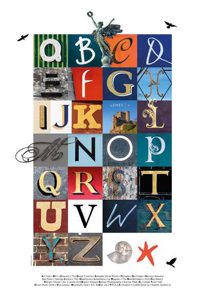
Figure 3: Lewes alphabet
Secondly, I wanted the alphabet to be personal, so the lettering had to be sourced from places that I liked or had a connection with, however tenuous. Since I’m not much of a shopper, this at times meant, say, somewhere that I might like to shop in another lifetime. For example, the W of the Lewes alphabet is for a plant nursery. My interest in potted plants is undetectable on any scale, but I included the letter because the owner had gained some local fame from a funny sign he posted in the wake of the 2015 general election—a sign that made me laugh when I wanted to cry.
Thirdly, and obviously, the lettering had to be attractive—and play nicely with the letters around it. This can cause a few compromises. I want the alphabets to be personal, but it’s an inconvenient truth that some of the places you love have crappy signage. At the end of the day, the alphabet needs to look good.
Ideally I wanted to use the first letter that appears on each sign. After all, A is for apple, even though the P may be more attractive. Inevitably, some letters prove harder to find than others—obviously Xs are a challenge—but thankfully you can usually find something X-shaped, like the crossing lines of a train track or the sails of a windmill (Figure 4). Strangely, Js proved particularly elusive in Las Vegas.
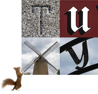
Figure 4: Where necessary, you can substitute images for letters.
My last rule was to have fun—use shapes or pictures to substitute for letters where appropriate (a rebus), add decorative pictures around the outside, and don’t forget the “punctuation.” Working with a 4 × 7 grid, there are 28 slots to fill, leaving two for interesting commas, ampersands, and full stops (Figure 5).
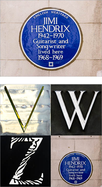
Figure 5: Jimi Hendrix was the first rock musician to be honored by English Heritage with a blue plaque: what better full stop for a London alphabet?

London alphabet
Type Safari
Going out in search of letters to photograph becomes a treasure hunt. The better you know the area, the more effective you’ll be, as you can plan your route according to your shot list and not have to rely upon serendipity. No matter how efficient your planning, be prepared to make several trips before you have all the letters you need.
I capture the images with a zoom lens so I can crop in tight enough, and in Camera RAW format for editing flexibility. Note that if you’re shooting JPGs you can still edit the images with the Camera RAW plug-in; you just won’t have as much data to work with.
Processing the images
I use Lightroom to organize my photos, but Bridge works equally well. Before I begin editing, I arrange the images in alphabetical order, rate them, and create stacks from similar frames (Figure 6).

Figure 6: Evaluating the images in Lightroom
It helps if the images are shot in similar lighting conditions, but this isn’t always possible, so I may need to adjust exposure and contrast to give the impression of consistent lighting across the range of letters.
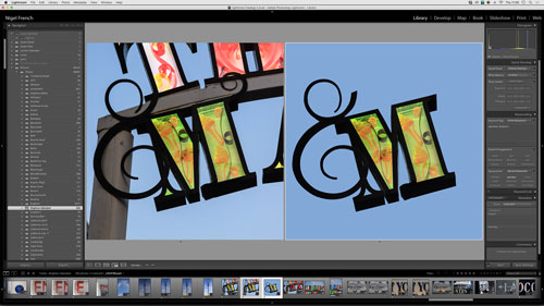
For most images of signage, the camera lens will be tilted, which, unless you have fancy tilt-shift lens, will result in some distortion. I straighten the images so that they appear to have been taking face-on using the Upright controls in Lightroom or the Camera RAW plug-in (Figure 7). Photoshop’s Perspective Crop tool can also be useful for squaring the image, and if you still need to fix distortions, there’s also Free Transform (Command/Ctrl+T).
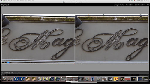
Figure 7: Applying Upright correction before (left) and after.
How much retouching you apply is a matter of personal choice. As well as any distracting elements like litter or electric cables, I also remove any adjacent letters. Using layers, I can retouch any unwanted elements in a nondestructive way with a combination of the Content Aware Patch and Clone Stamp tools (Figure 8).

Figure 8: Examples of retouching, before (left) and after.
Once I’ve edited the short list, I export the images as full resolution, high quality JPGs. It’s now time to move to InDesign!
Setting up the InDesign page
My preferred page size is A3+ (13 × 19 inches), sometimes known as Fillmore poster size. I divide the page into a 6 × 9 grid, with the outside grid fields serving as the margin. Within this margin, I draw a frame and use the Gridify feature to divide it into four columns and seven rows. This makes each letter’s square slightly bigger than 2 inches (Figure 9).

Figure 9: To use the Gridify feature, take the Rectangle Frame tool, hold the mouse button down, and tap the right arrow to add columns and the up arrow to add rows. To remove the space between columns, press Cmd/Ctrl+Left Arrow. To remove the space between rows, press Cmd/Ctrl+Down Arrow. The end result is a grid of frames to hold your letters (left). To create a set of evenly spaced guides, choose Layout > Create Guides and enter the desired number of rows and columns (above).
To these empty frames I’ll apply an Object Style that has the Frame Fitting Options set to Fill Frame Proportionally, and then choose File > Place to place the images into the frames (Figure 10).
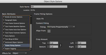
Figure 10: Controlling the picture fitting with an Object Style is a huge time saver.

So that I can experiment with different letters, I’ll create additional layers to accommodate my second, third, and fourth choices. It’s not until you see the letters in context with their neighbors that you know if they are going to work or not (Figure 11).
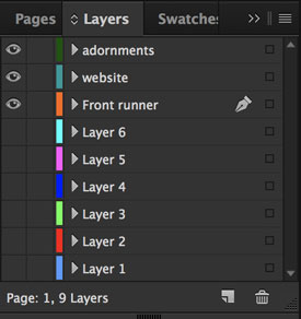
Figure 11: Keep your options open: add alternate choices on separate layers.
With so many different lettering styles, there’s the possibility of the poster looking like a hodgepodge of unrelated images. To mitigate this, you can both scale the letters within their frames to be visually proportional with each other and create interactions by allowing selected ascenders and descenders to break out of their frames.
Start by scaling up the image within the frame so that the ascender/descender is cropped by the frame boundary. Option/Alt-click the image frame to open the image in Photoshop. Use the Pen tool to make a pen path around the portion of the letter that you want to isolate. Save the pen path, and then save the file. For this stage I prefer to use pen paths rather than layer masks for a smoother workflow. Pen paths can be saved in the JPG file format, whereas layer masks require saving as a .TIF or .PSD, which would then require me to relink the file in InDesign.
Back in InDesign, select the frame, and choose Edit > Copy and then Edit > Paste in Place. This will put a duplicate on top of the original.
Now choose Object > Clipping Path > Photoshop Path. Return to the frame, and increase its size to reveal the protruding portions of the letters (Figure 12).


Figure 12: Use clipping paths to allow some letters to break out of their frames.
To personalize the poster, consider adding images of local landmarks and icons around the edges (Figure 13).

Figure 13: Add seasoning by including pictures of local landmarks.
Not only does this add visual appeal and context, it also helps break up the inherent boxiness of the grid. The result is less stiff, more organic, and more fun. I also like to provide a discreet key to the images identifying their source.
Learning Your A-B-Cs
Making your own alphabet is a great way to get to know a place better and makes a great memento of a place you love. It might also be a rewarding shared project for a family or group of friends. But don’t try to rush it—your alphabet will turn out better on a slow simmer than a fast boil—and stay flexible in your approach. Make rules to give you direction, but ditch those rules if they become too limiting. If you’re tempted to try, please send me a link to the result. I’d love to see what you come up with—no matter where you live.
Commenting is easier and faster when you're logged in!

Recommended for you

InPerson: Roger Black
David Blatner caught up with world-renowned designer and font entrepreneur Roger...

TypeTalk: Position Hyphens and Other Glyphs Properly
TypeTalk is a regular blog on typography. Post your questions and comments by cl...

The Fabulously Talented Louise Fili
All designers have their own list of the creative professionals they admire and...