


This article appears in Issue 73 of InDesign Magazine.
Sweet versus savory, color versus grayscale, body versus mind… our world is made of seeming opposites that, in reality, go beautifully together. In type, the fundamental division is that of serif versus sans serif, and it’s amazing how wildly different the flavor and feel of text can be when you remove those tiny endcaps. Today, most designers are familiar with Helvetica, Arial, and Myriad Pro because of their default status in our applications and operating systems. But those are just the tip of a powerful iceberg that can support your design—or sink it if you don’t know what you’re doing. Let’s take a look at the world of the sans-serif font and how to make it work for you.
A Short (but Helpful!) History of the Sans-serif
To learn how to use sans-serif fonts, it actually helps to understand a little of their fascinating history. The history of typography has a long reach, and relatively speaking, sans-serifs are the new kids on the block. In fact, printers had been working with movable type for more than three centuries before anyone felt the need to pare down the letterforms and lose those small lines attached to the ends of the strokes. While there were isolated earlier instances, the first sans-serif typeface came along circa 1816, cut as an uppercase titling face from signwriters’ block letters by William Caslon IV, a member of a family type dynasty better known for classic, serif text faces. Known as Caslon’s Egyptian, it was digitized and extrapolated into a full typeface by Cyrus Highsmith and Christian Schwartz between 1998 and 2001 (Figure 1).

Figure 1: Caslon’s Egyptian, the first sans-serif.
referred to as “Grotesques” (or “Grotesks” in Germany); in the US as “Gothics” or “realist” typefaces. Ironically, perhaps—given that sans means without in French—in France they were known as “Antiques.” The popular Antique Olive still carries the name. You have likely seen examples of all these, such as Akzidenz Grotesk (1896), Franklin Gothic (1903), and News Gothic (1908)—the latter two designed by American type designer Morris Fuller Benton. And these fonts later influenced the postwar “Neo-grotesques,” most notably Helvetica (1957), which is now arguably the most famous font in the world. These typefaces show little variation in their line weight and are considered “neutral” in their appearance, even though Franklin Gothic and News Gothic have a distinctive (and for sans-serif faces atypical) two-story g (Figure 2).

Figure 2: Examples of grotesque and neo-grotesque sans-serifs. From left to right, Franklin Gothic (1966), Akzidenz Grotesque (1953), and Helvetica (1969).
A New World Order
 It was with the radical art movements of the interwar years—Constructivism, DeStyl, and the Bauhaus—that sans serifs really got a boost. In the idealism for making the world anew, adornments like serifs were deemed superfluous. These designers felt that serifs were part of the old order, a world of inequality and irrationality that had culminated in the cataclysm of the First World War. Jan Tschichold, author of the influential design manifesto The New Typography (1928), argued that communication must appear in the shortest, simplest, and most forceful form. Photography was favored for its objectivity, and to complement photography, sans-serif typefaces with asymmetrical layouts and an intentional use of white space should be employed (Figure 3).
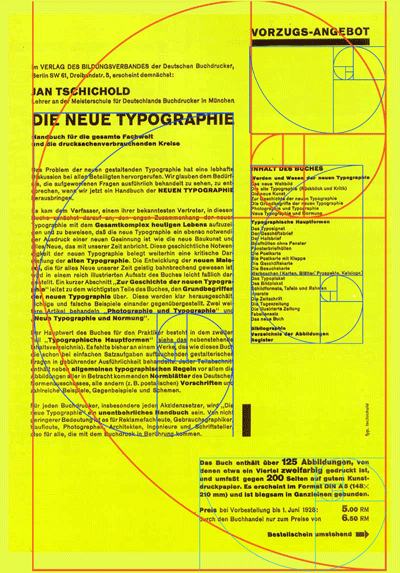
Figure 3: Cover of Die Neue Typographie
(The New Typography) by Jan Tschichold.
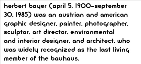
Figure 4: Bayer Universal
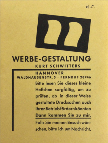
Figure 5: Self-promotional booklet in Futura by Kurt Schwitters, circa 1930.
Sans Transportation
Gill’s typeface was influenced by the work of his mentor Edward Johnston, who was commissioned to create a font for London Transport. If you’ve ridden a London bus or Underground “tube,” you’ve seen his work. Incidentally, you can distinguish Gill Sans from Johnston Railway by the diamond-shaped dots on the Is and js of the latter (Figure 6).

Figure 6: Examples of Gill Sans and Johnston Railway

Figure 7: The signage at Charles de Gaule airport designed by Adrian Frutiger. Signage for the Berlin U-Bahn designed by Erik Spiekermann.
Figure 8: Futura boldly goes where no font has gone before.
Modern (and post-modern)
The most famous 21st-century sans-serif (at least thus far) has to be Gotham, designed by Tobias Frere-Jones originally for GQ magazine in 2000. Adopted by the 2008 Obama campaign (and retained in 2012), it helped set a mood of optimism and change. Gotham helped Obama appear fresh compared to the earlier campaigns of Hillary Clinton and John McCain, who weren’t breaking any new ground with their choice of New Baskerville and Optima, respectively (Figure 9). Though technically a sans-serif, perhaps because of the way it swells at the terminals, Optima looks more classical and less modern.

Figure 9: Gotham, used for the Obama campaign, compared with New Baskerville (Hillary Clinton) and Optima (John McCain).
When, Where, and How
There is a long-held belief that serif typefaces are more readable at text sizes while sans serifs are more suited to headings and display work. However, today, in an age of screen reading, this idea has diminished relevance. On screen, sans serifs are widely used as body text. The anti-aliasing of computer monitors—necessary to render curves—can’t adequately display fine serifs, and simpler letterforms fare better. But even taking screens out of the equation, there’s no reason, beyond the fact that it’s not typical, that sans serif typefaces can’t be used as body text. That said, the age-old combination of serif for body text and sans for headings is still widely practiced in print.
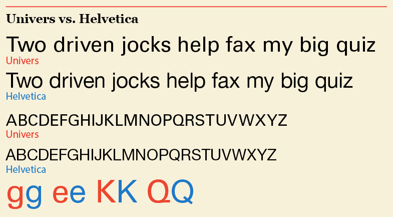
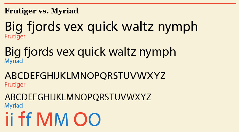
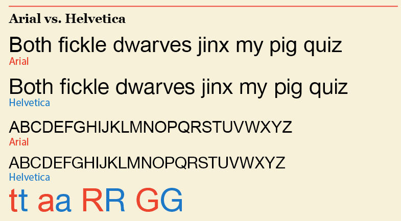
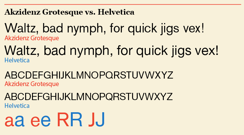
The Many Flavors of “Vanilla”
To the untrained eye, most sans serifs might look similar and somewhat “plain.” But when you look closely, there are distinct differences. Here are some comparisons of sans-serif typefaces that are commonly confused. Compare not just the letter shapes, but also the x-heights and line lengths—which can differ noticeably, even over a small range of text. In all cases, the type is the same size and uses Optical kerning.
Final Thoughts
One way or another—on screen or on paper, as body text or headlines, in combination or going solo—use the following guidelines and personally-biased observations for setting sans-serif type:
- When set as headlines, tightening the letterspacing gives sans serifs a density and presence that serif faces lack—and without the serifs, you can make the letterspacing tighter without unsightly collisions.
- Without serifs, some letter shapes and combinations can be ambiguous or harder to read. The combination of cap “I” and lowercase “l” may cause a double take.
- Used as captions, a point or two smaller than the body copy, they benefit from some air.
- The high x-height of many sans serifs, like Helvetica, Futura, and Gotham, means that they also benefit from generous leading.
- Traditionally, many of the grotesque sans-serifs use obliques rather than real italics.
And, as a final rule to remember, as with any class of typeface, don’t mix two or more similar-looking sans-serif fonts. For example, Helvetica and Univers are just different enough to create a discord if combined, and offer little in the way of contrast. Futura and Gill are likewise similar-looking to the untrained eye, but are borne of different design aesthetics: mixing them would be like having dinner with a posh aunt and a bohemian friend—the conversation might be a little awkward.
Commenting is easier and faster when you're logged in!

Recommended for you

Designing with Lead-ins
Lead-ins draw attention and add flair to text by highlighting the opening words,...

TypeTalk: Horizontal Alignment
TypeTalk is a regular blog on typography. Post your questions and comments by cl...
FontStruct Turns Five
FontStruct, the free font-building tool sponsored by FontShop just celebrated it...