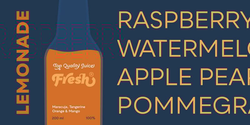
When CreativePro rebranded recently, we spent hours looking for a font family that felt that it reflected our corporate personality. We finally landed on Qualion, designed by Roch Modrzejewski of the font foundry ROHH Type.

Roch Modrzejewski
We reached out to Roch to ask him a few questions about his process, philosophy, and the making of this beautiful typeface.
David: How did you get started designing fonts?
Roch: My way was quite organic. It all started from growing interest in typography while working on web design — typographic layout techniques, fascination in old typefaces, vernacular type, history of type design, then calligraphy and so on.
David: There are so many sans serif fonts, from Helvetica to Montserrat to Gotham. Why did you feel that the world needed Qualion?
Roch: I found the idea of an eclectic typeface that mixes contrasting influences quite fascinating. How to mix geometric, humanist, minimalist, ornamental, modernist, and calligraphic… it all sounded enough fun to give it a try!

David: When you are designing a font, how do you keep the font’s “personality” in mind, to ensure the font speaks with a consistent voice?
Roch: Ideas on personality and purpose of the typeface are the first elements in my creative process. I start designing the letters after I have a clear view on the typeface’s functionality and look. The key thing for me is to define what elements and details are crucial to creating the mood of the typeface, and how they influence the personality. Then I work on how to apply and adapt these elements in particular letterforms in order to have everything functional, consistent, and serving a practical purpose. Constant comparisons between various glyphs and testing in different contexts during the design process are important ways of keeping an eye on the identity and overall look for sure.
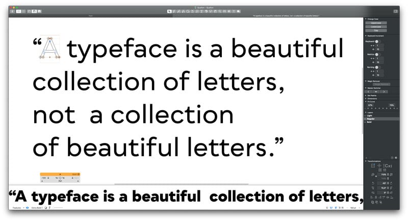
David: Qualion has a huge variety of swashes and accented characters, but almost no ornaments. What do you enjoy focusing on when you’re building a character set?
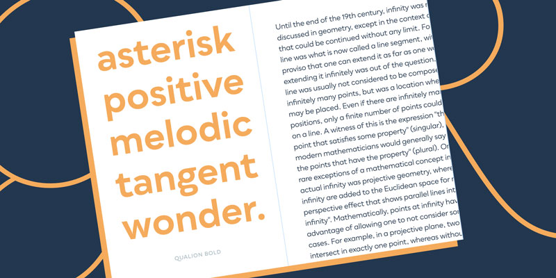
Roch: The main idea for Qualion was to build a typeface with very rich possibilities of achieving a calligraphy-like effect inside an area of geometric typography. The swashes and numerous crazy ligatures are there to help create unusual text compositions for logotypes and display scenarios. The swashes, ligatures, and true italic styles make Qualion very versatile and unique in character.

My main focus areas depend on the particular project of course, but generally I love working on designs that include lots of alternates, ligatures, or swashes — designs that allow more playful and experimental use and give more options for unique branding compositions.
David: Qualion Text is a different face than Qualion. How do they differ?
Roch: Qualion is a geo-humanist typeface, whose idea is to merge geometric proportions with humanist and calligraphic forms in order to create a new look with some unusual design possibilities. I wanted the Qualion Text variant to be more humanist and traditional in nature, in order to work best in small sizes and large paragraphs of text. Text offers more condensed proportions, more stroke contrast, more pronounced ink traps, and even more organic, handwriting-inspired and elegant letterforms in the italic styles.
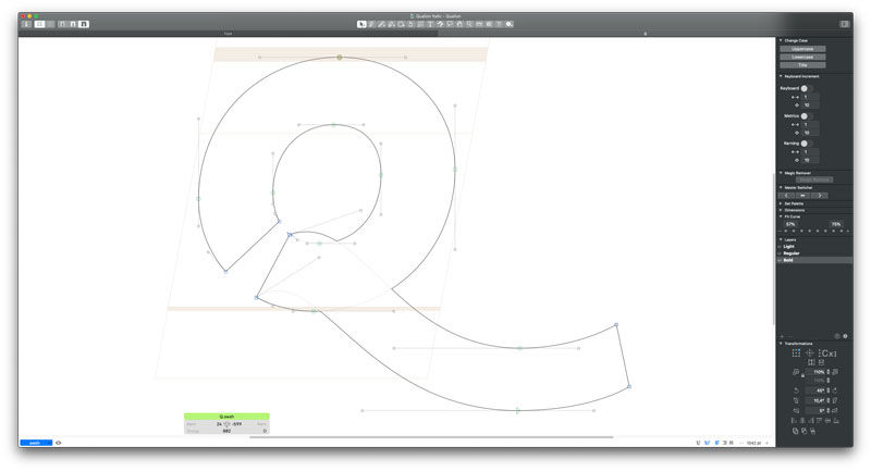
David: Where did the word “Qualion” come from?
Roch: Naming the font is a fun process — sometimes a bit wild and random. Qualion’s name was rooted in association with different qualities of its design. Another important factor was that the word started with letter “Q” — the typeface features a very cool style of capital Q in italics, so I simply wanted the name to utilize it.

This article was last modified on July 5, 2023
This article was first published on July 5, 2023
Commenting is easier and faster when you're logged in!

Recommended for you

Making a Custom Shape for Highlighting or Boxing Text
T.J. wrote: Just wondering if it’s possible to get a rounded corner frame...