
Interview with Colleen Gratzer, Accessibility Specialist
Q&A with Colleen Gratzer, who is presenting at The Design + Accessibility Summit 2025


Colleen Gratzer is a design industry veteran and accessibility specialist.
She’s also speaking at The Design + Accessibility Summit 2025, which takes place September 16–19 online, with a session on The Foundations of Accessibility in InDesign.
We thought it would be fun to get to know her better with some Q&A.
What are you most excited to share in your upcoming sessions at the Design + Accessibility Summit?
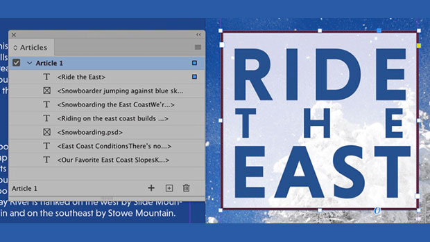
I love showing designers how accessibility can be much easier simply by using InDesign smarter! I find that a lot of designers have been using InDesign for a long time but not using it to its potential. When they better understand how to do that, it makes accessibility so much easier. It also makes any type of project—accessibility related or not!—that much easier.
You’ve been a leader in accessibility for years. What first sparked your interest in this field, and how did it shape your path as a designer?
I actually got into accessibility by accident almost 10 years ago. I didn’t know what it was then. Once I understood what it was about, I thought it sounded intriguing that my work could be more inclusive and reach more people.
Our design work serves a purpose. It’s all about communication. So ensuring that your work can be understandable and readable by more people means better results.
It was a happy side effect that accessibility also gave me more confidence as a designer too. I was already confident in my skills, but I sometimes felt like I needed more ammo to defend my work. Accessibility gave me that, and clients stopped pushing back.
What’s one common mistake you see designers make when it comes to accessibility, and how can they avoid it?
The most common mistake I see has to do with contrast, which affects people with low vision and color blindness. Some designers who know of accessibility will take steps to help blind users by adding Alt-text to images, for example. But many often neglect the needs of sighted users.
Simply using a contrast checker to check foreground and background colors for text is an easy step that has big impact.
Can you share a favorite InDesign trick or feature that helps you work more efficiently when building accessible documents?
I have default paragraph and character styles set up with the proper tags. Because they are set as default styles, every time I open a new document, they appear. They make my workflow much easier.
This article was last modified on August 6, 2025
This article was first published on July 28, 2025
Commenting is easier and faster when you're logged in!

Recommended for you
10 Steps to Accessible PDF
Making sure that the PDF files you create are accessible to all users should be...

Accessibility Plug-ins for InDesign
Generate PDFs that are more accessible with more ease by using these two new plu...
The full agenda for The Design + Accessibility Summit is here!
Accessibility Matters. We’re thrilled to share the full agenda for The Desi...