
Inspired Designs Created in InDesign
InDesign takes center stage in some high-profile places.

This article appears in Issue 70 of InDesign Magazine.
To get your design juices flowing for the year ahead, we put together a selection of great, innovative work in InDesign which is sure to inspire projects that hail from California to New York to Mexico and across the pond to Europe. And while there are touches of vectors, frames, styles, margins, and layers throughout, our goal is to focus on the creative process more than the technical how-to. Let inspiration take center stage as you peruse these designs that demonstrate the delightful complexity of InDesign.
Weekend Almanac
“Whether it’s a cocktail party, a trip to the nearest beach, or an entire afternoon spent making your grandma’s Sunday gravy, your weekends are worth working for,” says creative director Ali Zeigler. That idea is the foundation of Weekend Almanac, a collectible, lifestyle publication that Zeigler started with editor Lauren Ladoceour in 2013. They produced three issues over several years. “The magazine is divided into three chapters,” Zeigler explains, “Friday, Saturday, and Sunday—and celebrates all the good stuff that happens during your time off.” The seeds for what would become Weekend Almanacwere planted years before, when Zeigler and Ladoceour bothworked at Yoga Journal. They discovered that they both wanted to create a place where they could work freely and give other artists, photographers, and illustrators that same opportunity. As they moved on to other publishing jobs, they kept in touch until the time was right to launch the lovely modern almanac—literally from Zeigler’s kitchen table. Zeigler studied design at RIT and began her career at a small New York City ad agency. It wasn’t long before she made the switch to publishing to work on Ride BMX, Guitar Player, Yoga Journal, and in the Food
and Drink division at Weldon Owen Publishing in San Francisco, creating books for Williams-Sonoma and others. Needless to say, with 15 years of publishing and editorial design experience, Zeigler was well versed in InDesign before starting Weekend Almanac. “We have a small print run, and I wanted our first issue to feel as if it was created just for you,” explains Zeigler. “Almost all of the main headline type was hand drawn. I then scanned the artwork and layered it into my InDesign file.” Other than those headlines, she designed the entire first issue herself with InDesign. “When I’m working on multi-page editorial design spreads, the photography selection, order, and flow is so important to tell the story. I always use InDesign to block this out first. It may not look like much, but it’s the heart of the overall design.” Zeigler and her partner then shared files, editing back and forth, until the design and copy were final. The big takeaway from that first issue? “Art directing and designing an entire magazine by myself, in a short amount of time, was a challenge,” Zeigler admits. So for the second and the third issue she enlisted the help of two designers. They work together in the spirit of the digital age—remotely—and are never in the same room. “From start to finish, we share our designs and feedback on file-sharing [services] like Dropbox. “When creating a book or magazine with 100+ pages, it’s important to stay organized. One of my favorite ways to do that is to use layers in InDesign. I’ll have a background layer, a folio layer, a graphics layer, a type layer, etc. If you’re sharing these files with someone, you can lock all the layers they don’t need access to, which keeps things tidy and eliminates mistakes.” This process is not without its share of irritations, Zeigler acknowledges. “I’m constantly frustrated with moving a photo box only to have the image inside the box move instead (even though I’m using the correct tool). It drives me crazy.” For those just diving into InDesign, Zeigler recommends LinkedIn Learning, though nothing beats working on real projects. “If it’s too intimidating to dive in on a real job, then make some up,” she suggests. “Use InDesign to make your business cards, invitations, or holiday cards. Do something fun so you enjoy working on it while you’re learning. If you have specific questions along the way, YouTube has tutorials for everything.”

Zeigler says, “I use the colors in the images to select a complementary palette for the artwork on the opposite page. I would have loved to have run this as a feature spread, but the image wasn’t high-res enough—one of the problems you often run into in print media.”

Almost all of the design elements throughout Weekend Almanac are hand drawn, scanned in, and layered. Creative Director Zeigler carved and hand-stamped the circles seen here behind the Saturday type.

The Almanac’s end papers feature images taken on the weekend from favorite Instagram accounts. For this edition, says Zeigler, “we chose Alice Gao; her feed is always full of delicious-looking food and striking architecture.”

Zeigler says, “It’s difficult to choose images for the table of contents because you want be sure it reflects the perfect balance of what readers will find inside. It’s always the last pages I design.”

Zeigler says, “This is one of my favorite stories in the issue. The majority of our content is submitted by readers, and this one was by hair and makeup artist Tricia Turner. She not only wrote the story, but made [chef] Preeti [Mistry] look beautiful for the photo shoot.”

The staff baked and photographed the “subjects” at the home of the writer.

The headline typography is set using CraftType from Creative Market.
A Part User
In 2010, frustrated by the current state of design and creative work in the United Kingdom, designer Neville Brody held the Anti-Design Festival in London. The nine-day event—which included performances, lectures, workshops, and installations— exhibited work that challenged the status quo and contemporary stereotypes. There was a call for submissions. And the idea of this “anti” festival resonated with Craig Hansen and Chris May, two Chicago designers who decided to create a project to submit. Even though no client was involved, they kept the Anti-Design Festival audience top of mind while creating their booklet titled A Part User. “We began the process at Harold Washington Library in Chicago. It has a wonderful, massive public domain image bank stored in file cabinets,” says Hansen. “We photocopied selected images, and then made hi-res scans. From there, we made half of the images monotone cyan, leaving the others black-and-white.” “We created an InDesign file with a very tight grid,” continues May. “This allowed us to work independently with the same source imagery and maintain a tight system. Near the end, we came back together, combining our work and layering the type.” The collaboration was a success, not simply in the creation of A Part User, but in the organic creative process itself. Hansen explains: “We began exploring ideas without rules or preconceived notions and were pleasantly surprised at different stages. During the course of development, we found that it became more about the process than the final product. We established guidelines for the layout of the spreads for both aesthetic and functional purposes. In addition to the layout, we had a very structured process for the text selection.” “In the end,” says May, “the process of developing these guidelines proved to be the main driver for the design executions.” The spreads for A Part User were printed and deliberately left unbound. While some might argue it was unfinished, Hansen and May instead created an interactive analog piece; in a nod to the Exquisite Corpse style, users were able to assemble the booklet in any number of ways. When asked about working with InDesign featur es, the long-time designers quickly light up with their likes and dislikes. Interactive capabilities top Hansen’s list of best features, while paragraph and character styles reign supreme for May. As with all things, there is good and there is not-so-good. And for that Hansen and May are in agreement: “We wish there were ways to better experiment with type outside of a box and to develop typographic ësketches’ quicker.” (Adobe, please take note!) In the meantime, both advise to play with a new InDesign tool every day.

Digitally printed posters to accompany the A Part User booklets, built in the same collaborative collage method.
Sofia
Just south of the Texas border in Monterrey, Mexico, the climate is hot and so is Anagrama, a firm that’s been taking the design world by storm since 2009. So it should come as no surprise that when renowned architect Cesar Pelli designed Sofia, a building in San Pedro, Mexico, Anagrama was tasked with creating its brand identity. Because the apartment tower boasts automated appliances and LEED certification, Daniela Garza, Anagrama project manager, says, “[We needed] to communicate such sophistication and exclusiveness to potential buyers.” What Anagrama produced was unexpected for this category, and absolutely stunning. The trifecta of Sofia’s identity is logotype, typography, and layout, according to Garza. “The logotype—the keys and the coat of arms—is inspired by San Pedro’s coat of arms. We developed a custom typeface designed especially for Sofia, which takes inspiration from British san serifs. And lastly, the arrangement of text and information is influenced by the typographical treatment used before grids were popularized by the Swiss grid system.” Garza is direct with her InDesign feedback: “We love the ability to create precise layouts in a short time, though working with vectors is tricky when moving from Illustrator to InDesign. You don’t have as much control.” It’s clear that Anagrama takes attention to detail seriously. Sofia’s branding program boasts lush still-life photography, crisp layouts, and stellar typography. It exudes elegance. Anagrama will be a firm to watch for years to come.

Advertising art for Sofia. The identity is formed by three very important axes: logotype, typography, and layout. Both the attention to detail and the brand’s elements convey the distinction of Sofia’s architectural project.

Custom typeface designed especially for Sofia, inspired by British san serifs
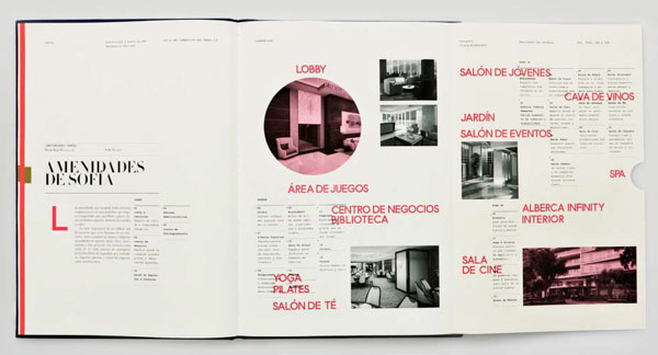
Foldout spread from the Sofia building’s brochure, showcasing its amenities.
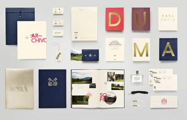
From custom stationery to scent to bags to books, the Sofia brand exudes elegance.
The New School for Jazz 25th Anniversary Poster
Before designer Jay Kapur moved to Oakland, California, he called Brooklyn home and was employed at The New School in New York City. There he worked on a variety of design solutions for Parsons The New School for Design, The New School for Jazz, and The New School for Drama. When an influential institution such as The New School for Jazz celebrates its 25th anniversary, the stakes are high, creatively speaking. Add a concert featuring one of its most prestigious alumni, jazz pianist Brad Mehldau, into the mix, and it intensifies. Kapur was asked to design the poster for the event. He worked on the project with senior designer Alex Ku and art director Ed Pusz. “I began this project as I begin all projects, with extensive research. I dug in and found out as much as I could about The New School for Jazz, and explored the historical visual language of American Jazz,” Kapur explains. “From this informed position, I began hand-sketching possible visual solutions to the problem at hand. Only after thorough research and sketching did I begin to use InDesign.” Kapur then experimented with several different grids before the right one for the poster revealed itself. “I arrived upon a flexible grid,” he says, “based on the Fibonacci sequence paired with a set of angled columns and gutters.” The solution worked in creating a dynamic layout that communicated all the information about the event in an elevated manner. These days, Kapur, a senior designer at Duarte Design, says his favorite InDesign feature is still the paragraph style settings. “Once you master the use of paragraph styles,” he explains, “as a designer, you can take maximum control of your layout’s typography and make fine adjustments throughout your design process to strive for perfection.”

Layout sketches from The New School for Jazz 25th Anniversary Celebration poster.
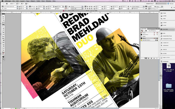
Detailed screenshot of The New School for Jazz 25th Anniversary Celebration poster.
Harrods City Guides
If you’ve traveled to London, you’ve probably visited, or at the very least seen, Harrods. Rich in history, the landmark department store is known not only for being one of the world’s largest (at 9,000 square feet) but for its connection to the Royal Family—royal warrants, Princess Diana, and more. The luxury store takes fashion seriously, so much so that it produces New York and London Fashion Week City Guides. In 2013, designer Lorena Massacane was hired to create the Harrods City Guides. Massacane, who splits her time between London and Berlin, says, “[The Guides] highlight the must-visit and must-see places loved and chosen by favorite designers.” The guides are then sent to editors and bloggers in both New York and London. So they needed to grab attention to ensure a far-and-wide reach. “It was an amazing experience to work with the Harrods creative team,” says Massacane. “They gave me the freedom to think out of the box and do something different.” Massacane has worked with a range of clients, from international brands to small boutique companies, and brought ten years’ experience to the Harrods project. And it shows. Her use of sophisticated type, a bold color palette, and striking graphics resulted in a contemporary design for this old-world institution. Why InDesign? Massacane says it’s the ability to work with styles—an important feature missing from other design programs. She advises designers to do as she does: “Keep exploring the tools, there’s always a new feature, and another way to get to the same result. Learn the shortcuts and have fun!”
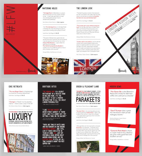
Harrods City Guides for London Fashion Week (2013).
Design New Worlds at Parsons Paris
When Parsons opened its European branch, recruiting students for the new Paris campus became a top priority. Traveling admissions counselors and the Parsons Paris staff requested an innovative booklet that would introduce prospective undergraduate and graduate students to the new academic center, entice them to explore more deeply, and eventually apply online. It’s a tall order for a “first-touch” booklet, but New York designer Paula Giraldo was up for the challenge. At the time, Giraldo was working as a designer and associate art director in the central strategic communications team of The New School. (She now heads her own firm, Paula Giraldo Creative.) This ambitious project had Giraldo working with teams in both New York and Paris. “A creative concept, based on the message that Parsons Paris offers students the ëbest of both worlds’ (that is, Parsons’ renowned curriculum along with Paris’s unique resources), was developed,” explains Giraldo. Next she began collecting and analyzing information, sketching, gathering assets, making paper dummies, and requesting printer quotes—all the while keeping the project’s time constraints and budget in mind. “Then I jumped onto the computer, using InDesign to assemble all information; I used Illustrator to create any necessary graphics and Adobe Photoshop to manipulate photographs,” Giraldo says. “Once the designs begin to take shape, I start printing mockups to better understand proportions, sizes, colors, and the pacing of the information. I carefully built my InDesign file from the beginning; doing so helps me stay focused and organized. During each step of the process, grid and styles were essential. And I kept all my links in the same place to further organize a given file, which is something that will serve you to move things faster.” To give the Design New Worlds booklet some dimension, Giraldo envisioned a three-dimensional center section formed by a die-cut semicircle. Thus, when laid open on a table at a recruitment event, it would draw attention. “In an open position, the booklet’s semicircle pages stand up, evoking a sphere of the two worlds described [in the booklet] as coming together in Paris,” explains Giraldo. The small, brightly colored, unusually-shaped pages add a surprising and interactive element to the booklet. It’s a smart solution with high impact in a category that typically leaves innovative design and printing techniques on the back burner. Giraldo leans heavily on InDesign in her work. “It’s such a big and flexible program that it often seems to me that the only limitations come from yourself. Once you know how to use it well, it becomes a tool that makes your creative process much easier.” Her “it list” of InDesign features includes styles, margins, rules, layers, and master pages. “A grid and styles should always be present in an InDesign file; together, they form a good foundation for a well-designed project.”
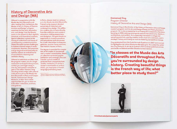
The die-cut in the 32-page Design New Worlds booklet cuts only partway through, giving the piece its 3D quality.
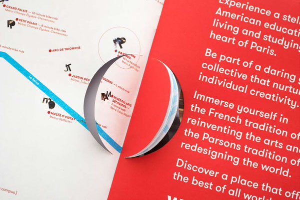
The middle section can be completely detached, affording the viewer a different experience with the brochure.
Adaptive Learning
One thing all the designers in this article have in common is playful experimentation. That love of learning is vital to the creative process. InDesign is a powerful tool and the possibilities are endless. Now it’s your turn to explore.
Commenting is easier and faster when you're logged in!

Recommended for you

TypeTalk: Identify Fonts in PDFs
Q. Is there a way to tell which fonts are used in a PDF file? A.Yes, in most cas...

Print Option for Documents with Multiple Page Sizes
Are you working in an InDesign document that contains multiple page sizes?...
New Promotion Eases Migration to QuarkXPress 8 with Free XTensions Upgrades
Quark Inc. announced today that leading QuarkXPress® XTensions® developers are o...