
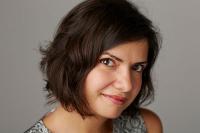
InPerson Interview: Nadine Chahine
David Blatner interviews an expert in Middle Eastern type design to learn about Arabic fonts, legibility, and antisocial glyphs


This article appears in Issue 92 of InDesign Magazine.
David: Can you tell me a little bit about yourself?
Nadine: My current job is the UK Type Director and Legibility Expert. I have been in this job for a year now, but I have been with the company for almost 12. I studied graphic design at the American University of Beirut, where I started becoming interested in type design. I later went to Reading University in the UK where I received a masters degree in typeface design.
That started my career in type design. Afterwards I taught for a little bit, and then was hired at Linotype. Then Linotype was acquired by Monotype, and here I am.
David: That’s interesting that your title includes legibility.
Nadine: Yes, “Type Director and Legibility Expert.” I kept the legibility in there because my PhD topic is in legibility studies, and I’ve been doing legibility research for Monotype since 2012. I still work with the MIT AgeLab on legibility research.
A year ago, before I became Type Director, I used to do two things: I was the Arabic specialist—so I did all of the Arabic projects that we work on, whether for customers or for the library—and then I also did legibility research.
David: Is legibility the same thing as readability?
Nadine: In general we tend to differentiate a little bit. Legibility, at least as I’ve described it in my PhD, is the ease with which we can extract information from the visual, in order for us to start processing the letterforms. It’s all about the speed of picking up what letterforms you are seeing and putting those together into words.
David: Most of us are familiar with purchasing fonts in a retail
way. But you also work with customers who come to Monotype for custom type work?
Nadine: Yes, we cater to all sorts of different kinds of clients. Some people will license a typeface or a font one time, for maybe a poster or an invitation for a birthday party. These would be the occasional users of type. They’re not necessarily graphic designers or visual communication designers.
Then you will have the graphic designers and the professional design community. They will license fonts from the library via the various websites that we have, such as the Monotype Library Subscription, or from other retailers.
But every once in a while you will have a project which requires something which doesn’t yet exist. Or it requires a certain kind of modification to an existing font. That’s when the project becomes custom.
For example, you could license the font Frutiger from us, but you could decide that you want a slightly different weight than the weights that are already existing. We do this quite often. For example, we worked with Heathrow Terminal 5 on a modification of Frutiger, because they required a slightly different metric—the ascenders and descenders had to be a little bit different.
Sometimes it’s as simple as changing a square dot—the dot of the i—from square into a circle. It could be very, very simple. Or it could be adding proportional numerals to a font that has only tabular numerals. Or it could be shortening the ascenders or it could also be making it a little bit bolder. Or maybe putting some cuts on the letter– forms. These are some of small things that we could do.
And then, once in awhile, we will have clients that require something completely new. We start from scratch. We discuss what personality they’re looking for. What’s the tone of the voice? What are they trying to say? What is it that they need?
Then we design it for them. We show them sketches. They approve a direction. We work some more. We show it to them again. We work together, like a partnership, back and forth, until we are all happy with the design.
David: Clearly a lot of the work that you do has to do with Arabic fonts. How are Arabic fonts different than working with Roman fonts—apart from the obvious difference in the character shapes?
Nadine: When I’m designing a font myself, I will only design Arabic. But because I’m the type director now, I also have to work with Latin fonts, which makes the differences and similarities between the two scripts pop up very quickly.
Let’s look at the similarities first. There are requirements to what makes a good typeface, and these requirements are the same in every script. It needs to be well drawn. It needs to be well spaced. It needs to be consistent in design. The quality of the outlines needs to be very good as well. And the text needs to be harmonious within itself—that is, the system that you are building. Because typefaces are systems… you’re not designing one final output—you’re designing letter shapes that will connect to one another and make words. If they do not connect nicely, do not make nice word shapes, then you are not succeeding as a type designer.
Also, there needs to be a concept as to what this typeface is trying to say, and it needs to be something that people are interested in hearing. And so all of these are qualities that we need in every script. This is the commonality of all of them.
OK, now what makes Arabic different from Latin… There are several differences, and at first glance, one might get a little bit scared, but with a little bit of perseverance and a little bit of research, you can overcome this.
For example, Latin is written from left to right. But Arabic is written from right to left, for the main text. But for the numerals, the numerals are written from left to right! Just to make life interesting.
Next, most of the characters in Arabic are connecting to the characters before and after, which is not like in Latin. In Latin, generally each glyph is separated, isolated. Also you typically have more than one shape per letter—like the capital A and the lowercase a. But in Arabic, we don’t have capitals and lowercase. We just have one case, but for every letter, the character has a different shape in the beginning of a word, in the middle, in the final, and then when it’s placed on its own.
And again, just to make life interesting, not every character connects to what is before and after. Some characters connect to the character before, but not to the character after. I call these the antisocial letters.
In Arabic, it’s like each letter is a person, and they’re all holding hands. Every once in a while, you’ll have this annoying person who will hold hands with the one before but not with the next one. It’s basically people holding hands (Figure 1).

Figure 1: Subtle differences between these Arabic fonts lead to a harmonious combination. Shown here: DIN Next Arabic, Univers Next Arabic, Sony SST Arabic, Akko Arabic
Plus, because of this connectivity, we’re actually drawing both letterforms and phantoms of letterforms—because the characters are connecting. When they connect, they create this special line in the middle. And of course this needs to be designed as well, so it makes the design of an Arabic font more complicated. You know, because when you design them, each letter is designed separately, but when you’re typing, it all needs to appear as if it’s one continuous line stroke. It’s an illusion. We create an illusion of continuity.
David: Does every character have three forms, the initial, medial, and terminal?
Nadine: Yes, and the final. Four forms: initial, middle, final, and isolated. Well, the antisocial ones have only two—final and isolated.
David: I can’t read Arabic, but it looks like you can also combine Arabic faces in a way that characters almost stack on top of each other.
Nadine: Right, we said they are holding hands, but we didn’t say how! There are different ways of holding hands. You can hold hands very comfortably and everyone is standing on the same floor. Sometimes, you can hold hands but jump up a little bit. It’s a bit more acrobatic in that sense, if we’re going to continue that metaphor.
So the stacking order is sometimes not horizontally side by side, but rather, diagonally (Figure 2). This does happen in typefaces that emulate the more handwritten versions of some of the styles.
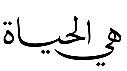
Figure 2: In Arabic, text can jump diagonally as it moves from right-to-left, creating the feeling of a flowing, hand-written script.
But most important is the fluidity of motion—this illusion that one continuous line drew this string of letters, and that illusion cannot be broken. You can only break it if you want to give the effect of a typeface where an earthquake has shattered it. Also, spacing in Arabic fonts is often very difficult. This is one of the big challenges for us.
David: It does seem like in justified text, or nearly justified text, that the character forms themselves are being extended.
Nadine: This is what is called the kashida—this horizontal extension that can be added between letterforms. It has no meaning and is only there to extend the line. It has calligraphic and historical references.
I prefer nonjustified text for Arabic. If it’s justified, then the column needs to be so wide that the justification is not too dramatic. If you have a lot of words per column, then the risk of having poor spacing is less.
David: How do you think InDesign handles typesetting Arabic?
Nadine: InDesign has made it quite comfortable to work with multilingual typography, because you have the ability to set Arabic, Latin, Japanese, Chinese, and more. And its OpenType support also makes the setting of Arabic much easier.
Historically speaking, when InDesign came out, it was a revolution within the world of Arabic typesetting, because we had struggled a lot with fonts and with desktop publishing. Now, it’s straightforward. It’s a liberation.
David: Tell me about some of your favorite Arabic fonts.
Nadine: I can tell you my two favorite Arabic type designers, and then we can pick some of their work. One of them is Tim Holloway. He is the designer of Adobe Arabic, and he is an amazing designer… very talented. He is not an Arab, but he’s done enough research to be able to design outstanding Arabic typefaces. Adobe Arabic is a really great typeface—it set the bar for what a good Arabic typeface should be: Very legible. Very nicely drawn. Very contemporary, but also based on heritage.
Another very good font of Tim’s is Mitra, for the Linotype library.
Mamoun Sakkal is my other favorite type designer—he’s a Syrian designer who lives near Seattle. One of them is Shilia that he designed also for the Linotype library. I also like the work that he does with Microsoft, such as Sakkal Majalla.
David: Finally, what advice would you give somebody who needs to set Arabic but who doesn’t speak Arabic? Is that possible?
Nadine: Yes, with a little bit of help. It depends on how complex the job is. The first thing that one needs to know is, “Is what I am typesetting actually Arabic?” Because sometimes what happens is that you take a word or a sentence and translate it with Google Translate, and you copy the text and you paste it in InDesign. But often the word order, or the letter order, doesn’t go from right-to-left properly—it goes from left to right, and it doesn’t connect. It’s happened for many high-profile clients!
So if you try this, take a screenshot of what that word looks like in Google Translate, and compare that to how it looks in InDesign. Just zoom in and look at the details. Obviously, the font might not be the same, but are the dots in the same place? Are things connecting? Do the shapes look similar in terms of movement of the line? Are they connecting in the same places or not? What kinds of shapes am I getting?
There might be some variations because of the change in style, but you should at least be able to spot any big problems. These are the basic requirements for Arabic that is blasphemy if we don’t get them… I don’t mean in a religious way, but in a cultural way: It’s a bit insulting to typeset Arabic that is not connecting.
Of course, even better would be to have an Arab speaker look at it. It doesn’t have to be a designer—just someone who knows how the text should run and the logical sequence of the text, especially if you have multiple columns.
In terms of design, I would recommend that Arabic fonts get a little bit extra leading than Latin because of the nature of the forms. We have a lot of these dots and marks, sometimes above or below. So never set Arabic on solid. Always give it a little bit extra space. It needs breathing space (Figure 3).
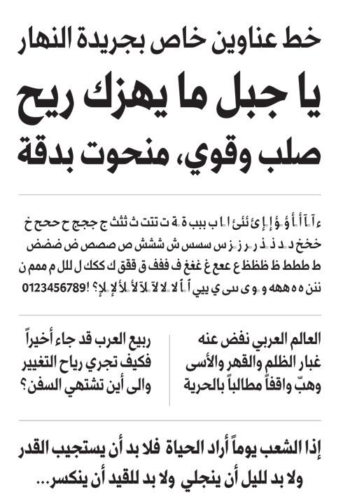
Figure 3: Arabic often needs more leading than Latin text, especially when various phonetic marks are added above and below the glyphs.
When you’re setting Arabic and Latin together, if you have a title, it’s much easier to put the Arabic on top of the Latin, because Arabic is so organic. It’s not always very stable. It needs something underneath. When you look at Latin, if it’s uppercase, it looks like one box. If it’s mixed case, it’s one box with a few things coming out of it. But the Arabic is rarely like a box. Normally, it’s very organic, so when you have the Latin under the Arabic, you give it extra stability.
David: Earlier, when you said that the first thing you need to do is make sure that it’s Arabic, it also occurred to me that you need to make sure that what you’re setting is not Farsi or Urdu or something else that looks like Arabic.
Nadine: Exactly. Ideally, your client will give you the text that you need to set. You shouldn’t have to translate it yourself. You also need to know that the typeface you’re using supports Arabic, because not every font has Arabic in it. The typographic choice is very important. This is where the best bet would be to get an Arabic typeface that has Latin inside and they are matched with the same optical styles (Figure 4).

Figure 4: A sampling of Nadine’s favorite Arabic fonts, including several designed to mix Latin and Arabic text.
You see, Arabic characters are often smaller than what you would normally expect for a particular font size. So if you want to set a Latin font in 10 points, the Arabic might be set at 13. It’s a bit confusing because some fonts are drawn very big and some fonts are drawn very small. If you are unfamiliar with the script, you might not know how to match them to be optically the same. So your best bet would be to license a font that already includes Arabic and Latin, because they will automatically be drawn at the same size. You don’t have to worry and you can use the same size for both. Also, that way you don’t have to worry about matching the flavor and personality of the typeface.
Commenting is easier and faster when you're logged in!

Recommended for you

TypeTalk: Text Fonts versus Display Fonts
Q. How can I tell the difference between a text font and a display font? Are the...

A Compendium of Slab Serifs
Slab serifs are hot! Also referred to as square serif or Egyptian, slabs are enj...
TypeTalk: Character Reference
TypeTalk is a regular blog on typography. Post your questions and comments by cl...