
InFocus: Autumn 2018
Erica Gamet delivers another bunch of cool stuff for InDesign users.


This article appears in Issue 114 of InDesign Magazine.
Ah, autumn! That time of year when you never know if the weather is going to lean more towards summer or winter. It’s that time of year when you keep a sweater, snow boots, and your hiking shorts all at the ready. Prepared for anything, you brace for whatever weather mix comes your way. Speaking of hodgepodges, in this InFocus I’m throwing a little of everything your way, from fonts to utilities to books to scripts. Like the unofficial icon of autumn, the cornucopia, this bounty of goodies is spilling over. Gather them up and enjoy!
Wakamai Fondue
Sometimes a product or service comes along that you never realized you needed until you saw it in action. Okay, “need” might be overselling this one, but the online service called Wakamai Fondue has me hooked. It’s a simple free service to glean information about specific fonts that reside on your hard drive (Typekit fonts need not apply). Simply head over to the site and drop a font onto the page or click in the circle to choose a font file; the fonts aren’t uploaded, merely analyzed. The site quickly posts information such as font format and name, designer, and version (Figure 1). In addition, the site displays specs such as number of glyphs and characters in the chosen font as well as the languages that are supported. The latter appears to be an incomplete, work-in-progress feature. Can’t remember the licensing specifics? That information shows up as well.
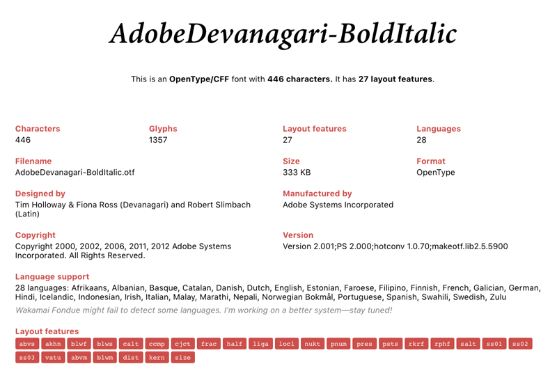
Figure 1. Font information from Wakamai Fondue
Wakamai Fondue (am I alone in wishing they called it “Fontdue”?) displays glyph sets and stylistic alternates. This can be a very helpful alternative to the Glyphs
panel in InDesign. If you’re exporting your text to HTML, the service lends a hand there as well, by producing an HTML snippet showing how to activate font features like discretionary ligatures and fractions (Figure 2). Finally, it generates a CSS file that you can download for use in your HTML-driven projects. I couldn’t stop dropping my local fonts onto this page, just to peek at their inner workings. If reading tea leaves isn’t your thing, try fondue!
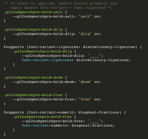
Figure 2. Generated HTML/CSS info from Wakamai Fondue
Colour Contrast Analyser
True to its name, the Colour Contrast Analyser from The Paciello Group is a free, open-source app for analyzing the contrast, and therefore the legibility, of text and other elements in both your print and digital designs. After installing the app, using it is simple: Select a foreground and background color by entering the hex or RGB values, using the color picker, or selecting the eyedropper to sample a color.
The Luminosity tab checks large and small text in varying sizes—classified by two levels of contrast—and assigns a pass/fail grade along with the resulting contrast ratio (Figure 3).
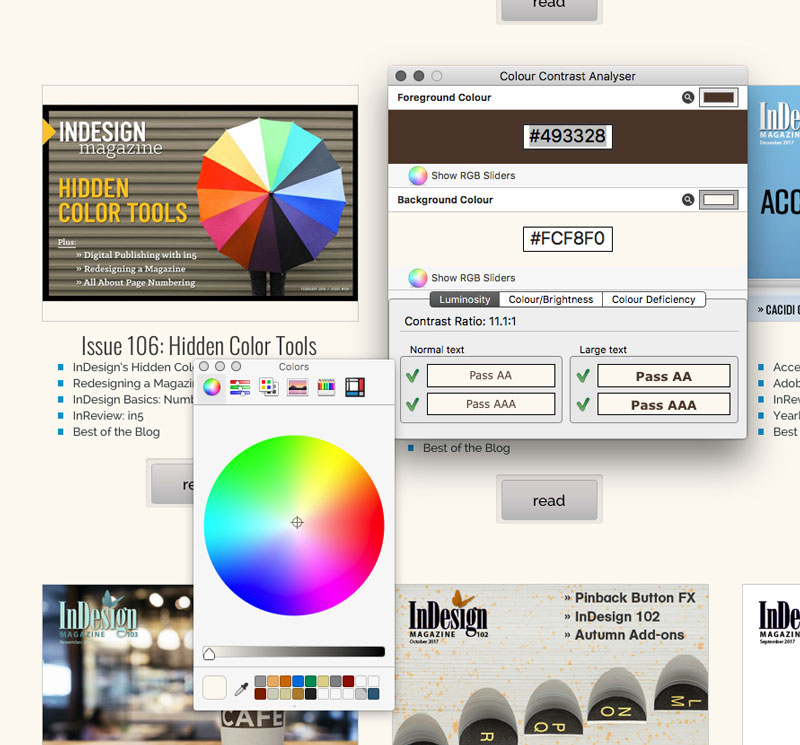
Figure 3. Colour Contrast Analyser Luminosity results
The eponymous second tab shows the color and brightness differences between the two chosen colors. In addition to the pass/fail assessment, the app states the minimum difference values required to pass. The final tab, Colour Deficiency, attempts to visually convey how your chosen colors will appear when viewed by people with specific visual conditions, such as color-blindness (Figure 4).
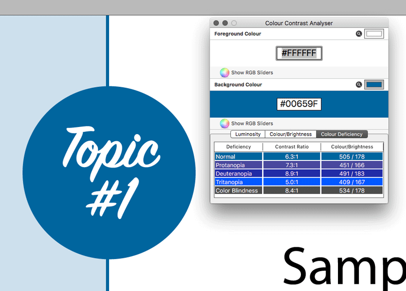
Figure 4. Colour Contrast Analyser Color Deficiency results
The Colour Contrast Analyser would benefit from a “snap to nearest passing color” option, but I found that switching to the RGB sliders and making slight adjustments quickly allowed me to get a passing grade.
Braille Neue
Japanese designer Kosuke Takahashi has created the concept typeface Braille Neue that combines visible alphabets with Braille that will be useful to both sighted and visually impaired individuals. The creator has said he hopes his font will “create a truly universal space where anyone can access information.” The plan is to address the use of Braille characters in public spaces without taking up more space for the tactile signage. It does this by overlaying the visible and the Braille characters (Figure 5).
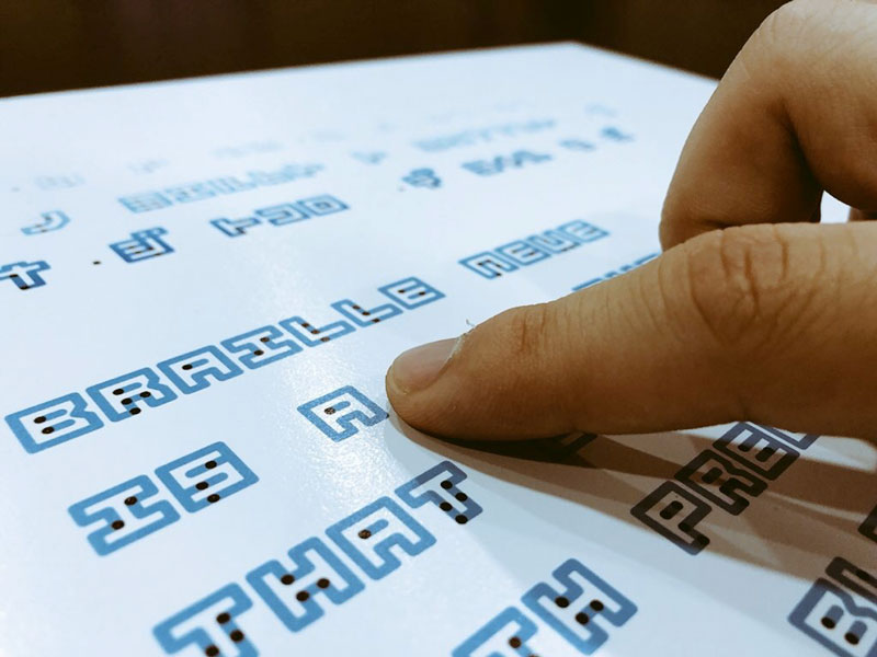
Figure 5. Braille Neue incorporates visible characters with the tactile Braille letters.
The font is made up of two sets: Braille Neue Standard, which includes Latin characters and Braille equivalents, and Braille Neue Outline, which adds Japanese characters to the mix. Though this font is not the first typeface to combine Braille with visual type, it is the first to incorporate Japanese characters. Takahashi’s design works by keeping the visual letterforms squarish to accommodate the 6-dot Braille format. Braille Neue is currently just a work in progress, but Takahashi’s hope is to incorporate the typeface into the Tokyo Olympics and Paralympics in 2020.
Text Cleanup Script
If you’ve ever imported text in InDesign, you’ve probably had to clean up that text to some degree. Even with the best editorial team and constant reminders/threats, imported text will most likely have formatting and styling issues. Most of these can be cured by executing some text and/or GREP queries in the Find/Change dialog box.
While creating custom find/change queries gives you total control, you often have to search for the same problems time and time again, such as extra spaces between words, extra line breaks, and unwanted spaces at the beginning of a paragraph, to name only a few. The Text Cleanup script from Mars Premedia makes it easy to find and fix all of these with just one click. This pay-what-you-want donationware script consolidates some of InDesign’s built-in text searches as well as a few of the built-in GREP searches, which are displayed in plain English, not GREP code (Figure 6).
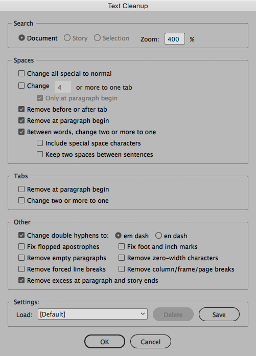
Figure 6. The many options available in the Text Cleanup script
The section for handling spaces lets you change all special spaces to a normal word space, consolidate multiple tabs into one, and reduce multiple spaces to a single space. And though it breaks my heart a little, there is even the option to keep two spaces between sentences, should you deem it necessary. (Helpful if you’re working with a monospace font!) When you first execute a find/change with the Text Cleanup script, you’re prompted to either okay each change individually or to change (or skip) all instances at once.
ID Util
Did you ever wish you could peek inside an InDesign file and see the elements within it without actually having to open it in InDesign? The folks at Markzware created ID Util to do just that. This free, Mac-only utility lets you view any previews that have been saved with an InDesign file, and it goes a step further, giving you the ability to export those previews in PNG, JPEG, or PDF format. The resolution of those previews—and output—will depend on your preview settings in InDesign, and if you have InDesign installed you also have the option to re-save those previews at a higher resolution. The Stories tab of the utility gives you access to every story in your file, even if you don’t have InDesign on your machine: you can copy the styled text directly or export that text to HTML, RTF, or TXT (Figure 7).
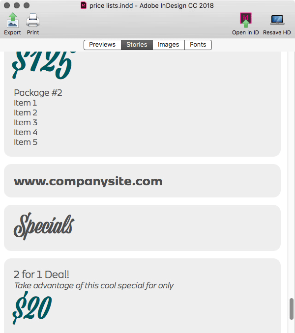
Figure 7. Each story is available to copy/paste or export from Markzware’s ID Util.
The next two tabs offer a great way to do a little more snooping on your file without having to open it. The Images tab displays all of the placed images in your document, including the file’s path, its status, and a button to jump quickly to its location in the Finder. The Fonts tab gives you similar information, including the Show in Finder button, which is useful for non-Typekit fonts that reside locally on your hard drive (Figure 8). The ID Util app also works on InCopy and IDML files, though InCopy previews can’t be automatically regenerated without going into InCopy itself.
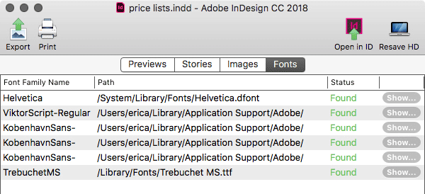
Figure 8. ID Util shows each font’s location.
One of the most valuable features in this utility, however, is the deceptively simple “Open in ID” button. This magic button opens the file in the version of InDesign the file was last saved! But it’s also smart enough to give up if you don’t have that version: I tried to open a very old (CS4) document, and when my computer was having none of that, the ID Util app helpfully converted it to CC2018.
If you’re a Mac InDesign user, you owe it to yourself to download this handy utility.
Nudgewink
While I was slightly disappointed that a font called Nudgewink didn’t contain a secret Monty Python quote generator, I was not disappointed in how much fun it brings to any page. This 1960s throwback type family comes in a standard and a pro version, each with four weights: Black, Bold, Light, and Medium. The baseline moves up and down a bit, depending on the glyph, which just adds to its whimsical nature. Originally designed with caps only, this newest incarnation brings more than just the addition of lowercase letters. The standard version runs $80 and the Pro version (which includes the standard fonts as well) is $130. The real magic of Nudgewink lies in its six stylistic sets (Figure 9).
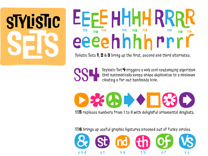
Figure 9. Some of the stylistic sets found in the Nudgewink font
While the first few sets provide variations of each letter, the fourth set includes a randomizing feature. This allows a different version of each letter to be randomly assigned, which in turn adds to the organic, hand-lettered feel you’d expect from a ’60s-inspired design. Yet another style set provides some ornamental dingbats, including the obligatory peace sign and flower-power icon. Nudgewink’s final style set includes ordinals, ampersands, and ligatures knocked out of circles. I like a retro font that doesn’t take itself too seriously, and Nudgewink certainly brings that attitude.
Pricing and Ethical Guidelines
Despite its fairly dry title, the Graphic Artists Guild’s Pricing and Ethical Guidelines is a veritable treasure trove of knowledge for the working artist. Covering topics so integral to an art-centric business such as copyright issues, royalties, speculative work, and scope of work, PEG—as it’s often referred to—breaks it down in easy-to-understand terminology. Not only does PEG include sample general and discipline-specific contracts, it also breaks down the hows and whys of using contracts and stresses the importance of not messing with the legalese in these contracts. The pricing and trade custom sections are nicely broken down by focus such as graphic design, illustration, web design, and the newly-introduced chapters dealing with surface pattern design.
This 430-page volume includes some easy-to-follow formulas for setting prices that even the most number- and math-phobic among us can put to use. Rounding out the hefty graphics bible is a chapter on resources and a glossary of both graphic and legal terms. A less daunting title for this amazing resource might be “Everything You Need to Know About Being a Working Artist,” as it deftly handles both the business and the artistic sides of our work.
Bauhaus Dessau Fonts
The Bauhaus movement looms large in the history of modern graphic design, and with the 100th anniversary of its founding coming up in 2019, it’s a perfect time to revisit some of its important contributions to the world of type design. Adobe is doing just that with the Hidden Treasures project. Five classic Bauhaus fonts have been re-created and digitized from old sketches and type samples by a team of international students led by Erik Spiekermann. Based on work by Bauhaus alums such as Alfred Arndt and Joost Schmidt, the five typefaces are Joschmi, Xants, CarlMarx, Reross, and Alfarn. You can sync them all from Typekit here.
Delete All GREP Styles
Sometimes you’ve tweaked a document so much and made such a mess of it that you just need to stand back and “nuke it from orbit,” as the saying goes. The mouthful that is the “Delete all GREP styles inside all paragraph styles” script from Kasyan Servetsky does exactly that for GREP styles. If you’ve ever needed to just wipe out any and all GREP styles you’ve set up within all of your paragraph styles, you need to check out this script. The interface is minimal: run the script, and click OK when it’s done (Figure 10). Every GREP style in every paragraph style in the current document will be discarded. If you feel remorseful about wielding such destructive power, you can easily reverse the purge in one go using the Undo command.
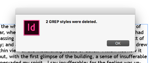
Figure 10. The minimalistic interface of the “Delete all GREP styles” script
Now, Go Reap What You’ve Sown
OK, I’ve sprinkled the seeds. Now it’s time for you to plant the ones that sound like something you want to nurture and grow. Here’s to a bountiful harvest for all of us, filled with an abundance of work, aided by groovy fonts, practical advice, and hidden typographical treasures.
Commenting is easier and faster when you're logged in!

Recommended for you

Search All InDesign Keyboard Shortcuts Quickly with Show Set
Sign up for the InDesign tip of the week to get a new tip, roundups of new artic...
Tip of the Week: Turning Off Typekit
How to turn off Typekit font synching in the Adobe Creative Cloud app if you don...

Freshen Up Your Fonts
Clear the cobwebs out of your font closet and bring in some fresh new options.