
InFocus: July 2016
Erica Gamet brings together an all new collection of cool goodies for working and playing with type.

This article appears in Issue 87 of InDesign Magazine.
Summer is in full swing (just ask my allergies) and everything is in bloom. As a kid in Colorado, summer meant time spent in the mountains amongst wildflowers, so my mind naturally turns to bouquets of hand-picked flowers this time of year. I always relied on field guides to tell me what was what and listened to the advice of other flower-gatherers for where to find the best blooms.
Think of this month’s InFocus as your field guide to colorful type-inspired buds and blooms. Some of the items might seem simple, as a daisy in a wildflower bouquet, while some are distinctive, like a tiger lily. As creative professionals, we work with words and type most days. It’s our job to bring these words meaning and depth through the way we present the typography. Here’s my type-inspired bouquet for you.
Working Hard
Whether you want to create your own font, easily license pro fonts, or be inspired by the masters of type, these goodies will help you on your typographical tiptoe through the tulips.
App.typography
As more and more digital publishing options have come into being, one of the more confusing aspects for creators has been font licensing and use. In the pre-digital days, it was pretty straightforward: buy the physical font, use the font. Even as we moved into the desktop publishing realm, the model worked more or less the same. Then solutions for web fonts came along, and things became slightly more involved. And now, with the explosion of digital publishing—where the fonts themselves travel along with final product—comes even more complexity in discerning just what you can and can’t do with a font.
In an attempt to streamline the licensing and use issues across digital platforms, Hoefler & Co recently
rolled out their App.typography licensing system. Whether you’re developing an app or creating digital publications, the App.typography subscription extends your existing font licenses based solely on number of product titles. As a publisher, this means that if you own an H&Co font for print, you can use that font—and any of its styles—to create the various flavors of eBooks, without regard to delivery platform or number of downloads. Starting at $299 a year for a single app or imprint, the service extends to any Hoefler & Co fonts already in your collection as well as to any future purchases. Having this blanket approach to font licensing will certainly go a long way to helping content creators navigate the murky waters of digital publishing.
IndyFont
If you’ve ever wanted to make your own font—or even just insert a custom character now and then—the task might have seemed foreign and overwhelming. Thanks to Theunis de Jong (aka Jongware) and Indiscripts, you can now dip your toes into the world of font creation. Or at the very least, single glyph creation. The IndyFont script runs from within InDesign, so you can enjoy the comfort of working in a familiar environment. There are two flavors of IndyFont: the full version (€59) allows for the creation of an entire font, and the free version can contain one glyph only. The latter might sound limited, but it’s perfect for tasks like creating custom bullets or for turning a company logo into its own glyph.
Creating a one-glyph font involves running the script from within InDesign and adding the glyph’s elements to the template document that the script creates (Figure 1).
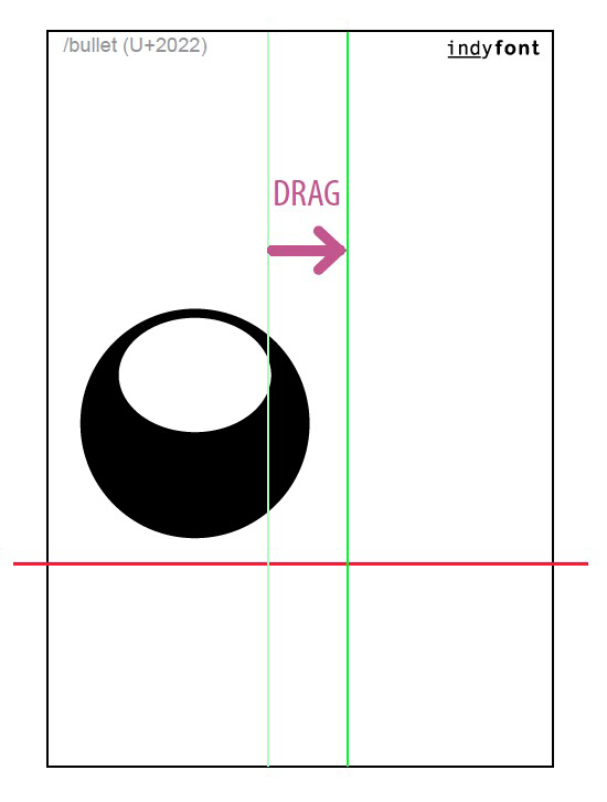
Figure 1: Creating a single-glyph font with IndyFont
The elements must be vectors with no stroke and filled using only the [Black] or [Paper] swatch. Using the guides and sample font characters for reference, paste and manipulate those elements within the space allotted and in relation to the baseline. When perfected, the font can be exported in OpenType format, ready to use in InDesign, or any other app that supports OpenType fonts. The process is similar for the paid version of IndyFont, where there are tools in place for adding ranges of glyphs to quickly generate an entire font. The full version also offers a slew of typographic editing features, such as creating skewed and horizontally scaled glyphs, crafting custom ligatures, and quickly creating sets of OpenType variants like swashes and small caps.
Font Candy
Making graphics with text and images is nothing new to designers: we do that all day long. Sometimes, though, it’s precisely because we’ve done it all day long that making a quick graphic for fun or for our own use seems like it will sap us of our last drop of creativity. Having apps that allow us to do just that with ease—especially on a mobile device—can be a godsend. Font Candy from Easy Tiger Apps is just one such app. Available on iOS and Windows Phone for free, Font Candy—and the premium Font Candy+—focuses less on the typography and more on the effects. There are a handful of fonts available in the free version, with Font Candy+ offering 40 additional fonts.
Both versions let you choose from a selection of social media post sizes and image filters and give you the ability to mask images using the text (Figure 2).
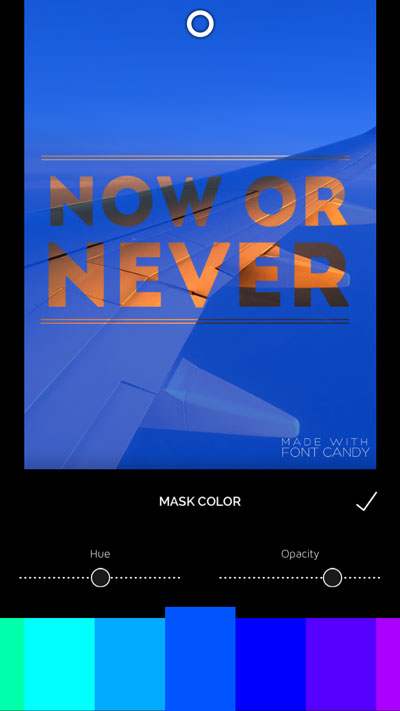
Figure 2: Font Candy lets you adjust opacity on type as well as images to create a mask.
Some shapes and pre-made sayings are available in both, with optional artwork like banners, bursts, and decorative items available as in-app purchases for $1.99. Font Candy+ delivers all of these extras for $2.99. The premium version gives you even more image control, including blend modes and an eraser, as well as removing all watermarks and ads. Your finished creations can be saved to your device, sent to social media, or even printed as a postcard or T-shirt design!
Helvetica/Objectified/Urbanized: The Complete Interviews
With over 100 hours of interviews shot for the Design trilogy—consisting of films Helvetica, Objectified, and Urbanized—much of that content hit the cutting room floor. Interviews with design legends like Michael Bierut, Hermann Zapf, Erik Spiekermann, Massimo Vignelli, and Jonathan Hoefler had to be cut short, reworked, and otherwise crafted in such a way that will always leave viewers wanting more. Well, fear not, lovers of type, because the films’ director Gary Hustwit has delivered up your heart’s deepest desire in book form. Helvetica/Objectified/Urbanized: The Complete Interviews (Figure 3) is a massive 736-page tome that collects the interview transcripts in their entirety for every typophile’s reading pleasure.
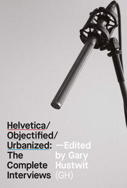
Figure 3: Helvetica/Objectified/Urbanized: The Complete Interviews contains the transcripts from all interviews in the Design Trilogy films.
Helvetica/Objectified/Urbanized came to life via a Kickstarter campaign in 2013 and comes in paperback ($45) or eBook format ($12). Whether you want to use the collection of design wisdom as reference or merely for inspiration, you’ll have each interviewee’s full thoughts to ponder.
Fontself Maker
Let’s face it—we all want to have at least one font that is uniquely ours. Uniquely us. No? Just me, you say? Well, I must not be alone, because a recent Kickstarter-backed project set out to make such a dream a reality. Fontself Maker ($50, Fontself) is a handy extension for Illustrator CC that lets you create a font from your own hand-drawn—or otherwise hand-crafted—letterforms. Any shape you create can become a character.
Creating your font requires only a simple drag and drop action. If you’ve drawn out your entire alphabet, just select the entire set of letters and drag them onto the window marked A-Z, and the entire alphabet will be mapped properly (Figure 4)!
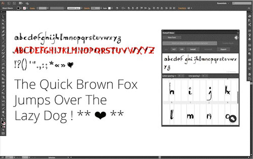
Figure 4: Drag and drop an entire alphabet on the Fontself Maker extension panel in Illustrator, and the letters map to the appropriate place.
Do the same for numbers, punctuation, and special characters. The most recent version allows you to create guides, adjust the letter spacing, and move the baseline for individual characters. A simple save, and then—as if by magic—your shiny new OpenType font is ready to use in your designs. Features to be included in future versions include alternates, ligatures, color, and kerning. Now if you’ll excuse me, I’m off to create the world’s most illegible font, based on my own handwriting.
Hardly Working
What’s the point of a beautiful typographical garden if you can’t sit back and enjoy it now and then? Enjoy the lighter side of your type obsession with these fragrant diversions.
The Rather Difficult Font Game
I’m convinced that all I need to do is play font-guessing games and I will become a type aficionado. Or at least be able to pick out a typeface by name on the first guess. So far that’s not the case, but that doesn’t keep me from playing games that help me identify fonts. I recently stumbled on the web version of the self-proclaimed “Rather Difficult Font Game.” It’s fairly straightforward, in that a piece of text is displayed and you have to choose the correct typeface used from a list of four options.
The iOS version for iPhone and iPad ($2) offers a little more variety in the gameplay. You are awarded higher points the faster you respond, and you can choose from three levels of difficulty. If necessary, you can scale up the letters for closer inspection, and even isolate just the sample word by rotating the game to landscape mode. In addition, the mobile version offers The Terminology Game, wherein you test your knowledge of type anatomy and other minutiae of a typographic nature (Figure 5). And, if you’re so inclined, you can even brag about your ability to tell the difference between Hoefler Text and Adobe Garamond Pro on Apple’s Game Center.
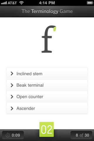
Figure 5: The mobile version of the Rather Difficult Font Game tests your knowledge of typefaces as well as type terminology.
Fontli
Finally, there’s a place for all type nerds to geek out over beautiful photos of amazing typography, freeing up precious Instagram space for well-styled food photography and duck-faced selfies! Fontli (Figure 6) is being called Instagram for Fontophiles, and that’s a lovely thing.
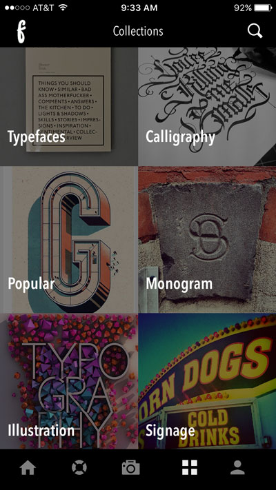
Figure 6: Assign photos of typography into one of Fontli’s premade categories.
Available for free for iOS, Android, and Windows Phone, the app is more than just a way to appreciate typography in the wild. Fontli’s typecentric focus brings together lovers of type in print, signage, illustration, and calligraphy to form a social network revolving around the common love of type on display.
Users can tag their photos by typeface; then others can find photos also sporting the same typeface. In addition, Fontli provides designer and foundry info for that particular typeface. The SOS section calls on the community to help identify particularly elusive typefaces. This feature is a huge aid for a type tenderfoot like myself. Of course, I’d be afraid to ask what typeface is gracing my beautifully-framed shot, only to be told, “That’s Helvetica, Erica.” Ah. So it is.
Typography SCRABBLE
What started out as a “wouldn’t it be nice” concept a few years ago has turned into a Hasbro-approved reality. I’m talking about the Typography SCRABBLE game ($50), now in its third edition. When first created, the Typography version was released as a luxury edition with a walnut cabinet, a magnetized playing board, and metal tile racks. This new edition is more laid-back but nowhere near pedestrian, more closely resembling a deluxe version of the original SCRABBLE game. It comes packaged up in a solid wood storage box, complete with drawer to keep the wood tiles and racks organized (Figure 7).

Figure 7: The Typography SCRABBLE game features a sparse game board and 12 different fonts on the letter tiles.
Version number three includes tiles featuring 12 new fonts, cheery colors on the bonus spaces, and a sleek new minimalist layout to the game board. Other than the look, however, the game is exactly the same one that we all know and remember. Some type purists might have trouble getting past the fact that a few of the typefaces are scripts and you might be forced to spell out words in all-cap script (ouch). But while you’re contemplating all sins typographic, I’ll just be over here plotting out my next triple-letter “Q” scoring coup.
Gather ye rosebuds while ye may
I hope you’ve enjoyed the romp through the fields of type and have your eye on what would go in your ideal type-infused bouquet. Until next time, enjoy the rays of typographical sunshine that make your designs blossom!
Commenting is easier and faster when you're logged in!

Recommended for you

Paper Tips: Uncoated Speaks Softer
This story courtesy of PaperSpecs.com. Traditionally, coated paper has been the...

CreativePro Week 2021 Agenda Announced
Five days, 100+ incredible sessions to take your skills to the next level We’re...

A Pre-Press Tutorial from PrintPlace.com
“Generally speaking, the term pre-press includes all the steps required to...