
InDesigners: Roberto de Vicq de Cumptich and Matteo Bologna
Together, Roberto de Vicq de Cumptich and Matteo Bologna create designs that contain multiple layers of text and subtext.


This article appears in Issue 2 of InDesign Magazine.
If a central feature of Adobe software is cross-application compatibility, then Roberto de Vicq de Cumptich and Matteo Bologna are the embodiment of that collaboration. De Vicq, senior art director and vice president of HarperCollins Publishing, is an Illustrator virtuoso, crafting imaginative portraits out of letters. Bologna, founder of Mucca Design and art director for Rizzoli in Milano as well as several HarperCollins imprints, performs layout magic in InDesign. Together they create designs that contain multiple layers of text and subtext. Their 2004 collaboration is a study in pushing the limits of InDesign. Words at Play explores the confluence of personality, typography, content, and design. De Vicq, the intellectual, chose quotes about words and language from 21 authors and public figures. Bologna, the droll designer, created layouts that underscore the meaning of the phrases as well as highlights different features of InDesign. For example, a quote by Vladimir Nabokov about the author’s duty to make unseen ideas visible through words is set against a backdrop of transparent letters. Central to each spread is a de Vicq portrait of the author composed out of the characters contained in his or her name and created in a typeface that reflects the author’s personality. Franz Kafka’s portrait, for instance, is set in the jittery Adobe font, Quake, which reflects the nervous author’s paranoia. To create Words at Play, De Vicq made the portraits in Illustrator and handed off the live ?les to Bologna who then placed them in InDesign. Bologna converted the letter portraits to outlines in InDesign. “InDesign’s Bezier curves management is better than Illustrator’s,” says Bologna, a former FreeHand user. Adds de Vicq, “Being able to have live pieces of Illustrator in InDesign made a big difference in how the pages were put together.” Two layouts stand out in the designers’
minds: William Shakespeare and Ludwig Wittgenstein. The Shakespeare spread, which plays off the quote that “a rose by any other word would smell as sweet,” includes a complex table of flower names coupled with their meanings. De Vicq notes that previously he was “terrified of tables,” but that InDesign has changed that for him. Bologna points to the Wittgenstein spread as the most difficult to lay out: the philosopher’s quote about the symbolism of language is set against a grid of 1,200 OpenType glyphs. “It was very slow to produce,” he says. The two met while exercising their dogs in 1994 and formed a professional collaboration shortly thereafter. Bologna had offered to help with the website for De Vicq’s Bembo’s Zoo, a children’s alphabet book of animals presented in his signature letter-portrait technique (bemboszoo.com). They have since worked on hundreds of HarperCollins titles together. WordsatPlay took more than two years—and two versions of InDesign—to complete. Both men use InDesign exclusively in their daily work as well. De Vicq says that working in InDesign is like working in Illustrator: “Sometimes I have to say, ‘Which software am I working in?’” Bologna, who also designs fonts, extols OpenType in InDesign as “the best thing in the world. You have all these interesting glyphs you didn’t have access to before.” And after this project, these two have probably seen them all.
![Quote: "Life's splendor forever lies in wait about each one of us in all its fullness, but veiled from view, deep down, invisible, far off. It is there, though, not hostile, not reluctant, not deaf. If you summon it by the right word, by its right name, it will come." Quote is in upper right corner. Franz Kafka's name is highlighted in light olive green and a stylized series of same color green arrows point in succession to a green circle overprinting on the right eye of a black line drawing of Kafka's face. A same-sized orange circle covers Kafka's left eye. From the circle, a series of orange arrows leads to another Kafka quote: "Life's splendor forever lies in wait about each, one of us in all its fullness, but veiled from view, deep down, invisible, far off. [This following sentence, and Kafka's tagline, is highlighed in the same orange as the circle and arrows:] It is there, though, not hostile, not reluctant, not deaf. If you summon it by the right word, by its right name, it will come."-Franz Kafka](https://creativepro.com/wp-content/uploads/2025/04/roberto-matteo-fig01.1000px.png)
Author: Franz Kafka. Portrait font: Quake. Technique featured: Eyedropper Tool.

Author: Gustave Flaubert. Portrait font: Nuptial Script. Technique featured: Nested Styles.

Author: Herman Melville. Portrait font: Poetica. Technique featured: Text Wrap.
![Spread built as two pages with a 26 col. x 24 row grid with a serif font's glyph in each cell. Filling selected two-row-deep areas with the same orange and green backgrounds is the font with each letter in a 2 row x 2 col. cell. Some words are broken, with word continuing two rows below, with lower right corner and upper left corner of two cells touching and the background the same orange or green. Strips of color on grid create a quote that reads: "[Orange] UTTER[break]ING [green]A [orange]WORD [green] IS LIKE [orange] A [green] NOTE [orange] ON THE [green]KEY[break]BOARD [orange]O[break]F [green]THE [orange]IMAG[break]INA[break]TION." At right in a 9 x 15 grid with orange background is a typographic portrait of Ludwig Wittgenstein. Below in a 9x8 grid, with green background, is the name LUD[break]WIG [one row space] WITT[break]GEN[break]STEIN. His name is in the same font as is shaded in the background of the cells that do not have the original quote text.](https://creativepro.com/wp-content/uploads/2025/04/roberto-matteo-fig04.1000px.png)
Author: Ludwig Wittgenstein. Portrait font: Giddyup. Technique featured: Glyphs Panel.
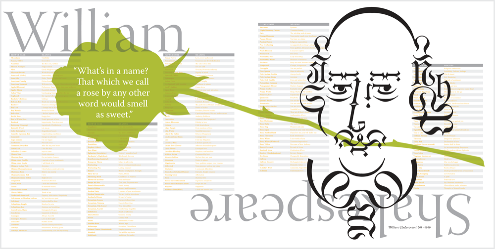
Author: William Shakespeare. Portrait font: Wittenberger Fraktur. Technique featured: Tables.
Commenting is easier and faster when you're logged in!

Recommended for you

TypeTalk: Type Tips for Letterpress Printing
The richness, depth and texture of a letterpress-printed piece is an exquisite t...

InDesign Magazine Issue 62: A Fresh Start
We’re happy to announce that InDesign Magazine Issue 62 (June, 2014) is now avai...

The 5 People All Creatives Need in Their Lives
As creative professionals we often find ourselves married to our work. Whether y...