
InDesigner: Theresa Stoodley
Learn about the creative process behind award-winning editorial and information design work.


This article appears in Issue 148 of InDesign Magazine.
We’re all familiar with magazine spreads that catch our attention and make us pause over full-bleed photos and distinctive typography. Similarly, we’ve all seen infographics that distill complex data into elegant designs, as well as white papers and research reports that convey important findings without boring or confusing us. These are very common publications, but it takes uncommon talent to execute them with precision and panache. The thought and processes that go into them are nothing short of complex—especially when it comes to data collection and visual storytelling. Interested in learning more about what goes on behind the design of such publications, I spoke with Theresa Stoodley, a graphic designer and application consultant based in the Midwest, about her career in editorial and information design, as well as what she finds herself creating (and doing) in her free time.

Self-portrait of Theresa Stoodley: “Graphic designer by day, fencing coach by night”
A Creative Journey
After bouncing between jobs after college, Stoodley officially kickstarted her design career working as an art director for the U.S. publishing company, Human Capital Media (HCM), which was the parent company to multiple business-to-business publications, such as Workforce, Chief Learning Officer, and Talent Economy. As part of the research division, Stoodley was responsible for designing large reports, infographics, and white papers. She gained most of her experience in editorial and information design during her time at HCM.
In May of 2019, the Australian-based software company Tanda acquired HCM and the Workforce brand, which Stoodley primarily worked for. The COVID-19 pandemic made it clear that magazine production was no longer viable, and in November of 2020, Stoodley was let go.
After spending so much time creating in InDesign, Stoodley realized she wanted a job where she can be helping others in InDesign. At the start of 2021, with a deep understanding of InDesign under her belt, she began her career as an application consultant for the priint Americas division of the German company, WERK II.
“priint has a powerful automation tool for publishing, and one of the pieces I specialize in is the print plug-in. When they sell the [priint] suite to the customer, there’s a lot of setup and implementation going on in the background, so we customize our tools for our customers. I get to look at their projects and help our tools fit their needs. It’s cool to see other people’s InDesign setup and why they made the choices they did,” she explained.
After learning about Stoodley’s background, experience, and current role working in InDesign, it became clear that she’s a wizard in the world of design and layout. She walked me through a few of the projects she designed during her free time and as an art director at HCM.
Editorial Design
Stoodley’s work in editorial design was typically a very templated process due to the strong style guidelines set in place by publication editors. Elements like paragraph styles, character styles, author bylines, and filler text were already established and could not be altered. However, she did have a decent amount of design flexibility on the opening spread.
“The fun part for me was the opening spread because I was able to do real design. With the rest of the sections, you’re just making sure there are no errors—adding in breaks, looking for widows, orphans, rivers, etc.,” she said.
One of the editorial designs Stoodley got a lot of creative freedom with was a spread called “Your First Digital Footsteps,” which also won a regional Silver Award for opening spread illustration at the Azbee Awards.
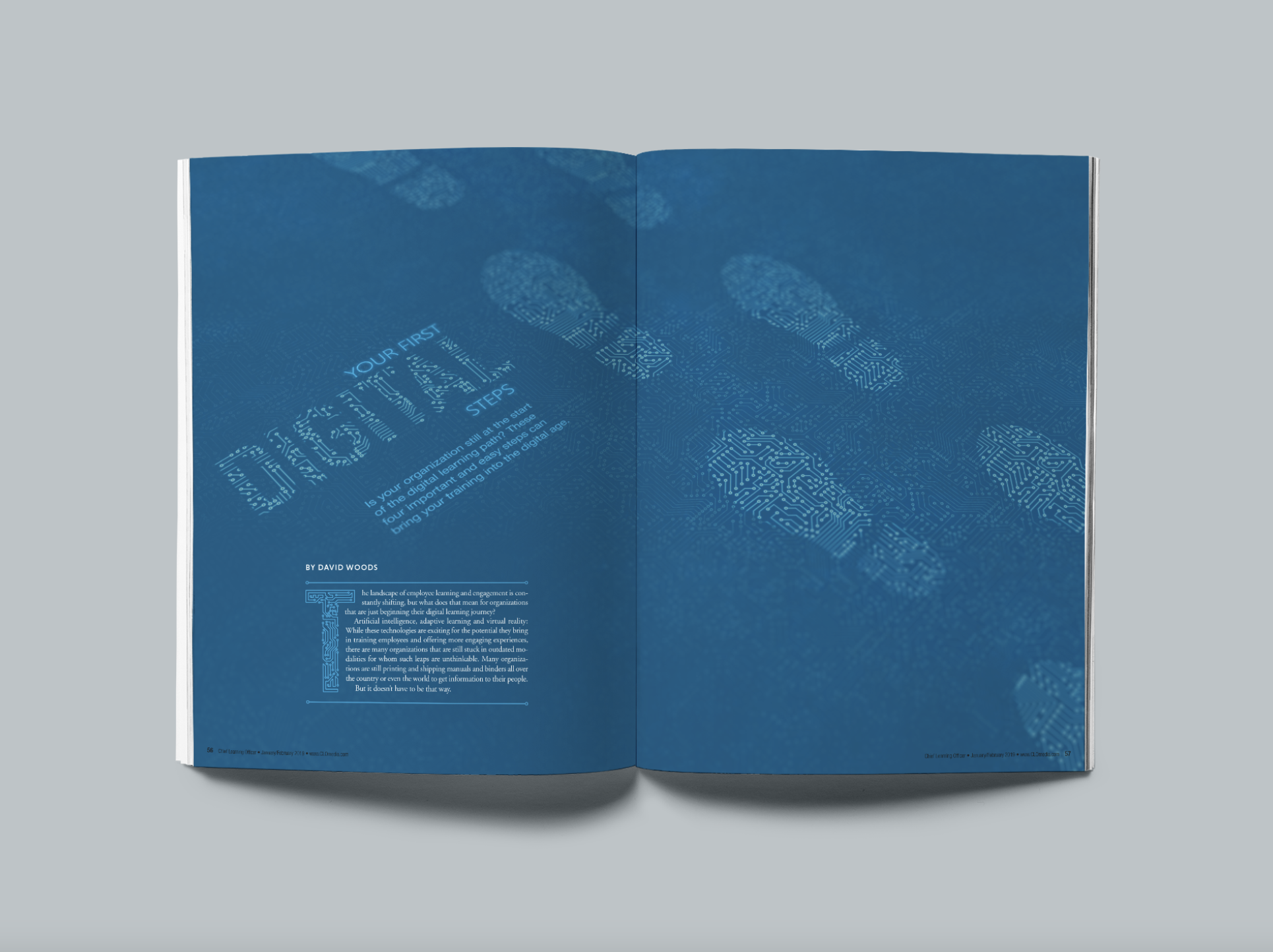
With little story copy to work with, Stoodley made sure to pull the headline into the art and lean into the design elements on the opening page—all of which were built using Adobe Creative Cloud.
“For this kind of editorial work, I first look to respect the readability and the stylesheets. But I also like to break the rules whenever I can get away with it. And this usually means pulling the headline into the art,” she explained.
Stoodley used many applications in Adobe Creative Cloud for this spread, such as pulling from Adobe Stock for the drop cap and patterns, making vector footprints within Illustrator, and adding tilt-shift effects in Photoshop. She mentioned that it was difficult to have creative freedom in a place of so many guidelines, but as she gained experience, she became more confident in what she was able to bring to the table.
“Most of the time the editors are trying to drive, but you can use the feedback to push yourself. There are definitely projects where I let the criticism make it better, and other projects where I disregarded that criticism,” she joked.
For a traditional editorial process, Stoodley would receive four to five stories per issue, read each of them, find a few key takeaways, and begin concepting and storyboarding. She would find two to four concepts for each story that were primarily focused on the design angle and a large image or illustration they could use to help open the story.


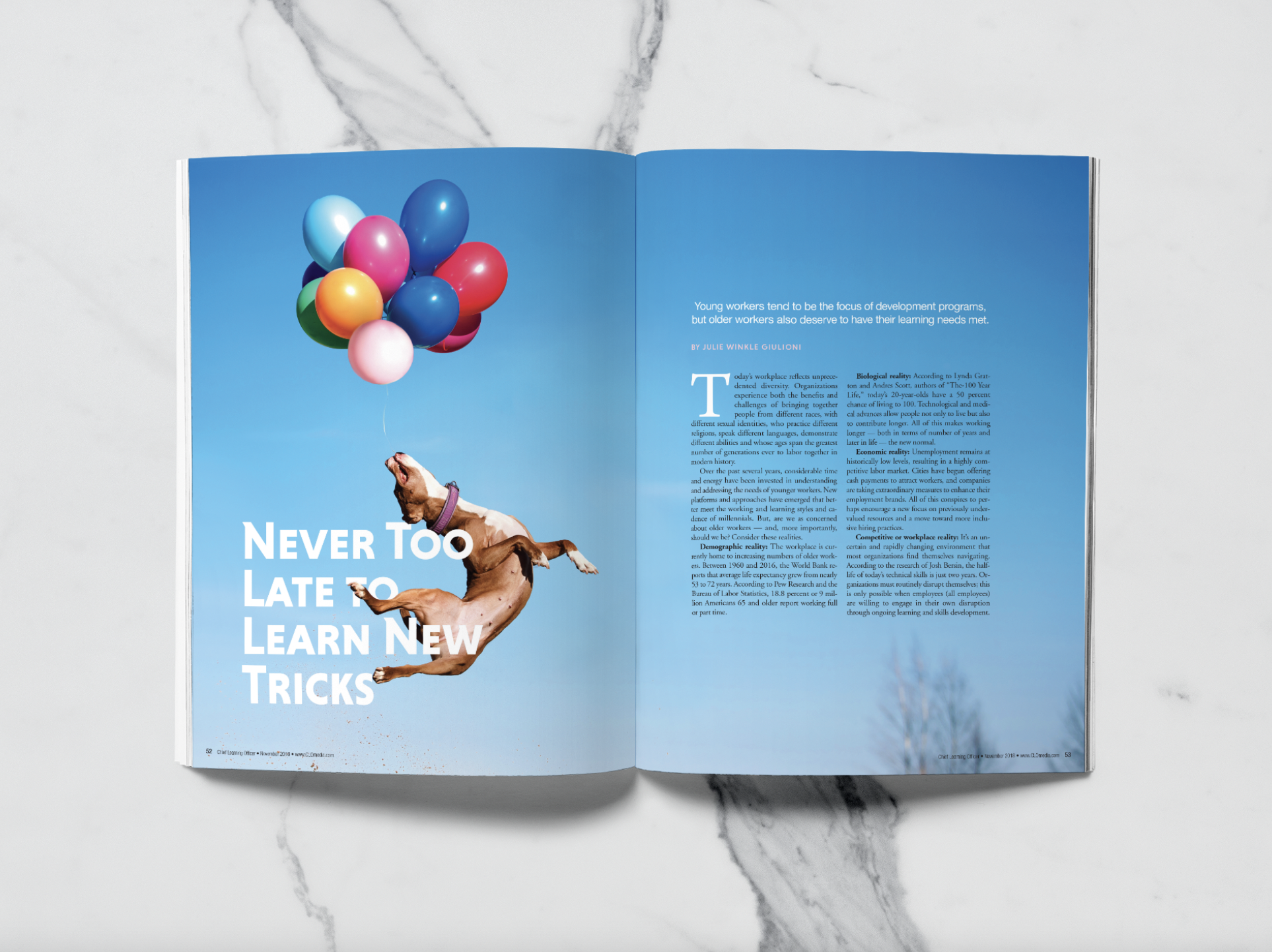
Stoodley had these two lead photos in a previous folder and thought they would make for eye-catching spreads. She then convinced her editors to re-work the article titles to match the nature of the images—what she calls, “a completely backwards shoehorning process.”
“The biggest challenge was trying to make the opening art different, new, fresh, eye opening, and relevant to the story. From there, we would talk about the options, and sometimes if I was lucky, they would say it was great, and sometimes they would tell me they’re all awful,” said Stoodley.
After that, there were two to three rounds of revisions until they picked a direction, and she would then begin designing the opening spread and formatting the following two pages of text.
However, it wasn’t all the time that articles began with the story and moved through to concepting and design. Due to her constant perusing of art and illustration, Stoodley had compiled many folders of unused images, and often proposed them to guide the story title—what she calls, “a completely backwards shoehorning process.”
“When a story was hard, we’d work backwards. I would go to the editor and ask to change the title to something relevant to the image. Especially if I had a really good piece of art. Oddly enough, these were a lot of the articles with the dogs,” she laughed.
Stoodley mentioned that this “collaborative” process was a surprisingly good way to work with her team and it ensured that the opening spread would be visually strong and compelling to readers.
If you’re an editorial designer looking for tips, Stoodley said, “It’s important to follow the rules—stylesheets, grids, etc.—but for your own sanity, you’ll need to break them sometimes. With that, you need to know how, why, and when you get to break them.”
Half-joking, she also added that you need to accept hyphenation into your life, and to stop abusing justified text.
Information Design
Compared to editorial design, information design is a bit trickier considering the quantitative inputs and the need to design and organize data in an unbiased and logical way that makes sense to the readers.
In 2020, Stoodley became involved in a project that surveyed and reported on sexual harassment and sexual assault in the Brazilian jiu-jitsu community. What began as initial hypotheses soon turned into a widespread survey that collected over 1,500 responses from 50 countries. Stoodley felt compelled to use her data visualization skills to build a report, later called Shut Up and Train, on what she felt was a common issue that needed to be addressed in the jiu-jitsu community. 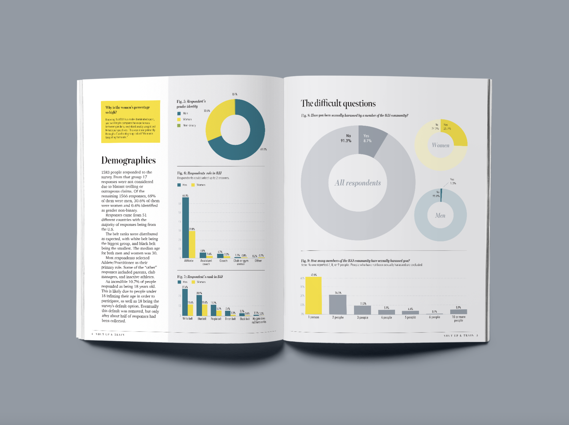

Shut Up and Train was one of Stoodley’s trickiest, yet most rewarding, projects to date. “It was so important for me to present this data in the most neutral form possible. I didn’t want to be accused of having a narrative,” she explained.
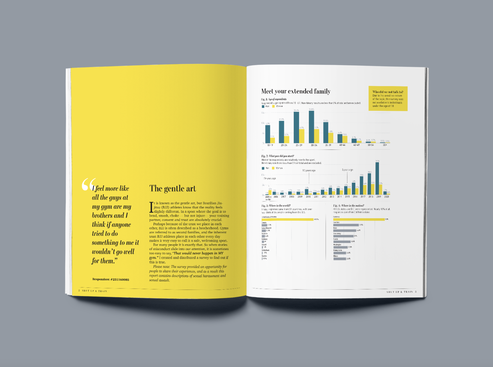
“I was pretty backwards in my approach. Because I was running the report myself, I knew what the questions were, I knew the things I thought would be really interesting, and I knew I wanted it to be editorial style in a report with facing pages,” she explained.
While the survey was running, she was able to make wireframes in InDesign where each survey question would go, as well as get a sense of what the responses would be and how they would be represented visually. At the same time, she was building paragraph styles, noted as “the fun part,” for all of the areas of text.
“This project was a blessing and a curse because I could make it completely my own,” she admitted. “I didn’t have to justify it to any editors, I got to pick the headings, paragraph styles, and color palette. I was always looking for a data project I could do on my own, just so I could make something like this, and all of the pieces fell into place, and it was a sign I should do this.”
Shut Up and Train was published online this year as a 66-page report that included 49 figures.
I asked Stoodley what her biggest piece of advice was for someone wanting to get into information design. She said, “You need to understand how design inherently influences how the data is read. And not just the nefarious ways people look for—flipping the axis, changing the scale, etc. It’s things like changing sort order and using color that affect what the reader focuses on, and you can use this to make your storytelling more effective.”
The Fun Department
Stoodley has spent a lot of time outside of her day-to-day jobs designing, creating, and learning. She has worked on a variety of personal projects, ranging from writing children’s books and designing icons for The Noun Project, to developing packaging labels and recreating parts of historical artifacts.
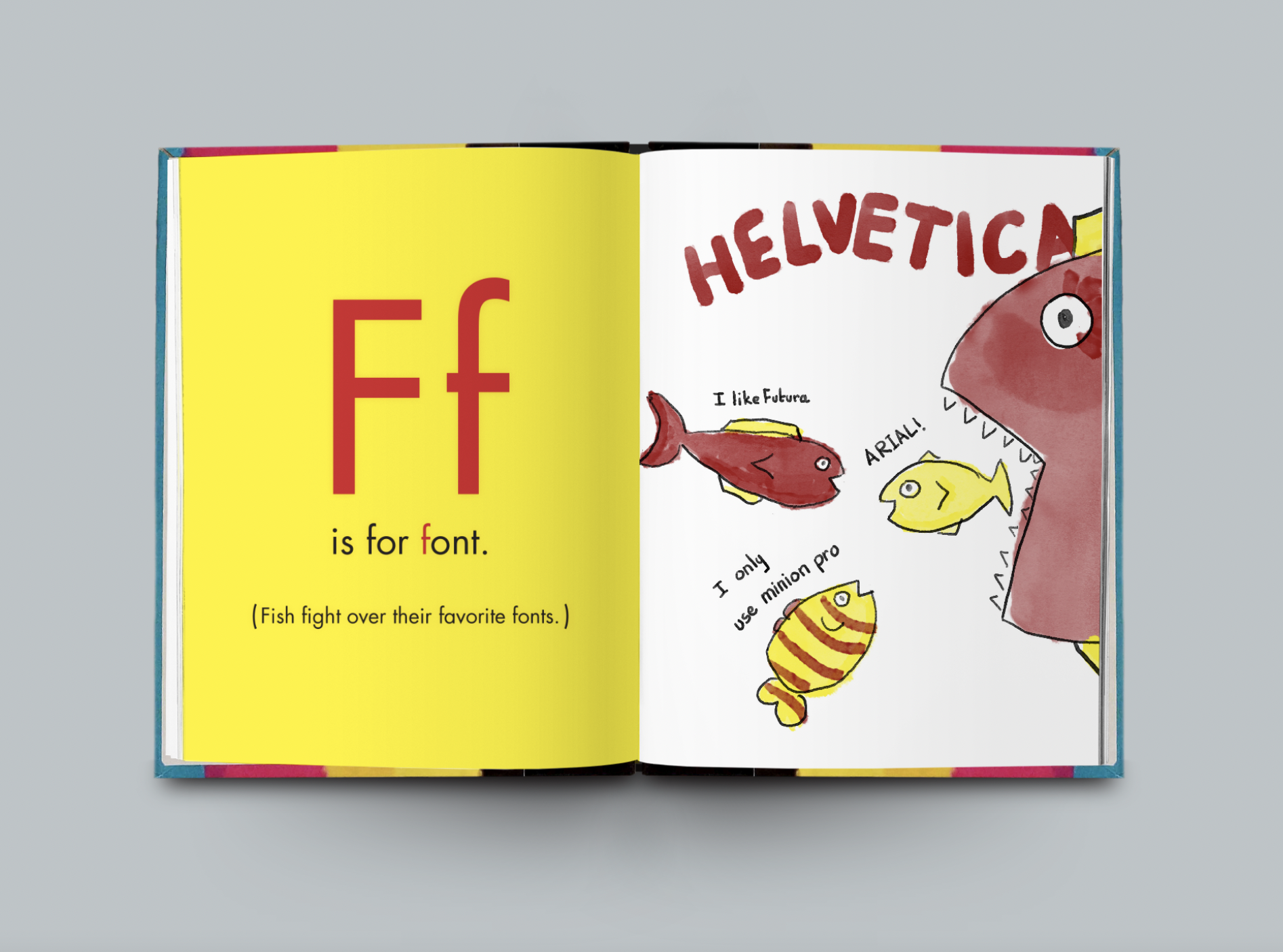
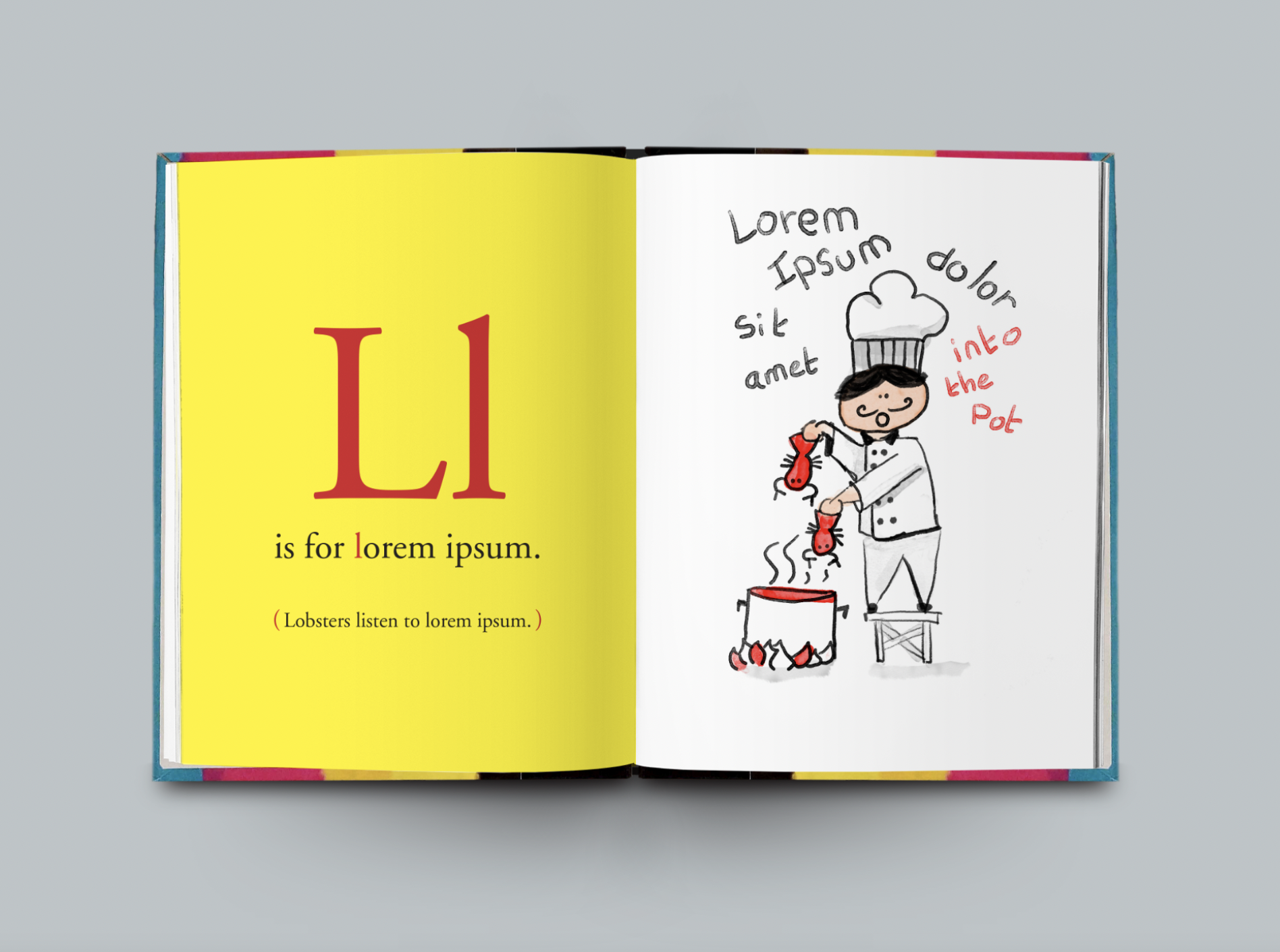
In 2018, Stoodley wrote, illustrated, designed, and hand-bound a book called Graphic Design for Babies. She even gifted one of the three copies to InDesign Magazine’s very own, Anne-Marie Concepción.
However, the one project that stands out, likely due to its challenging nature and “enormous reward,” was teaching herself InDesign scripting.
“In 2019, I decided it was time to learn how to write scripts for InDesign. After only a month of learning JavaScript and ExtendScript, I was able to write my very first working script. It simply closed the active InDesign book, and I thought it was the greatest thing ever,” she explained on her website.
With a little help from the internet and by attending a CreativePro event with Kris Coppieters, Stoodley was able to hone her scripting skills and apply them to post-production work at HCM.
“I wrote a script that exports each magazine section as a text file and exports all the images in two sizes. It also straightens rotated images before exporting them, and exports the magazine cover in two sizes,” she said.
Stoodley has been contributing to The Noun Project since 2013, and her icons are downloaded thousands of times each month.
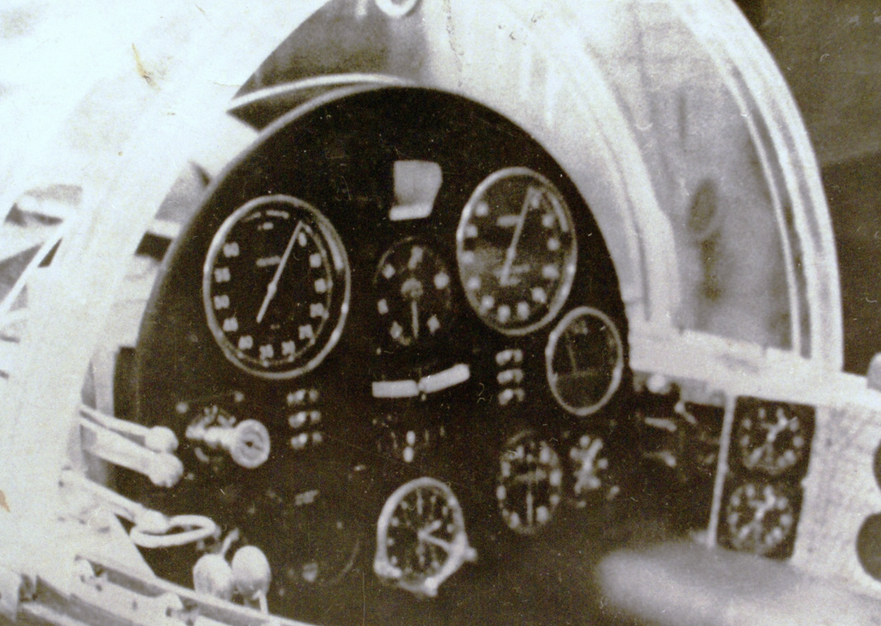
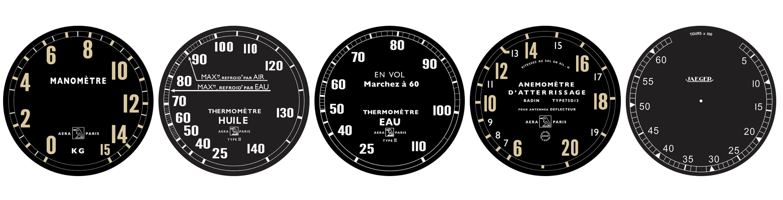
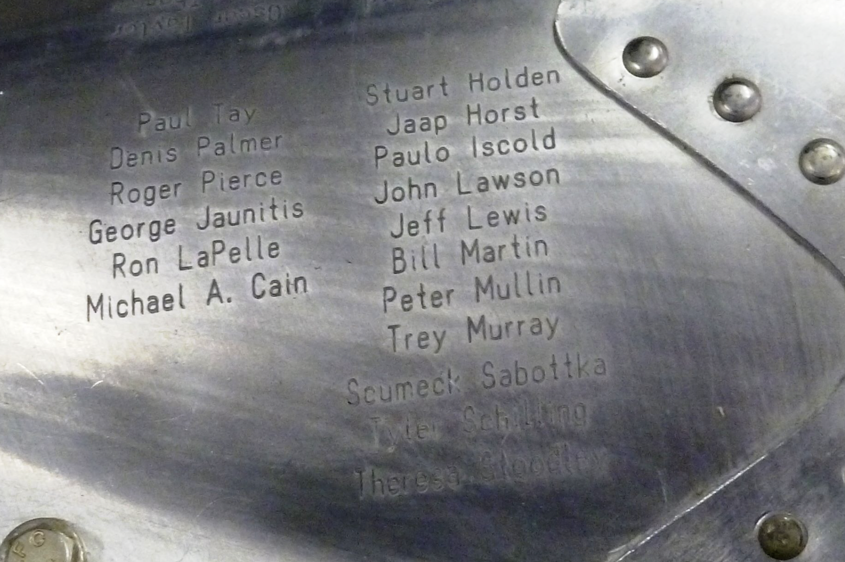
In 2013, a small team asked Stoodley to help to recreate the original instrument panel of the Bugatti 100P—the world’s fastest airplane in the 1930s. Stoodley recreated the instrument panels from original photographs, and her name was even engraved on the plane.
Stoodley reduced her team’s post-production work from four hours per issue to 10–20 minutes.
“InDesign scripting is so cool, it’s like magic. But, in order to feel the magic,” she joked, “you have to spend three months sobbing at your desk.”

Theresa’s PostProduction script exports text and image content from InDesign so it’s all ready to place in a web version of the article. “Learning ExtendScript was such a brutal learning curve for me, but the payoff was enormous,” Stoodley said.
Aside from spending her days working in the depths of InDesign, Stoodley is a mom, an avid fencer, and a devoted coach. Or as she dryly puts it, “I spend a lot of my free time hitting children or showing them the proper way to hit each other.”
Commenting is easier and faster when you're logged in!

Recommended for you

InDesigner: Seattle Met Magazine
Pam Pfiffner takes a look behind the scenes at Seattle Met magazine.

InDesigner: National Geographic Learning
Pam Pfiffner explores the classroom offerings of National Geographic Learning.
InDesigner: Pratt Institute Grads
Jeff Witchel speaks to three recent graduates and shares samples of their impres...