
InDesigner: Tamara Khalaf
Learn how one designer brings the Disney archives to life in books.


This article appears in Issue 15 of CreativePro Magazine.
A quick look at designer Tamara Khalaf’s resume will give you two very different impressions. On the one hand, Khalaf has been working at Walt Disney Animation Studios for 27 years—an impressive display of commitment and focus! On the other hand, outside of her full-time job she’s busy with a range of unexpected ventures, including her Doctorate of Ministry in Theology and Spirituality and her side gig as a certified Enneagram coach. When I sat down to talk with Khalaf about her life and work, her passion and curiosity for everything from InDesign tricks to feminist theology to screenwriting just leapt off the screen. It turns out that this range of work and hobbies isn’t accidental. Instead, it’s part of Khalaf’s philosophy on how to have a happy career (and life!).

Tamara Khalaf
“All of us are multifaceted individuals,” she explains. “While my day job fulfills some aspects that I need it to, it can’t account for my interests in things like music, wine, or fine art! Thankfully I have other places to engage those parts of my brain.”
From Entry-Level Employee to Manager of Design
Khalaf started at Disney right out of college, getting her foot in the door by filling in for an employee who was out on maternity leave. At UC Santa Barbara, she had majored in English Literature and minored in Art Studio (a mix of graphic design and traditional art courses).
With some experience in database management from working for her university’s art history department, she was hired as part of a team working to digitize Disney’s animation collection. When the approvals for the digitization project stagnated, Khalaf was able to step in and help with the art department—her true passion! Soon after, the graphic designer of the department left, and Khalaf took over the role. Over the years, she moved into a senior designer position, eventually working her way up to manage a small team of designers.
In her current role at Disney, Khalaf manages a design team in the Animation Research Library, where she works on a wide variety of projects. They work on Disney’s traveling exhibitions and partner with Walt Disney Imagineering on hotels, resorts, and cruise lines, as well as working on smaller design projects within the company. In a given week, Khalaf might be reviewing floor plans and layouts for an exhibit opening in Europe, art directing custom artwork for a hotel in Disneyland Paris, and working on site for a local exhibit installation, all on top of actually sitting down with InDesign (Figure 1). InDesign plays a crucial role in her workflow for everything from art labels to style guides, but most frequently for book layouts.

Figure 1. Khalaf on site at the Academy Museum in L.A. as it was being built. The Academy Museum had asked to borrow artwork from the Animation Research Library, and Khalaf was invited to a site visit to see the gallery where the artwork would be displayed.
Khalaf may be the first InDesigner we’ve ever interviewed with her own IMDB page. When I asked her to explain the work she’s done on a handful of Disney movies, she explained that Disney credits everyone who has helped support the production of the film—like Khalaf and her team in the Animation Research Library. Disney artists and filmmakers do a lot of research within the company’s own archives when producing a new film.
For example, animators working on creating new animal characters for the movie Zootopia studied examples of animal characters from previous Disney films. Khalaf’s team provided them with drawings from Robin Hood and other similar films so they could see how earlier animators worked out the animals’ movement. Even though films nowadays are animated using CGI, the animation archive’s collection of traditional, hand-drawn animation can still provide a lot of inspiration.
Back in 2008, when Khalaf had already been with Disney for nearly a decade, the Disney Animation Research Library changed leadership and started looking for projects for books. Khalaf’s team had recently finished an exhibit on Disney dogs and cats, which displayed reproductions of art and animation of canine and feline Disney film characters. Khalaf and her boss decided to pitch the idea of a book based on the exhibition, a small coffee table book full of full of original drawings, story sketches, photographs, and more of famous dog characters from animated Disney movies throughout the company’s history, from Pluto and Goofy to all 101 Dalmatians to Slinky from Toy Story.
When Khalaf’s pitch got greenlit, she asked for the opportunity to design Disney’s Dogs (2008, Disney Editions; Figure 2) and was thrilled when the Disney Publishing department agreed.
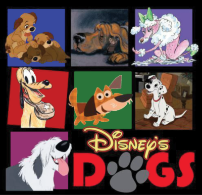
Figure 2. The cover of Disney’s Dogs
There was just one problem: At the time, Khalaf had no familiarity with InDesign. On Disney’s tight deadline schedule, she had no time to learn, either, so she opted to design the entire book in Photoshop, flatten the images, create the trim and the bleed in InDesign, and simply import the spreads directly from Photoshop. “If I had to make a change, I had to go all the way back to Photoshop!” she laughs. “But it got the project done.”
Disney’s Dogs was a big hit. The book sold out and was reprinted two more times. And Khalaf enjoyed the process of designing it so much (despite the Photoshop chaos) that she eagerly offered to design future books as well (Figure 3). Of course, the first step would be actually learning to use InDesign. Using lynda.com (now known as LinkedIn Learning), reading design books, and attending conferences like Adobe MAX and CreativePro Week, she dove right in, learning everything about InDesign she could. “Once you’re out of school, you don’t really have a way to learn how to do these things,” she says, “so these conferences, for me, are invaluable.”

Figure 3. Since Disney’s Dogs, which was published in 2008, Khalaf has designed 14 books, 11 of them through Disney Editions.
The Design Process
Khalaf’s book design projects typically begin in the same way: a Word document from the book’s author and print specs from Disney Publishing. As she puts it, “The publisher will say, ‘We’re planning on an 8 × 11 trim size and approximately 210 pages.’ So I flow the text through, with the actual font, just to see more or less what the text-to-image ratio will be.”
Most of Khalaf’s book projects are image-heavy, because they’re meant to display the gorgeous art in Disney’s animation archive, so it’s important to make sure early on that the page count will accommodate the breadth of images that need to be included. “At this point,” she says, “I’ve got the spine of the project.”
After the basics are in place, it’s time for some inspiration. “The first step is that I get out and I roam bookstores to get inspired,” she says. “There are some funky little art bookstores all throughout L.A., though sometimes I’ll just go to the Barnes & Noble art section. And I’ll just start picking layouts that I like and taking pictures of them. I’ve started to collect a whole folder of designs and layouts.” When she looks through books for inspiration, she notices everything: how they designed the chapter headers, the “flow” of the book as a whole, anything unique about the images, the number of columns used, how easy it is to read, if it’s more art- or text-heavy, and more.
The next step is to begin experimenting with style: typography, color palette, layouts, and the like. Khalaf says that authors are usually (but not always) interested in being a part of this process, so she’ll typically create two or three options to give them the flexibility to choose the style they want (Figure 4). “It becomes a kind of a conversation,” she says. Because she works in the Animation Research Library, Khalaf and the Library’s talented research team are often the ones helping the authors pull the art that they want from the archives. Because of her familiarity with the collection, Khalaf can often offer recommendations or alternates for artwork and images that she knows are available.

Figure 4. Khalaf experimented with several layouts for the chapter openings of Ink & Paint: The Women of Walt Disney’s Animation. Eventually, she opted for a full-size image on one side of the spread with the chapter title, epigraph, and text in two columns on the other.
In some cases, Khalaf gets pulled into the research phase herself, far more than the average designer, due to her familiarity with the Disney content of the books she designs and her access to archives, directors, producers, and more that a non-employee would not have access to. For one book she worked on, Dali and Disney: Destino, Khalaf heard from the author about the possibility of a photograph that would be perfect for the book (Figure 5). “I was told that there was a very high probability that Roy Disney [the nephew of Walt Disney] was photographed on the red carpet for the short film Destino. So I drove out to the Academy archives and I flipped through every single photograph from that year’s Academy photographer. And I’m not joking, the very last photograph in that box was the exact one I was looking for.”

Figure 5. Cover proofs and galleys for Destino
After setting up her grids and parent pages, Khalaf has a habit of zooming out so that all the pages are tiny in her window and then dropping in large text on the pasteboard where she wants her chapters to be (Figure 6). “I’m sure there’s a smarter way to do it with colors or something,” she laughs. “But I need to be able to see visually where the chapters are when I’m scrolling through a book.” Khalaf says that even though you can organize a project using InDesign’s Book function, she hates jumping from document to document and prefers her system, where she can see her whole book at once.

Figure 6. Khalaf’s “Chapter 5” marker is visible in the upper-left corner of this sample chapter opener from Oswald the Lucky Rabbit.
Khalaf says that every author she works with has a different style. Some do all their research and writing up front and are happy to hand their work over to Khalif and trust her design process. Khalaf says she usually returns to an author like this with some ideas about what she’s thinking stylistically, what the chapters would look like, and some sample layouts, and then she will hear back “Yup, good, go for it!”
One book like this was Oswald the Lucky Rabbit: The Search for the Lost Cartoons (2017, Disney Editions). David Bossert, the author, was an easygoing client who encouraged latitude, and the subject matter of the book suggested a clear stylistic theme. “Oswald, to me, was one of the easiest books I’ve designed,” Khalif says. “All of the fonts, the colors, and shape language [an animation term referring to using familiar shapes to elicit emotional responses] came so easily[…] It was so clear, the decisions that I made in terms of the styles.”
Oswald is plucky, young, animated rabbit designed by Walt Disney in the 1920s and featured in 27 animated short films over the course of the next decade. All of the short films were produced in black and white, but Oswald has blue shorts, so Khalaf chose the Pantone color that the company branding uses for him to be the central color of the book. She took further inspiration from the techniques used in animation shorts of this time. “All of the short films begin with an iris in and end with an iris out,” she says, describing an old-fashioned animation technique where the image on screen appears in a growing or shrinking circle surrounded by black. “So I used circle shape language throughout the entire book.” (Figure 7)
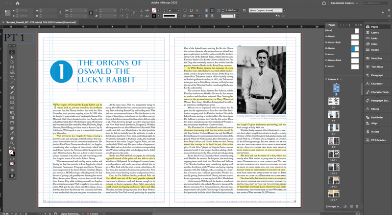
Figure 7. For the chapter headings in Oswald the Lucky Rabbit, Khalaf subtly referenced the iris effect of the original cartoons with the circle behind the chapter number.
Disney Publishing will often give Khalaf the choice between a book jacket and a book case. For Oswald, both she and the author were sure they wanted a case (because people often remove and lose book jackets). So she designed a cloth cover with a foil emboss (Figure 8). The final look is a matte cover with glossy, slightly raised effects.

Figure 8. The case setup for Oswald shows the cover image at the top and the spot UV guide beneath, with the black shadow spots that the UV embosser will fill in with foil.
Other authors are much more hands-on. For example, Mindy Johnson, the author of Ink & Paint: The Women of Walt Disney’s Animation (2017, Disney Editions), had spent years gathering information and photographs and writing the text prior to handing her work over to Khalaf.
“I appreciate the different process and styles of the authors I work with,” Khalaf notes. “For Ink & Paint, Mindy was thinking about her book constantly, so I would often get emails all times of day and night with adjustments to the copy or moving images around. She also continued researching as we were designing the book, so it was fun to receive emails with new discoveries she was making even after turning in the initial copy. Part of being a designer is learning to work well with whatever style author or client you are working with.”
Ink & Paint was the most complicated book Khalaf has designed to date, both stylistically and technically. “When Mindy came to me, she was trying to tell this film history of women artists in the field of animation from the late teens/early twenties, all the way to present day.” One thing that Khalaf realized right away was that they were going to have to pick one style, but it would have to suit the aesthetics of each of the different decades reflected in the book. The two decided to settle on the 1950s, and Khalaf chose colors and fonts that would hint at that decade while still blending seamlessly with the rest of the book (Figures 9 and 10).

Figure 9. The style card for Ink & Paint

Figure 10. Each section of Ink & Paint began with a “Decade Opener” page, featuring a large photograph and a timeline of events throughout the decade. Each of these eye-catching pages used a different color from the style card.
Besides stylistic challenges, Ink & Paint offered Khalaf several technical challenges. As she worked on the book, she was constantly developing her InDesign skills, exploring various program features through each new style choice she wanted to include. For example, she practiced anchoring text and objects and studied InDesign’s Keep Options as she perfected the book’s pull quotes (Figure 11). She credits creative conferences as a fundamental part of her education, especially some of the educators and designers that she met through such conferences as Adobe MAX and CreativePro Week. One who stands out is Bart Van de Wiele (a frequent contributor to CreativePro Magazine!). Khalaf beamed as she described how Van de Wiele once offered to look through the files of one of her early book projects, saying, “He went through my files and was just like, ‘There’s a better way to do this, there’s a better way to do that’ all the way through, all while I’m just furiously taking notes!”
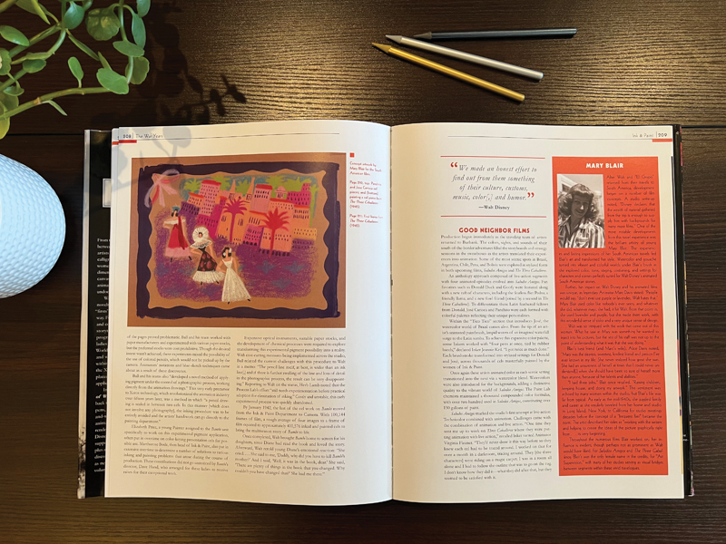
Figure 11. Ink & Paint’s spreads are full of sidebars, embedded quotes, and margin text.
Khalaf says that she’s never doubted her ability to design things the way she wants, but learning about InDesign’s many hidden features helps save her time and keeps her organized. “I want my files to be done well,” she says. “I want them to be designed smartly and using the program the way it’s meant to be used.”
After the inspiration, the research, the photo collection, the learning, and the designing are all complete, it’s time for the most collaborative part of the process. After Khalaf completes a rough draft of the book, she has to send her material to both the author and Disney Publishing. “I’ve got a system in place to keep everyone’s sanity intact!” she says. “It becomes this kind of symbiotic process of [the publishing team] making changes to the PDF, then it will go to the author, then back to me, and then I’ll make those changes and it kind of goes around in a circle.”
A common challenge Khalaf faces when it comes to this stage of the process is negotiating with Disney Publishing’s sales and marketing teams about the cover or jacket. “One thing that’s an ongoing lesson is I’ll design covers that I think are really great, and the editorial team comes back after they have shared it with their sales and marketing teams, and on a couple of occasions, the teams picked designs that were not my favorite! But because they know what sells books, I realized that the process of designing really is a collective process. They’re the experts, so I will always go with the design they believe will work best.” Regardless, it’s hard not to be proud of the final products (Figure 12).
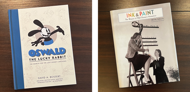
Figure 12. Final cover designs for Oswald the Lucky Rabbit and Ink & Paint
Curiosity and Creativity
Khalaf believes strongly in the power of mentorship. An early guide to her graphic design career was the professor of a desktop publishing course she took in university. “I learned so much from her,” Khalaf says. “She always challenged us. She approached the journalism department and asked if we could borrow their cameras and green screens so we could import videos and play around with Photoshop and the latest applications at the time. I was in college from ’92 to ’95, so for college kids a lot of that technology was completely new… I’m so grateful to her for giving us that spirit of play and challenging us to not be afraid. We never worried about what didn’t work, because the only way you could fail was by not trying and not being excited and not being curious. I never realized it at the time, but looking back, this was one of the greatest scholastic and life lessons I have received.”
Khalaf explains that although she gained tons of practical design from the class, the most important lesson was how to develop a sense of playfulness and creativity. She points out that maintaining that mentality can be more challenging than it might seem. “You think as a creative that you have to find a creative job. And I did! Working for Disney and ending up being a graphic designer. But what I didn’t realize is that because I was being creative all day long in the office, I had stopped creating art for myself.”

Khalaf in her doctoral regalia, at her graduation from Fuller Theological Seminary in June 2022
“Everything I was creating was in service to The Walt Disney Company, which is great, but with clients, legal, and brand approvals, it can diminish the personal satisfaction you feel from creating your own work,” she continues. “So I realized the importance of carving out time to be my own artist and to ‘play’ and create without restrictions that come from working in a corporate field.” When Khalaf gives talks to young potential artists, this is one of her top “Life Lessons for Creatives:” Don’t stop creating for yourself.
For Khalaf, as her résumé suggests, creating for herself takes many forms. “That’s where all of my other interests—theology, wine tasting, sculpting, screenwriting—come into play,” she says. “The one thing that I say to younger folks is to be curious about life. When you are, it makes things interesting! The minute that we form preconceived notions and judgments, that’s when we start putting our lives in a box. The more curious we are, the more open we are.”
Commenting is easier and faster when you're logged in!

Recommended for you
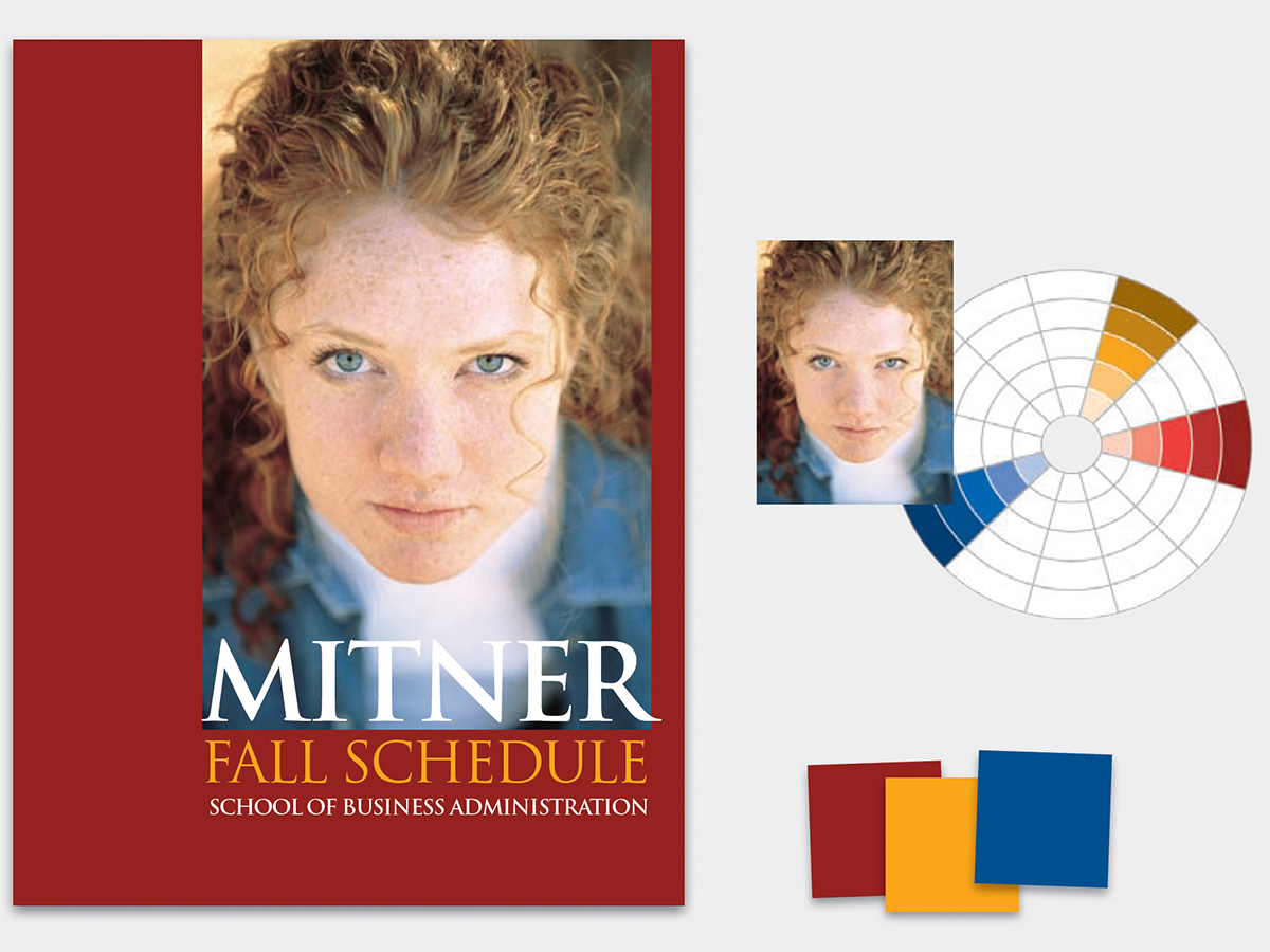
Before&After: How to Find the Perfect Color
Hidden in your photo is the color palette you need. Here’s how to get it out.

dot-font: Squaring the Typographic Circle
dot-font was a collection of short articles written by editor and typographer Jo...

Jupitermedia Launches JupiterImages Unlimited Subscription Service
JupiterImages, a division of Jupitermedia Corporation (Nasdaq: JUPM), today anno...