InDesigner: Scott Citron
This magazine’s first designer returns for our third birthday.


This article appears in Issue 18 of InDesign Magazine.
During the interview for this article, Scott Citron told me, “It needs to flow and be organic.” While he was talking about design, the statement could have applied just as well to jazz music. That correlation between the visual and the aural comes up again in a book he’s now writing:
“To be a graphic designer we must think like musicians. This means we must understand the harmony of balance, the rhythm of shape, the staccato of tension, and the grace notes of type. Plus, as if this weren’t enough, we have to know which keys to press and which commands to choose to make our computers play the right notes to produce our visual symphony.
“Yet when most designers sit down to create a layout I doubt many think about these principals. I know I don’t. At least not consciously. But when I’m struggling, when things aren’t coming together, when I’m fighting the page or the screen, it’s usually because one or more of these concepts is missing. So the key here is to train ourselves to recognize these ideas, not to worry about them too much, but to understand (or better, intuit) how to use them to create design. Once we do, once we tune our eyes to the sound of visual harmony, the chore of knowing where to place objects on a page becomes fun.” More about that book in a bit.
School of Life
Just like many jazz musicians, Scott didn’t receive a formal education in his craft. “Most of my formal education was geared toward working in film,” he said. “That was what I thought I wanted to do. Then I reached a point where I was tired of working for other people and on silly TV shows.
“During most of this time,” he continued, “I had a graphic design business on the side, and I had always enjoyed it. A friend who was the production manager at a publishing house asked if I wanted to design a book. I never had before, but I said yes, and for some reason I decided to use InDesign. This was back in the day of version 1.5.
“I didn’t tell the art director I was using InDesign, so when she asked for the Quark files, I panicked. I finally got the courage to say I was using this thing called InDesign. She said, ‘I’ve heard of that. Do you like it?’
“I said I really liked it. She hooked me up with someone she knew at Adobe, and a few weeks later, three people on the InDesign team came to my apartment and watched me work. It was like a piano recital: ‘OK, play something.’ Obviously, not many people were using InDesign then!”

Software Doesn’t Matter
From there, Scott’s graphic arts business flourished, and in 2004 it even included the design of a new PDF publication called InDesign Magazine. But Scott also started teaching others to use the software he adopted so early. He’s now an Adobe Solutions Network Certified Training Provider and an Adobe Certified Expert in InDesign, Photoshop, Illustrator, and InCopy. So it may surprise you that when I asked him if software really matters, he replied, “No, of course not. In the end, it’s not about the software. If it is, you’re in the wrong place.”
“However,” he went on, “it is nice when you like the software you use. One thing I appreciate about InDesign is that it’s fairly transparent. That transparency makes it a better tool for me because I don’t have to think about the mechanics of what I’m looking at. When I used QuarkXPress, I felt as if the ideas didn’t flow from my head to the screen as easily.”
In the Author’s Seat
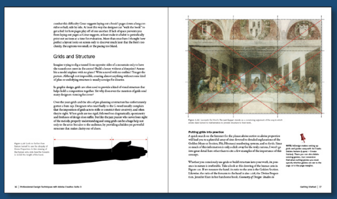
Scott has designed both the covers and inside pages of many books; now he’s also writing a book. Titled Professional Design Techniques with Adobe Creative Suite 3, will be published later this year by Peachpit Press under the Adobe Press imprint. Each chapter helps readers understand specific elements of good design by using them to create a project, such as a newsletter or corporate identity package. Scott is responsible not only for the design of the book, but for each project, as well.
He describes this level of involvement as “incredibly exciting after working on other people’s books. It’s like making a movie; everything is yours. The copy, the illustrations, the screenshots—it’s all from you.”


Commenting is easier and faster when you're logged in!

Recommended for you
Interview with Melissa Piccone, Multi-Disciplinary Trainer and Certified Expert
Q&A with Melissa Piccone, who is presenting at the 2026 Design + AI Summit for C...
InDesign Magazine Issue 133: Object Styles
We’re happy to announce that InDesign Magazine Issue #133 (May 2020) is now avai...