
InDesigner: San Francisco Bay Brand
How consistent design and efficient processes make for a successful product packaging workflow


This article appears in Issue 132 of InDesign Magazine.
In the competitive world of retail packaging, many companies update their product branding over time to ensure that they stay refreshed, relevant, and innovative. However, when San Francisco Bay Brand, a natural fish food manufacturer with over 50 years in the aquatics industry, completely revamped their packaging design, they soon found their customers didn’t recognize them any more.
This insight led them to revert back and adhere to their traditional branding, which consumers could easily spot a store shelf (Figure 1).

Figure 1. San Francisco Bay Brand blister packs (above) have bright, easy-to-spot designs. The short-lived package redesign (right) was not as successful.
I spoke with Jason Oneppo, a veteran designer, marketer, and consultant, who has been working in the aquatics industry for 35 years. Oneppo’s primary role is marketing and graphics for San Francisco Bay Brand, and it encompasses everything from packaging and magazine ads to freezer decals and tradeshow booths.
“We don’t have a lot of competition. So we don’t have the challenge that some companies do, where they need to be constantly changing things to set themselves apart with packaging looks on a shelf,” explained Oneppo.
Even though most of the products’ packaging and labels stay consistent, I was eager to learn more about how Oneppo optimizes his design and production process when handling more than 500 separate products.
Implementing and Maintaining Process
When Oneppo first began working with San Francisco Bay Brand, all of the existing art files were built in QuarkXPress. Not long after, the company made the shift to Adobe, and Oneppo was then able to convert his files to InDesign.
Hoping to implement a more efficient and
simpler production process, Oneppo made sure to structure the documents using tables, Data Merge, and plenty of styles (Figures 2 and 3).
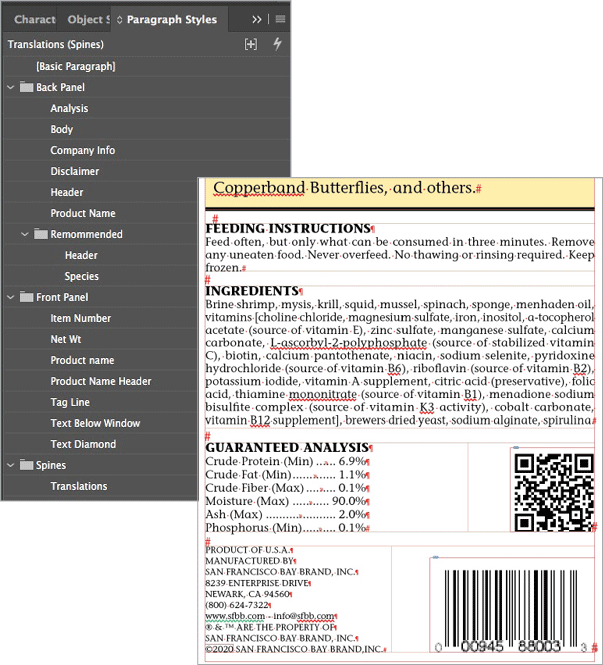
Figure 2. The Paragraph Styles panel setup for product designs
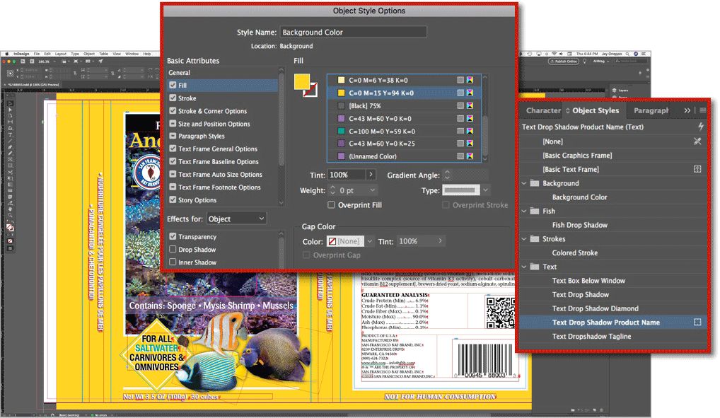
Figure 3. Object styles help Oneppo control and change background colors for the packaging.
“As is often preached, a little bit of upfront prep can be a big timesaver down the road,” said Oneppo.
For basic updates, Oneppo works within current designs and alters the data using text variables (Figure 4).
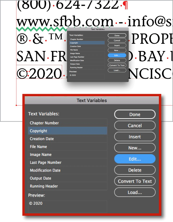
Figure 4. By using text variables, Oneppo can easily change such details as copyright dates and other data for updates or new designs.
But every time the company invents a new fish food product, there is subsequently a need for new packaging. Rather than develop a layout and design from scratch, Oneppo streamlines the process by using an up-to-date label and design as a template (Figure 5).

Figure 5. Using Object Layer Options, Oneppo can easily swap the product names in and out for product packaging updates.
He is supplied with the product name, description, ingredients, nutritional analysis, and other necessary information, as well as suggestions for the color palette and images to use. But ultimately, it’s up to Oneppo on how he structures the design as a whole.
Oneppo explained that some product lines have varying packaging colors, which often times confuses the consumer. Oneppo uses layers to organize background elements so if he needs to change them he can do so with one click (Figure 6). Recently, he’s been working on standardizing the color palette for the entire product line, to make both the brand and specific products recognizable to frequent shoppers.
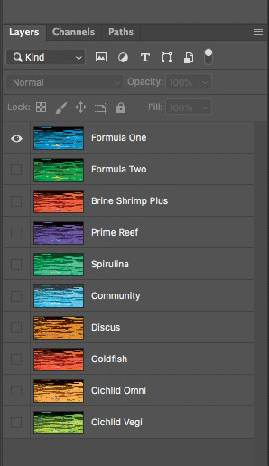
Figure 6. Oneppo uses layers to control the background color, which is usually one solid rectangle, as well as the stroke.
Using GREP, Oneppo is able to control the color of the words within a given space, so when he types the right word, it will automatically change to the correct color (Figure 7).
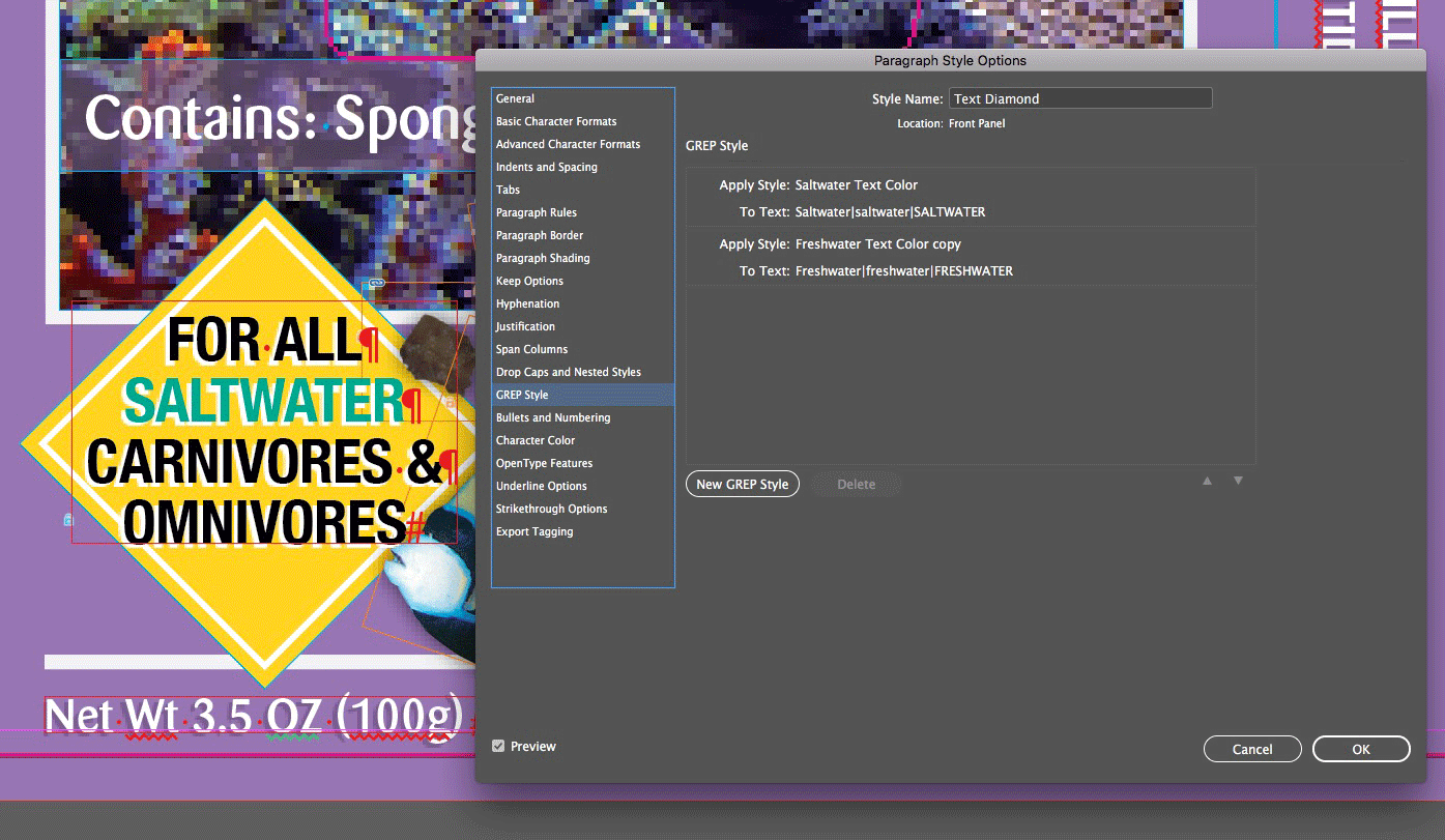
Figure 7. The paragraph style for the text within the diamond uses GREP to control the color of the words.
With over 500 SKUs in the San Francisco Bay Brand, packages and labels often need updating as new information is processed. According to Oneppo, a typical packaging update includes rewriting the product-specific copy, nutritional analysis, copyright date, and ingredients. He receives a spreadsheet with updated information and uses Data Merge to insert it into the layout (Figure 8).

Figure 8.
“I probably save hundreds of hours a year using Data Merge,” he added.
Converting, Scaling, and Designing Packaging for Retail
In 2009, San Francisco Bay Brand acquired Ocean Nutrition, another leader in the fish food manufacturing space. This presented a challenge to Oneppo as Ocean Nutrition built its packaging files in Illustrator. Although he was able to move some of the content over to InDesign, he had to painstakingly rebuild some of the labels from scratch.
“I first studied the artwork, looked for common size labels and packaging, and then looked at the common elements,” said Oneppo. “I began to look for the images used on the packaging in the assets provided. Some I found, and others I had to extract from Illustrator and resave in Photoshop at 300 dpi.”
Many of the product categories are complex—some include as many as ten varieties and three sizes of each item. With that many labels to update, Oneppo knew he had to find a way to make the process more efficient.
“I created layered PSD files with the background images and then made the product name banners in layered Illustrator files. This allowed me to create one label that I could easily convert to the next product and scale to the next size,” said Oneppo. “I also created styles to control all formatting aspects of objects and text, so I could easily create each variety.”
One issue that manufacturers often encounter is product changes due to supply issues. For example, San Francisco Bay Brand recently began using a set of jars in new sizes.
“Each jar was 20 percent larger than the previous size. To achieve this, I first resized the document. Then I selected all elements on the page and used the Scale Percentage fields in the Control panel to increase everything by 20% (Figure 9). After that, I made just a few quick adjustments to a some of the elements, and it was done,” explained Oneppo.

Figure 9. For proportional scaling of page elements, you can use math in the Control panel’s Scale fields.
Even though minor elements such as spacing and date codes don’t adjust accordingly and may need manual tweaking, the use of proportional scaling makes the process quicker and more efficient, especially when handling multiple products in varying sizes.
Another common element of retail design is the placement of the UPC barcode. When a barcode is horizontally printed onto a small curved surface, it’s possible for the ends of the barcode to disappear around the curves (Figure 10). When Oneppo creates labels for containers like this, he makes sure to use a vertical orientation (Figure 11).

Figure 10. For some curved containers and designs, you may need to use vertical barcodes.

Figure 11. An example of a barcode in the UPC Encoder app that Oneppo uses and its vertical orientation: Oneppo often places barcodes vertically because of packaging restrictions or retail requirements.
An additional wrinkle is that some online retailers like Amazon require that barcodes be placed vertically, which underscores the importance of keeping e-commerce in mind when developing and designing a new product.
“Barcodes have a specified size of about 1.5 inches by 1 inch, and it is recommended to go no larger than 200% or smaller than 80% of that,” added Oneppo.
Usage guidelines for barcodes can be found through GS1, a non-profit organization that provides common standards for business communications.
Design Inspiration
I was curious as to where an aquatics industry veteran like Oneppo finds his inspiration. Not only does he work with San Francisco Bay Brands, he is also the co-founder of Aquarium Hobbyist Magazine.
“I try to be different in everything I do, so I don’t look within the pet industry [for inspiration],” he said.
Oneppo explained that he finds most of his packaging inspiration in the human consumables market, as well as through reading Packaging Digest and attending food tradeshows. By studying design in other industries, he has found new ways to incorporate different fonts, text, and other design elements to connect with the consumer.
“I believe that if people can easily relate to it, the more likely they are to pick up your product,” he said.
Commenting is easier and faster when you're logged in!

Recommended for you

InReview: ID2Office
Steve Caplin reviews a solution from moving InDesign layouts into Word, PowerPoi...

HTML: The Secret Sauce for Layout, Animation, and Interactivity
As we publish more content across more screens and devices, HTML remains the mos...
Regarding Transparency
The essential guide to getting the best results with blending, opacity, and effe...