
InDesigner: Patch & Tweak with Moog
See how Kim Bjørn finds harmony where music and graphic design meet.

This article appears in Issue 142 of InDesign Magazine.
At the start of his career in the late 1980s, Kim Bjørn had to make a decision: pursue music or graphic design. Bjørn chose graphic design, knowing there was a direct path to earning a living and supporting his young and growing family. Two and a half decades later, his two passions would intersect, and he would create the “Bjook.
To earn extra money in his early twenties, Bjørn took on freelance work making infographics for local newspapers. These infographics were inspired by the infographics published on the front page of the USA Today newspapers in the 1980s. The discipline of creating simple, easy-to-read infographics influences Bjørn’s designs to this day.
For Bjørn, the most beautiful books are filled with clean and straightforward designs, “In the end, it’s all about communication. For me, it’s about taking something complicated and condense it, and make [the idea] clear to people.” To Kim’s surprise, fans started affectionately calling his books “Bjooks.” And he has embraced that as his brand now.

A Brief History of the Bjook
Bjørn has been refining his Bjook craft since his first publication, Push Turn Move. It is a beautiful tome covering user interface design of electronic music instruments. With this book he hit upon the intersection of his passions in music and design. The Kickstarter campaign Bjørn used to fund the publishing of Push Turn Move was so successful that he was able to splurge on the quality of paper, make it a hard cover book, and use a high-quality book binder in Germany. And so, the “Bjook” was born.

Bjørn’s Bjooks
His second book, Patch & Tweak, focused on the mysterious world of modular synthesizers. Bjørn explains that you can spend all day online watching videos about modular synthesizers, but never make any music. “I’ve watched all the videos for you,” Bjørn laughed. With a book there is less distraction. “You can go at your own tempo,” he explained. “Just read the bits that you need to know and then move on to creating music.”
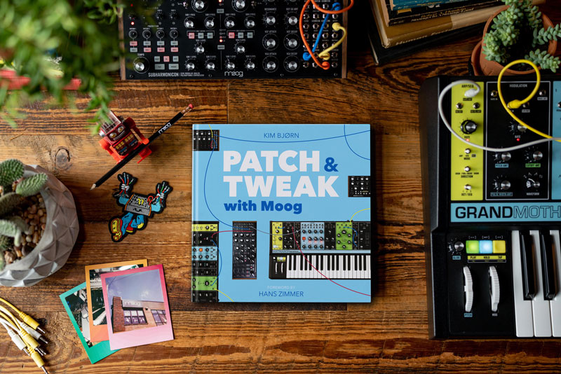
After diving deep into the world of modular synthesizers, Bjørn moved over to the parallel universe of guitar pedals with Pedal Crush. Then, as a follow-up to Patch & Tweak, Bjørn decided to highlight one of the most accessible and beloved American synthesizer designers. Patch & Tweak with Moog celebrates the work of Bob Moog. The book features a narrative of Bob’s life and work at the various companies he formed. Intertwined through this story are artist interviews and instructions on how to use Moog’s modular instruments.
The first Patch & Tweak book covered a vast and daunting realm of modular synthesis, but Patch & Tweak with Moog offers a more accessible way to get started. “It’s a complicated subject for beginners. But Moog has a family of semi-modular instruments that are each a self-contained instrument. You can start making sound immediately,” Bjørn explained.
How Do You Make a Bjook?
Bjørn starts his work in InDesign, not a text editor. “I learned this from one of my mentors in the Graphic College of Denmark (now DMJX) that if you lay out the book first, then write it afterwards, it is easier,” said Bjørn. Bjørn first designs the book cover, and then mocks up spreads, dedicating some to interviews and others to the core story he’s telling. Next, he mocks up the pages with text frames and notes. He places images from the web that approximate what he wants for final imagery. He then starts writing the rough draft in the text frames of each spread. Bjørn explains that it is easier for him to start writing when there’s an image on the page so it doesn’t feel so blank.
“Making a book is a puzzle. I like to think in spreads,” said Bjørn. Keeping things to spreads makes it easy to move sections around as the book takes form. Perhaps an interview went longer than expected or he tried to fit too many tips on one page. “With this method I am building the book in parallel, both writing and laying out the spreads,” said Bjørn.
Much like Bjørn prefers to create music outside of a computer by turning a physical knob or pressing a real button, he prefers to paginate his book in a physical space outside the computer. “For Push Turn Move we physically laid out all 352 pages in an auditorium and sorted them manually,” said Bjørn. By printing everything out, Kim was able to have a visual overview of the whole book and see how it all flowed together. Bjørn still does this with his other books, but now he prints the pages smaller, six pages to an A4 sheet, so he doesn’t have to use a large space to see the whole book laid out.

For his first book, Bjørn printed all of the spreads full size and laid them out in a large room. He then shuffled the spreads around to find a good flow for all of the content. For his subsequent books, Bjørn has a similar process but prints the pages much smaller.
Kim’s books make great use of color. “Every time you turn a page, something should capture your eye,” said Bjørn. The palette of colors used in each book evolves from book to book so there is a consistency, but also it keeps refining with each new book. The palette is also driven by the photography used on the cover and inside the book. For Patch & Tweak with Moog, the colors were inspired by the playful brand colors used in Moog Music’s Matriarch and Grandmother synthesizers. It just so happened that these colors aligned closely to the color palette used in the first Patch & Tweak book.

The color palette for Patch & Tweak with Moog was inspired by the playful colors used on the more recent Moog synthesizers.
As with the first Patch & Tweak book, there are many illustrations of patch cables connecting various inputs and outputs to demonstrate how to create desired effects. In a modular synthesizer, several types of signals can travel on these patch cable wires. Bjørn color codes the patch cable illustrations to denote each type of signal, making it clearer to the reader as to what’s going on in the patch.

Bjørn uses graphic styles and libraries to keep his layouts consistent. The patch cables are color-coded to denote which type of signal is traveling through the cable.


His spreads depend on precise placement and styling of many of these patch cable illustrations. To maintain consistency, Bjørn uses graphic styles, but also a lot of precise manual alignment to correctly position the cables to the location where they are “plugged” in.
“One-third of a millimeter is important to me when laying out these patch cables,” said Bjørn. To make quick and accurate placement of design elements such as the patch cables, Kim once again reaches for a physical user interface: the Loupedeck CT. This hardware interface has an array of programmable buttons and knobs. Originally designed for speeding up repetitive tasks in video production, it is starting to be adopted by other creative disciplines. Bjørn has mapped knobs to zoom, move, and scale by very precise increments. The Loupedeck does not have deep integration with InDesign yet, but Kim has reached out to the company in hopes they will add deeper support for InDesign in the future.

To work faster and more precisely, Bjørn makes use of a hardware controller. He maps the buttons to common tasks and uses the knobs to nudge and zoom precisely.
Throughout my interview with Kim, he talked a lot about contrasts. One such contrast is the busy nature of the photography in his books. The product shots and patch panel illustrations have a lot of visual interest. To contrast this, Kim uses one font family throughout his books, “I chose Avenir Next as it has this simplicity and timelessness to it.” Kim went on to talk about how he also loves the contrast of the lighter weight used for the body copy and the heavier weight version of Avenir Next for his book titling.

Bjørn keeps the text of his work consistent by sticking with one type family: Avenir Next.
To keep everything aligned, Kim works in a six-column grid. “On top of that, there’s a three-column and four-column grid,” said Bjørn. “The three-column grid is mostly used for the interviews to give them a calm reading experience.” When more information needs to be packed into a tighter space, he turns to the four-column grid.

Bjørn employs a flexible grid system to accommodate both large and small elements in his spreads.

Remote Collaboration
Writing these books is a collaborative effort between Kim and his editors and co-authors in the US and the UK. With Bjørn in Copenhagen, it is very difficult to find a time to meet in real-time. Thanks to the internet and Adobe InCopy, Kim is able to share his layouts with his editors and they can work in their own time zones, passing comments and change requests via InCopy files.
“We are able to work in parallel. I write a section, and then hand it off to the editors as a set of InCopy articles and then I can work on another section while they are editing in InCopy. For me it has been a massive improvement in the editorial process,” said Bjørn. As a result of using InCopy, the editors have started to alter their editorial decisions. Now they can make suggestions based not just on the content of the text, but also how it fits in the layout.
Kim notes that InCopy hasn’t been getting much development love lately at Adobe, “I do hope they continue to develop this product and even improve it.”

Bjørn (on the right) with his musical hero, Jean-Michel Jarre. Jarre penned the foreword to Bjørn’s first book, Push Turn Move. For Patch & Tweak with Moog, Hans Zimmer wrote the foreword.

Patch & Tweak with Moog intertwines an excellent overview of Bob Moog’s career with artist interviews and tips and tricks for learning how to use a modular synthesizer.


Contrasts
Kim sees a lot of commonality between music and visual design, “Either it’s a tip, or a quote, or a photo, or a little photo and a lot of text, there have to be contrasting elements in a layout.” These contrasts are what keep the reader’s attention. “Music is most interesting when it has contrasts. Like a big crash in classical music, when everybody is woken up for the big finale,” jokes Bjørn.
As in music and books, we need contrast in our lives. “We work in front of a computer all day. We need something physical to tweak,” said Bjørn, “I want to create books that people want to experience, not just read, but experience and extract their own inspiration and go make music.”

Affiliate link disclosure: CreativePro will earn a commission on any purchases made through the Amazon links in this article, at no additional cost to you.
This article from InDesign Magazine is for members only. To continue reading, please log in above, or sign up for a membership today! Thanks for supporting CreativePro!
Commenting is easier and faster when you're logged in!

Recommended for you

InDesign Magazine Issue 117: Anchored Objects
Issue 117 of InDesign Magazine with articles on anchored objects, PDF comments,...

InDesign Magazine Topic Index Now Available Online
Locating the articles you want is faster and easier than ever before, thanks to...
InDesign Magazine Issue 65: Long Documents
We’re happy to announce that InDesign Magazine Issue 65 (September, 2014) i...