
InDesigner: Nick Sherman
Nick uses InDesign for everything from band buttons to cookbooks for kids with cancer.


This article appears in Issue 23 of InDesign Magazine.
Nick Sherman, 25, embraces modern life (he’s a skateboarder, musician, digital artist), yet he also employs methods (silkscreening, letterpress) that were around way before computers, much less Twitter.
Now working as a designer at MyFonts.com, Nick recently spoke to me on a wide range of subjects.
Tell me about silkscreening as it applies to graphic design projects.
Silkscreening, like letterpress printing, gives a piece much more of a physicality. Even when the final design is considered a 2-D piece, planning for a silkscreen or letterpress print forces you to think about it more in 3-D terms: Ink and paper have volume, texture, color, and physicality—all with their own unique qualities and consequences. This is easy to forget about when you’re not as directly involved with the printing process as you might be with silkscreen or letterpress printing (both of which are typically much more DIY than offset printing).
Working within the limitations of relatively lo-fi production processes forces you to constantly consider all the variables. Usually such limitations will also steer you towards more simple solutions that tend to end up more striking and successful.
How would you describe your graphic design style?
I don’t aim to have all of my work match some kind of consistent look, but there are some general recurring themes. I’m obsessed with letterforms and other such two-dimensional shapes. Sticking to the manipulation of simple shapes and colors encourages a kind of abstraction that can make things both eye-grabbing and conceptually stimulating.
I put a lot of value into subtlety and simplicity. Especially for less “functional” design, I like to evoke ideas without telling a full story. Leaving open ends gives so much more space for a viewer’s imagination to be stimulated. If you force the viewer to fill in the blanks on their own, you are shaking up their cognitive storage bins, making them add their own personal piece to the puzzle to complete the idea; like a visual haiku of sorts.
Does software matter?
Software matters to the extent that it can ease the execution of a plan, but it won’t make anyone a better designer. I think about software the same way I think about any other tool: If it works well, your execution and efficiency can certainly improve; but just having this fancy thing in your hands doesn’t improve your artistry. A truly talented designer can create just as good of work with a piece of paper and a pencil as they can with the newest and most expensive software.
That said, a designer should also be as comfortable as possible with his or her tool. It should work intuitively and not create unnecessary distractions. As Eric Gill wrote, “It is important that the workman should not have to watch his instrument, that his whole attention should be given to work.” Typography is the biggest part of my life, and InDesign is probably the most powerful tool for working with it.
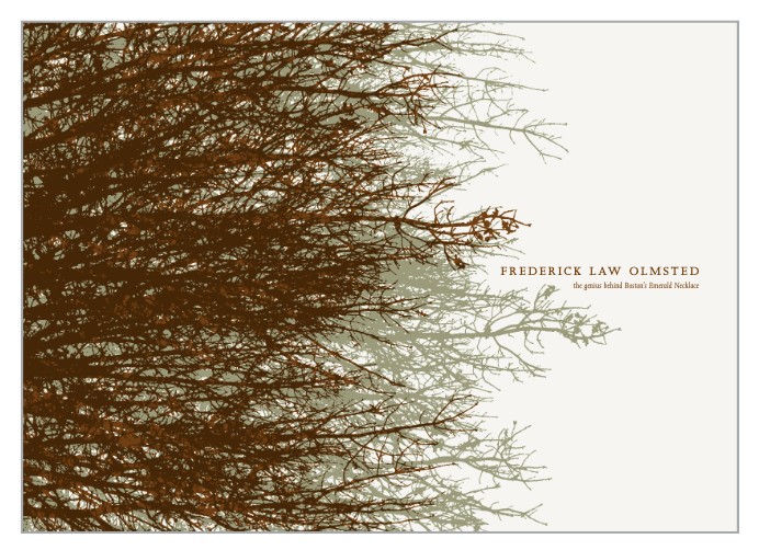
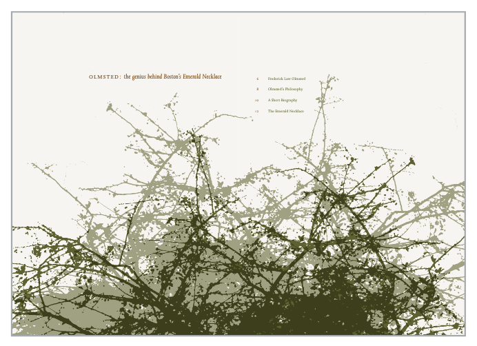
Nick’s design inspiration for this booklet on Frederick Law Olmsted was Olmsted himself: One of his principles was to design organic natural spaces that fit into the heart of the hard corners of the urban landscape. Nick brought this philosophy to the booklet by integrating the natural organic shapes of the tree branches with the solid, rectilinear blocks of type. Nick overlapped the monotone images of the plants in InDesign.

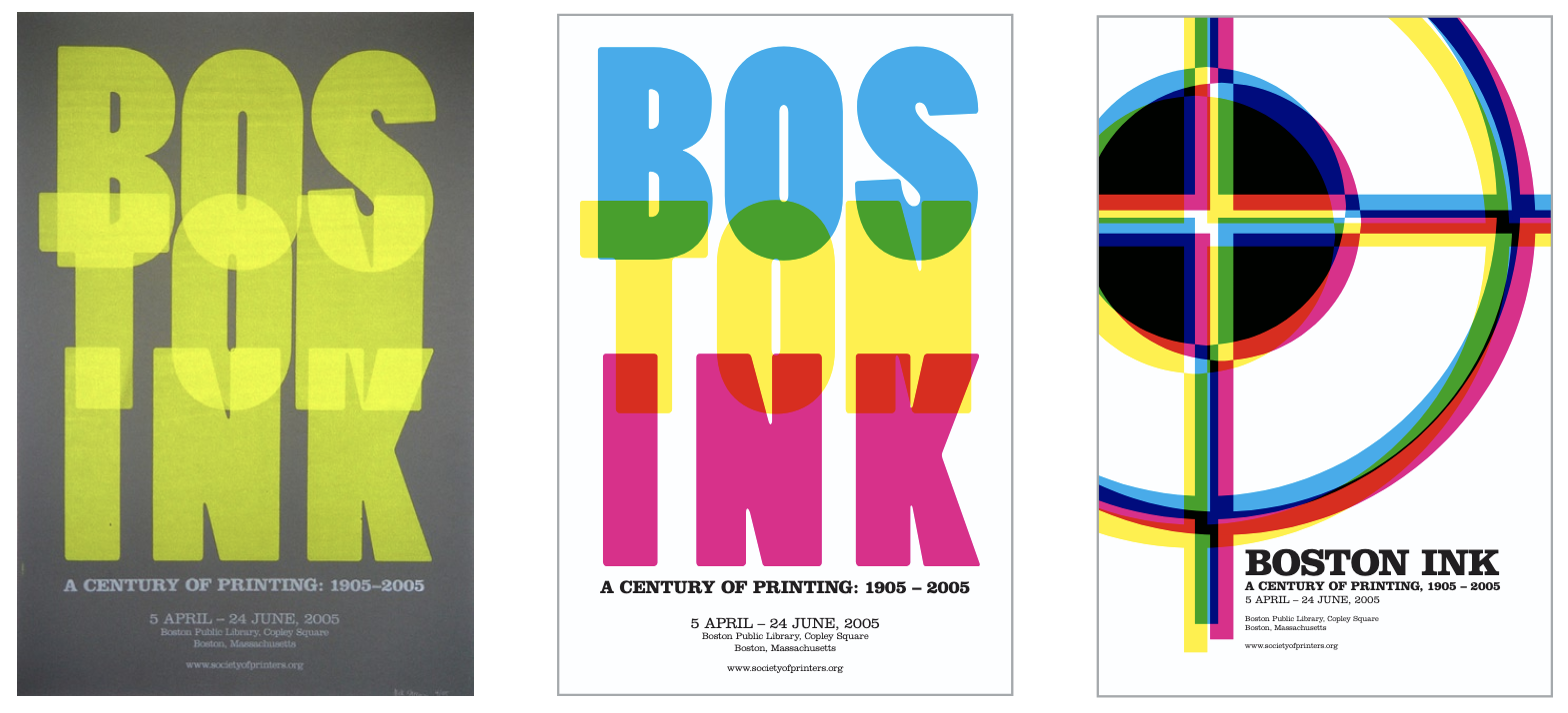
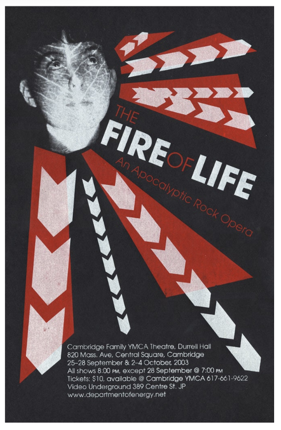
For this small (5 inches by 10 inches), silkscreened poster, Nick used many different typefaces that were designed in the style of 19th-century wood type. Because of its small size, silkscreening the poster was tricky, especially when it came to color registration. However, he chose to silkscreen it to push himself and see how detailed of a piece he could print.
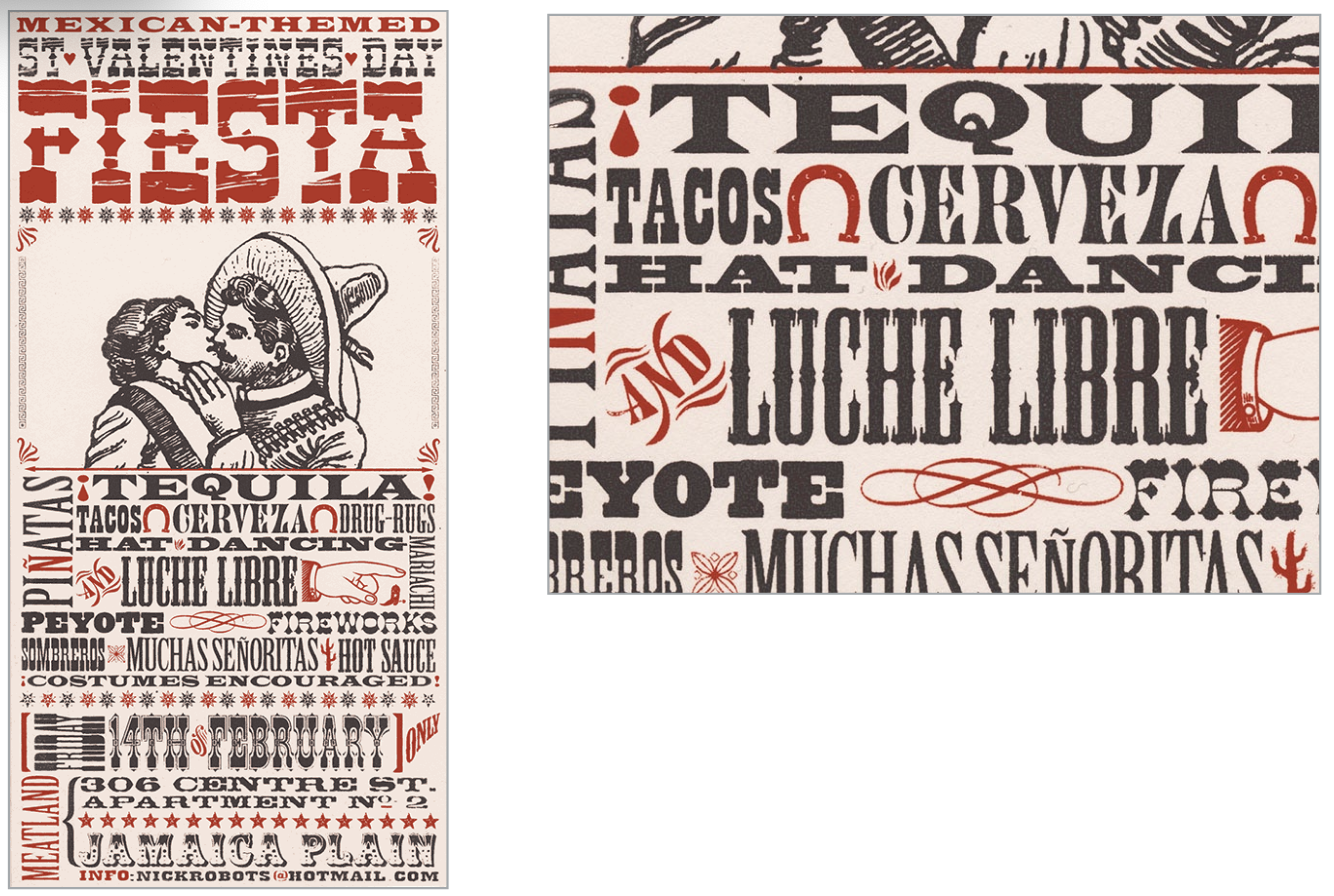
Nick chose silkscreening to produce this poster because the play itself had a DIY spirit. “Cost also had a lot to do with it,” he says. “Compared to something you do on your own, offset printing can be pricey for smaller runs like these, especially if you want to make use of a special ink, like the silver I used.”
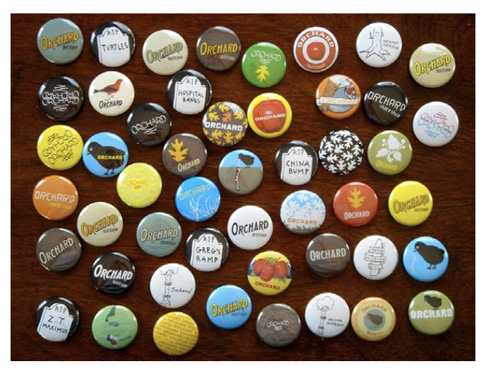
Yes, Nick used InDesign to design these buttons. “With InDesign, I can set up a spread with a big field of circle templates as a master page,” he notes. “Then I can create page after page of quick ideas. One of the features I like about InDesign that I don’t think a lot of people know about is that you can override a master-page item and change its color (for example, if I wanted to make a button with a different colored background) but if you don’t move or resize it, its position is still linked to the original master-page item.
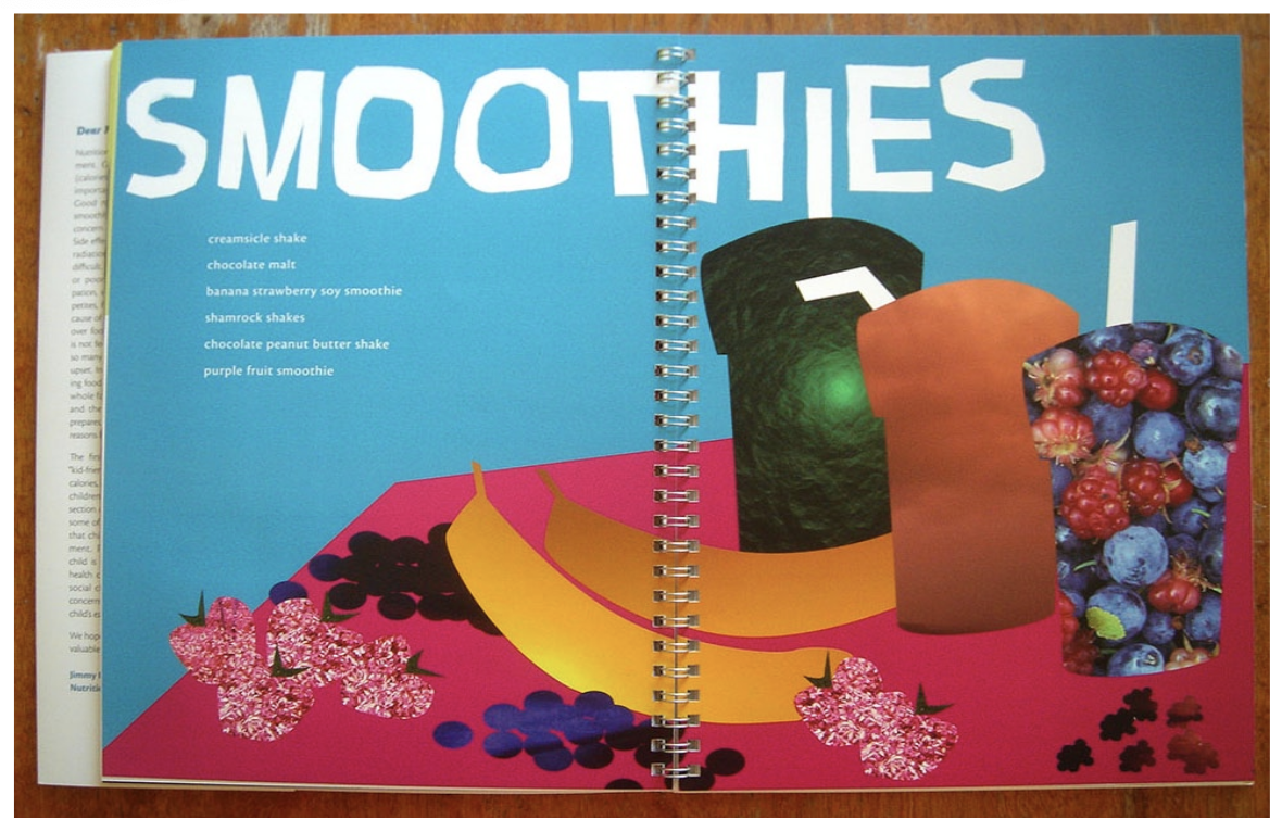
While a student at Massachusetts College of Art and Design, Nick was one of a group that designed and oversaw the production of a cookbook, entitled What’s Cooking, which caters to the nutritional needs and complex appetites of children living with cancer.
For the section opening spreads, the students searched for a look that was playful but avoided the cliché “kids handwriting” lettering. They found it by cutting out the titles in paper, then scanning them and tracing them with the
Pen tool. “We took the extra time to avoid using the same letterform twice,” Nick says. “For example, the two ‘o’s in ‘smoothies’ are different cut-outs. This kept the titles looking real/organic and not as though they were just typed in using some existing font.”
Commenting is easier and faster when you're logged in!

Recommended for you
InDesign Magazine Issue 148: Designing for Social Media
Issue 148 has articles on designing for social media, dielines for creative fold...

InDesigner: Modern Dog
Pam Pfiffner interviews this Seattle firm about their posters, packaging, pups,...

Interview with Caroline Desrosiers, Alt Text Entrepreneur
Q&A with Caroline Desrosiers, who is presenting at The Design + Accessibility Su...