
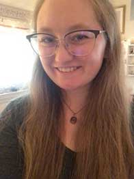
InDesigner: Kieron Lewis
Learn how one freelancer uses editorial design to inspire change and build community.

This article appears in Issue 13 of CreativePro Magazine.
When I sat down to talk to Kieron Lewis, a freelance graphic designer based in London, he told me he had already “got my vibe.” He picks up on energies quickly, he explained, and as I spoke with him more, I soon realized this was no throwaway comment.
As a freelance designer, Lewis depends on his people skills to connect with clients, break down barriers, and gain insight into their vision for the project. In particular, he keys into something unique about a person’s style, personality, or energy and brings that to life in his design work.
The Coffee Date
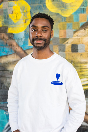
Lewis’s design process starts by sitting down for a chat with his client—whether on Zoom in his home office (Figure 1) or over a coffee—to get a sense of their energy. Building these relationships is important to Lewis.
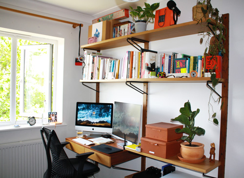
Figure 1. Lewis does the majority of his design work in his home office.
“Usually, a lot of the clients I have, even the big clients, we have a good energy, we have good vibes, we laugh a lot,” he says. “It allows me to be more comfortable, and I can tell the person is more comfortable with me as well.”
Lewis points out that as a designer, he is asking his clients to put a lot of faith in him, so building a sense of comfort and connection is essential.
“Being a freelance designer isn’t just about doing the job and being amazing at these design programs,” he says. “It’s about the people skills.”
I took this advice, and before launching into questions about his work, I took some time to learn about Lewis’s “vibe,” his background, and his passion for editorial design.
From an early age, Lewis told me, he was drawn to artistic and creative pursuits, from doodling Simpsons characters in his school notebooks, to cutting up and rearranging his superhero comic books.
Lewis entered university with a plan to pursue video game design, taking life drawing classes and studying animation, but he quickly realized his real passion lay elsewhere. He graduated a few years later with a degree in marketing, branding, and graphic design at Winchester School of Art at the University of Southampton.
As Lewis bounced between design jobs at advertising agencies and publishing houses, he started dreaming of editorial design while he was still designing ad banners and email popups as a junior digital designer. Though the junior designers rarely got opportunities to work on print projects, he took every project he could.
Outside of his day job, he took on more work, at first designing small print projects for family and friends. These side projects became increasingly significant, and Lewis took the plunge in 2021. He has been working as a freelance designer, art director, and speaker ever since.
Shortly after Lewis began his freelance career, he landed his biggest project: Still Breathing: 100 Black Voices on Racism, a collection of firsthand accounts of racism in Britain published by HarperCollins. For Lewis, who was accustomed to designing literary magazines and booklets, a huge hard-bound book seemed daunting. He remembers thinking, How many InDesign pages am I going to need to even set this thing up?
Lewis’s had already laid a successful foundation for beginning the process by establishing good communication with the team at HarperCollins. On the initial call, he made sure to ask, before getting into the nitty-gritty design details, what the editors wanted to get out of the publication and what they hoped a reader would feel when they opened the book.
The Inspiration
The next step in the process is the inspiration. For Lewis, this might mean going for a midafternoon walk. It could mean perusing his bookcase (Figure 2), which is overflowing with titles that range from fiction to books on editorial design and brand strategy. Or it could mean browsing Pinterest, looking through portfolios of his own past work, or even people-watching on the London Tube.

Figure 2. An office bookcase is chock full of potential inspiration for a designer.
He always includes his clients in this stage of the design process, sharing his inspiration and visual research with them to start the process of identifying a client’s style. He’ll often construct mood boards (Figure 3), displaying his work and the work of others to share design styles ranging from conservative to “out there.”

Figure 3. Lewis put together mood boards when he began work on Still Breathing. Elements of these designs (his and others’) eventually made their way into the final project. This mood board to elicit conversation about the table of contents eventually inspired the design of the book’s cover.
Lewis spends a couple nights per week sketching and doodling in a Moleskine notebook (Figure 4), a fundamental element of his design process. “I can’t just jump on a screen and start laying out—I have to draw,” he says. He arranges and rearranges his thumbnail designs, images, graphics, text, and lettering. The process is so soothing to him that he barely considers it actual work—just therapeutic fun. “There’s something about editorial design that’s almost Tetris-like!” he says.
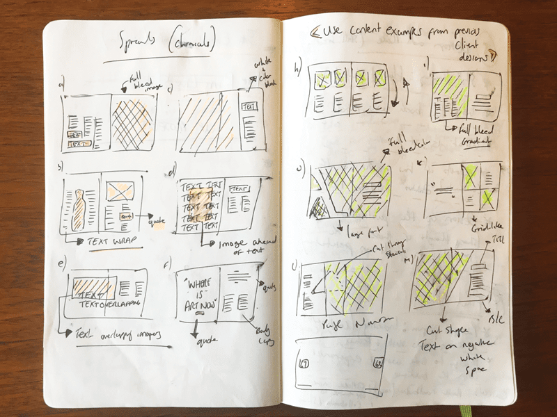
Figure 4. Lewis’s Moleskine notebook is full of loose sketches for layouts and design elements.
He thinks that his tendency to fiddle around with the structure of his spreads comes from his university days, when he worked on a nature-themed zine. He and the other students loved the tactile nature of cutting out photographs and blocks of type, then shuffling these pieces around to experiment with different layouts. He still finds this kind of joy in his editorial design projects today.
Over the past two years as a freelance designer, Lewis has worked with a range of brands and companies, including Penguin and HarperCollins, where he has designed covers and interiors, and Adobe, where he has hosted streamed events.
Lewis also works with smaller brands and finds these projects can offer an exciting creative challenge, whether it’s designing a climate justice report for a London-based nonprofit (Figure 5) or working on a brochure about bat-friendly landscaping for a small architectural studios (Figure 6).

Figure 5. Cover options for a report produced by Julie’s Bicycle, a British nonprofit that mobilizes the creative industry to take action against climate change. The organization chose the middle option for the final cover. , a British nonprofit that mobilizes the creative industry to take action against climate change. The organization chose the middle option for the final cover.
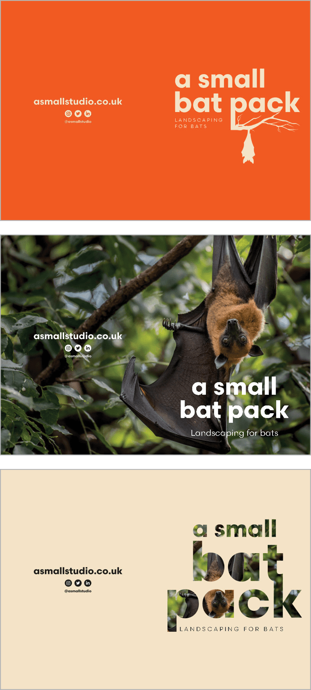
Figure 6. Lewis designed this piece for an architectural studio that had developed a bat highway in South London. The client needed a brochure to encourage residents in the vicinity to make small changes to their houses and gardens to increase bat activity. Lewis was given three brand colors and a handful of images and graphics and then was set free to experiment. You can watch him work on these covers and talk about his design process on this Adobe Live episode.
“Big brands know what they want, and it can be difficult to put your own spin on it,” he says. “When you work with smaller brands, they’re actually really wanting to know what you bring.”
Alternatively, startup brands “sometimes don’t mind taking a risk and seeing where things might go,” he says—and that creates more potential for creative design inspiration.
The Design
For the next stage of the design process, Lewis says, “I sit down at my computer screen and I open up three programs, every day: InDesign, Photoshop, and Illustrator. But InDesign, that’s my baby. I love InDesign.”
Lewis tends to jump effortlessly from program to program as he designs, tweaking some display type in Illustrator before placing it in Photoshop, or constructing a cover in Photoshop before setting the rest of the book in InDesign.
Although designing within InDesign is more standard, Lewis says he often uses Photoshop for cover designs because of how frequently he incorporates graphics and photographs.
“I tend to work with a PSD file within InDesign for as long as I can during the design process, as I’m constantly going back and forth to make amends,” he says. “Having the luxury of editing, saving, and then having the automatic update happen in InDesign is awesome!”
“One thing I do with any editorial project is that I get the content down first,” he says. “Once the body copy is laid out, I kind of know what I have to play with.”
Lewis is disciplined in setting up and working within grids and columns in his designs (Figure 7). He is also meticulously organized in his production techniques both within his software and his operating system, including his files and digital assets.

Figure 7. Lewis always structures his page designs around columns and grids, as illustrated by these early designs of spreads from Still Breathing.
He says these habits were instilled in him by a former boss, a heavily tattooed motorcyclist of a German art director named Sven.
“He would pull me up so much, on how I would organize the saved work on my desktop, how my folders were organized—everything,” Lewis says. “He had a system for how he worked and ever since then, I can’t get out of that system.”
Lewis’s organizational system (by way of Sven) involves not only structuring designs aesthetically with grids, but organizing projects in well-maintained folders, and using clear file names.
He also keeps his files and even his Photoshop layers meticulously cataloged and color coded (Figures 8 and 9). He does it for his own sense of organization—and sanity—but says that his clients appreciate it, too.

Figure 8. Lewis uses color coding in the macOS Finder to tag each image for Still Breathing. Colors indicate whether the image was adequate, would need some Photoshop editing, or would need to be replaced.

Figure 9. This variation on the Still Breathing cover shows Lewis’s Photoshop Layers panel completely color coded—he insists there’s a method to the madness!
“Sometimes clients are worried that if they get working files, will they be able to actually go through them and navigate?” Lewis says. “And I always say, ‘Guys, I’ve got you covered.’”
But that’s just an added perk. “For peace of mind,” he admits, “I have to live in a color-coded world.”
A common challenge for designers in this stage of the design process is working around low-resolution or even non-existent photographs. Often Lewis uses placeholder images from social media or stock agencies while he waits for selections from a photo shoot.
For Still Breathing, each of the 100 writers who contributed to the project had to provide their own head shots, because the COVID-19 pandemic prevented in-person photoshoots from taking place. Unsurprisingly, the images ranged from iPhone selfies to professional portraits, with their quality varying wildly. Lewis accommodated imperfect pictures by incorporating a small size into the design for a low-resolution image or by covering parts of a flawed photograph with a graphic element.
As he designs, Lewis almost always uses a Wacom tablet—currently, a Wacom Intuos Pen Tablet PTH-451 (Figure 10)—and says it’s a holdover from his early career days, where he saw everyone working with the device.

Figure 10. Lewis’s Wacom tablet has been an integral part of his design process since his days in advertising design.
Although at first it “felt alien” to him, “I could see clearly how comfortable my team was using it and, to be honest, I do have a tendency of disliking being left out!” he recalls. After some practice, it became “second nature,” and now, working without one feels like working without his right arm, he says.
Lewis likes giving text room to breathe. Whether he’s designing the text flow of a book or an annual report crammed full of information, he allows the text to fill more pages than the bare minimum needed, a strategy that helps the reader absorb the details, making the project communicate.
“Things need to breathe,” he says. “Don’t be afraid to have a blank page. If you need something in the middle to break things up, that’s okay. You don’t have to throw the kitchen sink at it.”
The Feedback
For a project as extensive as Still Breathing, the design process might go through many different iterations.
Early on in the design process for the cover of Still Breathing, Lewis recognized that the content of the book was extremely powerful, even potentially uncomfortable and upsetting. He wanted to design a cover that would emphasize the most significant elements of the book, while remaining open and inviting to a potential reader.
He experimented with ways to emphasize the contributors to the anthology, both by making 100 the centerpiece of the design and by incorporating the full name of every Black person whose voice is featured in the book (Figures 11 and 12).

Figure 11. The first round of cover designs yielded five options. Throughout this stage of the process, a reoccurring challenge was the list of names on the cover.

Figure 12. Once the client was satisfied with the design direction for the cover, the design evolved through several subsequent rounds.
“I knew from early on that having each person featured on the cover really reinforces the importance of how we’ve all come together, as a collective, to share our experiences,” he says. “We are one community with an underlying narrative of experiencing racism.”
The decision to include every name on the cover resulted in some serious design challenges.
“It’s one thing to have the idea of it, and it’s another to execute in a way that visually looks engaging,” Lewis says.
The process took many rounds of tweaking. Over the course of the project, several of the original contributors were replaced, meaning that Lewis had to redo his careful layout of names.
Lewis says that for him, the most crucial element was making sure the names were legible and presented the way each contributor desired. The final cover displays an alphabetized list of names in three columns, with surnames subtly bolded.
Lewis originally set out to design the spreads to echo the cover, using a red and white color scheme and minimal, spacious style (Figure 13). Over time, however, the concept transformed. By the time it was published, the book used a unique color scheme and design style for each contributor.
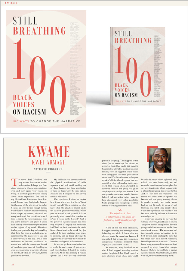
Figure 13. Early on, Still Breathing called for all 100 contributions to the anthology to use a single design treatment, one that echoed the design motif of the cover.
One unique challenge: Lewis had only a few pages to help each of the book’s 100 contributors tell their story in text and photographs.
Once he knew the style the editors preferred, he could experiment with variations on the theme. For him, an important consideration was staying away from design choices—like using bright red, yellow, green, and black colors, or a very colorful, busy aesthetic—that evoke what he calls a “stereotypically African” feeling.
By rejecting facile presumptions about what shapes, graphics, patterns, and color palettes resonate best with people of African descent, Lewis could explore how to design for the African community and its diaspora in a way that doesn’t look like a traditional “book about Africa.”
Eventually, the big design choices have been made, and it’s time to dive into the nitty-gritty of production. Lewis describes this process as a careful balance between wanting to accommodate his client’s feedback and wanting to advocate for his own design expertise.
“I don’t want to be afraid to challenge the client if I feel something is wrong,” he says. But of course, pushing too hard on a client could easily backfire, especially in the early stages of a freelance designer’s career.
Lewis says that this is why establishing a good relationship with a client early on is so important—when the client trusts that you share the same goals and vision, they’re more likely to accept your feedback on their edits and requests.
Because the layout of each page of Still Breathing was completely different, Lewis and the editors would go back and forth several times, making sure that the pages were as legible as possible yet still eye-catching.
The project gave him the creative license to apply his personal design style to make each author’s spread reflect something about them personally. And it was a success: Lewis says that once the collaborators got a chance to see the pages he had designed for them (Figures 14, 15, and 16), “seeing their response to seeing their spread—it felt so personal to them.”
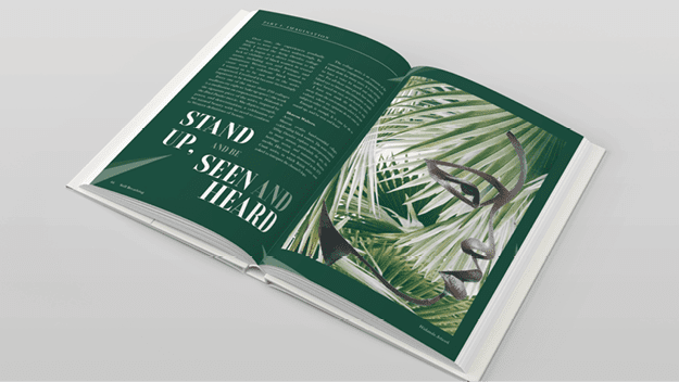
Figure 14. For this spread featuring the collage work of artist Sharon Walter, Lewis pulled leaflike shapes from her artwork to decorate a bold green background he chose to complement her art.
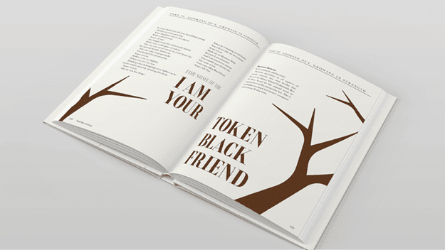
Figure 15. As a Black creative himself, Lewis allowed his own experiences and connection to the text to inspire his design choices. He built designs around phrases and sentences that resonated with him personally.
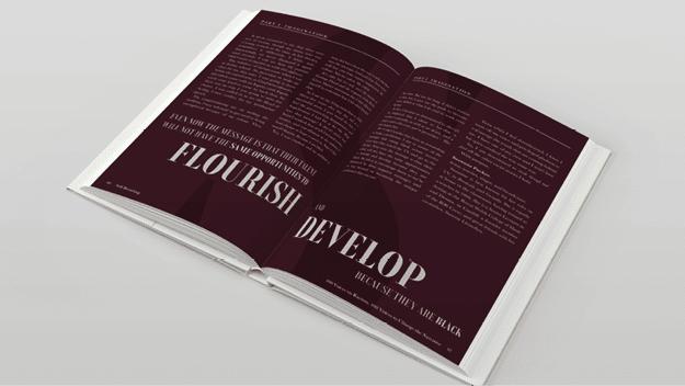
Figure 16. “I do like the idea of two tones—like here, there’s an S behind the color,” Lewis says. “I love doing tints, rather than a brand-new color. The tint saturates into the book almost seamlessly, without being a shock.”
“They kind of felt like everything here is a piece of their own,” he says. “They felt like they had taken a piece of the book for themselves. When I heard those comments, I can’t even describe how awesome that is.”
“There’s much more in hearing that the people who are featured feel that their voice was represented in the book,” Lewis says, adding that this response “means more to me than just hearing that the design looks cool.”
“Hearing from the people actually featured about their story and that I’ve channeled it in a visual way and they feel like I’ve done justice to it? There’s no words.”
The Finished Product
For Lewis, his connection to a project doesn’t end even after a book he has designed has been published and he has it in hand (Figure 17). This is especially true for Still Breathing.
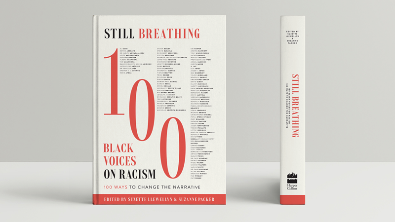
Figure 17. The final cover design for Still Breathing is simple and striking.
“This book is bigger than just me,” he says. “For me, once I designed it and it was out there, it was like, what happens next? Now we’re having events, we’re having discussions, and it’s making the book feel like it’s kind of alive.”
Designing Still Breathing has led Lewis to opportunities to talk about the book, its impact, and his career at all kinds of events in 2021, including the Adobe MAX conference and, of course, at CreativePro Week.
A book like Still Breathing can foster a sense of community, both among those who work on it and those who read it and recognize themselves in it. And Lewis says that he found a sense of community while working on the book even beyond the team at HarperCollins.
During the pandemic, he says, WhatsApp and Google groups of Black creatives started to become more active, and there he was able to influence and be influenced by other Black designers.
“It ranges from people who are very high, CEO-level professionals and art directors for big brands, right down to new graduates and design students,” Lewis says. “And so you’ve got this space for us to share ideas and feel listened to.”
“When Still Breathing came out, I got the link and shared it and didn’t just hear ‘well done’ and [get] pats on the back,” he continues. “It was more about what we can do with it and where we can take it from here.”
This kind of response from other Black creatives was very meaningful to Lewis, because this project felt especially personal to him. Lewis grew up in Brixton, a district of South London and predominantly Black community, but moved away as a teenager, eventually attending university in a predominantly white area.
As a result of this upbringing, Lewis feels as though he has insight into two distinct cultures, and he considers much of his design work an effort to bridge the gap.
“A lot of the work I do is based on community and race and design,” he says. “But I think I’m in a position now—because of the work I’ve done on projects like Still Breathing and because I have brands approaching me—where as a Black designer myself, I have a sense that I need to do this kind of work.”
This article from CreativePro Magazine is for members only. To continue reading, please log in above, or sign up for a membership today! Thanks for supporting CreativePro!
Commenting is easier and faster when you're logged in!

Recommended for you
InDesigner: Weldon Owen Publishing
Beautiful samples and an interesting interview by Diane Burns.
InDesigner: Alan Just
Learn how a shared AirTable database was the key to streamlining a complex publi...
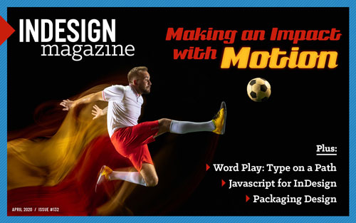
InDesign Magazine Issue 132: After Effects
We’re happy to announce that InDesign Magazine Issue #132 (April 2020) is now av...