
InDesigner: Curl Magazine
Erica Gamet goes behind the scenes at a new print and digital magazine aimed at women with curly hair.

This article appears in Issue 110 of InDesign Magazine.
Proving that there really is a magazine for everything and everyone, Curl is a brand-new print and digital magazine aimed at women with curly hair. It’s the brainchild of Stephanie Hinderer, who is not only the founder and editor, but also the designer and producer of the nascent publication.
Stephanie recently launched a pilot issue to build a following, with plans for a Kickstarter campaign to help raise the funding to fuel her ambitious project, to be followed by an official launch in the fall of 2018.
I sat down with Stephanie to talk with her about bringing her dream publication to life.
Erica Gamet: This magazine has been a dream of yours for a very long time. Where did this idea come from?
Stephanie Hinderer: It was an idea I had in high school, so it’s been about 20 years in the making. At first it was just a joke between me and a curly-haired friend, but as I got into journalism in college, it started to become something I dreamed about more seriously. It was that big life dream, you know? The one where people say, “If you could do anything, what would it be?” This is that thing for me.
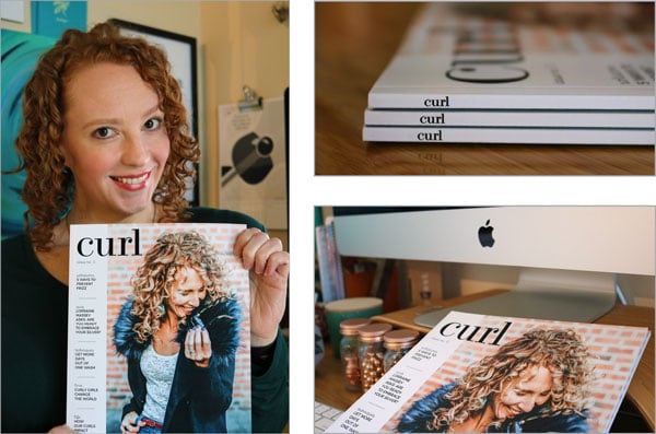
Stephanie Hinderer is making a dream of hers a reality with the launch of her magazine, Curl. The pilot issue was published in April 2018, with the first official issue scheduled for publication in the fall of 2018.
EG: Curl is available in digital format, but is primarily a print publication. What was behind your decision to create and launch a print magazine in this digital age?
SH: The big thing is
that I’m a print girl. I just love print. Personally, I felt that if I couldn’t do it in print, I didn’t want to do it. So it was initially a heart reaction. But the more I thought about it, the more I realized it makes sense for this particular magazine. This is something women can keep and refer back to as their hair journey continues, not to mention they can try the techniques without trying to scroll their phone with gel on their hands. But I also envision women reading it at the salon, while they wait to be seen or sit under the dryer, and that space is still dominated by print magazines as opposed to digital.
EG: How was the small run of the printed pilot issue produced?
SH: Since I only printed 20 copies of the pilot issue, I ordered them through Blurb (who I met at CreativePro Week last year). I’ve been getting pricing from more traditional printers for the future because I plan to print much larger quantities and have them shipped directly to subscribers.
EG: What specific format are you distributing the digital version of the magazine in?
SH: Right now the digital version is a very simple interactive PDF (just so the links are clickable), but I hope to use in5 in the future to make it more interactive and reflowable.
EG: Did being both the designer and client (in your position as editor) cause any conflict in the design or production process?
SH: I have a hard time knowing when something is done with the design. I can keep tweaking forever because there is no one but me to say when it’s finished. And I have my own design style that of course I want to infuse, but I have to balance that with what the audience wants to see.
EG: How and when did you start using InDesign?
SH: My degree is in journalism and not design, so I’m a mostly self-taught designer and InDesign user with a few great mentors along the way. I started with Quark on my college newspaper and I remember going to a conference and seeing a presentation on InDesign and I thought it was the most amazing thing ever. (It could put pictures inside letters? Craziness!) I don’t think I really started using InDesign in earnest until CS5 came out.
EG: How did you decide on the overall look and feel of the magazine? How do you balance the editorial and photographic elements?
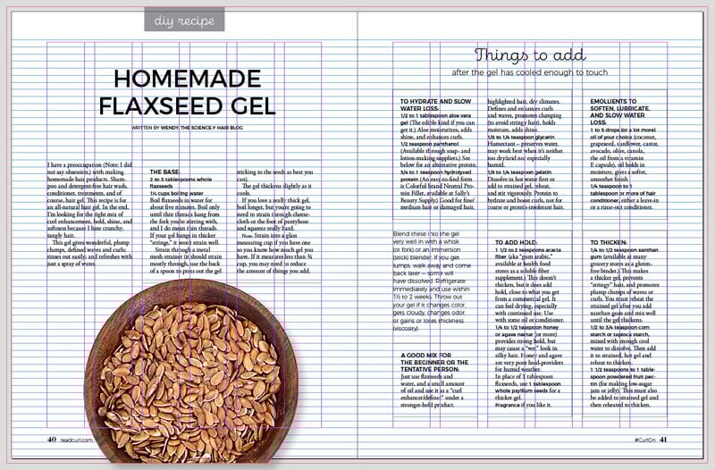
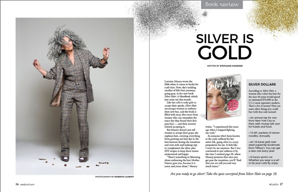
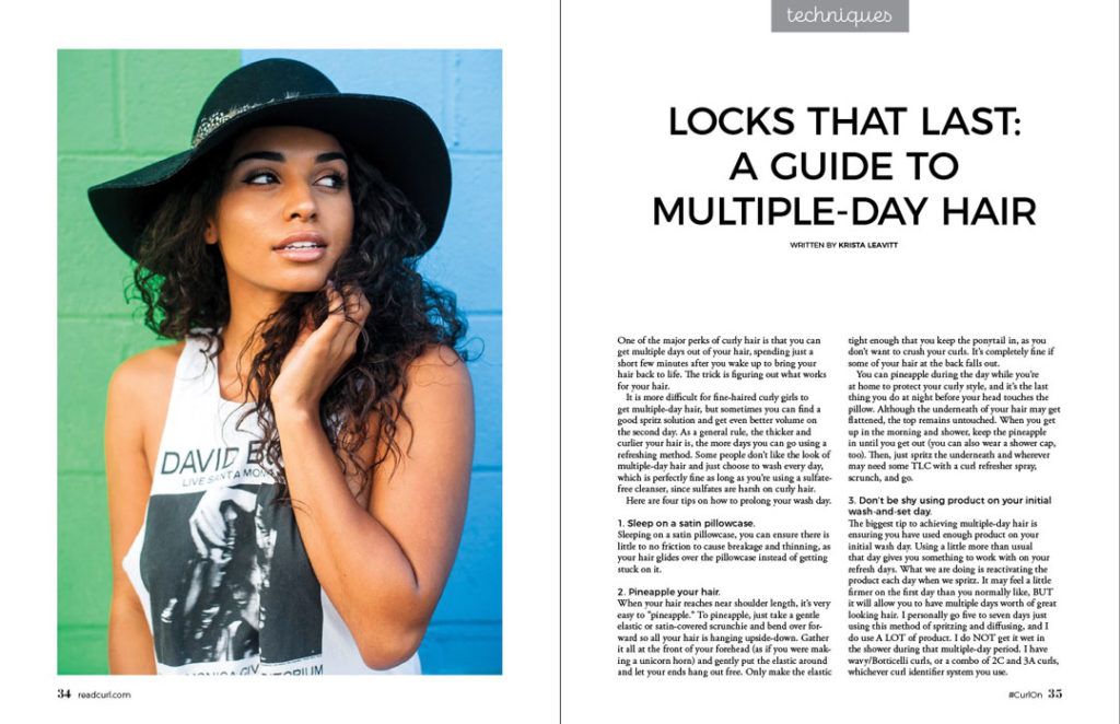
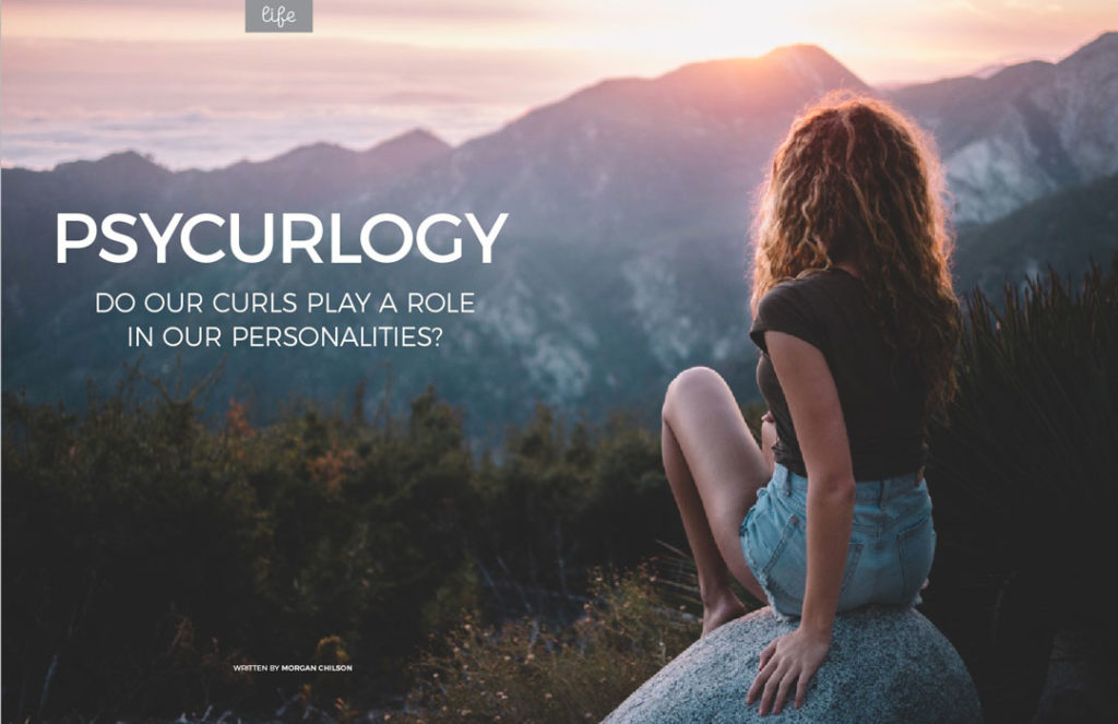
SH: I have always loved designs with lots of white space, so I started there. I knew I didn’t want it to feel splashy and spazzy like a celeb[rity] gossip magazine. I want it to be taken seriously, to be a calming reading experience, and to feel timeless. I stuck with a black and white color palette (did I mention I love print?) and let the colorful photos be the center of attention. I plan to use higher-contrast photography as opposed to more muted tones because, one, I just prefer it; and two, because I think it speaks to the boldness of curly hair.
As a big fan of clean and simple, I knew I wanted to have a lot of white space and not get too cluttery with the photos. I tend to prefer one big amazing image as opposed to trying to get in multiple shots on one page, so I did that when I could. But as all print designers know, sometimes we just have to work with what we’ve got because people aren’t always going to have their photos as big and as high-res as we’d like.
“A lot of white space and not too cluttery with the photos”–looks like Hinderer is staying true to her vision.
EG: What factors influenced your choice of typography for the magazine?
SH: I was considering three fonts for the body copy. I ended up using Adobe Garamond Pro because I wanted something that was legible, slightly feminine, and beautiful. I really like Didot as a display font—I didn’t use it in the magazine, but I was looking for something that gave that same classic feel. So the headline font and accent text are from the Montserrat font family. I wanted something with multiple weights because I wanted both variety and continuity, and I’ve been crushing on thin sans serifs lately, so definitely thin options. Montserrat is more of a square-shape font, which I prefer, and I liked that it was clean and simple with a tiny bit of personality.
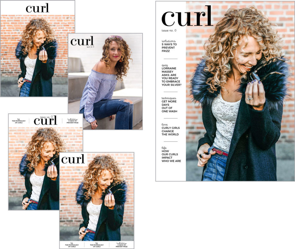
Evolution of a cover: Curl’s cover went through countless iterations before landing on the current version.
The category listings are in Eldwin script, chosen for its legibility with a hint of curliness. The article titles are set in Montserrat Regular. The Curl logo was crafted using a modified version of Ratio Modern.
At left: multiple iterations of the cover’s look and typography. Above: The final version from the pilot issue.
The script font was the hardest, but I knew I wanted to incorporate one because it’s “curly.” It was a challenge to find one that doesn’t feel overused, is curly, upright and not too slanted, and still is legible, whether you’re holding the magazine or it’s on a newsstand. I wound up choosing Eldwin Script. Dreamy Script was another front-runner, but in the end, I felt the legibility wasn’t quite good enough.
The logo was actually a miracle. I started mocking up a cover before I even had a logo, so I just tried out a font or two knowing I would come back to it later. I think Ratio Modern was the second font I picked. I was looking for a classy serif font because I felt like a script was too predictable, but I was hoping to find something with a little curl to it. I landed on this one and thought, “That’ll work for now.” But the more I looked at it, the more I loved it. The C and R have cute little curls that don’t bash people over the head, but they’re there. The final version is a very slightly tweaked Ratio Modern.
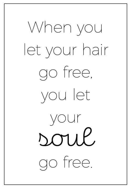
Figure 1. Pull quotes use Montserrat Thin and Eldwin Script for highlights
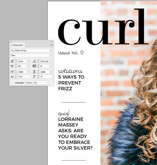
Figure 2. A closer look at the cover type
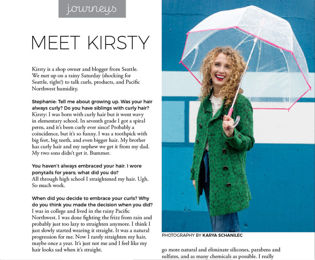
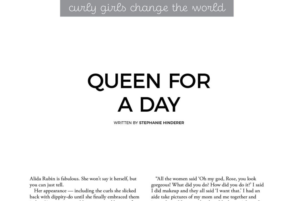
Figure 3 and Figure 4. Category headings set in Eldwin Script, titles in Montserrat Extra Light (Figure 3) or Regular (Figure 4), body copy set in Adobe Garamond Pro Regular, with highlight questions in Montserrat Medium.
EG: Were there any hurdles you encountered from a production standpoint?
SH: It almost doesn’t feel like there was much “production” in the prototype issue, because I was setting things up for the very first time. Everything I touched was new. But I did have to set a deadline for myself because I work best on deadline. And I made myself a galley to plan out all the pages because that’s what I’m used to working with. But as the editor, I kept changing it.
Curl uses a black and white palette—and cautious amounts of color accent images—allowing the focus photos to really stand out.
EG: What are some of your favorite tools or features to work with in InDesign?
SH: I was really good at laying out things in Quark, and I’m really good at laying things out in InDesign. But that means the program does a ton more that I don’t know about. Specifically for the magazine, paragraph and character styles are at the center of the design. I also learned a bit about object styles for the first time, which was helpful, especially on things like the boxes when the stylist panelists are quoted. This was also the first time I’ve worked with auto page numbering (coming from newspaper that doesn’t all get laid out in one document, I haven’t had much need for it) but it took me a bit of Googling to figure out how to get rid of the page number if I didn’t want it on a certain page.
EG: What do you want readers of Curl to walk away with (both from a content and a design standpoint)?
SH: The main thing I want readers of Curl to walk away with is that it’s OK to be who they are. As that applies to our hair, I want them to know hair doesn’t have to be straight to be beautiful. Nor does frizz equal flawed. But since we’re encouraging people to embrace their hair and who they are, we’re going to teach them how to take care of their curls and cheer them on each step of the way.
From a design and print standpoint, I want Curl to be something women can keep and refer back to, so I’m making the look classic and timeless and the quality something that lends itself to going on the coffee table or bookshelf instead of in the trash.
“CURL ON”
Hinderer uses this phrase to empower her readers to love their curly hair—so much so that those words are emblazoned along the bottom of the publication’s pages. If you are ready to curl on, you can check out the magazine’s website and sign up for digital access to the pilot issue. You can also keep up with the publication on the Curl Instagram account.
Commenting is easier and faster when you're logged in!

Recommended for you
InDesigner: Fritz Klaetke
Fritz Klaetke has designed scores of projects for the Smithsonian, including the...
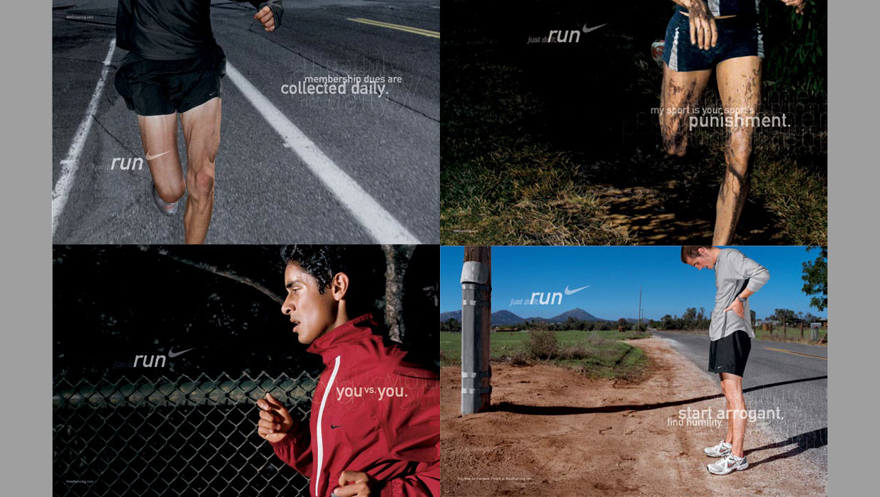
InDesigner: Wieden+Kennedy
When this ad agency switched to InDesign, their creative concept- ing process go...

InDesigner: Insight Guides
Pam Pfiffner examines how one publisher is tackling the problem of creating prin...