
InDesigner: Arabic Typography Design Contest Winners
David Blatner shares the gorgeous design and typography in the competition’s top ten entries.

This article appears in Issue 38 of InDesign Magazine.
In 2009, French software and font developer WinSoft announced the Arabic Typography Design Contest. The company invited typographers, graphic designers, and artists to submit work with a theme of reconciliation and relationship. The topic was picked to celebrate the UNESCO International Year for the Rapprochement of Cultures. The contest rules stated that all artwork must be created with Adobe InDesign and Winsoft’s Tasmeem plug-in, which allowed designers to expand the calligraphic options of typesetting Arabic in InDesign. More than 70 pieces were submitted from 18 countries (primarily from Europe, North Africa, and the Middle East). The pieces were judged both by a five-expert jury and a public voting on the Winsoft website, and in May the winners were announced at the Adobe Beach Bash in Dubai. Some of these winning works are on the following pages.
Arabic text is based on hand-written script and uses many diacritical marks and accents. Soraya Syed, a London-based calligrapher who created two of the top-10 pieces, explains, “Arabic typography has different challenges than roman typography. In one way it is simpler, as there are no italics, no small caps and no drop caps, and so on. But, on the other hand, it is more complicated as individual letters can have multiple forms and the positioning of the vowels is very important and often need to be manually tweaked and positioned so they do not crash into the letters.”
Add in a vast array of ligatures, stylistic alternative characters, and the ability to stretch characters to fill the desired horizontal width, and you can understand the mind-boggling nature of Arabic typesetting. Syed continues, “I have used other software in the past but the ease of use of InDesign and Tasmeem, and the way it works with other Adobe software, gives
you the freedom to concentrate on your creativity rather than baffling software interfaces.”
Samar Maakaron described how she built her award-winning pieces: “I created the illustrations in Photoshop and Illustrator and used the text layout features in InDesign. InDesign is great for keeping the consistency of all the details, size, shapes, colors, etc.”
When it comes to creating bilingual pieces, Maakaron warns, “There are many challenges. To start with, Arabic is a language that is difficult to learn, and it bears no resemblance to Latin, which can be frustrating if a team of designers does not have an Arabic speaker on board. The direction of the text is from right to left, so when combined with English, one needs to think really carefully about how the design will work. Also, the field of Arabic typography is still relatively new in comparison to English. For example, a typeface like Helvetica, designed in the ’50s, has only recently been made available in Arabic. Putting two languages side by side requires a lot of skill to avoid making the Arabic side look inferior, or less well-designed.”
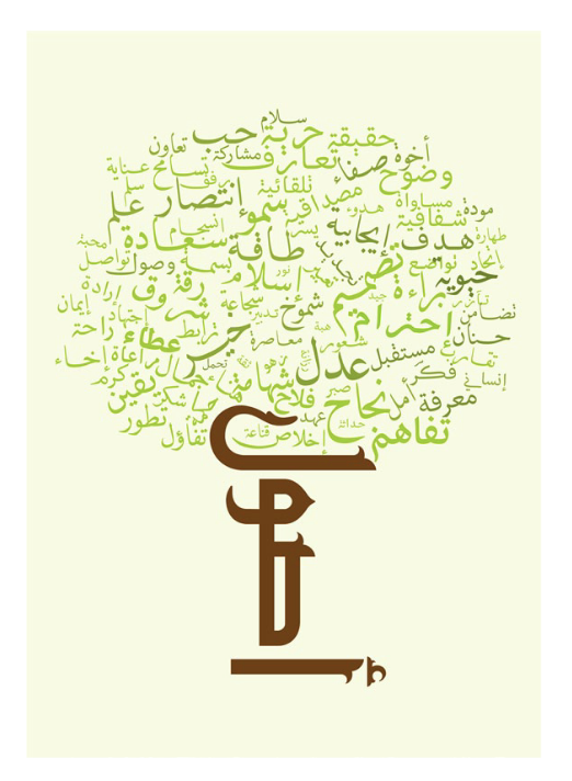
Fifth Place
“Origins : Ossouls” by Tahour Med Amine
One hundred words—including “care, love, faith, cooperation, tolerance, courage, and reflection—around the tree trunk made of the word “Origin.”
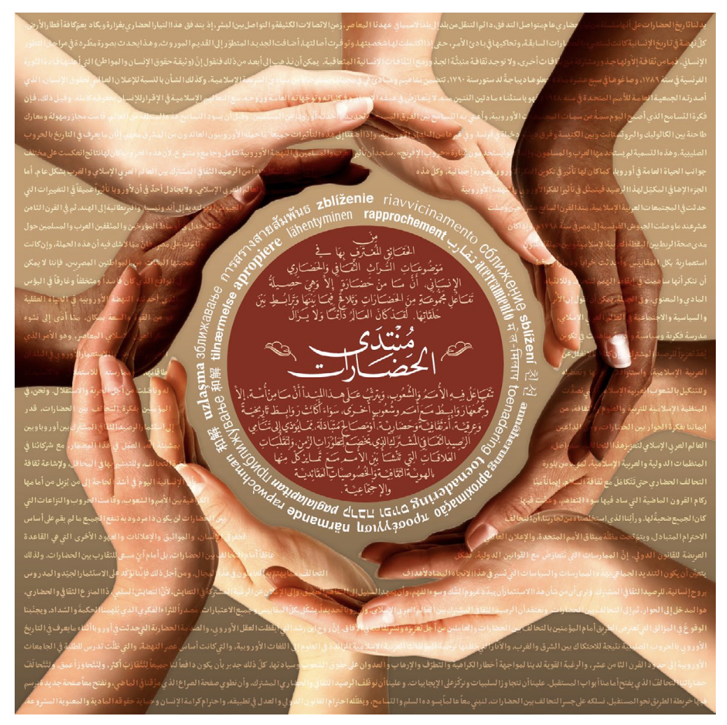
First Place
“World Cultures Interaction” by Dareen and Habib Khoury
“The word Rapprochement in 27 different languages… symbolizes the interaction between world cultures and nations, which also depicts the desire to live peaceful coexistence. The texts over elaborate the truth behind a mutual respect for human dignity and the protection of morals, as an entrance to the dialogue and interaction between civilizations.”
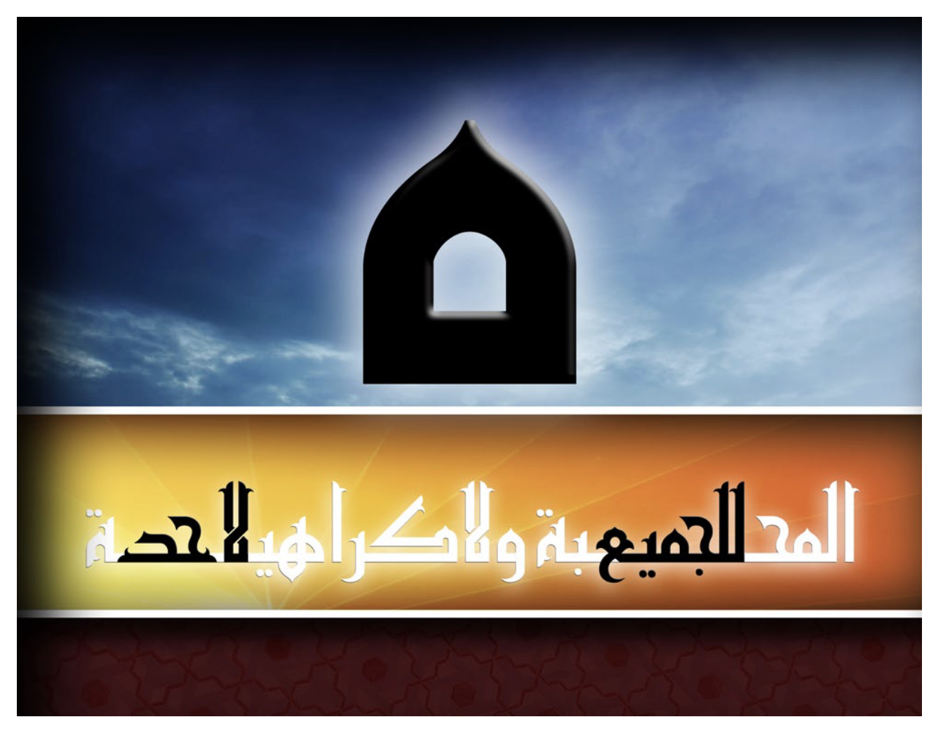
Second Place
“Love for All, Hatred for None” by Farhan Naseer
“I have used a Sakun/Jazm as a symbol to represent coming together, as this is what this symbol does in writing, it joins letters.”
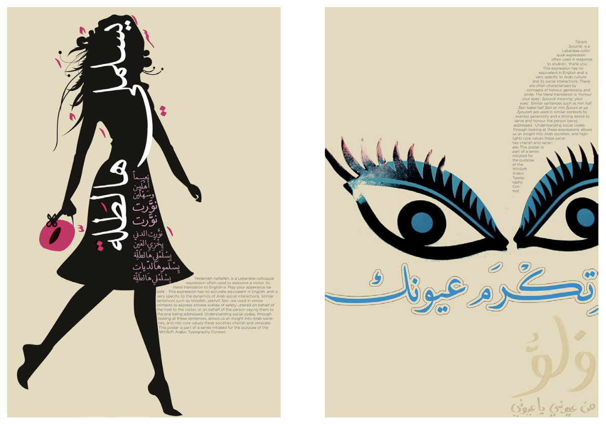
Third and Sixth Place
“Corniche series 01” and “The corniche series 02” by Samar Maakaron
“Arabic expressions used in everyday life are numerous and entertaining. Unlike proverbs, these expressions tell us a lot about the culture but do not have obvious accurate translations and are often very difficult to explain. They are organic flotations, sweet words, pleasant, and unbinding… They form the essence of the language, and the basis of the values that define us, values that we constantly negotiate and exchange.
“In this poster, I attempt a form of translation, in the hope of starting a conversation about these sayings, about the contexts in which they reside, and how they nuance the basic differences between East and West.”
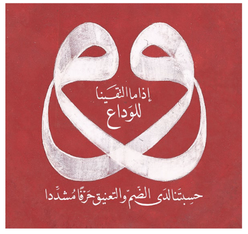
Fourth Place
“Letters Embracing,” by Soraya Syed
When we came together
to bid each other adieu
You would have thought that we were
Like a double letter
At the moment of union and embrace.
— Muhyiddin Ibn ’Arabi, 12th century Sufi philosopher, also known as Sheikh-i-Akbar (the Great Sheikh)
“The letter ’waws’ in their reflective form have been used in the past by the Ottoman-Turks, often symbolic of the Divine Name. Visually, their curvaceous forms lend themselves to be personified as two individuals in a loving embrace, at that point the two letters become one.”
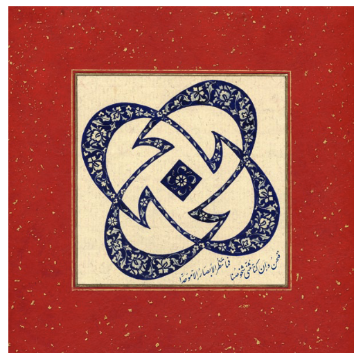
Seventh Place
“Union,” by Soraya Syed
Even if we are made up
Of a double nature,
Our glances see only
One unified being.
—Muhyiddin Ibn ’Arabi (1165 – 1240)
“Here the letter ’jeem’ is repeated four times around a shared dot creating a geometric pattern. Persian nastaliq, Arabic poetry, Turkish illumination and English-inspired ideas come together to bring this piece into fruition.”
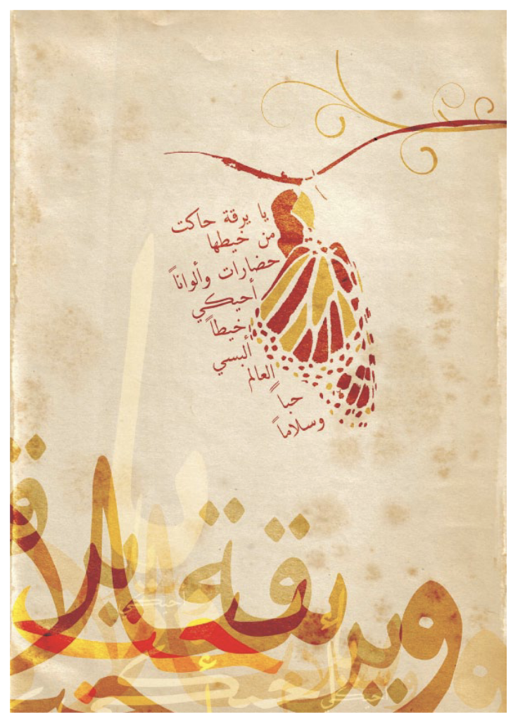
Eighth Place
“The Fabric of Peace,” by Zahra Ezzeddine
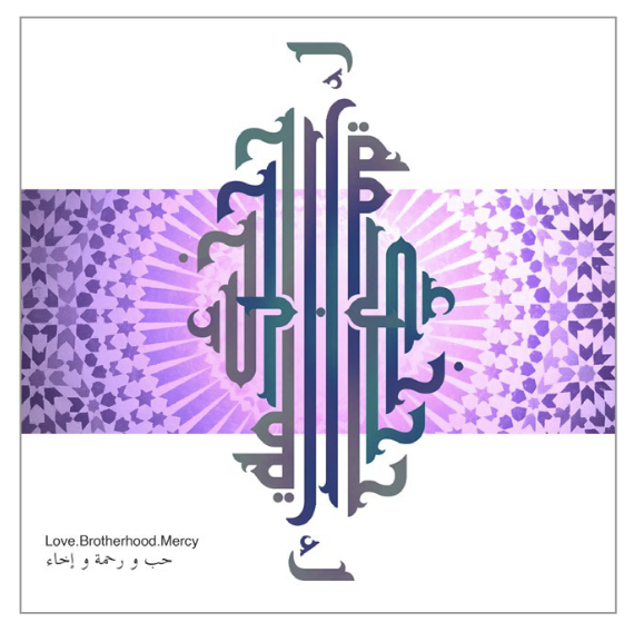
Ninth Place
“Human Unity” by Thamara Tarek
“This work is a typographic design of three key aspects of human unity. Love, Brotherhood, Mercy bind humanity together and bring us closer to one another. The artwork was designed in InDesign CS4 with Tasmeem and later with Photoshop in order to add texture and background to the design.”
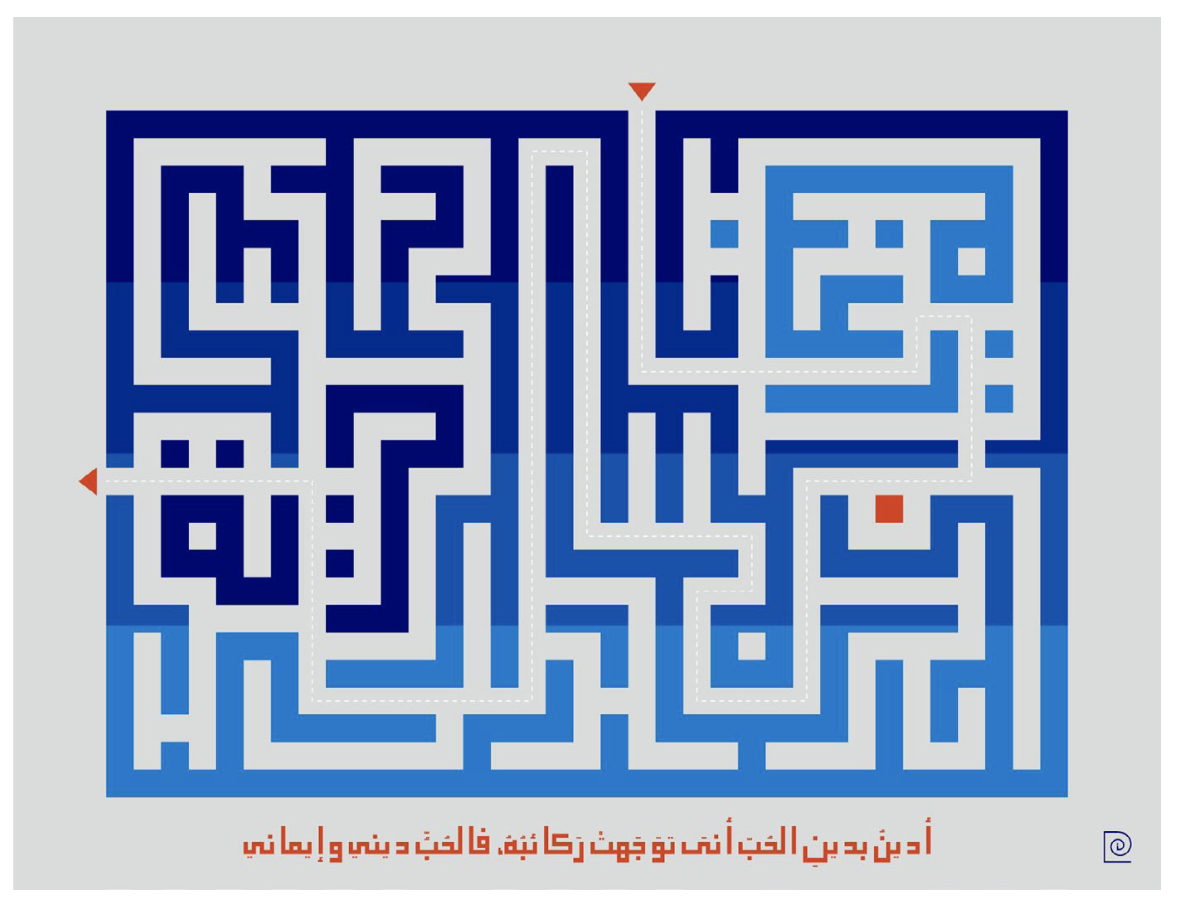
Tenth Place
“Kufic Labyrinth” by Soraya Syed
I believe in the religion
Of Love
Whatever direction its caravans may take,
For love is my religion and my faith.
—Muhyiddin Ibn ’Arabi
“This piece is inspired by a trip to Iran where Kufic inscriptions adorn the walls of stunning architectural masterpieces. From a distance, the walls of calligraphic brickwork resemble computer chipboards and pixels. On closer scrutiny, the encoded messages hidden in geometric blocks become readable and meaningful. The Kufic Labyrinth is entered through the word raghba, meaning ’desire’ in Arabic. The shortest pathway through the maze, shown in a dotted line, makes up the Arabic word jamal meaning ’beauty.’ The exit is made through the word hurriya meaning ’freedom.’
“Kufic script is one of the oldest forms of Arabic writing but its timeless simplicity can look contemporary. Just as the past informs the present, art evolves from the continuous relationship and interaction between people, cultures and civilisations.”
Commenting is easier and faster when you're logged in!

Recommended for you
InDesigner: Curl Magazine
Erica Gamet goes behind the scenes at a new print and digital magazine aimed at...
Interview with Alisa Smith, Accessibility Evangelist
Q&A with Alisa Smith, who is presenting at the CreativePro Design + Accessibilit...