
InDesigner: American School in London
Russell Viers finds out what kids today are up to.


This article appears in Issue 17 of InDesign Magazine.
Imagine that your boss walks into your office one September morning and says, “I have a big project for you.
“I need you to create a coffee table book,” he says, “hardbound, around 300 pages, about our company. You’ll need to take all the photos, write all the copy, design it, and lay it out. It’s due April 1 and you can only work on it two hours a day.”
And just like the old joke, he ends the conversation with, “I’ve got some good news and some bad news. The good news is, you’ll have help. The bad news is they’ve never used InDesign before… and they’re high schoolers.”
This is exactly the assignment Kathleen Laughlin, yearbook advisor for the American School in London, faces every September, just as school starts and she dives into yet another yearbook chronicling the year ahead.
“It is a massive challenge, but one that is pretty cool once all is said and done,” said Laughlin, originally from Omaha, Nebraska, and now in her third year with ASL. “Thankfully, my program involves students who are highly dedicated to our production. At the end of the year, when we put to bed a 272-page book, I sit back and think it was produced by 30 kids ranging in age from 14 to 18, half of whom did not know InDesign from Photoshop. It is pretty incredible and very rewarding.”
The American School in London is an international school mere blocks from the famous Abbey Road Studios that educates students from all over the world who happen to live in London. Their yearbook, The Sojourner, is created using Creative Suite 2 for pagination and press-ready PDFs. Once exported from InDesign, the files go to Walsworth Publishing in rural Missouri for printing. The printed yearbooks are then sent to London’s Heathrow Airport for pickup.
One of the first tasks for yearbook staffers in the fall is to decide on a theme to pull the book together.
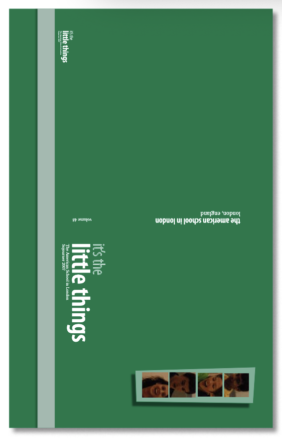
“This year the theme of our book was ‘It’s the little things,’” said Lindsay Jernigan, assistant design editor, a junior originally from Memphis, Tennessee.
“Because it really is the little things that make your year, or even your day,” added Stephanie Dahl, co-concept editor, a senior who has lived in London since age five. “It’s that smile someone gave you, that test grade, or that perfectly toasted panini you had for lunch.”
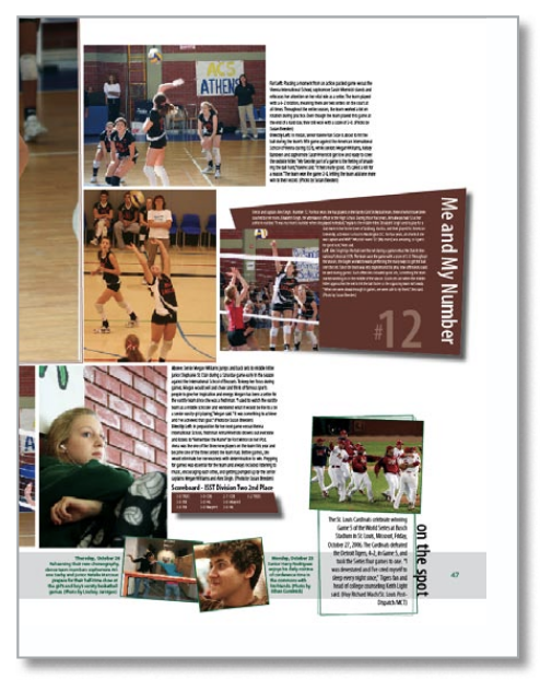
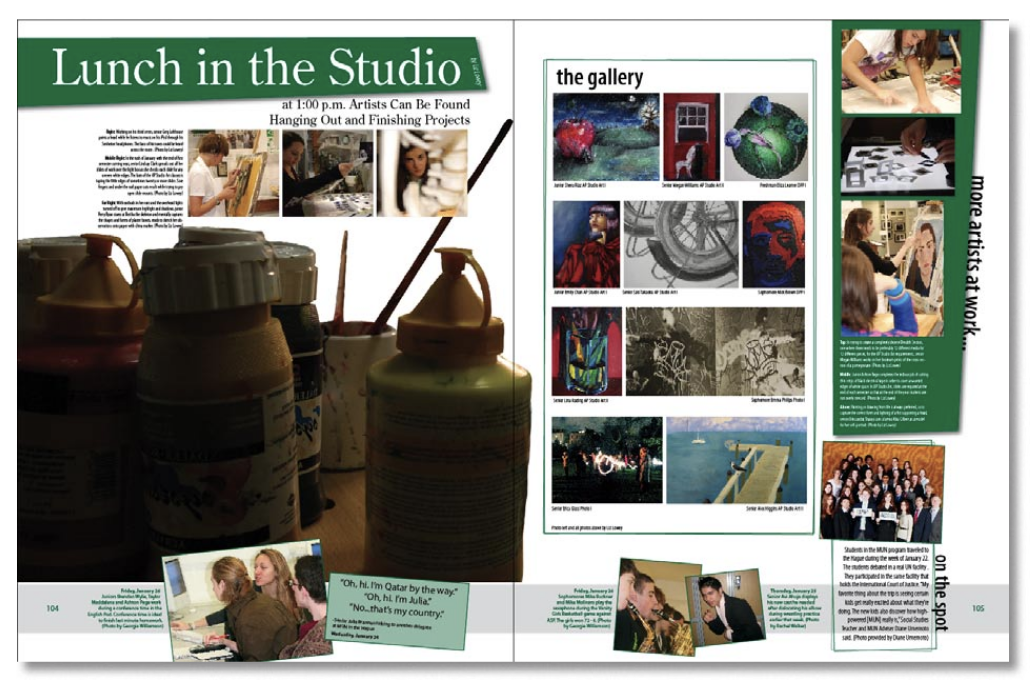
“To develop this theme, we created a bar at the bottom of every page that represented one week, with up to four elements, including quotes heard around school and pictures taken on a daily basis,” explained Jernigan. “Then we had an ‘on the spot,’ which was one big event that happened the week that we highlighted.”

“In the past the staff has always had a problem with coverage,” said California native Liz Lowey, concept editor of The Sojourner, “so this year we decided to survey every member of the high school, students, and faculty. Also, each staff member has to send in quotes and take photos each week. We worked it into the book with the bar idea.”
“We incorporated a type of calendar into the bar that runs through every spread and covers a week at a time,” Lowey explained. “The quotes and photos help us cover the small things that happen every day that wouldn’t normally be featured in a full spread. In this year’s book there is So much to read, little quick reads, which I like the best. I am so excited!”
Laughlin converted to InDesign three years ago from QuarkXPress. “It allows us to be very creative within the InDesign interface,” she said. “When we were using Quark, I would have never thought possible we could produce the spreads we do now. InDesign is amazing from that perspective. It is also much more approachable. Kids do not find it intimidating at all, whereas they did with Quark.”
“I picked up InDesign so quickly,” said Dahl. “I taught myself how to use Adobe Photoshop over five years ago, so navigating InDesign was no problem. Then, I just spent hours in the program, trying out everything and anything I could find.”
The Sojourner staff also benefits from many of InDesign’s time-saving features, such as tight integration with other Adobe products and, possibly most importantly, the ability to convert images from RGB to CMYK during export. This eliminates manually converting thousands of photos to CMYK in Photoshop each year. The staff also lets InDesign crop and downsample images during export, saving even more production time that can be spent on content creation.
Deadline for this year’s Sojourner was March 30, just before the staff left for a much-deserved two-week holiday in various parts of the world. Upon return, pages will quickly be proofed online and the book printed, bound, and shipped for distribution to the students just before summer break.
After months of design, photography, writing, layout and frustration, the moment of truth is when the books are delivered in June. “Until I open a box and look at a book, it is absolute torture,” said Laughlin. “The pressure is hard to describe. You just hope when it arrives and you get a chance to look at it, that every communication with the publisher
was carried through and the book looks like it did when you saw it on the PDF. Until then, stress.”
But, she quickly adds, “Seeing the excitement on the faces of every staff member when the books arrive in June and they see their work in print is so rewarding.”
Dahl. “Not only do we include things that are specific to our own experiences, such as our one snow day of the year, but we also include world news. Even though we may not have directly experienced it, we’re all aware of what’s happening in the world, and we figured there’s no reason not to include world events in our yearbook.
The next year the process starts again for Laughlin. “I am fortunate that not all of my staff is starting from scratch each year,” she says. “I view a program such as the yearbook as an amazing opportunity for students to teach each other. We have a team of editors who are often in their second or third year in the yearbook program, and their leadership and expertise is what drives the program. It is a chance for them to teach, which in turn strengthens their knowledge of the process. It is pretty amazing to see and be a part of.”
For some students moving on, like Dahl, who will graduate this June, the yearbook experience and working with InDesign have possibly charted a career path.
“Basically all I do during my spare time is design and write,” says Dahl. “I’m an editor on both the yearbook and newspaper at my school, so I’m torn between passions. I’m still keeping my options open, although I love the idea of continuing on in publishing.”
Commenting is easier and faster when you're logged in!

Recommended for you
InDesigner: Smyrski Creative
Pamela Pfiffner interviews a designer whose projects range from an experimental...
InDesigner: Fritz Klaetke
Fritz Klaetke has designed scores of projects for the Smithsonian, including the...

InDesigner: Theresa Stoodley
Learn about the creative process behind award-winning editorial and information...