
InDesign Type: Choosing the Right Leading
By understanding and applying a few key principles, you can determine the proper amount of leading to achieve beautiful and legible text.


This article appears in Issue 49 of InDesign Magazine.
If you like trivia, it’s useful to know that the line spacing of type is referred to as leading (pronounced “ledding”) because in the days of hot-metal type, strips of lead were inserted between the lines of type. I’d been ready with this answer for years—just waiting for the question—before I actually worked with real metal type. Getting to handle the stuff was a revelation. Just like the books said, you really do put strips of lead between your lines of type to space them out. Simple and profound at the same time. Lines of type without these strips of lead were—and still are—referred to as “set solid.”
Nowadays, with applications like InDesign, setting the leading of our type is so easy we can do it almost without thinking. And that’s where things can go wrong. The deceptive simplicity of leading along with its default options make it easy to overlook its importance. Our leading choices profoundly affect the readability of our text. Bad leading makes text harder to read because, as they move down the page, your eyes have difficulty locating the next line.
First, let’s define how leading is measured: The leading value of two or more lines of type is measured in points from one baseline to the next (Figure 1). This value is the sum of the point size of the typeface and the actual space between the lines. Thus, 10-point type with 12 points of leading really means there are two points of space between each line. This is written 10/12, spoken as “10 on 12.”
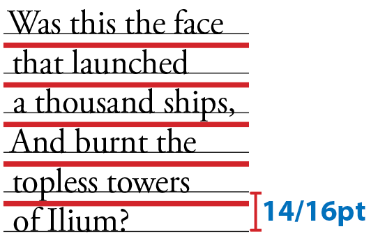
Figure 1: Leading is indicated by the red strips between the lines. The total amount of leading is measured from the baseline of one line to the baseline of the next.
When you use Auto leading InDesign makes the leading 120% of your type size by default (and displays the leading value in parentheses). To put it another way, with Auto leading, as the type changes, the leading changes proportionally.
That might sound like a good idea, but when it comes to leading there is no “one size fits all.” For example, while body text is usually made more readable by positive leading, for headlines and display type, the opposite is more likely true.
How Much is Enough?
On one hand, tight leading increases the density of the type and gives it authority. On the other hand, if you go too tight the type looks claustrophobic, and the descenders of one line may collide with the ascenders of the next.
Loose leading can create a luxurious look, but if you go too far and make it too loose, then the lines of type look like unconnected strips. This is especially true if the leading value is greater than the size of the space between the paragraphs.
Leading, like all type attributes, needs to work in harmony with everything else on the page. While there’s no definitive “right” amount, choosing an appropriate leading value depends on several variables. Perhaps the most important of these is the nature of the text. For example, text intended for continuous reading benefits from some breathing space (from +1 to +3 pts), while a short burst of advertising copy or a title treatment might be more effective with tight leading.
Then there’s type size: as point size increases, you’ll want proportionally less leading. With display sizes, the same relative amount of space between the lines appears larger, so much so that it’s common to use negative leading for display type (Figure 2).
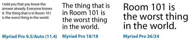
Figure 2: Positive leading works OK for body text sizes, but as the type gets bigger, proportionally less leading is needed.
Column width, or measure, also plays a part: you’ll want to increase leading as you increase column width. Increasing the leading anywhere from 0.5 point to 2 points improves readability by keeping lines distinct and preventing the eye from doubling back to reread the same line (Figure 3).
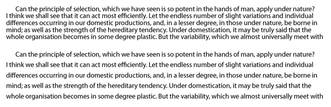
Figure 3: Leading and column width. In the top example the leading is too tight; below, the leading has been increased to compensate for the wide column.
The width of the column gutters should be the same as the leading value or a multiple thereof. If the gutters are too small there will be a tendency to read across the columns; too large and the separate columns will look like separate articles (Figure 4).
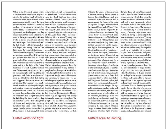
Figure 4: Column gutters and leading.
The color of your page should also be considered. Because we’re used to reading black type on white paper, when we use the opposite, we’re guaranteed to get attention. However, reversed type tends to “sparkle,” making it hard to read. A slight increase in leading—as well as avoiding fonts with delicate serifs—can compensate.
Then there are the characteristics of the typeface. Typefaces with larger x-heights, such as Helvetica, are perceived as bigger than other typefaces at equivalent sizes. Because the lowercase letters are large relative to the size of the overall character, these typefaces require more leading. Typefaces with small x-heights, like Garamond, appear to have more horizontal space between lines and thus require less leading (Figure 5).
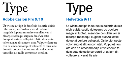
Figure 5: Identical text set in 9 pt Caslon and Helvetica shows that fonts with larger x-heights (like Helvetica) require more leading for optimum legibility.
Typefaces that combine a low x-height with particularly tall ascenders require special treatment. The low x-height begs for tighter leading, but tighter leading might lead to the ascenders and descenders colliding. Much depends on the characters themselves. If you’re working on display type, rewording—if you have editorial license—might make all the difference. Let common sense prevail—and be open to the possibility that colliding ascenders and descenders might even look good in certain situations (Figure 6).
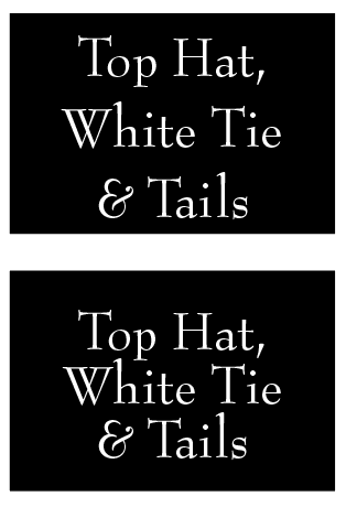
Figure 6: Even though Bernhard Modern has elongated ascenders, it also has a low x-height and short descenders, and so can be leaded tightly.
Bold and Semibold typefaces benefit from extra leading to prevent the type color (the darkness or blackness of the letterforms as a block) appearing too dense.
Type in all caps requires less leading because without descenders the lines appear farther apart (Figure 7).
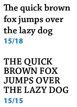
Figure 7: The text in all caps (bottom) needs less leading because there are no descenders.
(Not) Using Auto Leading
Overuse of Auto Leading will almost certainly result in amateur looking type. The best thing you can say about Auto Leading is that it’s convenient. As you change type size your leading increases or decreases proportionally. So, what’s not to like? Well, for starters, Auto Leading is proportional specifically to the largest piece of type in the paragraph. If you have one character larger than the rest of the paragraph, your leading value for the whole line will be 120 percent of that character’s size (Figure 8).
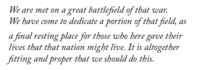
Figure 8: Here’s an example of what can go wrong with Auto Leading. Because one character (a space in line 4) is larger than the rest of the paragraph, the leading is now inconsistent.
More than that, Auto Leading doesn’t give you the control that you need. Sure, if you’re using 10-point type, Auto Leading is 12 points, an easy number to work with. But if you’re working with 11-point type, then your leading value is 13.2, which is difficult to calculate in multiples—necessary if you have paragraphs of different sizes and want to achieve harmonious spacing between them, whether of not you are working with a baseline grid.
Also, while Auto Leading works OK for body text, it can look terrible when applied to display type, which almost always requires less leading.
That said, there is a time when Auto Leading is necessary, and that’s when working with inline graphics.
Auto Leading and Inline Graphics
Inline graphics (frames pasted into a text frame so that they flow with the text) act like a hybrid of text and graphics since you can control their spacing with leading. Auto Leading ensures there will always be enough space for inline graphics because InDesign takes into account the height of the graphics when determining the leading value. When working with inline graphics, make a paragraph style that uses Auto Leading and apply this to the paragraphs into which the inline graphics are placed or pasted. You may also wish to change the Auto Leading percentage in the Justification settings to adjust the spacing around your inline graphics. See the sidebar “Leading Preferences” for other examples of InDesign preferences that affect leading.
Keep It Consistent, Except…
Leading, like so much in typography, is about rhythm—and as with a piece of music, you want your rhythm to be steady and unfaltering. The best way to achieve this is to set the leading values within your paragraph styles. If you need to change the leading values, you can edit the style definition rather than work on the text locally.
When it comes to fixing widows and orphans, it’s not a good idea to mess with the leading. You have other tricks up your sleeve—rewriting, tracking, discretionary hyphens, applying No Break to last two words of the paragraph—to fix such problems. Tempting though it may be to tighten the leading a little bit here and there, your document will suffer if you do. Keep your body text leading consistent, otherwise the rhythm of your type will wander like the beat of a distracted drummer.
With columns of text, it’s usually preferable to have those columns be of uniform depth. Rather than use Vertical Alignment, which increases the leading in the short column to make it bottom out (i.e., end on the same baseline as other columns), you’re better off using Balance Columns, which adjusts the height of all columns, rather than just extending the shortest one. Vertical alignment has its place—like when you need to make text fill a sidebar—but it can wreak havoc on multi-column text (Figure 9).
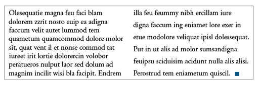
Figure 9: Good leading gone bad: The columns are balanced,but at the expense of inconsistent leading across the two columns.
Ultimately, trust your eyes rather than the math. For headlines and advertising copy there may be times when you need to relax consistency in favor of optical leading and tweak individual lines to make the leading appear more consistent. Such a situation can arise when there are no descenders on
a particular line (Figure 10).
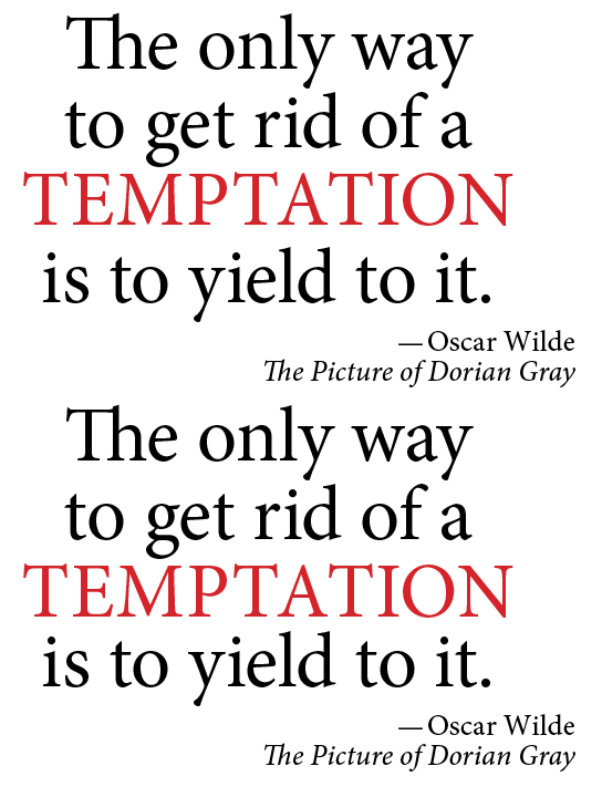
Figure 10: Using optical leading: In the second version the leading for the fourth line is reduced to compensate for there being no descenders on the line above.
Leading and Baseline Grids
If you work with a baseline grid, keep in mind that the grid increment trumps your leading value. For example, if you have a 12-point baseline grid and you increase the leading value of text that is aligned to that grid to 13 points, the leading will round up to the next grid increment of 24 points. Any increase in the leading value causes the lines of the paragraph to snap to the next available grid increment.
Summary
Leading is one of the most important factors contributing to the readability of text. It ain’t rocket science but there are a number of variables to consider. While there’s no one “right” leading value, there are definitely lots of inappropriate amounts. To sum it up: Avoid Auto Leading (except for inline graphics), think about the purpose—as well as the characteristics—of the type you’re working with, exercise a strong degree of common sense, and always trust your eyes.
This article was last modified on October 20, 2025
This article was first published on April 7, 2014
Commenting is easier and faster when you're logged in!

Recommended for you

Creative Blöks: The Perfection Fairy
Each step you take on a creative path—whether you’re designing, drawing, or deve...

InDesign Magazine Issue 102: User Dictionaries
We’re happy to announce that InDesign Magazine Issue 102 (October 2017) is now a...

Fonts on Friday: Influenced by the ’70s
What better time to round up new typefaces than on Friday. Not only is “Fo...