

Transparency is one of those features that designers love and printers hate. That’s because while transparency gives you the ability to create very cool-looking graphics, older PostScript RIPs are unable to process the files, which makes the people who try to output them very grumpy. So while forward-looking designers embraced InDesign for its transparency support, printers grimaced whenever InDesign files came into the shop.
And as a result, InDesign got a bad reputation with printers.
But all is forgiven if you know how to flatten your transparency before printing.

If you use InDesign (or Illustrator 10 or Acrobat 5, for that matter, both of which allow transparency) and you create effects like drop shadows or apply modes like Difference, then you need to read this section from “Real World InDesign 2.” Written by two of the industry’s leading experts on page layout, David Blatner and Olav Martin Kvern, it contains all the info you need to successfully flatten your files for printing.
We’ve posted this excerpt as a PDF file. All you do is click this link “Printing Transparency” to open the PDF file in your Web browser. You can also download the PDF to your machine for later viewing.
To learn how to configure your browser for viewing PDF files, see the Adobe Reader tech support page.
This story is taken from “Real World InDesign 2.”
This article was last modified on March 10, 2025
This article was first published on August 20, 2003
Commenting is easier and faster when you're logged in!

Recommended for you

Illustrator How-To: Breathe New Life into Stock Clip Art
Many designers find the idea of using clip art in their work to be somewhat gauc...
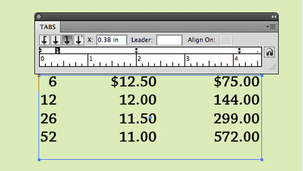
TypeTalk: Setting Tabs in Illustrator
TypeTalk is a regular blog on typography. Post your questions and comments by cl...

TypeStyler for Mac OS X Finally Ships
Press release After seven long years in development, Strider Software proudly an...