

This article appears in Issue 136 of InDesign Magazine.
Whether you work in an in-house graphics department, at an agency, or as a freelancer, the chances are at some point in your career you will have to build layouts for some sort of advertising campaign, big or small.
Most advertising projects involve creating multiple layouts for different formats, sizes, and aspect ratios, so an important “before you begin” best practice is to nail down as many of the expected publication formats as you can, preferably with the specs for each one. We’ll cover how to use InDesign to help tame that beast.
The Project
Our fictitious client Paraguayan-American indie diva Bola Granola is about to launch a North American tour to promote her new album, Cereal Killer (Figure 1). Besides social media promotion, her tour management plans to provide venue operators with a set of pre-made layouts for magazines, newspapers, lobby posters, and outdoor advertising.

Figure 1. Bola Granola’s new album. Photos by Screaghin, Adobe Stock
In the entertainment industry, it’s not unusual to be handed marginal or sub-par images to create show advertising. Fortunately, Ms. Granola’s record label, Special K Records, is on the ball. We have a set of high-resolution, high-quality photo assets from one photo shoot, including the one selected as the cover shot from her new album. They have also supplied a vector art version of their logo and a tour motif. The rest is up to us—and InDesign.
Our project is to create a set of ready-made advertisements for the tour that can be quickly customized by adding the performance venue, date, and time details. These will appear in magazines, newspapers (including black-and-white), venue season programs, and other collateral.
Wrangling Assets
Unless
you charge by the hour, as the joke goes, it’s a good idea to put in the time up front to get things organized. You don’t want to be wasting time while you’re on deadline, trying to produce finished layouts!
Collecting assets and branding elements, organizing them into a manageable form, and keeping track of a complete set of layouts and formats can be tedious, but InDesign, Adobe Bridge, and Creative Cloud can help.
Multiple assets for each project and multiple output formats quickly add up to more than you want to carry in your head. That’s why Digital Asset Management is a thing. You may or may not need a fully-fledged DAM system (see Issue 109 for an in-depth look at DAM), but you certainly want to be sure all the pieces are organized.
Everything in its place
To begin, set up a top-level folder for the project, and subfolders to hold the various categories of layout and output files. Add the top-level folder to your Favorites in Adobe Bridge so you can get to it instantly no matter what else you’ve been working on during a typical day (Figure 2).

Figure 2. A basic folder set for the project in Adobe Bridge
Keep your project folders neatly organized. Don’t let them become “Where the Wild Things Live.” The Assets folder is where we will put the images and artwork files that we’ll place in the advertising layouts. For now, it houses the photography and an Illustrator file of the record company logo (Figure 3).
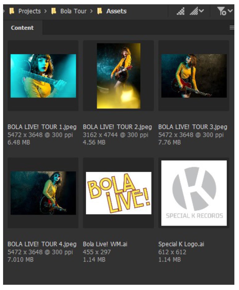
Figure 3. The assets supplied for the project
Cloud sharing is caring
If you will be collaborating with other designers, you’ll need a way to share assets and layout files. A shared Creative Cloud library, Dropbox, Box.com, or OneDrive folders are all useful solutions.
One important advantage of a CC library is that it stores more than just files. You can save swatches, text, table styles (but not, sadly, object styles), blocks of text, images, and artwork in a dedicated library for the project. Even if you are working alone, a dedicated CC library will speed your work. If you’re in the middle of, say, a pandemic and suffering from cabin fever, a cloud library also frees you from your desktop for those days when you want to go work on the balcony, in the backyard, or at a local park.
Open the CC Libraries panel (Window > CC Libraries), click the “hamburger” menu at the top right of the panel, and choose Create New Library (Figure 4). We’ll populate the new library as we go. (To avoid unexpected grief, make sure you have the correct library set as the “Current default” any time you are working on the project.)
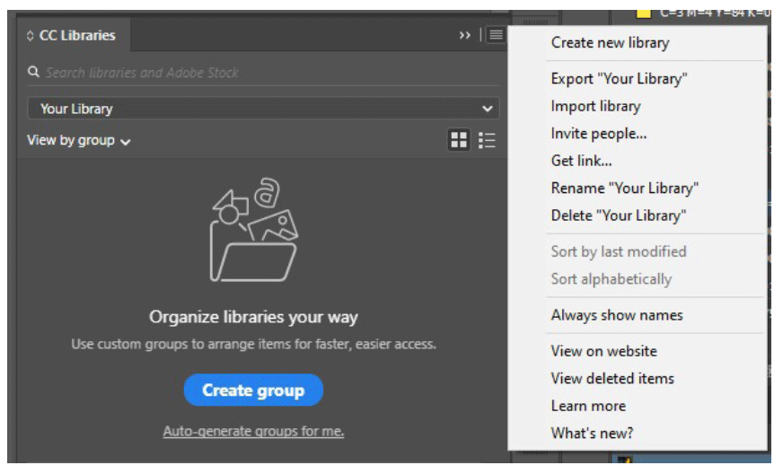
Figure 4. Colors selected by the Color Theme tool
But not images…
Although a CC library is great for many of the things you want to share, it has limited storage space so there’s a trade-off. Adobe gives you 100 GB of storage with your CC subscription, which might have felt generous a few years ago, but Photoshop compositions, collections of licensed stock images, Adobe Dimension renders, and large Illustrator documents—not to mention video—can use it up at a frightening rate. Anything beyond 100 GB is an extra monthly cost to budget for.
If you need to share large files in the cloud, consider using a more suitable service like Dropbox, Box.com, or OneDrive. Changes made to images or documents stored with these services will show up as needed updates in any layouts that use them, just as they would if they were in a CC asset folder, but without using up that limited CC allowance.
For oversize files like Photoshop composites, consider exporting a flattened JPG to use if you will be working remotely on possibly sketchy internet connections.
Building a Color Palette
We have the album cover shot, so it is a great starting point to create the color palette for the project using InDesign’s Color Theme tool (keyboard shortcut Shift+I). Place the photograph in a new US Letter-size print document with a bleed of 9 points (.125 inches). Unlike the regular Eyedropper tool, which recognizes RGB colors only, the Color Theme tool honors the color mode of a document. In this case, it will return CMYK swatches.
Click anywhere on the image with the tool, and InDesign will pick a selection of five groups of five colors each (Figure 5).
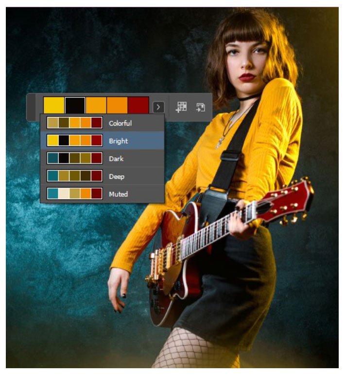
Figure 5. Narrowing the Color Theme selection to a specific area
Oftentimes InDesign’s color choices will be plenty to work with, but you can narrow those choices to just the parts of the image you want. For example, you can drag out a smaller area of the image using the Color Theme tool. Let’s say we want the bright yellows of her sweater and the deep maroons in the guitar and lipstick, but don’t want the blues or muddy yellow-browns of the background and lens flare. Figure 6 shows the area dragged out by the tool, and the result. When the colors you want are concentrated in a small area of a larger image, this is a quick and effective way to exclude colors you don’t want.

Figure 6. Narrowing the Color Theme selection to part of the image
When you have a selection of colors you’re happy with, add a theme set to the Swatches panel by choosing it from the menu and clicking on the Add button. Figure 7 shows the Bright Theme color set and how it shows up in the Swatches panel.
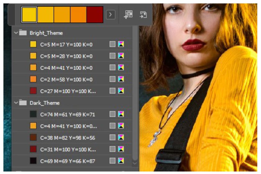
Figure 7. Swatch groups added from the Color Theme tool
To choose individual colors rather than a whole set, select the color you want to add in the little Color Theme panel, then Alt/Option-click the Add button.
A word about black
When you’re working up a set of advertising layouts destined for print, or a combination of print and web, it is vital to know the difference between CMYK black and RGB black, and see it on your monitor.
In the InDesign Preferences dialog box (Ctrl/Command+K), go to Appearance of Black and change both On Screen and Printing/Exporting settings to display and output all blacks accurately (Figure 8). This should be one of the first defaults you change when you install InDesign, but just in case you didn’t, do it now.

Figure 8. Accurate blacks are important on screen and on output!
The next step is to create a “rich” or “built” black. That’s because the normal 100% K (InDesign’s [Black] swatch) reproduces as a dark gray on the page and will always conflict with a photograph that has black in it. Our rich black swatch combines 100% K with 60% C, 55% M, and 50% Y to give a deep black as shown in Figure 9.
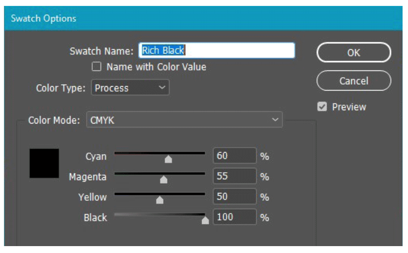
Figure 9. Creating a rich black swatch is important for CMYK color work.
Do It With Styles
By building a baseline, “generic” ad layout first you can set up the paragraph, character, table, and object styles that will be used throughout a campaign. It’s important to style everything you can, because that lets you maintain consistency while also quickly modifying each variation of the ad when necessary.
For the example campaign, the tour graphic motif echoes the Cereal Killer album cover. The title type is ITC New Rennie Mackintosh, and the tour name uses Intel Clear Pro Bold, a font that is part of a family created for Intel Corporation but free for commercial use. It has a neutral voice, and its compressed width makes it particularly useful for narrow formats like newspaper columns and web “skyscraper” ads.
After placing all of the major text elements on a generic US Letter-size page and creating text styles for them, we can add the text styles, swatches, and identity graphics to the CC Library for the tour to make them easy to get to and so that we can share them with collaborators (Figure 10).

Figure 10. Building the CC Library for the tour project
Alternate Layouts vs. Adjust Layout
Adobe introduced Alternate Layout, Liquid Layout, and “linked content” in InDesign CS6 to make it easier for a designer creating digital publishing layouts for iPads or other tablets to make a portrait (vertical) version of a landscape (horizontal) layout and vice versa.
Although that early form of digital publishing is no longer a thing, Alternate Layout is still with us and does much of the work of creating different ad formats using a single document. Alternate Layout has many advantages and some definite limitations, as you’ll see.
Adjust Layout is a more recent addition to InDesign and uses some artificial intelligence technology (aka “Adobe Sensei”) to hopefully adjust elements to fit the new page dimensions, so that there isn’t much left for the designer to fix manually. Like Alternate Layout, it has pros and cons.
Magazine layouts
Our starting point for magazine layouts is the letter-size prototype we created to build our color palette and styles (Figure 11).

Figure 11. The initial “generic” letter-size layout
We’re going to create ads for Entertainment Weekly and People magazines. These are both owned by magazine publishing behemoth Meredith, and they are the same size, so their ad specs are the same.
Read the (conflicting) spec. Twice.
Step 1 is always, always, always “Read the spec.” I would add to that, “carefully!” Magazine and newspaper ad specs often contain legacy information from the Bad Old Days when setup was mechanical and printing, folding, and trimming was far less precise than today, especially from a high-speed web press. They also contain more up-to-date specs that conflict with the legacy information.
The Meredith table of ad sizes (Figure 12) lists a bleed size of 8 1/8 × 10 3/4 inches for full-page ad, with a trim size of 7 7/8 × 10 1/2 inches. That gives a bleed of 1/4-inch on the sides and 1/8-inch top and bottom. On the other hand, the “Document Settings” section of the same spec sheet says, “extend bleed to 1/8 -inch” beyond trim on all sides.”
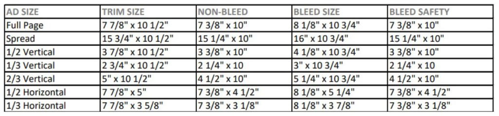
Figure 12. This is the kind of legacy sizing spec sheet you will encounter. Always read the rest of the spec, too!
The “Bleed Safety” column is there to tell the designer the maximum dimension for live (important) content, such as text, that must not be trimmed off. A little math tells you that this means you must keep everything important inside a 1/2-inch margin. The “Document Settings” text again conflicts, saying “Keep live matter 1/4-inch” inside trim dimensions on all sides.” In the Bad Old Days, trimming was often wildly imprecise, and a half-inch safety margin made sense. That isn’t the case today.
If you can’t figure it out (and sometimes it just isn’t possible), call or email and ask. Don’t just go ahead and hope for the best!
Pay attention to details like minimum tint (5% in this case), maximum ink coverage (300% is common), minimum rule/line weight, and other requirements. In other words, read the stuff carefully; you’ll save a lot of grief down the road.
Adjust layout
First, we’ll see whether Adjust Layout will work to create our full-bleed, full-page version.
Open the Adjust Layout dialog (File > Adjust Layout or Alt+Shift+P/Option+Shift+P) and enter 7.875 in for Width and 10.5 in for Height, which InDesign converts to picas automatically. Following the more modern-looking spec, use a quarter-inch margin (1p6) and one-eighth-inch bleed (0p9).
Be sure to turn off “Auto-adjust margins to page size changes,” but do enable Adjust Font Size. Figure 13 shows the completed dialog box.
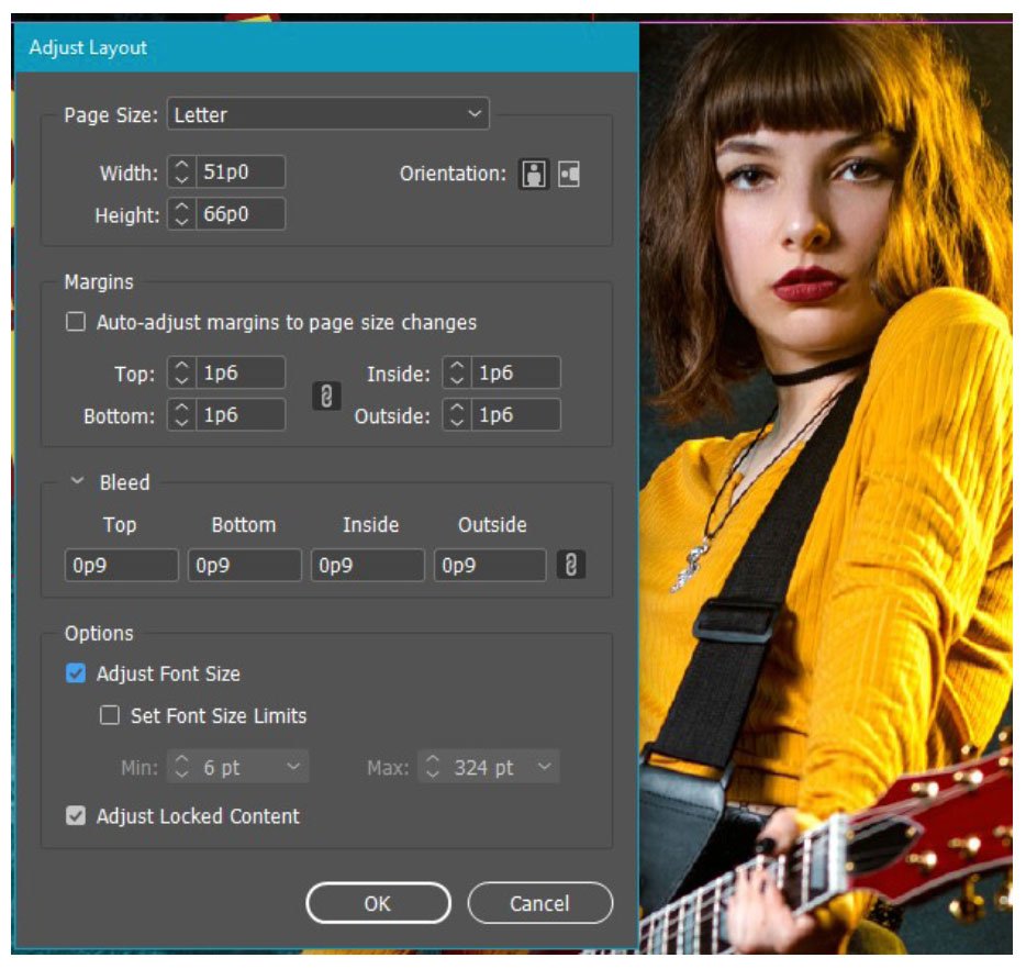
Figure 13. Adjust Layout quickly adjusts the document to the right size.
InDesign does a decent job of adjusting the size, bleed, and margins (Figure 14). Only the tour URL ends up overset, which is a quick, easy fix. The date and time text is a little outside the safety margin, needing only a quick nudge to bring it into bounds.

Figure 14. After applying Adjust Layout
To keep things organized, save the file as Bola Tour Magazines before going to the next step.
Alternate Layouts setup
We finished the full page with bleed, so now we’re going to create the half-page vertical and one-third-page horizontal layouts, both with bleed. This next part is tedious, but the good news is you only have to do it once.
Activate the Page tool (Shift+P) to see the Liquid Page Rule options on the Control panel. Switch the rule to Object-based, and turn on Objects Move with Page (Figure 15). As you click on each object on the page, InDesign displays affordances that allow you to pin or unpin the object from the page edges, as well as lock or unlock the object’s height and width. Hover over them to see the tooltips that describe their function.
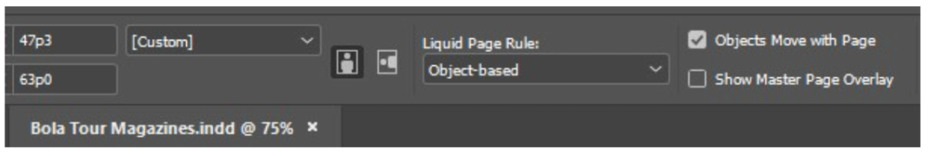
Figure 15. Liquid Layout settings in the Control panel
Unlock the width of the bottom text frames by clicking the green lock icon at the center of each one (Figure 16).

Figure 16. Unlock the Width or Height settings by clicking the lock icon.
Pin the Bola Live graphic to the left edge of the page by clicking the white dot to the left of the frame (Figure 17). Pin the record company logo and the URL text frame to the left and right edges, respectively, and to the bottom, in the same way.

Figure 17. Lock an item to a fixed distance from the edge of the page by selecting the tiny round affordances (not always easy).
You may find it tricky to pin the hero image to the right edge of the page, or the black background to both edges. InDesign doesn’t make it easy to do when an item stretches beyond the page edge into the bleed. Your main goal is to enable the frames to change width, so if you can do that much at least, it’s a win!
Make the first alternate layout
In the Pages panel, double-click the name Letter V and change it to Full Page (Figure 18). That’s not vital, but it keeps things neat. The first alternate layout we’ll make is the vertical half-page with bleed, which the Meredith specs tell us is 3 7/8 inches wide. All the other dimensions remain the same.
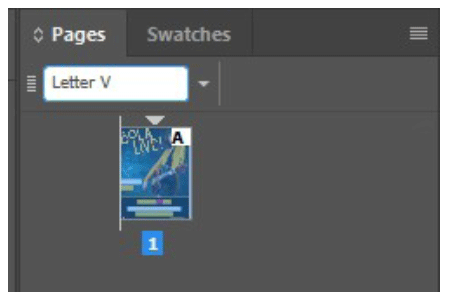
Figure 18. Click on the default Letter V name to change it to something more useful.
Click the disclosure triangle and choose Create Alternate Layout to bring up the dialog box. InDesign assumes we’re making a horizontal version of the layout, which we are not, so change the name from Custom H to Half Page. Be sure to switch the Orientation from horizontal back to vertical before you type 3.875 in into the width field.
Set the Liquid Page Rule field to Preserve Existing, and make sure that Link Stories and Copy Text Styles to New Style Group are selected. The complete settings are shown in Figure 19.
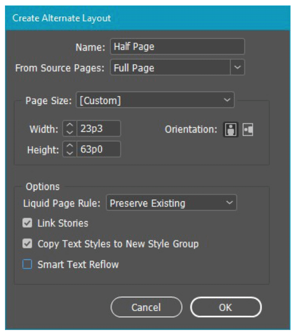
Figure 19. The Alternate Layout dialog box
When you click OK, InDesign does a number of things simultaneously: It creates a new section and page in the document, makes a master page for the new layout and applies it, creates two style groups in the Paragraph Styles and Character Styles panels named Full Page and Half Page (aren’t you glad you renamed the layouts?), and makes its best effort to shift page elements around to where we want.
As you can see in Figure 20, it doesn’t do a great job. Our work clearly isn’t finished! Besides rearranging things quite a bit, we must update the paragraph styles to match the new sizes. Figure 21 shows the completed layout between the Paragraph Styles and Pages panels.
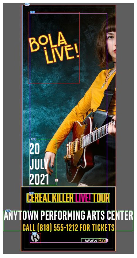
Figure 20. Alternate Layout does what it does.

Figure 21. The fixed-up alternate layout, with the Pages and Paragraph Styles panels showing the changes
Another alternate layout
Let’s go ahead and create the horizontal one-third page layout from the original full page, without making any other changes.
The result shown in Figure 22 is (and I’m trying be kind) not particularly useful. The only advantage we have immediately is that InDesign has given us another set of paragraph styles that we can modify. In the case of this layout, we have to do a lot more cleanup (almost a full redesign, really). Plus, the original photograph won’t work, and we must relink to a new image, using a landscape shot this time. You can see the result in Figure 23.

Figure 22. Alternate Layout doesn’t always handle vertical to horizontal very well, even though that was its original purpose.

Figure 23. The short and wide format calls for a different image, but all the text frames remain linked.
Where does that get us?
Our document now has three layouts, each in its own section with its own text styles. The text frames in the original full-page version are the master text for the set. Even though we’ve changed the positions and modified the paragraph styles in the alternates, they are still linked to the original.
That means if you change the date and venue information in the full-page layout, warning triangles immediately show up in the Links panel (Figure 24). A double-click on each of the warning triangles updates the linked text.
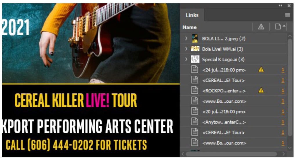
Figure 24. After you change text in the original layout, linked text frames show as modified in the Links panel.
You can modify and save this set of layouts for each performance.
A Better Way?
Alternate Layout has its uses but, as you’ve seen, its main virtue is that once you create a set of ads, you can update the text easily across all the layouts. To explore whether Adjust Layout is a better way to create multiple layouts in InDesign, let’s use a set of newspaper ads.
First, check the specs
Newspapers have their own way of allocating space and specs for advertising. Ads are very often bought and specified in “column inches.” A column is from about 1.5 to a little over 2 inches wide depending on the publication, so a “1 × 7” ad is 1 column wide and 7 inches tall. There is no need for bleed because none of these newspaper ads will be full-bleed layouts.
Make the ads
We’ll use Adjust Layout to make a set of color ads that will also work in regular black and white. The target publication uses a column width of 2 3/16 (2.1875) inches, and we’re going to set up 1 × 7 and 2 × 7 ads.
Our starting point is the 1 × 7 (7 column inches) layout in Figure 25.

Figure 25. A one-column by seven-inch (1 × 7) newspaper ad layout
Expanding that to 2 × 7 (14 column inches) should be an easy trick. All of the graphic frames have Auto-Fit turned on in the Control panel, so open the Adjust Layout dialog box (press Shift+Alt+P/Shift+Option+P) with the settings in Figure 26, which give us twice the width.
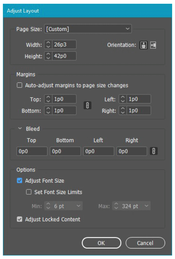
Figure 26. The Adjust Layout dialog box set up to make a double-wide layout with no bleed
The result is reasonable, though hardly perfect (Figure 27). After some adjustments, choose Save As to save the new 2 × 7 document.

Figure 27. As before, the result of Adjust Layout needs some manual adjustment.
Creating black-and-white versions
There are two approaches to creating grayscale production artwork: Make a separate set of grayscale artwork (the long route), or convert color to grayscale only when exporting to PDF (the shortcut).
The way to find out whether direct output to PDF will work is to set up a custom view for Proofing Colors. Select View > Proof Setup > Custom, as shown in Figure 28.

Figure 28. How to find the Custom Proof Setup dialog box
In the Device to Simulate field, scroll way down to find and choose one of the Dot Gain profiles (preferably the one that you verified with the publication, although Dot Gain 20% is usually a safe choice). Turn on Simulate Paper Color and Simulate Black Ink (Figure 29).

Figure 29. The Customize Proof dialog box correctly set for a 20% Dot Gain profile
InDesign immediately switches to your custom color preview (Figure 30).

Figure 30. The out-of-the-box grayscale is too dark, particularly in the artist’s face.
In this case, the photograph is too dark. You need to create a custom black-and-white version in Photoshop and relink it to the newly created PSD (Figure 31).

Figure 31. After a bit of treatment in Photoshop (InDesign’s favorite plug-in)
Note that making a custom black-and-white version of the image doesn’t necessarily mean having to track a new image! For example, in this case, we only added adjustment layers in the native PSD file—leaving the original image untouched. That way, you can use one PSD for all the layouts and use Object > Object Layer Options (Figure 32) to hide the black-and-white conversion except when you’re exporting to black-and-white PDF.
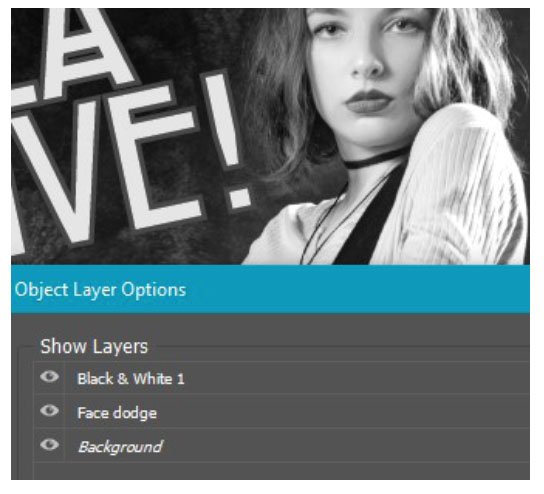
Figure 32. Object Layer Options allows you to turn the added Photoshop layers on or off as needed.
PDF export
To export your grayscale PDF directly from InDesign, open the Export dialog box (Ctrl/Command+E) and go to the Output options. In the Adobe PDF Preset menu, choose Press Quality or change Standard to None. Change the Color Conversion setting to plain Convert to Destination because you do not want to preserve numbers!
For Destination, select the Dot Gain profile you chose for proofing. (If it doesn’t show up in the list, check that you have correctly made all those other changes.) Figure 33 shows the dialog box with the Dot Gain 20% setting.

Figure 33. You must set the PDF output to the same dot-gain profile you set up for proofing.
If necessary, make any changes to the Marks and Bleeds options, then before you do anything else, click Save Preset in the bottom-left corner of the dialog box, give your preset a descriptive name, and save it.
Save Everything
Any time you’re creating production files for a magazine, an outdoor advertising provider, trade show vendor, or a newspaper, double-check their requirements before you submit the files. In fact, I recommend you go a step further: Create and save PDF Export presets for every publication and vendor you come across. Some kinds of advertising work can arrive with a very tight deadline (“The magazine deadline is tomorrow. Can you do it?”). If you already have a PDF preset matching that vendor’s spec, you have one less thing to worry about.
Adding It All Up
Adjust Layout is perfect for minor size and format changes, but using it to change from a vertical to a horizontal layout gives no better results than Alternate Layout. In both cases, you’re not going to save a whole lot of time creating a set of different layouts. Alternate Layouts does have the advantage of automatically linking text frames and creating dedicated style sets, which will help when, like in our concert example, you must make many versions of the same set of ads with minor changes to the copy.
As with any design work, advertising demands careful attention to publisher’s specs. If you are freelance or a small design shop and advertising work comes your way, one of the fastest ways to lose that business is to submit incorrectly formatted artwork or artwork that doesn’t match the vendor’s profile requirements. Either mistake causes a delay, and possibly the unforgivable sin: a missed publication deadline.
Organizing and keeping your assets and output files under control is vital, but is such an important topic that I couldn’t do it justice here. Some other time, perhaps!
Commenting is easier and faster when you're logged in!

Recommended for you

InDesign Magazine Turns 15
Addison Lalier takes a look back at 15 years of InDesign Magazine, with the peop...

The Type Project Book Excerpt: City Poster
See how to embrace your influences and borrow from them to make something totall...
InDesign Magazine Issue 109: Digital Asset Management
Issue 109 of InDesign Magazine include articles on digital asset management, col...