
Illustrator How-To: Creating Your own Chop

In Western culture, it’s common for an artist to sign or initial her name on pieces of original artwork. In Eastern culture, specifically Chinese, it’s customary for an artist to create a chop, an identifying symbol. Chops typically look something like the examples in figure 1. You may have seen them on antique Chinese prints, but they’re still used in China and Japan to this day. Individuals still pay artists handsomely for designing them their own special mark. There’s no reason you can’t design your own in Illustrator, though, as chops provide you with a unique way to mark your work.
Chop It Up
In this article, we’ll give you a little background history of the chop and how you can go about designing your own. Then we’ll show you the process of building a chop in Illustrator. Finally, we’ll tell you how you can turn your digital chop into a more traditional stamp.
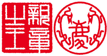
Figure 1: Chinese chops are beautiful representations of the person who created the artwork.
History of the Chop
In China, the chop has the same weight and authority as a signature does in Western culture. The use of a chop, or seal, started thousands of years ago and continues to this day. Chops are commonly seen on Chinese artwork, but they’re also used by everyday people to simply sign their checks or greeting cards. Artists use them not only to sign their work but also as a way to enhance it. A beautifully designed seal in the right place adds a special touch to the image.
Traditional vs. Non-Traditional
Depending on what sort of person you are, you may be interested in creating a more traditional Chinese chop with Chinese characters or perhaps just a design that’s representative of you. We’ll show you how to approach the design of your chop from both perspectives.
Translate accurately.If you want, you can have your name translated into Chinese sounds. This can be a bit dodgy because many Chinese characters sound the same but have significantly different meanings. A well-known example of this is when shopkeepers originally sold Coca-Cola in China; they chose random characters that sounded like Coca-Cola but actually translated to “bite the wax tadpole” and other oddities. Coca-Cola Corporation spent a long time developing its Chinese logo so it sounded appropriate but also meant something in relation to their product. What they came up with were characters that sound like Coca-Cola and literally mean, “to allow the mouth to be able to rejoice.”
If you’re interested in going this route, there’s a Web site that can help you generate the meaning of your name in sounds. To try it out, go to www.mandarintools.com. Here, you can enter your name and the site will generate a Chinese name that sounds as close as possible. As an alternative, you may want to seek out characters for words that have particular meaning to you. One way to do this is with sites like www.zhongwen.com, which is an excellent English-to-Chinese dictionary graphically represented online. You can simply enter words that are significant to you and you’ll be presented with the symbols, which you can then re-create in Illustrator.
But I’m not Chinese. Other designers may not want Chinese characters in their seals simply because they feel no connection to them, or they feel as if they’re appropriating aspects of another culture. If that’s the case, there’s no reason your chop has to contain Chinese characters. It can simply be a design that’s symbolic for you. In this case, we’ll use the author’s initials (GHC) to create a chop. In figure 2, you can see her signature created from simple lines and then how we extrapolated it to a simple design. To try it out, make a simple line drawing and then select all the objects. Then, to create the final look, outline the stroke by choosing Object > Path > Outline Stroke, which turns the paths into filled shapes.
To make the symbol more textured, you’ll apply the Roughen filter. Because the Roughen filter adds so many selection points, it can be hard to see exactly what your final result will be. Hiding edges will ensure that you get an unobstructed view. To get a good view, select your shapes and then choose View > Hide Edges. Finally, choose Filter > Distort > Roughen. In the resulting Roughen dialog box, choose settings based on how crinkled you want your text to look. Keep in mind that you can set the Size slider to a small percentage, such as less than 1 percent. Click OK when you’re done.

Figure 2: It’s easy to extrapolate a symbol from your own signature.
Making the Chop
Now that you’ve finished your initials, let’s make the chop shape in a similar manner. Most chops are either circular or square. Create a black circle or square, and then select your initial symbol and make it white. Next, click the Add To Shape Area button on the Pathfinder palette. Now, place your initial symbol on top of the circle or square. You may need to choose Object > Arrange > Bring To Front to get it on top of the base shape. That’s basically it, though you may want to apply the same Roughen settings to your circle or square. Once you have your shapes arranged, select both the initial symbol and base shape.
Adding texture. In real life, ink stamps have a texture and usually the ink coverage isn’t perfect. You can mimic these effects somewhat digitally since Illustrator supports transparency as well as various brush patterns.
To add some texture to your chop, select the Line Segment tool and draw some short lines on top of the chop. (In version 9, use the Pen tool to draw your lines.) Then select all the lines and set the stroke color to White. Finally, click on the Galaxy art brush in the Brushes palette to apply dots to the lines. (In version 9, select the Fire Ash art brush.) Now, move the lines around to position the spatters where you want them. You can see our results in figure 3.

Figure 3: In this close-up, you can see that adding a brush effect helps break up the solidity of the chop.
Finishing it up. With that, you’ve completed the design of your chop. Now, we have just a few finishing touches to complete the stamp and make it easy to use. In its present state, it’s easy to edit but won’t work well as a stamp. However, it’s good to keep a version in this state so you can go back and edit it in the future if necessary; so make a copy of your chop before continuing.
At this point, select all the brush strokes and then choose Object > Expand Appearance to turn your brush shapes into objects. Now, choose the Direct Selection tool and select the path the brush was applied to and select Object > Ungroup. Now you can delete the path. You can see what ours looks like in figure 4. It’s important to delete the path because it will mess up how the chop goes together in the next step.
Once you’ve converted all the brush strokes, select the entire chop copy and then click the Subtract From Shape Area button (Minus Front in version 9) in the Pathfinder palette. This Pathfinder command converts all the shapes into a single unit, which makes it easy to apply effects such as transparency. If you have a lot of points involved from using the brushes and Roughen filter, you may get a complex path warning. Usually, the Pathfinder command will still work; but if it doesn
‘t, simplify your chop by removing some of the texture or points. In version 10, click the Expand button on the Pathfinder palette to unify all of your shapes into one. This isn’t necessary in version 9.

Figure 4: Once you expand a brush, delete the stroke to which it was attached.
A little glow. Another nice effect you can apply to chops is an Inner Glow. To do so, choose Effect > Stylize > Inner Glow. In the resulting dialog box, select the Preview check box and then choose Multiply from the Mode pop-up menu. Adjust the Opacity setting to 100% and the Blur slider to 0.05 in. Finally, select the Edge option button and then click on the color chip to select your color. It’s best to select a darker version of your base color. Since a chop is traditionally red, these are the shades we’re working with. Once you’ve done that, click OK and your chop should look something like ours on the cover.
Real-Life Chops
If you really like your digital chop, you can get it made into a stamp as well. Real Chinese chops are usually carved out of soapstone or jade and then a durable red ink paste is used for stamping. It’s probably more practical to have your Illustrator work turned into a rubber stamp. Doing so is easy. Simply print out a version of your stamp minus the effects so that you have a solid black and white image of your work. Make it just the size you want so it’s camera ready. A stamp company can photograph your work and then make a plate and stamp to suit. This way you can use your same mark on your digital and traditional artwork. One thing to keep in mind for this sort of work is how thin your lines are. You might have to worry about excess ink causing the lines to fill in. Figure 5 shows our chop made into a stamp.

Figure 5: Get your chop made into a stamp for use on any of your traditional work.
On Your Mark
Chops are an interesting and creative device as well as a great way to sign your work digitally or stamp on more traditional work. They also make great informational graphics. In this article, we’ve shown you what you need to know to create them for any purpose.
This story is taken from “Inside Illustrator” (Element K Journals).
This article was last modified on July 18, 2023
This article was first published on December 6, 2002
Commenting is easier and faster when you're logged in!

Recommended for you

Image Source Partners with Fair Trade Photo Collection
Image Source, the world’s leading independent producer of royalty free sto...

Share My Screen missing in CS6
The File > Share My Screen option is missing in action in InDesign CS6. Here'...
CreativePro Tip of the Week: Drawing Instant Abstract Art in Illustrator
This CreativePro Tip of the Week on creating instant abstract art in Illustrator...