
How to Prepare and Preflight Ads in InDesign
Want the ad you’ve built in InDesign to soar? Preflight is the key!

This article appears in Issue 69 of InDesign Magazine.
If you work on publications, you know it can be maddening to receive that back cover ad right before your deadline, only to find out that it’s the wrong size, it has no bleeds, and the photos are low resolution. Here are a few tips for how to improve your chances of receiving ads that will be usable, and how to create ads that will pass preflight.
Garbage Out, Garbage In
As obvious as it sounds, the most effective thing you can do to ensure that the ads you receive will work in your publication is to give your advertisers the right specifications in the first place. Every publication, no matter how small, should have a media kit, even if it’s a one-page ad-rate PDF, that clearly identifies all of your requirements for the following categories:
Trim size
It’s unlikely that an ad was designed specifically for your publication. Advertisers frequently repurpose ads, so it’s common to receive ads that are built with the wrong trim size. Your spec sheet should clearly identify the size (and orientation!) for every size ad you offer. If ads that bleed are an option, you should list sizes both with and without the bleeds. The same goes for covers vs. interior page ads; some magazines require a clear space for the glue strip on the side nearest the spine, so an ad on the inside cover may be a slightly different size than one for the back cover. If you’re the one creating the ads, a best practice is to set the page size to match the trim size of the ad, rather than building an ad on a larger page and drawing crop marks. InDesign has long allowed multiple page sizes in one file, so there’s no reason to use a larger
page. If you type the dimensions in the Page Size field and let InDesign create the crop marks when exporting the PDF, both the ad size and the crop marks will always be accurate, and the production artist has the option to turn off the crops when placing your PDF.
Color space
Typically clients should submit ads as RGB or hexadecimal for digital use and CMYK for print (but not always; see the post Why You Should Import RGB Images Into InDesign and Convert to CMYK on Export). One of the most common errors I see is the use of spot colors in art and logos. Converting from RGB to CMYK for print usually doesn’t require going back to the client for approval, but converting a color from Pantone or other color matching libraries to CMYK or RGB can yield very different results. The same holds for converting anything to grayscale. Rather than run the risk of an unhappy customer, I always ask them to resubmit the ad using process colors, unless they specifically give the OK for me to convert them.
Resolution
People seem to have a really hard time understanding the concept that for print, you need 300 dpi at the final size, and that if you take a 300 dpi image and scale it up 200%, it becomes only 150 dpi. I see ads all the time with 72-dpi logos or photos copied from the web. Just because it looks OK on screen doesn’t mean it will look good in print. It’s the unenviable task of the desiger/production artist to explain to the advertiser that if they don’t redo the ad with a high-resolution image, it will look blurry and jaggy.
File formats
PDF is hands-down my preferred file format for print ads. Type comes out sharp, and you don’t need to supply fonts or linked images. And, when placing a PDF in InDesign, you can choose to include the trim only for a half-page ad, or the crop marks and bleed if it’s a full-page one (Figure 1). Accepting native application files (such as INDD, PSD, .AI, or even QXP, DOCX, or PPTX) is asking for trouble with all the different versions of applications and fonts in use today. For web ads, image formats (PNG, JPG) are usually preferred, but always check with your web production person.

Figure 1. When placing a PDF, you can choose whether to include bleeds, crops, or just the trim size.
Ink coverage
For print documents, you’ll want to ask your printer what the maximum ink coverage is for their press, and add this to your spec sheet. But don’t be surprised if the ad designer has never heard of this one!
How to See What’s Wrong and Fix It
Sadly, no matter how detailed your spec sheet is, a lot of advertisers will totally ignore it, so you will still have a lot of ads that are not up to print quality.
Use a dummy
There are several ways to preflight files with InDesign, but for ads, I find it best to use a multi-step approach. The first step is to use either InDesign’s built-in Preflight panel or a third-party app such as FlightCheck from Markzware, just to see if there are any problems. InDesign’s Preflight panel will show you everything about the entire publication, but that’s a lot of information to wade through if you just want to see the info about one ad. It’s easier to place the ad by itself into a new document, so you see the errors only in the ad. Typically, I make a copy of the publication file, delete all of the pages, and insert a new blank page, so that the parent page margins and guides match the live document. If the ad is a raster image file, you can customize the Links panel to show you what you need to know (Figure 2). However, the Links panel cannot parse the resolution or color space of images within a PDF or AI file. The solution? Set up a custom preflight profile, and the InDesign Preflight panel will tell you whether there are errors in the PDF (Figure 3). If your dummy doc is based on the live file, you can easily see if the ad is the correct size by just placing it at 100% size into the type of page where it is supposed to appear. This is easier than opening it in Acrobat or its native app and looking up the size. If it is supposed to bleed, be sure to include the bleeds when placing the PDF.

Figure 2. For raster image files, you can customize your Links panel to show the color space, original resolution, scaling percentage, and effective resolution.
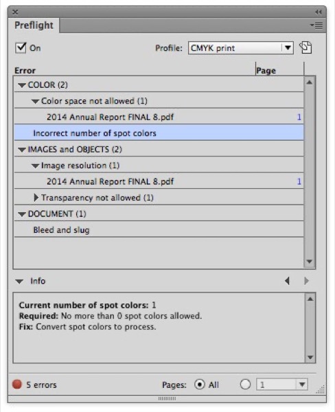
Figure 3. If you create a custom preflight profile (this one is for CMYK print), InDesign’s Preflight panel will show you what kinds of errors there are in a placed PDF or AI file.
The ad failed; now what?
If no errors are flagged, chances are the ad will be fine. If the placed ad fails the preliminary test, all you may know is that your ad has something in it that is low-res or uses a spot color. This could be enough to ask the advertiser to resubmit it, but I find that I get better results if I can tell them exactly what the problem is and how to fix it. For ads that are built in InDesign, the Preflight panel will tell you exactly where each low-res image is, and allow you to navigate right to the problem (Figure 4).
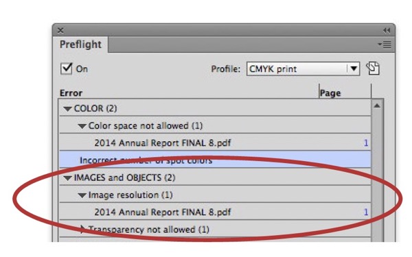
Figure 4. In the Preflight panel, click the disclosure triangles to reveal specific problem images, and then navigate to them by clicking the page number or double-clicking the image name.
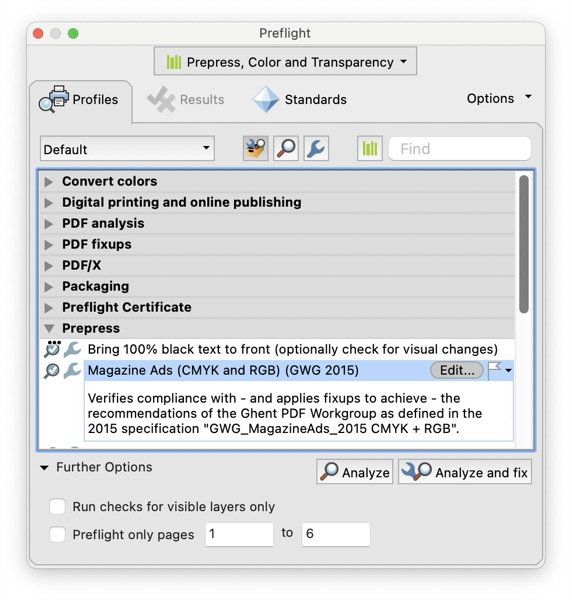
Figure 5. Acrobat Pro has sophisticated preflight tools with presets for many common types of presses.

Figure 6. Acrobat Pro lists each item that contains an error.
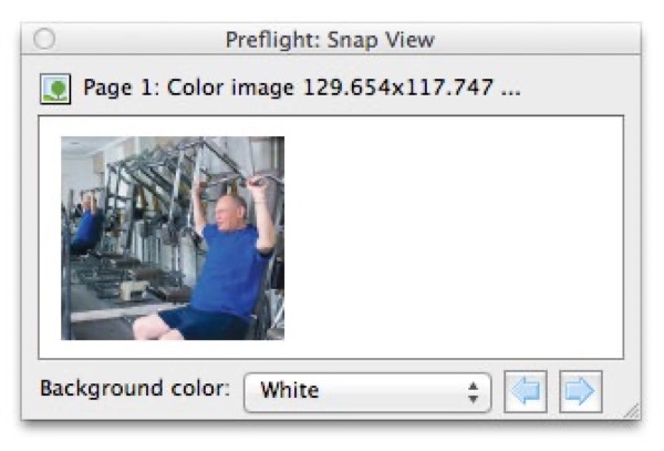
Figure 7. The Snap view identifies the problem image.
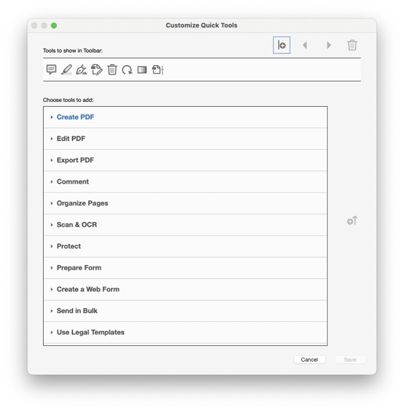
Figure 8. Customize your Acrobat Pro toolbar with the tools you use most often. Press Cmd/Ctrl and click on the toolbar, then select Customize Quick Tools from the menu.

Figure 9. Previewing color separations in Acrobat Pro
Commenting is easier and faster when you're logged in!

Recommended for you

InDesign Magazine Issue 136: Advertising
We’re happy to announce that InDesign Magazine Issue #136 (August 2020) is now a...

Ensuring Objects Bleed off the Page Properly
Are all the questions on the Adobe InDesign ACE practice test fair? Let's look a...

InDesign Magazine Issue 144: Stealing Great Design
Issue 144 has articles on stealing great design, designing with rules, borders,...