How to Make a Rippling Flag in Photoshop
How to make a realistic flag on any background with the design of your choice.

It’s easy to find flat flag artwork online. But it’s not so easy to find images of rippling flags, especially shot against the background you want. Fortunately, you can use Photoshop to create a multi-purpose rippling flag, and then replace the design with the flag of your choice. Pretty cool, right? So let’s see how it’s done.
1. The initial setup
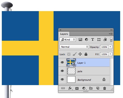
Here’s our starting image: a flagpole and a flag, on separate layers. I’ve chosen the flag of Sweden to begin with, because it’s a simple design that will allow us to see the distortion and shading process clearly. We can change the design to whatever we want later.

2. Make a Smart Object
Before you start distorting, turn the flag into a Smart Object. You can do this by choosing Layer > Smart Objects > Make Smart Object. You won’t see any initial difference, other than the fact that the icon in the Layers panel now sports a tiny Smart Object logo in the bottom right corner.
3. Enter Free Transform
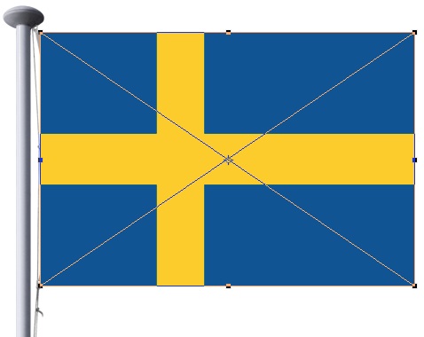
Use Command T/Ctrl T to enter Free Transform mode, and adjust the size of the flag so it fits onto the existing tape attached to the flagpole. Don’t perform any more distortions yet. All we’re interested in here is the approximate size.
4. Switch to Image Warp
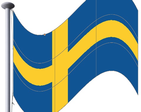
Press the Image Warp button on the Options Bar, and choose—naturally enough—Flag as the distortion preset from the pop-up menu (the menu will default to reading Custom). The initial effect is a little extreme, but it’s
a start.
5. Modify the distortion
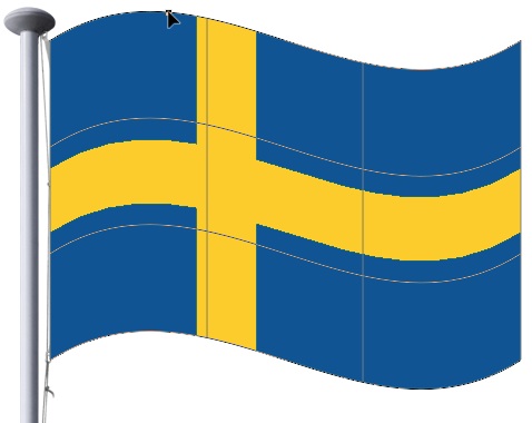
There’s only one handle on the Flag distortion, about a third of the way along the top edge. Grab it and drag it to create a more traditional flag shape. You can choose to wave it up or down; I’ve chosen to go up first.
6. Switch to Custom
From the pop-up menu in the Options Bar, change the type from Flag back to Custom. The shape itself won’t change, but you’ll now have access to all the control handles.

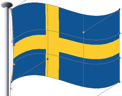
7. Fit the tape
The flag needs to be adjusted so the left side matches the tape that’s already attached to the pole. Drag the adjustment handles until it fits the shape. It doesn’t need to be exact.
8. Ripple the flag
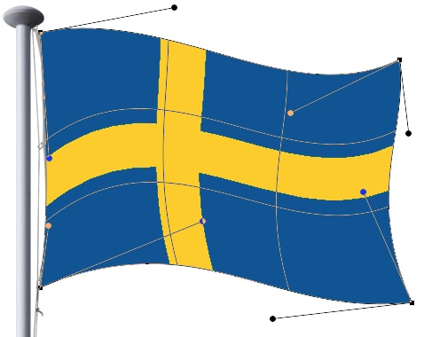
Now it’s time to adjust the rest of the flag so it’s waving more effectively. You can drag the handles, or the corner points, or the four interior intersections in Image Warp to move it around. Try to make it look less stiff by waving the edges in a more realistic, organic way. When you’re satisfied, hit Enter.
9. Load the selection
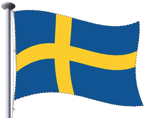
With the basic shape done, you can move on to the shading section. First, load up the pixels in the flag as a selection, by holding Command (Mac) or Ctrl (Windows) and clicking on the thumbnail of the flag in the Layers Panel. You’ll see the familiar “marching ants” border appear.
10. Make a Hard Light layer
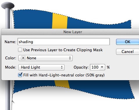
Make a new layer and set its mode to Hard Light. Also, check the box marked Fill with Hard-Light-Neutral color. This fills the layer with 50% gray, which is invisible in Hard Light mode.
11. Invert the selection
With the selection still active, use Select > Modify > Inverse so that everything except the flag area is selected, and hit Backspace to delete it. You won’t see any difference to the artwork, but the Layers panel should now show the shading area to match the flag shape.

12. Lock the transparency
On the Hard Light layer, check the first icon next to the word Lock. This locks the transparency, so that no painting or smudging operation can extend outside the bounds of the pixels already present on the layer. This will be very useful later.
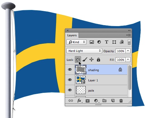
13. Start the shading
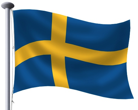
Switch to the Burn tool, set to Highlights at 100% opacity. Using a soft-edged brush, drag from the top left of the flag to the top right, performing a loop downwards in between.

14. Add more loops
Continue to work around the flag, adding more loops with the Burn tool below and above the original. In the corners, just match the direction and shape of the original loops.
15. Dodge the shadows
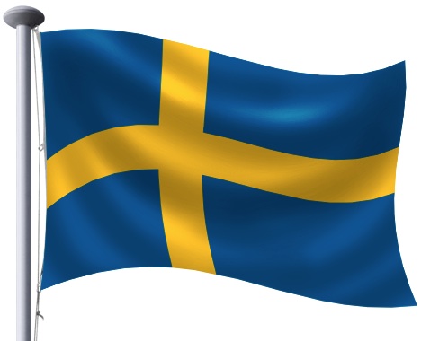
The Burn tool darkens the image; the Dodge tool brightens it. You can hold Alt or Option to temporarily access the Dodge tool. Drag another loop just above the original Burn loop, to add the highlight to the flag.
16. Keep on Dodging
Continue to add highlights above each fold. You should set the Dodge tool to about 50% strength, to avoid burning the gray of the Hard Light layer to pure white.
17. Smudge those folds
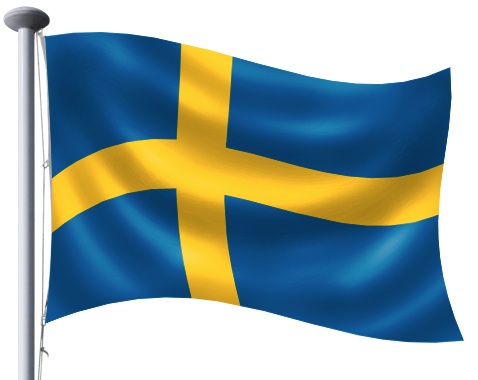
The folds created so far can look a little lumpy. So use the Smudge tool to smear the ends into more precise, tighter folds. Use a small brush, with a strength of around 90% for best results.
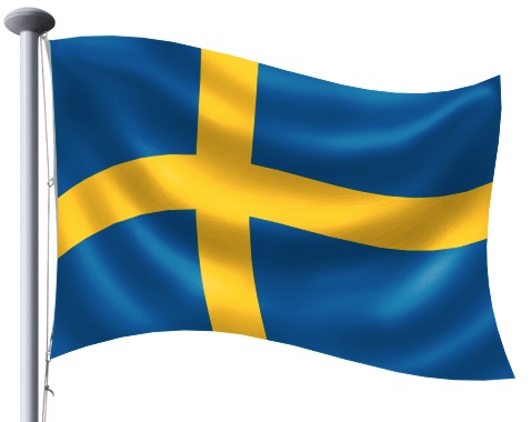
18. Keep on Smudging
Continued use of the Smudge tool can turn that coarse shading into something altogether more appealing. The good thing about the Smudge tool is that you can keep working away until you’re happy with the result.

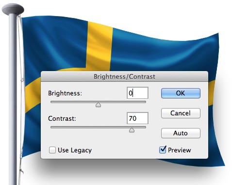
19. Increase the contrast
Depending on how much you darkened and brightened the image with Dodge and Burn, you may find it looks a little washed out. Use the Brightness/Contrast adjustment if desired to boost the contrast for a more dynamic look.
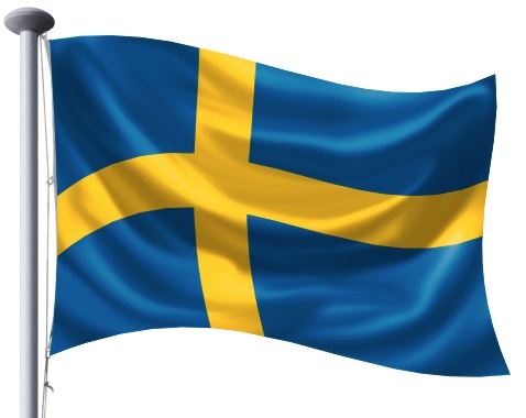
20. The finished flag
Here’s the result of the work so far. The flat artwork we started with now looks much more like a real rippling flag—so much so that you barely notice that the design of the flag itself isn’t really rippling.
21. Open the Smart Object
We’ve finished with the Swedish flag, so let’s replace it. Double-click the flag layer in the Layers panel and, because it’s a Smart Object, it will open in a new window.

22. Replace the contents
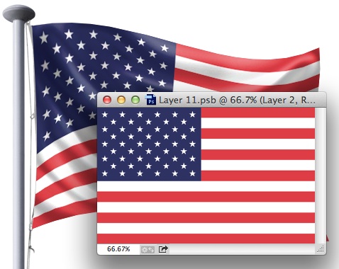
You can paste any flag you want into this window. Here, I’ve added the Stars and Stripes, and resized the flag so it fits the original dimensions.
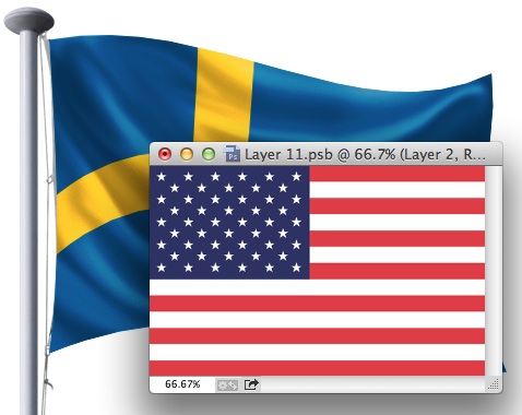
23. Save the Smart Object
Choose Save and the contents of the Smart Object window will be saved back into the artwork, replacing the original flag. You can also simply close the Smart Object window, and you’ll be prompted to save it.
24. Adjust the distortion
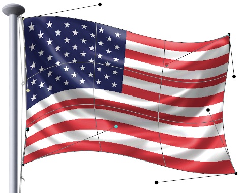
When we view the Stars and Stripes, though, it appears that the Stars box on the left is too distorted. It’s too high compared with the stripes beneath it. Fortunately, we can fix that. Because it’s a Smart Object, choosing Free Transform and clicking the Image Warp button will return us to the state of the image as we left it, with all the control handles in place.
25. Complete the adjustment
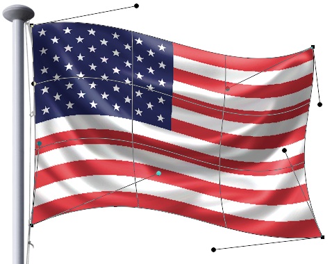
It’s now an easy matter to drag those handles on the left, to change the flag’s distortion so that it better matches the flagpole.
26. Add a background
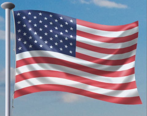
With a background added, the flag looks much more realistic. Here, I’ve also reduced the opacity of the flag to 80% to allow a little of the background color to show through, which produces an even more convincing effect.
Commenting is easier and faster when you're logged in!
Recommended for you
Scanning Around with Gene: The Joke's on You
Before Hollywood brats got “Punk’d,” and before political oppo...

Illustrator CC 2018 New Features
Adobe Illustrator CC 2018 brings several exciting enhancements, including Variab...

Fill Live Text With Any Image in InDesign
Mike Rankin shares the trick for filling live text with any color, pattern, or p...


