
Graphs and charts help tell stories with data. You can easily compare values and see trends when numeric data are presented as a graph. Illustrator has a nifty feature that can turn plain graphs into more engaging infographics with images that you can construct easily in just a few steps.
The Starting Point
To graph your data in Illustrator, click the Column Graph tool (keyboard shortcut “j”) in the Toolbar. You can click and hold on the tool to reveal all the graph styles and tear off the tool palette to make it a floating toolbar. The techniques in this article work for Column and Bar graphs.

With the Column Graph tool selected, click your artboard to specify dimensions for a graph, or drag out a rectangle to define it manually. You are now ready to add data by typing into the cells.

A single row of numbers will work as a starting point. For category labels, place the data in columns, with the leftmost column for labels and column 2 for numbers.
Click the checkmark in the upper right-hand corner of the graph data window and your graph will update. Initially, its appearance is very basic – let’s kick it up a notch!
Creating a Graph Design
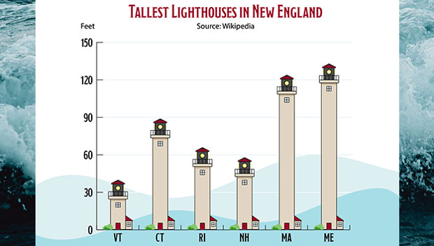
Let’s suppose that you’re graphing data about houses. Instead of plain bars, you could apply house icons, each representing a portion of the data. Draw a simple house shape similar to this:

Group all the elements of your house by selecting Object > Group or using Cmd/Ctrl-G. and keep the selection active. Now choose Object > Graph > Design… and click New Design. You now have a custom building-block for bar and column graphs. While the Graph Design dialog box is open, click Rename to give your design a unique moniker. Each graph design element you add will be saved with your document.
To use the design, click on your graph with the Selection Tool. Now select Object > Graph > Columns… and choose the new design element.
You can experiment with the various Column Type options, though you will have to click OK to see the results, as there’s no preview option. For a design element like the one above, Stacking works well.

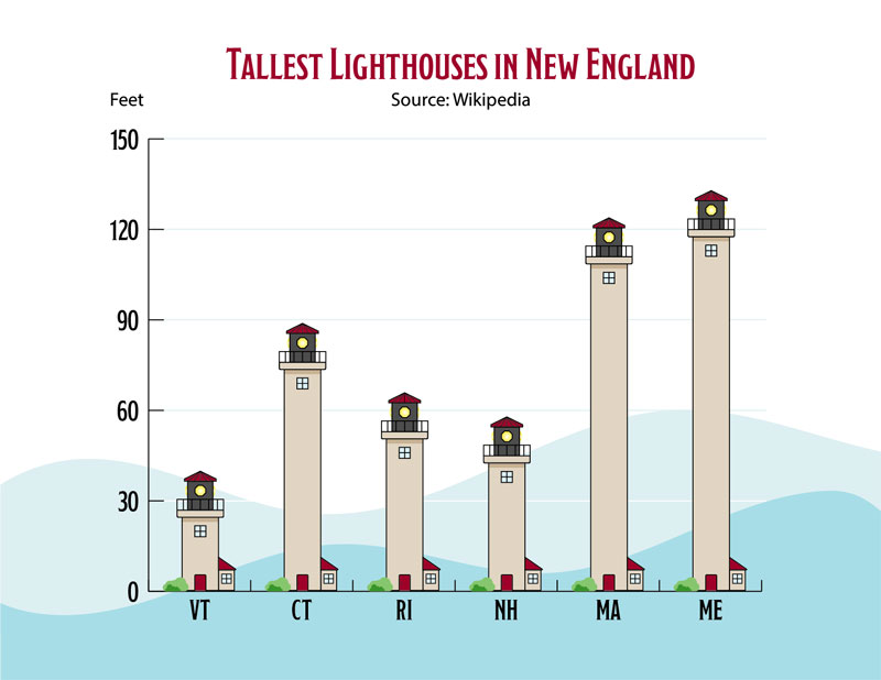
Make the Design Element Stretch to Match the Data
You can make the graph even more compelling with a purpose-built sliding design element. A sliding element grows and shrinks from the center while maintaining the right proportions at either end. To make it work, simply add a guide across the artwork.

Unlock the guides by choosing View > Guides > Unlock Guides. Then select both the artwork and the guide, and as before, choose Object > Graph > Design… to create a new graph design.
Now with the graph selected you can choose Object > Graph > Columns or right-click the graph and select Columns from the contextual menu. Next choose the design and the Sliding option from the Column Type drop-down menu. You just turned a plain graph into an engaging infographic!
Use Your Artwork on a Bar Graph
Use the Bar Graph tool to create a new graph, or select an existing column graph, and choose Object > Graph > Type… to change it into a horizontal bar graph. Any sliding graph design elements that you created in a vertical orientation will work properly.

You can customize individual bars or columns in your graphs, for example by altering their colors. Use the Group Selection tool, found in the toolbar when you click and hold the Direct Selection tool, or by holding the Alt/Option key while using Direct Selection. You may have to click a column two or three times to select the entire design element. Choose Edit > Edit Colors > Recolor Artwork… to change the selected element’s colors.
This article was last modified on August 9, 2021
This article was first published on March 29, 2021
Commenting is easier and faster when you're logged in!

Recommended for you

Work Week Projects: File-Handling Features in Adobe Bridge
Five quick exercises to do while you're at work to learn important skills in Ill...

CreativePro Video: Using Illustrator’s Shaper Tool
In this week’s CreativePro video, Michael Ninness demonstrates the power of Illu...

How to Selectively Recolor Your Artwork in Illustrator
Learn how to recolor artwork quickly in Illustrator by selecting objects with th...