

As an Illustrator user, you have access to the entire Creative Cloud font library: thousands of typefaces you can use in your designs. Display fonts with bold, heavy letters can act as a canvas for ornamentation. Using the Appearance panel, you can make plain type stand out.
19th century woodcut letters are the inspiration for this tutorial. Here’s an example of display lettering printed in two colors:

The Starting Point
With the Type tool selected, click on your artboard and type out a few lines of text. Now choose Window > Type > Character and click on the Font Family field in the panel. Choose a heavy display font.
To help you find a suitable typeface, use the Filter controls. Click the downward dropdown menu control on the right-hand side of the Font Family field. Then click the filter icon in the upper left-hand corner. You can choose various classifications and properties, such as Slab Serif and Heavy Weight to narrow the selections in the drop-down font menu.

A heavy font like Superclarendon Black at a size of 48 points will work well for colorful ornamentation.
Creating the Offset Shadow
With your text selected you’re ready to work in the Appearance panel, so make sure it’s visible by choosing Window > Appearance.
Start by adding a stroke and fill. Click on the Add New Stroke icon in the bottom left corner of the panel.

Both a stroke and a fill are added to the Type object. Target the fill and change it from none to a color other than black, that will help you visualize the next step more.
The new stroke you just added will be at the top of the appearance stack by default. Drag it below the fill. Make the stroke black and give it a heavy weight of 6 – 8 points.
Do you notice that the word “Stroke” in the panel is underlined? Click this and you can change the stroke’s characteristics. Adjust the Cap and Corner styles to your liking. Reducing the miter limit to 2 can prevent random spikes from appearing.
Now you’re ready to move the stroke to turn it into an offset block shadow. At the bottom of the Appearance panel click the fx button to add a new effect. Choose Distort & Transform > Transform… Adjust the Move sliders to offset the path horizontally and vertically to a position that makes it look like a shadow.

Make a Striped Fill
Add a new fill in the Appearance panel, and position it at the top, above the current fill. To make this distinctive, you can select a pattern swatch instead of a color. In the example shown here I opted for a simple stripe pattern that’s included with Illustrator. To find and load this pattern, you need not leave the Appearance panel. Click the dropdown arrow on the new Fill, and then use the flyout menu.

Choose Open Swatch Library > Patterns > Basic Graphics > Basic Graphics_Lines. The new pattern swatch library will open in its own panel. Click on a swatch in this panel to apply it.
With the fill still selected add another Transform effect. As before, click the fx menu in the panel and choose Distort & Transform > Transform…. Adjust the pattern size by unchecking Transform Objects, then move the Scale sliders until you’re satisfied with how the pattern appears.
To change the color of the pattern, double-click it in the Swatches panel. At this point, you’ve entered Pattern Editing mode; select elements in the pattern with the Direct Selection tool and change their color. Click Done in the gray bar at the top of the window, and your design will update with the changes.
Add an Inner Separator Border
Adding a white stroke will complete the appearance of your text. White separator borders were often added to woodcut letters to make applying the different colored inks easier. Add a new stroke to your text in the Appearance panel. Make it white – the color of your artboard – and drag it to the top of the panel. Adjust the weight to suit the size of your letters. Avoid making this stroke too heavy so it won’t cut into the letter shapes and distort them.

Save Your New Woodcut Letter Appearance
You can continue to adjust the parameters in the Appearance panel for each fill and stroke until you’re satisfied with the results. Once you a achieve a look you like, drag the text object into the Graphic Styles panel (Choose Window > Graphic Styles to show it, if necessary) and give it a name. You can apply this woodcut look to any text or objects in your design.
Here’s a look at the Appearance panel with all of the strokes and fills for our woodcut lettering effect.

This article was last modified on July 29, 2022
This article was first published on June 24, 2021
Commenting is easier and faster when you're logged in!

Recommended for you
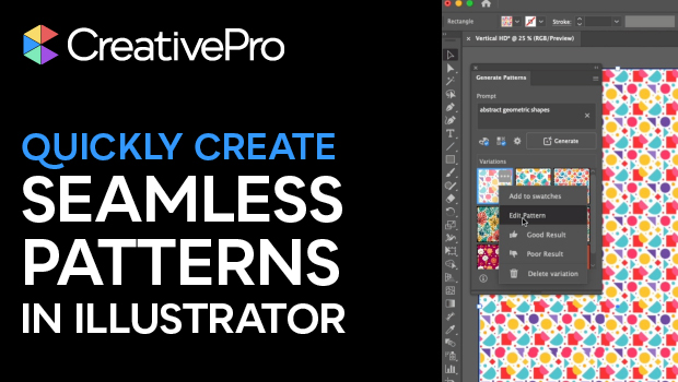
Generating Seamless—and Editable—Patterns in Illustrator
Learn how to create a seamless pattern with Illustrator’s built-in AI and then m...

Switching Between Composers with Keyboard Shortcuts in InDesign and Illustrator
Illustrator has a built-in shortcut to switch between composition methods, an id...
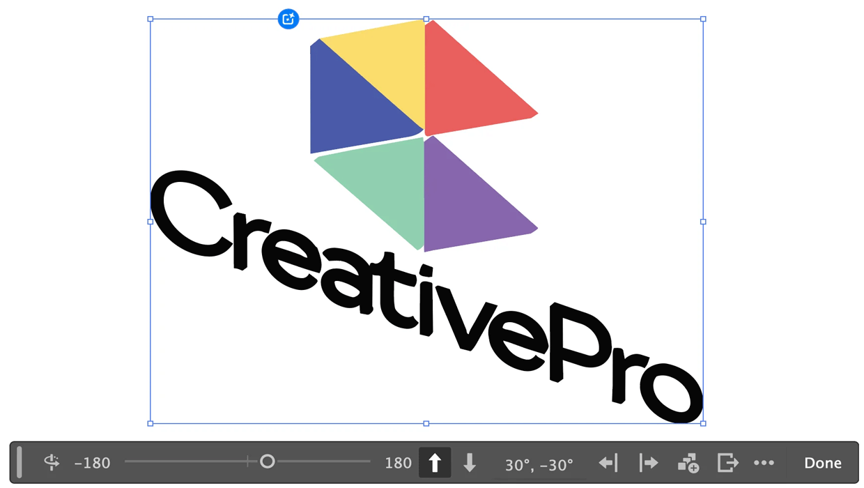
Rotating Objects in Illustrator Using Turntable
Generate vector objects from a variety of angles with the help of AI