

Images that contain type make frequent appearances on websites and blogs, ebooks, smart phones, emails, and other digital media. Whether you are a print designer, a business owner with a website, a corporate marketing person, or just someone who has a blog, knowing how to create and supply images for uploading is critical. Even web masters, programmers, and creative directors (who rarely get that involved in a website’s production) need to stay current on what kind of image to upload to appear sharp and crisp on today’s array of devices, specifically retina displays and other hi-res technology. I have seen too many web sites and other digital media with inappropriate low-res images, which are poor quality, hard to read, as well as amateurish.
Prior to the availability of high-res monitors, smartphones, e-readers, and the like, the standard “deliverable” for digital images, has been a GIF, JPG, or PNG at 72 ppi (pixels per inch) resolution at the exact, required dimensions in pixels. In spite of this, and even before today’s higher-res devices, it is easy to find websites and other digital media with fuzzy, hard-to-read logos and other images with type. Some have clearly been enlarged from a smaller image supplied by a client.
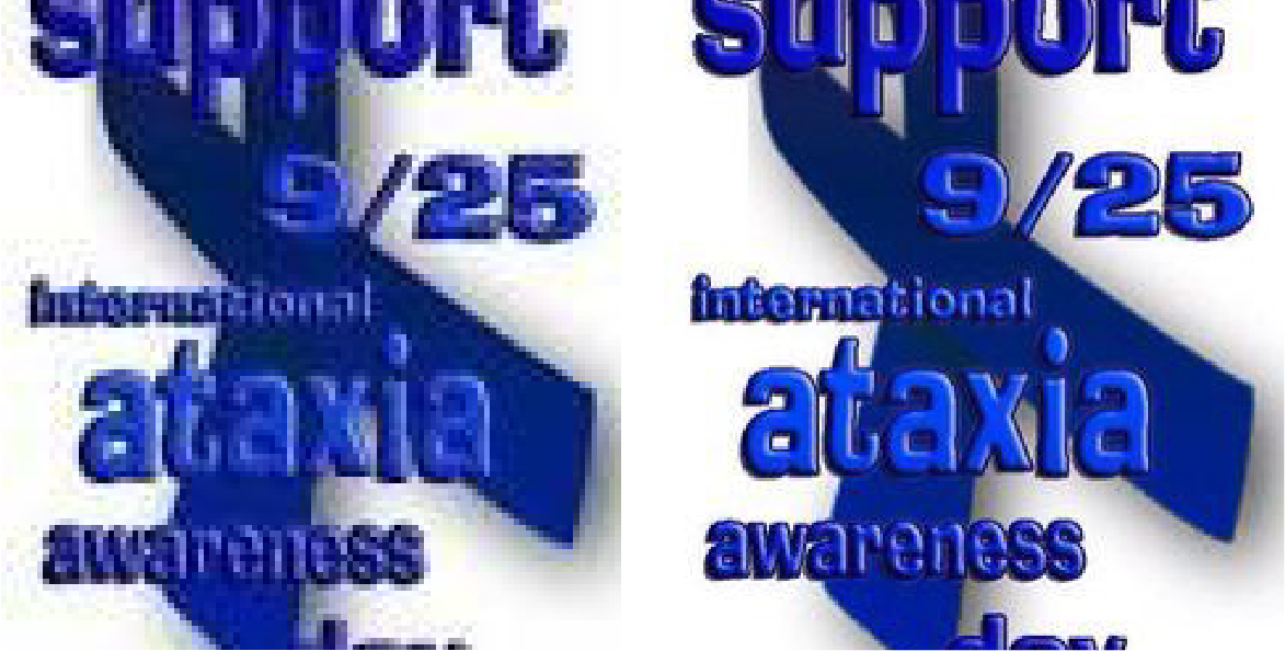
I found the image on the left on the web, at this size. It clearly is poor quality, and possibly was enlarged from a much smaller image. In my search for a sharper version, I was able to find the one on the right, which is better, but still not as sharp as it should be. To avoid this, always go back to the designer to get original art when making a new image.
With the development of so many hi-res devices and monitors, there is an opportunity for viewers to see crisper, sharper images, which is especially beneficial for those containing type – especially small type.
But you also don’t want to repeatedly use images that are too large because they will cause your web pages to load slowly, frustrating your viewers (or causing them to leave). Web pages that load slower are also penalized by appearing lower in Google search rankings. So you have to try to strike a balance between the quality that your audience expects, and the time it takes to deliver that quality over the internet.
Which format to use?
Each file format has different characteristics and rendering capabilities, but many of their differences are subtle in certain kinds of images. Even so, it is a good idea to know the differences when making images for digital media. Although the focus of this article is on images with type, text can appear with photos, illustrations, or any other kind of graphic, so the format needs to work with everything.
GIF (Graphics Interchange Format): Maximum 256 predetermined colors, good for flat images with solid colors, and when you want to keep the file size small. Largely replaced by PNG.
JPG, or JPEG (Joint Photographic Experts Group): Millions of colors, good for images with photographs and gradients.
PNG-8 (Portable Network Graphics): Maximum 256 colors, similar to GIFs.
PNG-24: Unlimited colors, also reproduces transparency. PNGs are beginning to replace GIFs and JPGs.
SVG (Scalable Vector Graphics): Vector format, not bitmap as all of the above. This advanced format requires more backend work to use as it needs to be coded and embedded into the HTML. Stay away from this unless you are working with an experienced web programmer. More info on SVG images can be found here.
Some clients or environments require a specific format and maximum size. If this is the case, go ahead and create what is asked for. But if it is up to you, play around and use whichever gives you the best results.
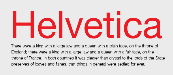
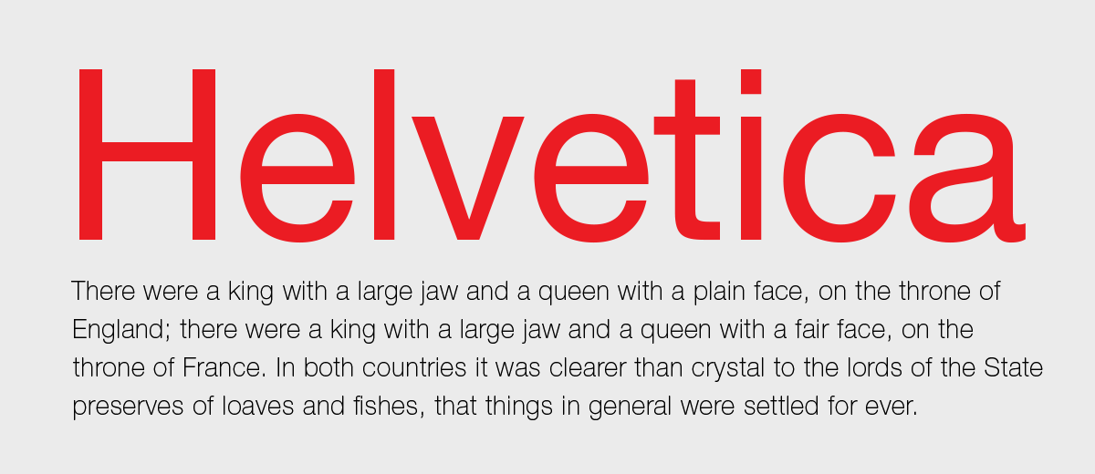
Here is a sampling of how different formats and sizes can affect the quality of an image, including the sharpness of the edges and the smoothness of the color blends. All images were created at 72 resolution, or ppi (pixels per inch).

When combining type with an image, the format needs to be right for both. GIF is a poor choice for this 600 px image, as there are not enough colors to create a sharp, crisp image with smooth color blends, for both the photo and the type. You can see the quality suffers, especially the sky.
This 600 px JPG looks much better, as does the PNG below. In fact, they are identical to the average eye.


The PNG-8 format is not good for this image either, as there are not enough colors to represent the entire image sharply and smoothly.

This PNG-24 file was created 2x up at 1200 px wide, as recommended, and it is much sharper for hi-res devices. If you click on it, it looks even better.

Enlarging a 600 px image to 1200 just makes it worse, so never scale up a pixelated format.
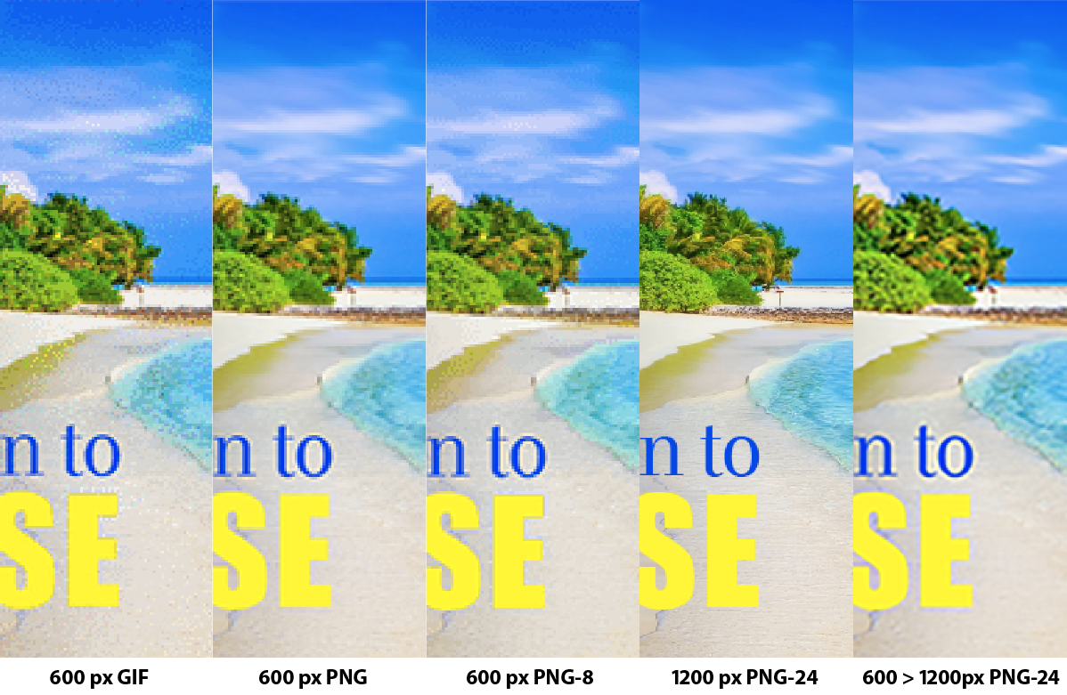
This is an enlarged comparison of these formats. (Click on it to see it better.)
How to convert images
If your primary concern is quality and not search engine rankings (or bandwidth cost) I suggest making the image at least 2x the final desired size in pixels (if possible based on the size of the original). This will allow those with hi-res displays to see the image much sharper, which is particularly important for type. For instance, I received an email for the CA Typography Competition with a graphic that is 1200 pixels wide.

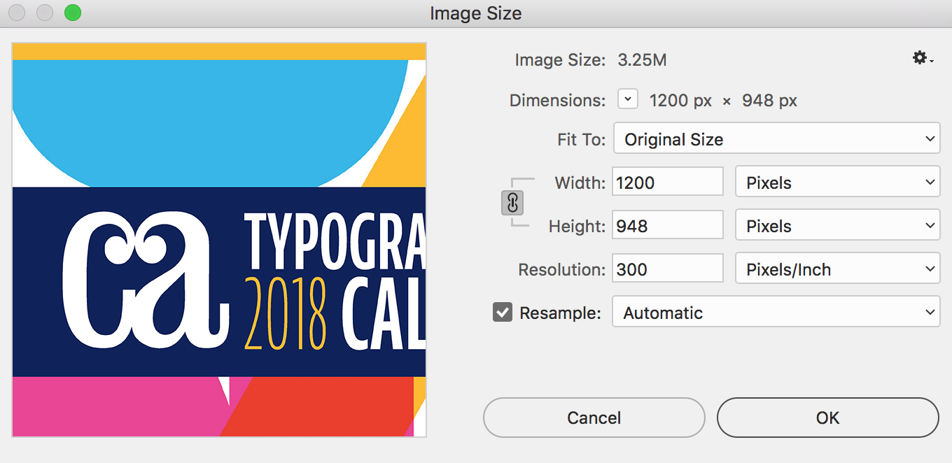
I received an email with the top image. When I opened it in Photoshop (below it), I found it was 1200 px wide. There is nothing wrong with this as it ensures the image will be sharp on all devices, as long as bandwidth is not a concern.
Here’s another example.
This image was created for this exact size, 600 px. It will not look sharp on hi-res devices.
This image was created at 1200 px wide. It looks much sharper on many modern displays.
Dos and Don’ts
- Try to strike a balance between the quality your audience expects, and the costs of larger file sizes in terms of bandwidth and search engine rankings.
- Never make an image smaller than the largest size you might need. In other words, always prepare for the largest possible size and highest resolution.
- Never enlarge an existing web image.
- If an image with small, detailed type will be clickable, go even larger.
- Never use a low-res image for print. (I have seen dozens of print ads using the low-res images from their web site and such.)
Keep in mind that many designers, web programmers, and anyone who has a blog or manages their own site might not be aware that they should be making or supplying all images to accommodate hi-res devices. For the best final outcome, it makes sense for all people involved in the process be aware of this, and as such, be informed of the guidelines above.
This article was last modified on January 16, 2023
This article was first published on August 16, 2017
Commenting is easier and faster when you're logged in!

Recommended for you
Presenting Anisette, the Typeface with Three Sets of Caps
Anisette, designed by Jean François Porchez of Typofonderie in France, is not a...

TypeTalk: Hyphens at Your Discretion
TypeTalk is a regular blog on typography. Post your questions and comments by cl...
TypeTalk: Standard and Discretionary Ligatures
Q. What exactly is a ligature, and what is the difference between a standard and...