
After a disastrous experience last year with a Tofurky (yes, it’s a fake turkey made out of tofu), my wife and I decided this year to go the traditional Thanksgiving route. So out came the cookbook collection along with other food-related ephemera, and thus begins another look at graphics from the past. Be sure to read this after a big meal, though, as I wouldn’t want to spoil any appetites.
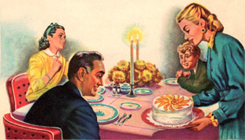
Figure 1: There’s nothing like a good meal to bring the family together.
Modern photography, production and printing techniques have lulled us into a world where food actually looks appetizing most of the time, and if anything, the reality of the dish is vastly inferior to the image in the cookbook or advertisement. But that wasn’t always the case. For years I thought past generations simply endured strangely colored, fake-looking, and rather unappetizing food. But it turns out the food wasn’t really at fault — the production technologies of the time were most inadequate when trying to show the texture, color, and subtlety of fine cooking. After browsing through the rather stark graphics in many of our older cookbooks, I wonder why anyone back then even bothered.
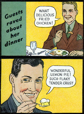
Figure 2: In this 1952 graphic from the makers of Spry vegetable shortening, people are raving about the cooking, so I know some food actually tasted good back then.
In my own home growing up, the food actually did look colorless and lifeless, and I’m not sure I could find reproduction methods poor enough to capture that special something about my mom’s fried chicken gizzards. The only food with color in my house was that which was made out of Jell-o, and even then my mom could turn vibrant cherry flavor into a pale pink roughly the color of diseased lung tissue.

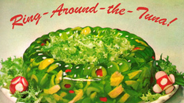
Figure 3: There’s always room for Jell-o, and who doesn’t want to run a ring around their tuna?

Figure 4: Pantone would have to invent a 12-color process to capture the exact colors that irradiate from a mound of Sea Dream, pictured here in one of the early versions of Joys of Jell-o, date unknown.
It’s hard sometimes to know why these pictures and artwork did such a poor job of whetting the appetite. Some of it was certainly the limits of color photography, and much of it had to do with poor color separation methods of the time. But some of it stems from the food items themselves, especially during the ’50s era of day-glow cheese products and Red Dye Number 2.
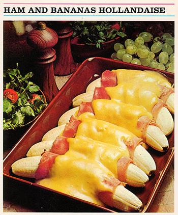
Figure 5: Ham and Bananas Hollandaise is the ultimate test of color management, as shown here in 1973.
In some cases, as in meat products, bad reproduction tends to be scary. But for other items, like fluffy pastel desserts, color shift and high-contrast halftones create an even more appealing picture. Some food items in early dessert cookbooks look rather psychedelic, sure to generate at least a sugar rush.

Figure 6: If Barbie made desserts, they might just be as fanciful as these colorful cakes from a 1966 Betty Crocker cookbook.
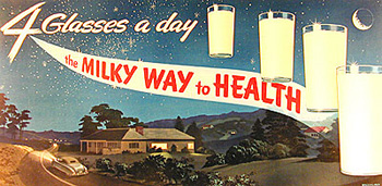
Figure 7: Milk gets in your eyes, if you happen to be gazing into the clear summer night of this fifties-era promotion from the California Dairy Industry Advisory Board. Painted by someone named Macquillard.
In the ’50s there seemed to be a brief period where housewives wanted their food to match, color wise, to other food items, draperies, cocktail aprons, and poodles. So we see lots of pink sauces, bright-yellow glazes, and all kinds of additive colors in some cookbooks. And any food item aimed at kids in those days was sure to be colorful, full of sugar, and molded into a non-food shape.
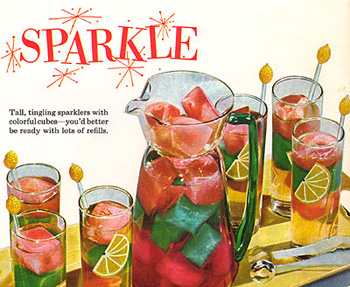
Figure 8: Not only does the beverage sparkle, but so do the words. If you can’t say it with accurate color reproduction, why not say it with whimsical type?

Figure 9: For some reason every cookbook ever published is set in Bodoni, though some, like this 1956 Better Homes and Gardens Junior Cookbook, handle it more interestingly than others.
The unappetizing graphics of food weren’t limited to cookbooks back when. My mother was a health instructor/nurse in elementary schools and I’ve saved some of her teaching materials. It must have been hard to teach good nutrition, when the cuts of beef looked like a Roger Corman horror movie prop, and everything else could have easily come from the dusty window display of a second-rate Tokyo restaurant.
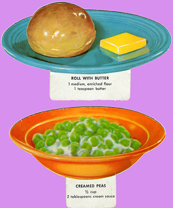
Fidure 10: These cut-outs of basic food items could be combined by the clever child into a perfectly nutritious meal, or a piece of avant-garde artwork.
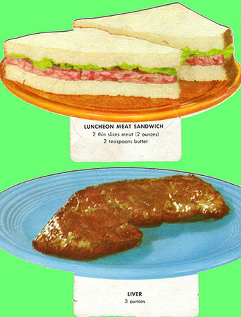
Figure 11: Sandwiches had a limited color palette back then, and it was obviously harder to create a convincing drop shadow.
Proper cooking can easily affect the color and texture of a food item, so it isn’t fair to think a printed copy should exactly mimic the real thing. My own mother could easily boil or fry the color out of even the most orange of carrots. And until I was an adult, I thought all asparagus was white, not just the expensive kind. Some of my mom’s food-color manipulations were the result of additive coloring. With enough Imperial margarine, she could turn white mashed potatoes the color of something you send to a lab to have analyzed. And of course Campbell’s Tomato Soup would add a Three-Mile-Island fluorescence to anything it touched.

Figure 12: Take all the color out of the peas and add more oil to the frying pan and this is a picture from my childhood, not an instructional panel from a teacher’s aid published in 1966 by the David C. Cook Publishing Co.
My grandfather was a butcher, but he died before I was born so I was mercifully spared any exposure to the carving up of dead animals. But someone’s got to do it, I suppose, and the visual aids need to be clear and concise. There should be no glorifying of the kill, no deliberate attempt to show gratuitous gore, and certainly no funny carvings or positionings.
And though I never did learn my cuts of meats, it’s a skill I wouldn’t want to deprive anyone of. Typically, however, I leave it to the supermarket to correctly identify any animal parts they have for sale.

Figure 13: This might be a good study guide if you ever get tickets to Letterman. Simple and to the point.
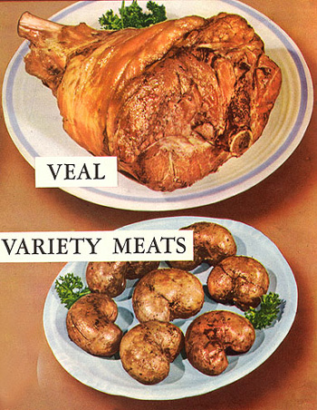
Figure 14: Variety is the spice of life, even in your choice of meat products. These appetizing visuals are from a meat poster put out by the American Medical Association Council on Foods.

Figure 15: I prefer my rump boneless, but thanks to this book from the Swift & Company meat packers, I may try a hunk of standing rump next time.

Figure 16: Meat, lest we forget, comes from dead animals which, if hacked up properly, resemble a jigsaw puzzle.
Not all the problems with cookbooks from the past are do to technical difficulties. Some are more philosophical, or sociological in nature. Such is the case with the “Wild Fowl Game Cookery” by Frank Kohler, published in 1961. The drawing of happy bears, smiling deer, and frisky squirrels are charming until you realize they are all celebrating their ultimate death, dismemberment, and eating.
“No one would bring in the carcass of an aged bull and expect a chef to serve up a tender roast,” opines Kohler. “Yet many a hunter has returned with a magnificent old trophy animal and expected his wife to perform a similar miracle.” Imagine that.
“The first rule, then,” according to Kohler, “is to shoot a young animal. Bear, for example, is fine meat during the animal’s first year, but not after hibernation.” So kill it before it gets a chance to sleep.

Figure 17: Bear are rather happy animals, especially when they are about to be served for dinner.
From the text of Kohler’s book, I learn that not all spouses were appreciative of the opportunity to eviscerate a 600-pound woodland animal, due almost entirely to the lack of knowledge on how to cook the beast properly. “…it is understandable that she should regard the cooking of game as an unpleasant emotional experience,” he says, “in fact, give it a very cold eye. This is unnecessary. Game is good food. It can be made a coveted experience for the epicure.” So be sure, if you’re a hunter, to marry someone from Epicuria.
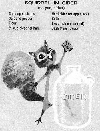
Figure 18: If I had three plump squirrels ready to cook, I’d want them to be as happy as this little rascal.
There are plenty of cookbooks out there that bypassed the bad-photography issue and used artwork or even line drawings to depict the finished masterpiece. This way, out-of-register inks or wild color swings would simply contribute to the “artiness” of the piece.
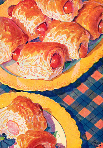
Figure 19: This artistic interpretation of Pigs in a Blanket is from the 1933 edition of Betty Crocker’s 101 Delicious Bisquick Creations, a book highlighting recipes from America’s social elite. This particular delight was served to guests by Mrs. Julian Street, Jr. of Sutton Place, New York, a young debutante much in demand for her “great chic,” and known for being “much in demand as a manikin for charity fashion shows.”

Figure 20: Mary Pickford’s Strawberry Shortcake, from the same book.

Figure 21: This infographic simply explains one of the great mysteries of humankind, and does it without fanfare, flourish or bravado.
I’m not sure when cookbooks went from these nothing-like-reality guidebooks to the coffee-table variety we seem so bent on today. I think a little mystery was part of the fun of cooking, and success required some imagination. Now we simply look at the picture, follow the recipe, and hope ours comes out lit as well as the example. But it probably won’t. At least when the colors in the cookbook were grotesque, faded beyond pale, or interpreted through the eyes of an illustrator, you had a pretty good shot of being pleased with your own results.

Figure 22: If this is true, then I might as well hang up my apron now.
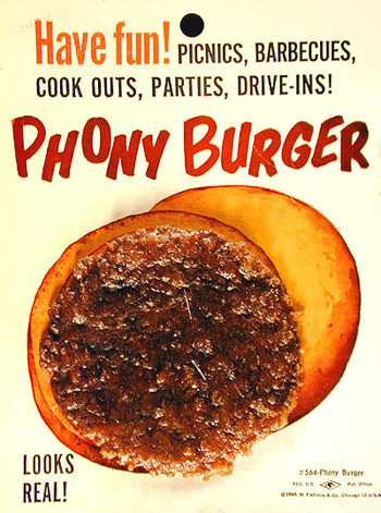
Figure 23: I finally found a food item that looks exactly like it did in the cookbook!
Read more by Gene Gable.
This article was last modified on May 19, 2023
This article was first published on November 27, 2003
Commenting is easier and faster when you're logged in!

Recommended for you

Only the Frame Rotates, Not the Image?
Why is InDesign CS6 only transforming frames, and not the contents, a user wants...

Three Ways to Make a Heart in Illustrator
Learn how to create a heart shape in Illustrator three different ways, using str...

The Art of Business: Learn to Love Negotiating
Like a first date, negotiating is thrilling and frightening all at once. But if...