
Once for the Illiterate, Now a Symbol of High Style
According to “Crane’s Blue Book of Stationery” — which I consider a must-read for everyone, especially designers (see Figure 6) — the monogram began hundreds of years ago and was popularized by Charlemagne who was illiterate and used it to sign his name to important documents. And for some complicated reasons, which I’ll leave to your further research Charlemagne’s monogram did not contain the letter C (see Figure 7).
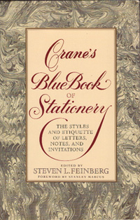
Figure 6: “Miss Manners’ Guide to Excruciatingly Correct Behavior”, “The AP Style Book”, “The Chicago Manual of Style”, “Roget’s Thesaurus”, and “Crane’s Blue Book of Stationery” — all must-have references for this or any other reality.
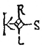
Figure 7: Charlemagne’s Monogram, or the logo for radio station KRLS in Pella, Iowa.
But for most of us, a monogram consists of the initials of our birth, or “given” names. When the letters are all the same size, the monogram reads in order, first initial, middle initial, and last initial. When the monogram style includes a larger center letter (which many of them do) the order is first initial, last initial (the larger one), and then middle initial.
For married women the formal style is to use initials representing first name, maiden name and married name. For single women and married women retaining their married name, then the usual first initial, middle initial and last initial rule applies (see Figure 8).
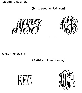
Figure 8: As shown in the Crane’s book, the order of initials matters not only based on your name, but also on the style of monogram. When possible, a monogram should be cross-media capable, able to work on paper, fine linens, matchbook covers, cufflinks, and steamer trunks.
Men often put monograms on their handkerchiefs, matchbooks, briefcases, and fountain pens, which is now considered acceptable for women, of course, though there is still likely some sexism left in the style recommended for each sex, depending on where you order your monogramming.
In the metal-type world, monograms came in many styles, and were assembled like puzzles, often with several options to accommodate various combinations of letters and the unusual circumstances of a something like a “Mc,” which is suppose to be represented by both characters, yet can only take up the space of one. If you have no middle initial, then your choices are a little limited, and it seems to be assumed no one uses more than three initials in a monogram, even if your name happens to be George Washington Carver Clinton III.
Of course any capital letters can be assembled in order to create a monogram, but the most interesting and beautiful ones are designed specifically for this limited use. The term “mono,” after all, means “one,” so the idea of a monogram is a set of letters connected in a design that forms one new character to represent your name.
My personal favorite is Fifth Avenue Monograms from American Type Founders — I love thin letters and the subtle style of these is terrific. When I make my own stationery I feel certain this will be my choice (see Figure 9).
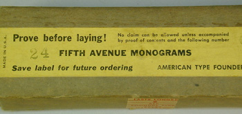
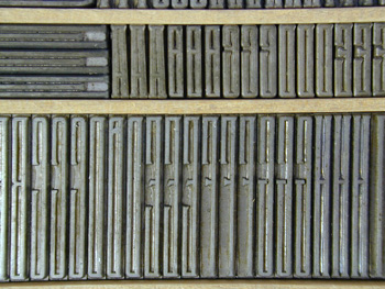
Figure 9: I scored an unopened box of 24 point Fifth Avenue Monograms on eBay, so I now have several monogram styles to choose from. Proving, in this case, means that you should pull a good proof of the type immediately to make sure there are not any flaws.
I also have the popular Virkotype Combination Monograms, which came in a wide variety of styles and complementary frames (see Figure 10).
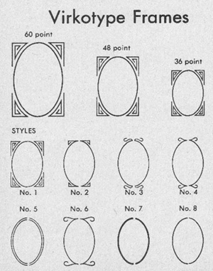
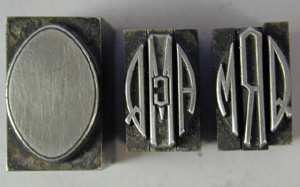
Figure 10: Most monogram styles include an assortment of frames to house the letters. These could add a second or third color, too, which allowed even finer personalization and expression of style.
And for something even more formal, how about the Elite Monograms, which were packaged with three of each character in case your initials were GGG or SSS (see Figure 11)?
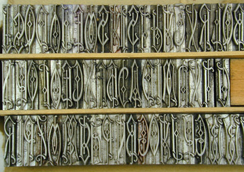
Figure 11: The Elite Monograms from ATF are among the most ornate, and also among the most difficult to picture in reverse-metal form! But they are stunning when printed.
Each foundry had their own set of monogram styles — I’ve shown a few others (see Figure 12) though there are many I don’t have.
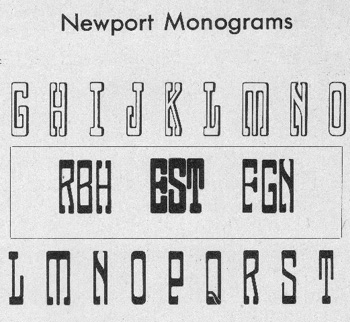
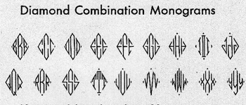
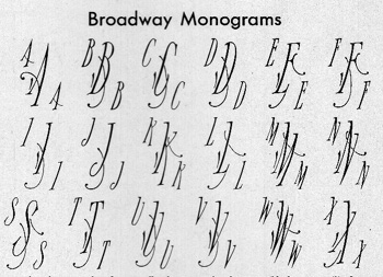
Figure 12: In Hitchcock’s North by Northwest, the monogram of Roger O. Thornhill (ROT) plays an important role when Cary Grant first woos and then saves Eva Marie Saint. It was done in the Diamond style.
A Monogram is Not a Logo
Of course in printing the monogram is a substitute for your name, and is meant for personal correspondence. Monograms are perfect for the front of correspondence cards, monarch sheets, and folded informal cards. If you combine a monogram with your name, it essential becomes a logo, which is another kettle of fish entirely. IBM is a logo, not a monogram, unless your name is Ignatious Bertrum Mapplethorpe. The current popularity of Chinese chops is a comparable art form to monograms, and as usual we can thank the Chinese for thinking them up first.
I would like to encourage everyone to pick a monogram style for themselves, and use it wherever appropriate. They can be designed with modern type, too, and you’ll find several PostScript monogram typefaces here on Creativepro if you search through the fonts. There’s something much more classy about a monogram than simply typing “Gus” in Dom Casual at the top of your letterhead.
As for my own identity, I’ve already broken one rule of monograms by using Gene instead of my Christian name, Eugene. But the only people I know named Eugene are serial killers and my father (and by a strange coincidence my father-in-law), so I’ve always gone by Gene. And I’m thinking that since I haven’t really earned the right to a blue-collar name patch (even though I now have the blue collar), I may as well break another rule and stick with what I know. Therefore when I graduate from “Wanabe,” I’m going to call Land’s End and see if they’ll consider adding to my dirty coveralls the same “GG” in block style that appears on my button-down, pinpoint-oxford dress shirts. Then, whether blue or white collar, at least I’ll match.
Read more by Gene Gable.
This article was last modified on May 19, 2023
This article was first published on April 17, 2003
Commenting is easier and faster when you're logged in!

Recommended for you

dot-font: Can a Book Teach You to Set Type Perfectly?
dot-font was a collection of short articles written by editor and typographer Jo...

Stop Hyphenated (Compound) Words from Hyphenating
Cathy wrote: Is there an easy way to change preferences so that it will no...

Creating a Project Fonts Menu in Creative Cloud Apps
Nowadays most graphic designers and production folks have huge font collections...