

We’ve been doing some minor remodeling at our house recently, so my wife Patty and I have been watching a lot of the Home and Garden Channel, and pouring over “Sunset” magazines and other helpful publications. From the amount of home-related material out there these days, and the popularity of stores like Home Depot, you’d think that attention to detail in the home is a relatively new phenomenon. The choices of colors and styles are limitless nowadays, and when you watch any number of home-makeover shows, you can’t help but be impressed what a little color and some clever carpentry work can do, especially if you’re on a tight budget.
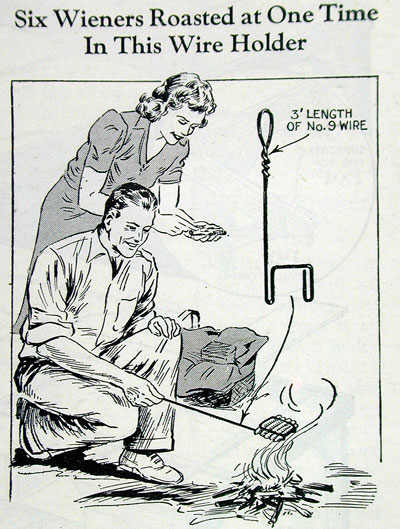
Figure 1: Long before Martha Stewart, “Popular Mechanics” magazine was giving out handy lifestyle tips like this one from 1943.
So, of course, while Patty spends weeks trying to pick the exact right shade of paint from the huge sample book supplied by our local paint store, I’ve been looking at printed home-improvement material from the past. I discovered that people have not only always been clever and innovative when it comes to their homes, but that the state of printing technology at any given time has a major influence on our interior design choices.
The Chicken and Egg Thing
It’s a little hard to say what came first — our technical ability to reproduce more printed colors and detail, or our need to do so. In our own remodeling choices, we have depended heavily on photographs from magazines to guide our selections, even to the point of having custom colors mixed to match a particular shade seen in a printed image. Yet if you go back a few decades, it was nearly impossible for a printed photograph or illustration to show anything but the crudest color palettes compared to today. Consequently, when you visit a home from the ’40s or ’50s that hasn’t been updated, you’ll see garish colors that look pretty much like they did in the magazines of the times. Is it possible that people came to be influenced by the crude colors and unrealistic tones produced by the printing methods of the time?
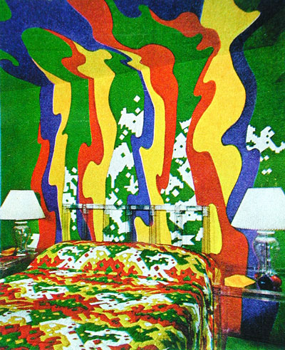
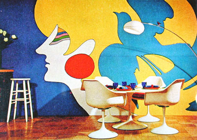
Figure 2: Try matching these colors with those little paint chips. “Better Homes and Gardens” was not able to present subtle colors back in 1971.
It probably doesn’t matter all that much, since all kinds of things factor into design and fashion trends, and printing technology is just one of them. But if homeowners in 1940 were taking magazine pictures to their local paint store like we did, it’s a safe bet they weren’t getting an accurate representation of the color the designer originally chose for that room. And I suspect editors requested really bright and colorful designs in order to highlight the color signatures of their publications, which until the ’60s were still mostly black and white.
Figure 3: Did magazine editors feature brighter colors and more dramatic settings in order to show off their color signatures?
An interesting test will be in the next few years as higher-gamut color systems like Hexachrome become more pervasive. Will we see a trend toward oranges and purples in house colors? And when High-Definition Television (HDTV) brings more detail and color range to the screen, will we embrace looks that are currently “out of gamut?” Even though we make selections based on real products, I have to believe we’re pre-disposed to limits by the reproduction methods in play at any given time.
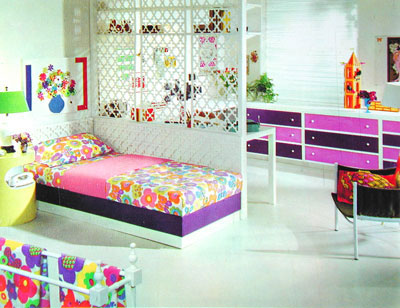
Figure 4: Had Hexachrome been around in 1968 when this photo was published in the “Doubleday Home Decorating Program,” the colors shown in this photo may have been completely different, and paint sales would have changed accordingly.
Budget Makeover Tips
There’s a show on HGTV where a team of designers makes over a room on a budget of $1,000. It’s amazing how they can stretch that cash, and how clever and resourceful they can be. Of course no one factors in the hours or days of time that go into converting that old bicycle tire into a contemporary picture frame, or how, with just a few simple tools, you can tear out that unsightly wall and open up the room to let in more light.

Figure 5: Home improvements have always focused on the basement. Before all the home offices, many people used extra space for family fun.
These kinds of tips aren’t new. In fact, in the days when people seemed to have more time, they were very popular and bordered on the absurd in some cases. We’ve always liked the idea of turning one thing into another, and using leftover junk to make something useful and beautiful. That’s why I don’t throw anything away — you never know when an old car part will make the perfect drawer pull.
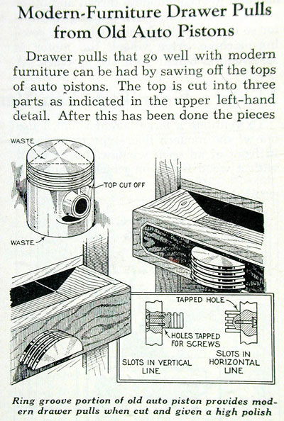
Figure 6: Next time your engine throws a piston, don’t throw a fit. Simply turn it into a handy drawer pull.
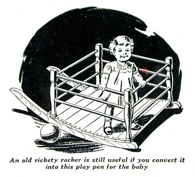
Figure 7: What better use for a rickety old rocker than a toy for little Mary? In 1943 that wasn’t such an odd thought.
I’m not a particularly handy guy myself, so I’d rather buy than make. But it’s good to know that as long as there have been old coffee cans, Pringles tubes, and egg cartons, there’s been someone out there who could turn them into something useful. They just didn’t have their own TV shows back then.
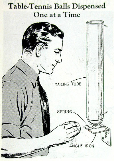
Figure 8: Curious what to do with your loose ping-pong balls? The answer awaits you in “Popular Mechanics.”
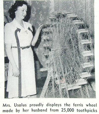
Figure 9: When not repainting or remodeling, many homeowners pursued other interests, as shown here in “The Home Craftsman” magazine of 1948.
In Search of the Perfect Image
I remember at Seybold Boston 1996, when Linotype-Hell and Agfa released the first stochastic screening technologies, many of the samples showed pictures of fabrics, which are notoriously difficult to reproduce in accurate detail — something about all those thread patterns reeks havoc with traditional line screens.

Figure 10: The Masonite company featured this ultra-modern kitchen in their home-improvement brochures of 1940.
The result of stochastic technology making its way into mainstream printing has clearly had an influence on how fabrics are shown in ads and articles. I spent a brief two years working for a high-end furniture manufacturer, and we always took care not to show fabric detail — it typically ended up looking pretty flat. There was no way to capture the “feel” of the fabric, so we backed off and showed color and style over detail. Today I see many more close-up shots of fabric and other texture detail, which I am sure influence choices.

Figure 11: In 1924, Congoleum advertised their fake linoleum rugs in “Sunset” magazine.
Of course the fabric always had the detail, just as the paint always had the color. But the ability to reproduce the details and colors more accurately raises their importance in the selection process. The popularity of a certain “look,” is at least partly based on our ability to reproduce it consistently and across multiple media.
There’s No Accounting for Bad Taste
I’m not suggesting that in the ’30s, ’40s,and ’50s, had printing technology been better, the styles of the time would be dramatically different. But I am suggesting that the popularity of certain colors (like avocado and harvest-gold appliances) was influenced by manufacturers’ ability to reproduce those colors in advertising and brochures (which were almost always tested before a new color was introduced).
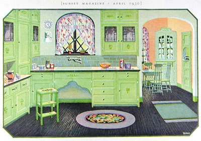
Figure 12: In 1930, “Sunset” magazine featured kitchens in a color that no one could have actually liked.
Today we have almost limitless choices when it comes to decorating our homes, thanks in part to more accurate printing methods. But as one who has experienced it firsthand in the last few weeks, I can tell you that no matter how hard you try to match a photograph from “Sunset” magazine, the results will still be different when you apply the paint to your own walls, and I suspect quite different than what the designer originally intended.

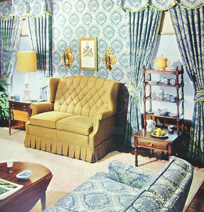
Figure 13: In giving out home decorating tips, “Family Circle” magazine of 1962 suggested these provocative colors.
Fortunately, for some of us, green is pretty much green, and blue is pretty much blue, so we don’t need thousands of shades to make up our minds. Now if only I could get Patty to see it that way.
Read more by Gene Gable.
This article was last modified on March 2, 2021
This article was first published on June 3, 2004
Commenting is easier and faster when you're logged in!

Recommended for you

FSI FontShop International Broadens Its Collection with Three New Foundries
New Foundry: MVB Fonts https://www.fontshop.com/showfont.cfm?mid=57 MVB Fonts wa...
InDesign How-To: Creating Tables
This story is taken from “Real World Adobe InDesign CS.” Tables prov...

InDesign 19.4 Brings Text-to-Image, Cloud Docs, and More
Update adds Text-to-Image Generative AI, Cloud Docs, password protection for Pub...