
Never having a very good sense of direction, I’ve always depended on maps to get me where I’m going. But aside from their practical purposes in getting us from point A to point B, maps are one of our most important forms of visual communications, and MapQuest aside, were often great works of art and craftsmanship as well.
At another time I’ll look at the era of American road maps—those frustrating-to-fold, free products promoted primarily by oil companies and automobile associations. For most of us, when we think of maps, we think of that variety. But the most significant era of mapmaking, in my book, is from about 1500 to 1700.

Figure 1: Oronce Fine, 1531. This beautiful, rare double-cordiform woodcut map is regarded as a very advanced depiction of the world compared to previously printed maps. The French cartographer has included several new geographic features such as place names in South America resulting from the explorations of Cortez, and more clearly defining the West Indies, Florida, and the polar regions. The hand-colored map is bordered by an ornate floral motif, two mermaids, and two cherubs. Also featured at the top is a French royal coat of arms and a flowing banner containing the map’s title.
Scientists, mathematicians, philosophers, and others have always depended on visual communication skills to promote their theories. But in these early days of true scientific discovery, the ability to draw, engrave, and print was perhaps even more important than specific scientific knowledge. It was the visual scientists and mathematicians that had the greatest impact, and mapmaking is a perfect example.
We Want the World to Be Flat
The idea of projecting physical three-dimensional space on to a flat plane, is mostly credited to Egyptian astronomer and cartographer Claudius Ptolemy (87-150 AD). Man had certainly been drawing crude maps long before that, but Ptolemy was the first to take the spherical view of the earth and attempt to flatten it. Little was known about the earth at that time, so it was much later, in the era of great exploration, that we started to gain more accurate information.
The man most associated with “modern” map making is Gerard Mercator, a German/Belgian philosopher who had great religious doubts and questioned the origin of the universe. After he began to study mathematics, Mercator applied his new pursuit to his interest in geography and astronomy. By learning the art of engraving, Mercator was able to put his education and drawing skills together and began producing globes in 1535.

Figure 2: Abraham Ortelius. This important period in map history is often referred to as the “Golden Age of Dutch Cartography.” Ortelius, called the father of modern geography, was a mathematician, scholar, and collector, not a practical surveyor. With the encouragement of Gerard Mercator, he adopted his graphic depictions (including the inaccurate outline of South America’s coast) to create his famous world map. The engraving features a sumptuous rendering of billowing clouds around the oval circumference and a quotation from Cicero.
Mercator was a pioneer in the use of copper for engraving, rather than the wood that had been used prior. By using copper, Mercator was able to get much finer detail, and so his first globe, commissioned by the Emperor Charles V, had much more information than previous efforts to depict the earth.

Figure 3: Gerard Mercator, 1578. Mecator’s elegant copper engraving of a Ptolemic world map is part of his revised version of Claudius Ptolemy’s “Geographia.” Most intriguing are the 12 beautifully rendered, named windheads comprising an elaborate border around the world map.
Because of his religious beliefs, Mercator was imprisoned for a brief time as a heretic in 1544, but was not held very long. His quest became making an accurate world map—a difficult project given the rapidly changing information coming back from explorers throughout the world. But one thing he did understand was the complex mathematics needed to turn a spherical world in to a flat surface. We still use the basic Mercator “Projection” of the world, which many modern cartographers would now dismiss as hopelessly inaccurate in how it portrays relative size of the continents.
Mercator is also famous for giving us the term “atlas” to describe a collection of maps. He chose the word atlas to “honor the Titan, Atlas, King of Mauritania, a learned philosopher, mathematician, and astronomer.”

Figure 4: The cover of Mercator’s “atlas.”
Early maps were like illuminated manuscripts—they served as both information sources and great works of art. The border drawings on many maps depicted popular mythology, or highlighted call-out locations and points of interest. Maps were hand engraved and sometimes took years to produce. Owning maps was something for the most elite—it would be hundreds of years before maps were simple commodities.

Figure 5: Pieter Goos, 1666. This magnificently designed world map follows the geography set forth by Visscher and Blaeu. The engraving and hand coloring is of the highest aesthetic standard, consistent with Goos’ very fine marine atlases. The distinctive border illustrations feature a resplendent sun with large and small birds (including a goose) flying toward it, small windheads as well as allegorical figures representing the seasons.

Figure 6: John Seller, 1675. As the hydrographer to King Charles II and James II, John Seller was a productive and prominent map and chart compiler. Here is detail from his 1675 map.
Look Up, Look Down
While one group of scientists-turned-artists (or was it artists-turned-scientists?) was plotting the shape and scale of the earth, another group was looking upward and trying to chart the night sky. Celestial maps followed the path of terrestrial maps—they were meant to have as much mystical and spiritual impact as scientific. As the printing press became more pervasive in the seventeenth century, maps became more widely distributed, so they often told stories as well as presenting information, giving them appeal to a broader, less scientific audience.

Figure 7: Andreas Cellarius, 1708. This chart depicts the appearance of the moon during its different phases of orbit around the earth.

Figure 8: Andreas Cellarius, 1661. The Ptolemic theory is exquisitely illustrated in this celestial sphere depicting the apparent movements of the planets and the sun around the earth. Signs of the zodiac are wrapped around the outermost orbit. The lower corners are decorated with astronomers in fancy costumes working with their globes and instruments.

Figure 9: Andreas Cellarius, 1708. This celestial chart features a large armillary sphere illustrating the apparent movements of the sun, moon, and planets around the earth. The sphere is surrounded by a zodiacal ring. Diagrams of the theories of Ptolemy and Brahe are in the lower border corners.
Maps were a terrific platform for the practice of copper engraving, and most early map makers were expert craftsmen, as shown in the examples presented here. Many were philosophers or great “thinkers,” and their agenda in illustrating maps was often religious or political. Indeed maps played a big role in the evolution of man, breaking people out from their local surroundings and giving them a global or even universal perspective.
Not a Lost Art
Despite our reliance on global positioning systems and online map sites, mapmaking is an active art form, and a huge group of map collectors exists. Maps for practical purposes are more efficient and much more accurate now, but maps for artistic purposes still often embellish or distort in order to make an impact.
If you are interested in maps, one of the best collections out there is the David Rumsey collection. This online database of over 10,000 high-resolution images is a terrific site that specializes in 18th and 19th century maps of North and South America.

Figure 10: From the David Rumsey Historical Map Collection, is a much later map from 1871. By this time, type was playing a more ornate role in map making, and thanks to higher-volume printing processes, the atlas had become even more popular as a way to display multiple maps of a state or area.

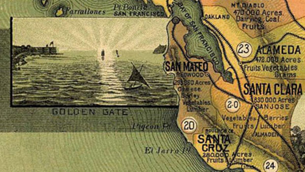
Figure 11: This 1885 map, also from the Rumsey collection, shows a close-up of the San Francisco Bay area before the Golden Gate bridge connected Marin and San Francisco counties. Many maps of this era had call-out drawings of famous locations or notable geographic features. This map was drawn by E. Johnstone, and published by Dickman Jones Lithographers in San Francisco.
Most of us have learned as part of our general education, how to properly read a map, what it means to think in terms of north, south, east and west, and we have trained our brains to project what we see in one dimension into our three-dimensional world. It won’t be long before we have holographic maps that overlay directly in to our space, and guide us automatically via global positioning satellites.
The big question that remains is, however, will the maps of the future be any easier to fold?

Figure 12: An early folded map is this one showing telegraph routes for AT&T in 1891. Again, ornate hand-drawn type and map making have gone together for some time. Courtesy of the David Rumsey Historial Map Collection.
This article was last modified on May 19, 2023
This article was first published on August 26, 2004
Commenting is easier and faster when you're logged in!

Recommended for you

10 Essential Project Management Tips for Design Teams
10 Project Management Tips for Design and Marketing Teams
dot-font: Seven Principles of Typographic Contrast
Carl Dair, an expert typographer, reveals the secrets of typographic contrast in...

How to Split Alternate Layouts to Individual Files in InDesign
Learn how to split alternate layouts in an InDesign file out to separate files u...