


A little over a year ago, Google threw its hat in the Web fonts ring. Since then, the company has increased its font library ten-fold, from the original 18 typefaces to today’s 180. But the interface you had to use to choose the fonts and implement them on your site had not enjoyed the same rapid evolution.
Soon, that will change. The new interface, which should roll out in the next few weeks, is much more usable. For example, you’ll be able to browse the entire library in three modes: Word, Sentence and Paragraph. (There’s an interesting explanation of the research behind these modes in this blog post from the Google Web Fonts team.) You can also filter the font library according to the weight of the available typefaces.
In the new interface, you can type in your own preview text; compare the fonts you’re considering side-by-side; and even use them in sample layouts (called a Test Drive). To make this entire process more manageable, you’ll be able to create font collections.
Many potential users worry that adding Web font will increase their site’s load time. To address this concern, the new Google interface will also include a gauge that indicates how your choices will affect page-load times.
You can try the new interface now at www.google.com/webfonts/v2.
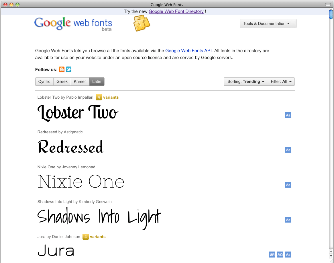
Screenshot of the old interface. Click on the image below to see a larger version:
The new interface. Click on the image below to see a larger version:

This article was last modified on January 8, 2023
This article was first published on June 29, 2011
Commenting is easier and faster when you're logged in!

Recommended for you

Suitcase Fusion 7 with Cloud Synchronization and Adobe After Effects Support
Press Release PORTLAND, Ore. – May 10, 2016 –Today, Extensis® released Suitcase...

50 Free Fonts, Part 1
Summertime, And the livin’ is easy Fonts are free And the kerning is nice...

25 Gorgeous Typographic Experiments
Ah, typography! Is there anything that inspires print designers more? No? Then g...