
Give Gradients a Chance
Think gradients are only gaudy, good-for-nothing gimmicks? Take another look.


This article appears in Issue 14 of InDesign Magazine.
Behold the lowly gradient! Maligned by many, often garish, unsophisticated, avoided by suspicious pre-press operators, always the bridesmaid, never the bride. In the same way that setting type in Times Roman or Arial is like placing a big “Kick Me, I’m a Beginner” sign on your back, using gradients to jazz up your page is generally guaranteed to bring scorn and derision from sniggering colleagues. Yet when handled with dignity, respect, and (most importantly) understanding, the modest gradient can achieve an orchid-like level of graphic beauty not possible with traditional fills or solids. Sniggerers, follow me.
Simple Gradients: The Thin Man
A few years ago, Black Dog & Leventhal Publishers pitched a collection of classic mysteries to Barnes & Noble under the Common Reader Mystery title. I was hired to design eight covers for the series, which included Dashiell Hammett’s classic The Thin Man (Figure 1). I started with a simple condensed typeface, Univers Thin Ultra Condensed, for the title and converted it to Outlines (Type > Create Outlines).

Figure 1: This proposed cover for a reissue of The Thin Man owes much of its effectiveness to the use of bold composition, a limited color palette, and simple gradients.
pulled them downward holding the Shift key to constrain the lines 90°. I made the angled reflecting lines manually with the Pen tool and then stroked the lines with a white to black gradient. I applied the same gradient to the fill of the author’s name.
Advanced Gradients: Trouble in Paradise
For a magazine article I designed about the dangers of toxic groundwater, I needed to create its accompanying illustration. Although I might have normally turned to Adobe Illustrator to create the flower illustration, I instead stayed inside InDesign and used its gradients and blending modes (Figure 2).
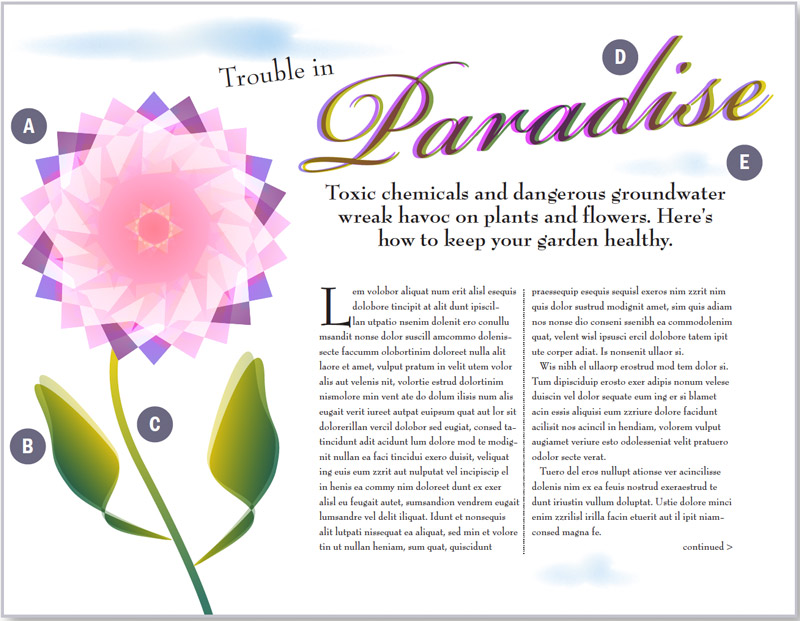
Figure 2: Anatomy of an illustration. (A) Radial gradients combined with various blending modes team up to create this flower. I then grouped the objects and selected Isolate Blending in the Transparency palette to prevent the stem from showing through. B) I used linear gradients for the leaves. I pasted a copy of each leaf in front and offset it slightly, then applied 47% opacity and Multiply mode. C) The stem shows how gradients can be applied to Strokes. D) | applied radial gradients to both headlines. The frontmost text also uses a Multiply blend mode. E) The clouds began as three separate ellipses. Selecting all, I applied the Pathfinder > Add filter to combine the shapes into one. Afterward, I filled the shape with a white to blue radial gradient before applying a 16pt feather with 10% noise. To distort the shape a bit I ran the Bloat effect in the PathEffects Javascript that ships with InDesign. Finally, | Option/ Alt-copied the original cloud twice and transformed it into different sizes and opacities.

Figure 3: The Swatches palette and its fly-out menu. If you forget to name your swatch when it’s created you can do it later with the Add Unnamed Colors command.

Figure 4: The New Gradient Swatch dialog. Click the Type drop-down menu to choose either a Linear or Radial gradient. Clicking a color stop allows you to mix a color from any existing swatch of CMYK, RGB, or Lab space. Stops are added by clicking below the ramp, To remove a stop, drag it off the ramp.

Figure 5: The comma (,), period (.), and forward slash keys (/) are shortcuts for Apply Color, Apply Gradient, and Apply None. Notice how the forward slash key mimics the red forward slash icon, making it easy to remember.
The Gradient Palette
While I prefer to work in the New Gradient Swatch dialog, some people like the Gradient palette (Figure 6). When working this way, you can drag and drop solid colors from the Swatches or Color palette onto the palette and onto existing color stops. The Gradient palette also includes a button to reverse the direction of the gradient, a preview of your gradient, plus a field to specify the gradient angle, all features absent in the New Gradient Swatch dialog.

Figure 6: The Gradient palette allows you to numerically control the gradient’s mid-point location and its angle. Click the reverse button to flip the start and end points of your gradient. Here I’ve placed the start and end points directly on top of each other, creating a gradient with no blend between colors. Choosing a Radial gradient in this case produces a dot within a colored field.
The Gradient Tool
You can manually adjust gradient angles using the Gradient tool in the Toolbox. Dragging the tool controls not only the direction of the gradient, but also the position of its starting and end points relative to the object. You extend gradient starting and end points beyond the boundaries of the object simply by starting or ending your drag outside the object.
Gradients and Transparency
Transparency effects, such as blending modes, feathering, opacity changes, and drop shadows, can be applied to gradients just like other objects on your page. Unlike Photoshop, gradients that transition from opaque to transparent are not technically possible. The closest you can get to such an effect is to apply a blending mode such as Multiply to your gradient, which renders white pixels transparent. Of course, along with white changing, so too will any other colors in the gradient. To avoid non-white colors shifting because of blending modes, apply a feather to your frame. However, this workaround is unsatisfying because feathering a gradient changes the opacity of colors only at the edges of the object, not the entire object as in Photoshop. If you’re looking for transparency on only one edge of your frame, my suggestion is to mask the other edges by pasting your gradient into another frame using Edit > Paste Into (Figure 7).

Figure 7: Albeit a so-so workaround, feathering a gradient allows it to blend from opaque to transparent, as seen at the bottom edge of the shape above. To limit the feathering to only one edge, l pasted the object into an empty frame that masks three of the four sides.
Gradients and Text
In the Trouble in Paradise spread, I made extensive use of transparency by applying blending modes not just to the flower’s leaves and petals, but to gradient text, as well. Even within a single text frame, multiple ranges of gradient text can even exist alongside default black text and color text. Unless you want to apply your gradient to all the text in the frame, you’ll need to highlight the specific range of characters with the Type tool before applying the gradient fill. Once applied, you can adjust the gradient’s location and angle with the Gradient tool. For the Trouble in Paradise art, I used two overlapping yet slightly offset versions of the text, each filled with a different radial gradient (Figure 8). I applied a Multiply blend mode to the topmost text to produce an interesting color effect.

Figure 8: You can fill overlapping objects, such as these two text boxes, with different gradients.

Figure 9: Here the headline text remained type in two separate frames. Using the Type tool | highlighted the text and applied matching gradients. Afterward, the text frames were selected with the black arrow (Selection tool) and a Screen blending mode applied, allowing the background to show through.
Gradients and Strokes
Gradients on strokes?! That’s right. In the illustration from Trouble in Paradise I applied a stroke gradient to the flower’s stem, which helps emphasize its elegance (Figure 10). Even text can be stroked with a gradient. Whether you should do so is a matter of taste.

Figure 10: Stroking a gradient is illegal in several countries around the world.
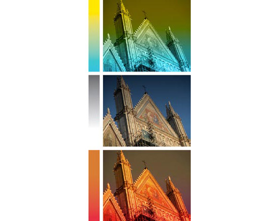
Figure 11: To create the top effect, I applied Luminosity to the image. For the middle image, I applied Multiply. For the bottom image, I applied Hard Light. All effects were within InDesign, not Photoshop.
Commenting is easier and faster when you're logged in!

Recommended for you

InDesign Magazine Issue 145: Designing with Gradients
Issue 145 has articles on designing with gradients, page numbering, InDesign's h...

How to Move Gradient Swatches Between Illustrator and InDesign
Using Illustrator gradients in InDesign is easy—if you know the trick for copyin...

Creating a Ghostly Effect with a Drop Shadow in InDesign
Here’s how to achieve a ghostly effect, using an obscure drop shadow trick...