
Get Your Design Cooking!
Here are the ingredients you’ll need for many design situations.

This article appears in Issue 39 of InDesign Magazine.
This article is excerpted with permission from The Designer’s Graphic Stew: Visual Ingredients, Techniques, and Layout Recipes for Graphic Designers, © 2010 by Rockport Publishers.
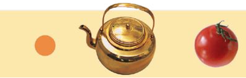
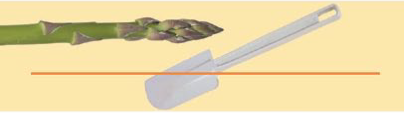
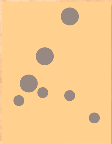
The first step in composing a dynamic layout is being able to decipher what, exactly, a visual element really is—to understand the visual element in the simplest way possible. A silhouetted image of a teapot, for instance, is really a dot: radial, enclosed, curvilinear; a spoon, seen on edge, is a line. As far as composition is concerned, the meaning or content of a visual form is unimportant; its true identity is what determines how it will behave when juxtaposed with other forms. Make negative space as interesting as form. Consider negative space as shapes that are created by the material you place within a format, not as a background simply to be filled up. Those shapes are exceedingly important in a composition—they help direct the eye, they enhance the perception of movement, and they provide places for the eye to rest while navigating the composition (Figure 1). Analyze the shapes of negative space above, below, and in between forms: What are those shapes and how many are there? Are they tight or expansive? Do they run parallel around the forms or in opposing directions? How different are they? Compare the negative spaces and their distribution around the format in this example, noting the system of repetition and contrast they set up as a counterpoint to positive forms.
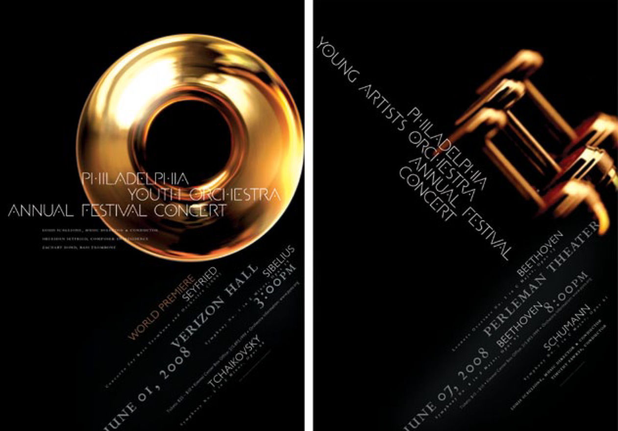
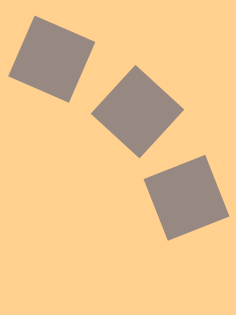
ANNUAL FESTIVAL shows extreme closeup of finger buttons. Concert title is parallel to the finger keys and both are perpendicular to the concert logistic information at bottom, at the same angl.e as the poster on the left.” width=”1261″ height=”879″ /> Figure 1. In these posters, negative space is as interesting as form.
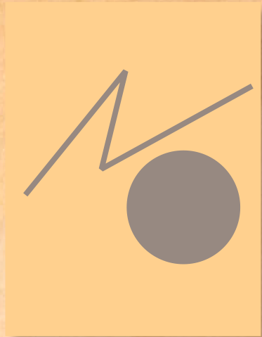
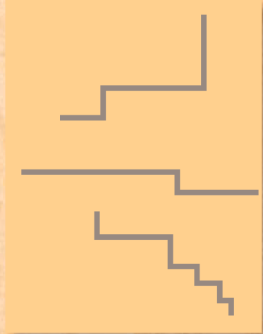
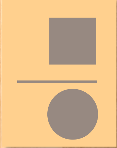
LINE A dot in motion. Describes direction, separates elements, defines spaces; may be solid or broken.
PLANE A dot large enough for its outer contour to become important; also referred to as shape. Geometric forms are mathematical and often angular, while organic forms are irregular, soft, or “natural” in appearance.
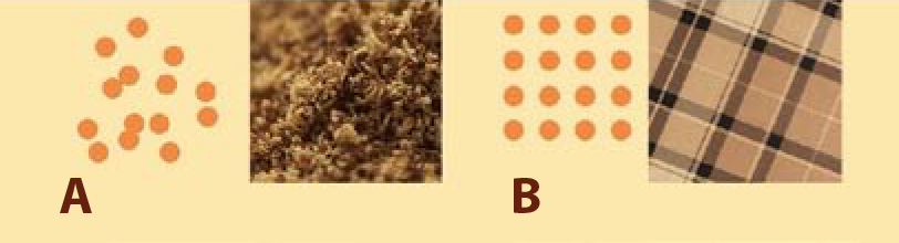
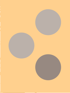
SURFACE ACTIVITY Also called texture or pattern, which are themselves dis- tinct: texture [A] is irregular, random, or organic; a pattern [B] is repetitive and/or geometric—hence, artificial or invented.
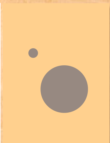
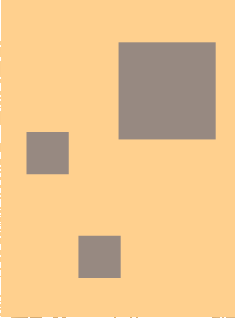
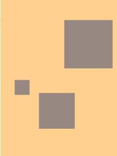
While forms of the same size appear flat, making forms different sizes creates the perception of three-dimensional space: Larger forms appear closer, and smaller forms appear farther away.
Play unique properties or proportions against each other by bringing them into close proximity: angle against curve, line against mass, vertical against horizontal.
Creating repetitions of, or variations on, a particular kind of form or spatial area invites the eye to compare and re-examine its understanding of a visual idea.
Position elements so that there is a sense of movement and, ideally, a recognizable rhythm. Organize the elements across an invisible superstructure, such as a triangle, curve, or grid.
Create clear, purposeful relationships that appear intentional: If you mean for two elements to align or to appear the same size, make sure these attributes are unquestionable.
Scale, Contrast, and Organization
After identifying the essential forms being considered, the next step is to look at how they’re going to behave when they’re mixed together. Form, or figure, is considered a positive element, or the ingredients of the layout; while space, or ground, is considered the negative, or opposite, of form—it’s the pot the ingredients are being mixed in, or the plate on which they’ll be arranged and served. Because page or screen space is intrinsically flat, as are the forms within them, viewers are predisposed to taking them for granted (much the way bored gourmands do with oatmeal). To ensure a rich, engaging optical experience, the designer must compose form in space in such a way that the viewer perceives not only that the forms are interacting three dimensionally, but also that there is a kind of harmonic rhythm among all the layout’s aspects (see sidebar, “Compositional Shorthand”). This harmonic rhythm is often called tension—it’s a perceived vibrancy or liveliness that one experiences in layouts where all the parts are relating to each other. But as the term itself implies, ten- sion isn’t only about formal and spatial relationships being the same. Just as must be in a successful culinary creation, some elements must oppose each other in some way, or create contrast, in order to appreciate each of the parts more clearly. A strong composition consists of visual relationships that support and restate each other, as well as some that conflict with the expectations that those mutually supportive relationships create. Every successful composition organizes a variety of compositional characteristics, held in a state of tension, to impart a sense of resolution. This property of a composition is called its gestalt, meaning “totality”; the viewer senses an underlying logic that unifies individual relationships into a whole. Individual relationships among forms and, therefore, the gestalt, will change each time a single element is altered; be aware of these changes as the design process leads you from rough iterations through the eventual solution.
Defining Clear Visual Hierarchy
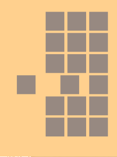
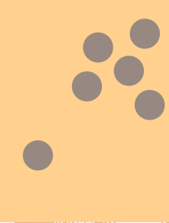
Strong composition depends not only on the compositional states of the various elements, but also on how those states contribute to the viewer being able to navigate, or under- stand, the content, and in what order the content should be “read” (whether in terms of type or purely pictorial content). Defining this order, or hierarchy, and controlling the sequence in which viewers will perceive and assimilate each level of information is an unavoidable process in every design project, no matter how straightforward it is. In coming to determine the most important element (whether pictorial or typographic), the designer most often relies on common sense by answering the simple question: What do I need to look at first? Beyond simply establishing this entry point into a sequence, the designer must also ensure that elements don’t compete with each other. This often means making some formal attributes—such as relative sizes, densities, or spatial intervals—subtler or more nuanced, while exaggerating others so that the viewer can process the material more efficiently without sacrificing vitality and tension. General Methods for Ordering Material Focusing attention on one form within a composition most often results from two pri- mary strategies: differentiating that element from all others (by means of exaggerated scale, density, or color distinction), and/or arranging surrounding elements so that the orientation of their angles, curves, or interstitial spaces directs the eye toward it. With the first strategy (see sidebar “Differentiation”), viewers tend to perceive a special emphasis on a form or space that separates itself in some way from the gestalt of the composition: While all other forms share similar relationships, the most important form has unique attributes. To create a more complex hierarchy using this approach—establishing decreasing levels of importance in a sequence of elements—the unique attribute applied to the top element may be applied in diminishing degrees to each subsequent form.
Scale
Weight or Density
Alignment
Direction
Rhythm
Proximity

Identity or Proportion

Orientation
Under the second general strategy, known as continuity (see sidebar “Continuity”), the relative proximity of surrounding forms creates an emphasis on the primary form and then directs the eye to a secondary location. Designers may use each strategy individually or in tandem.
Rotational Alignment
Axial Alignment
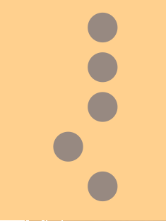
Spatial Progression: Interval
Spatial Progression: Scale/Depth
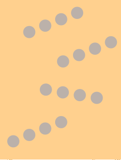
Structural Focus

Triangulation
Spiraling  Stepping
Symmetry and Asymmetry
Two basic kinds of gestalt logic govern composition in every layout: symmetry and asymmetry. Symmetry is a compositional state in which the arrangement of forms responds to the central axis of the format (either the vertical or the horizontal axis); forms also may be oriented relative to their individual central axes. Symmetrical arrangements create a “mirroring” effect—spaces or contours on either side of the organizational axis are the same. Asymmetry is an opposing logic: The arrangement of every form defies relationship with any central axis or among the forms themselves. The result is a collection of spatial proportions that are inherently different from each other.
| Comparing Attributes | |
| Symmetry | Asymmetry |
| Static | Dynamic |
| Quiet | Loud |
| Formal | Casual |
| Studied | Spontaneous |
| Historical | Contemporary |
| Conservative | Innovative |
| Decorative | Essential |
| Solid | Fragmented |
| Simple | Complex |
Visual and Metaphorical Differences in Compositional Logic
Symmetry and asymmetry produce very different visual experiences in a viewer. The similarity of spaces or shapes in a symmetrical configuration is very direct and efficient, but can be too simple or static, causing viewers to hastily gloss over information. Asymmetrical arrangements provoke rigorous involvement—they require continual assessment of differences in space, stimulating the eye to greater movement. From the standpoint of communication, asymmetry improves the ability to differentiate, catalog, and recall content because the viewer’s investigation of spatial difference becomes tied to the ordering, or cognition, of the content itself. On another level, symmetry and asymmetry come with cultural and conceptual bag- gage. Prior to the early twentieth century, all design was ordered symmetrically. As a result, symmetrical, or centered, layouts tend to be perceived as traditional or historical; because design prior to the Industrial Revolution was primarily created by religious, governmental, and academic institutions, symmetrical lay- outs also are generally perceived as formal, careful, decorative, or institutional. Choosing the best gestalt logic for a given project depends on which association will be most appropriate for the target audience—compositional logic itself is a message to be conveyed.
Commenting is easier and faster when you're logged in!

Recommended for you
Converting All Bullets or Numbering to Text
The best ways to convert all automatic bullets and numbering to live text in a s...

Why Did My Curly Typography Quotes Turn Off?
Ben wrote: Do you know why in InDesign, the “Use Typographer’s Quote...
How to Create Preflight Profiles in InDesign
Learn how to quickly create a set of parameters for your InDesign files to only...