
FreeHand How-to: Making a Rune

With the release of MX, Macromedia changed the way we think about FreeHand. This new version offers all of the power we have become familiar with and includes some amazing new features that will enable endless creative possibilities. Now that FreeHand MX has joined the Macromedia MX family of products, you can expect to see many new improvements and enhancements to the drawing tools and the interface.

Figure 1
No, that rune in Figure 1 isn’t some new Macromedia MX software application. Those are the initials of my name, modified to look like they are part of the Macromedia MX software packaging. This rune was created from scratch, using the new features included with FreeHand MX, (such as soft inner and outer drop shadows, transparency masks, and special gradient fills). In this tutorial, I’ll explain how it was built, and highlight some of the newer FreeHand MX effects along the way.
This tutorial doesn’t discuss every feature of FreeHand MX, so if you’d like to learn more, you can take the feature tour.
Building the Base
The first thing we’ll need to do is build the colored base that the surrounds the rune itself.
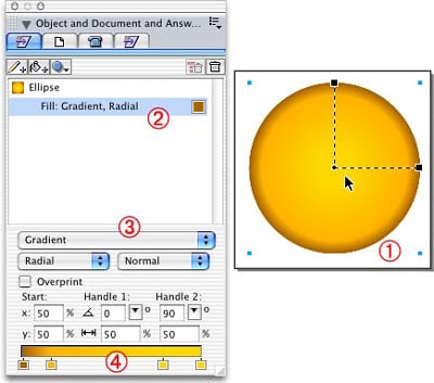
Figure 2: Creating the ellipse for the base.
First, launch FreeHand MX and create a new file (File > New).
- Select the ellipse tool from the Tools panel and draw a circle on the workspace. You can constrain the proportions of the ellipse to a perfect circle by holding down the Shift key while drawing the ellipse.
- Since the ellipse doesn’t have a fill, add a fill by clicking on the “Add Fill” button at the top of the Object Properties panel.
Note: If you’re familiar with previous versions of FreeHand, you’ll notice that the Object Properties panel has changed considerably. You can now control all of the object properties in one panel; including its fill, stroke, and effect (more on that later). Each of the properties sit under the object hierarchically. To edit a property, just click on it in the panel and the options are presented beneath it.
- Next, change the fill type to Radial Gradient by selecting Gradient from the drop-down menu for the fill’s properties and Radial from the gradient type drop-down menu. Leave the radial type set to Normal. You will also notice a few new options here for Gradient fills that we will be using later.
- Add the colors for the gradient at the bottom, (under the gradient settings) by dragging two new color handles from one of the existing gradients and picking colors for them.
Note: You may have also noticed that there are new Gradient Handles displayed on the selected ellipse. These are very fun and again, I’ll explain them in more detail later.Adding Highlights to the Base
Next we’ll build the set of highlights that accent the base and give it a shine. These are built using a series of gradients fills, which use some of the new gradient effects in FreeHand MX.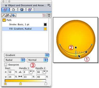
Figure 3: Highlighting the base.
- To build the bottom highlight crescent shape, overlap two ellipses and combine them using the punch command (Modify > Combine > Punch).
- Fill the crescent using a Radial Gradient fill using the same method we used for the base.
- This is where we get to play with the Gradient Handles. We’ll need to position the gradient slightly upwards and make it a little smaller. In previous versions of FreeHand, you’d have to do this with complicated clipping paths…but not anymore. Now you can either drag the Gradient fill handles around to get the fill you want, or use the fields in the Properties panel to get more precise results. I decided to just drag the handles around and adjust the fill, using the display as a guide.
The fields in the Properties panel may be slightly confusing at first, but after working with them you’ll begin to memorize what they all mean. The x and y fields indicate the origin point of the fill center. When I look at my object, the fill center starts 34% from its original location vertically. The Handle percentage fields are the scale of the handles from their original locations. This pretty much means that you can create an oval radial gradient within a circle, something that was not possible in FreeHand until now. You can even rotate the Gradient fill using the handles.
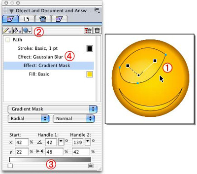
Figure 4: Creating the second highlight.
We want the next highlight to look a little more natural. In order to do that, we will be diving into the new FreeHand MX Raster Effects. This particular highlight starts with a Basic fill color that is lighter than the base. This new lighter color will need to show through around the edges and blend in with the underlying gradient fill. For this purpose, we’ll use a Gradient Mask effect.
- First, create the second highlight shape with a basic fill as shown above (Figure 4, number 1).
- To add the Gradient Mask effect, select the shape. Under the Effects drop-down menu, choose Transparency > Gradient Mask.
Note: You will notice that there are a bunch of effect types listed in the Effects drop-down menu. The top section contains vector effects, and the bottom section contains the raster effects. The Gradient Mask options are very similar to the regular Gradient fill options. Here’s a little background information on how this works: If you have a solid filled object and want it to fade off to transparency, you must define the level of transparency using the gradient color bar at the bottom. It’s important to note that FreeHand MX takes the opposite approach in masking, compared to most of the other applications that have a similar Gradient Mask feature. To mask out the object’s original color completely, use white. To show the color 100%, use black. - To replicate this example, begin with white in the gradient, so that the outer edges show the original base ellipse colors, and 50% black for the middle of the gradient. As you can see in the illustration above (Figure 4, number 1), you can move the Gradient Handles around to position the mask on the base. After you’ve adjusted the mask and have the desired highlights, removed the strokes.
Finally, you’ll want to take some of the hard edge off of the highlights so that they are little fuzzy. To do this, click on the Gradient Mask in the Properties panel. In the Effects drop-down menu, choose Blur > Gaussian Blur (Figure 4, number 4) and enter .25 in the field.
Remember that you have to pay attention to the property hierarchy when adding effects to your objects in the panel. You can move the effects above or below fills and strokes-depending on your needs. This all may sound confusing, but it’s easy if you imagine it this way: The effects you’ve added to your object will change anything that sits underneath them. In this example, the Gaussian Blur affects the Gradient Mask that affects the Basic fill.
Creating the Rune Letters
This next part will focus on drawing the rune letters. This example mimics the same style used in the other Macromedia MX logos. To accomplish this task, you’ll use the Pen tool. As many remember, the pen tool in FreeHand 10 was rather difficult to use. This is no longer the case. In FreeHand MX the pen tool works more effectively, and it even includes another cool new feature, the Pen Preview.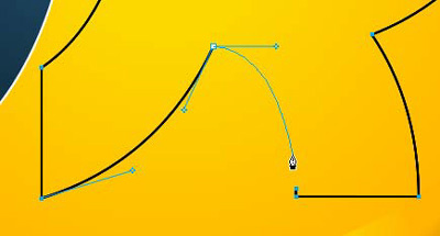
Figure 5: Drawing the rune letters.
It may be hard to tell from Figure 5, but that blue line coming out of the Pen tool is actually a preview of what the path will look like the next time the mouse is clicked. This preview is extremely handy when trying to figure out if the anchor point handles are extended enough for the curve to work. This feature can, of course, be turned off if it bothers you.
After you have finish drawing the initials, give them a Gradient fill and a white stroke. Then, adjust the fill to better fit the shapes, as shown below.
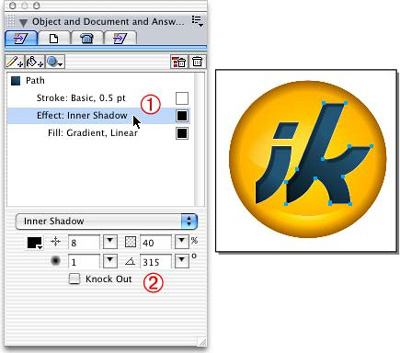
Figure 6: Filling in the letters.
This next step involves making the rune letters look like they are cut into the glass-like base. To do this, choose Shadow and Glow > Inner Shadow from the Effects drop-down menu. Make sure that the effect sits above the Gradient fill as shown in the illustration (Figure 6, number 1).
The Inner Shadow options are all pretty self-explanatory if you’ve ever used similar effects in other applications. There’s the offset amount, opaqueness, blur, and angle. These settings can all be adjusted to fit any shadow requirements you might need.
Note: If you are changing the options and discover effect settings you’d like to keep, just add them to your Style panel. Later, you can quickly apply the same attributes to other shapes.
Finishing Touches
There’s just a couple of things left to do to complete the rune icon. We’ll add one final highlight and create a drop shadow to complete the glass-like appearance.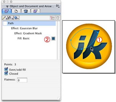
Figure 7: Adding the final highlight.
- First, add a large highlight to the inside of the rune letters by selecting the highlight created on the base shape and cloning it. Make sure that the clone sits above the letter shapes.
- In the Properties panel, leave everything the same except for the color of the Basic fill. Change this to a lighter color of the underlying color. You can adjust the Gradient Mask percentages to make the opaqueness of the highlight match more precisely.
- Next, select the letters and Join them together into one composite path.
- Finally, cut the new highlight and Paste Inside the composite path.
Let me take a moment to explain this last highlight. I suggest making the final highlight exclusively for the rune letter shapes, rather than just using the same highlight over both the letters and the base shape. I recommend making this new highlight for the letters, because white, (used as the highlight color) just doesn’t look right. Using lighter mixtures of the base colors as the highlight color results in a graphic that looks much more natural.
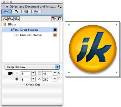
Figure 8: The final shadow.
The last step involves adding the drop shadow to the base ellipse. From the Effects drop-down menu choose Shadow and Glow > Drop Shadow. The Drop Shadow properties are identical to the Inner Shadow, so you should feel at home here.
You should now have a pretty good looking Macromedia MX rune icon. And we didn’t even have to use a bitmap software program to create the natural looking highlights or shadows.
Ian Kelleigh has over 10 years of experience in print, web design, and development, with a specific expertise in using Macromedia Flash and FreeHand. Ian runs the award-winning tutorial website www.freehandsource.com dedicated to the software. Ian freelances in Seattle, and his clients include Microsoft, Group Health Cooperative, and Virtuoso.
This article was last modified on July 20, 2021
This article was first published on November 6, 2003
Commenting is easier and faster when you're logged in!

Recommended for you

Limiting Matches with GREP in InDesign
Peter Kahrel shares a technique for targeting a specific instance in a repeating...

OnOne Software Supports QuarkXPress 7 with QX-Tools Pro 7
Quark Inc. and onOne Software Inc. announced today the upcoming availability of...
Scanning Around With Gene: Party Fun and Games
I was recently invited to a gala black-tie fundraiser that had a vintage televis...