
Four Terrific Table Techniques
Diane Burns offers up a cool quartet of tactics to get your tables noticed.

This article appears in Issue 78 of InDesign Magazine.
From tweaking the size and shapes of cells to shuffling the grid itself, there are many ways to maximize the visual impact of your tables. Here are four table techniques that every InDesign user should know.
Highlight a Row or Column
There are several ways to emphasize data in your table. One of my favorites is to format a row or column to appear larger than all the others in the table.

This technique involves some simple trickery. Add a new row or column, and set the fill and stroke so that it looks like the row or column is longer. Set the adjacent cells in the new row or column to have a fill and stroke of [None]. In this example, the middle column is highlighted using these steps:
- Make the middle column wider.
- Add an extra row above the table; move the Company label into the new row.
- Give all the adjacent cells a fill and stroke of [None].
- Merge the price cell with the now-empty cell above it.
- Enlarge the text frame containing the price. In this example, the text frame is five-sided, filled with a gradient, and then anchored in the cell.
Use Tables to Tame Complex Layouts
I can’t tell you how many times tables have helped me solve complex layout problems for entire pages. Tables help you “freeze” a grid into place and allow you to work within it while maintaining the structure.
Here is an example from BioCentury, a company that publishes weekly subscription-based newsletters covering the business side of the biotech and pharmaceutical industries.

Their publication Week in Review starts each of four sections with a visual compilation of the data contained in the issue, showing a series of Excel charts or graphs, along with summary information at the top of the page.
Because the publication is just one of many that goes out each week, the design of these pages is uniform. The goal was to set it up so that the production staff has to do little or no adjustment to each page.
This was accomplished beautifully by setting up each page as a large InDesign table. Each table contains seven rows and two primary columns.
Because the team creating the data visuals in Excel wanted to bring variety to the way the information is presented week by week, the designers established five different layouts, each accommodating a different number and size of charts and graphs.

Biocentury uses InCopy and a Woodwing Enterprise system, so the tables were set up as InCopy templates, which the data visual team populates with the appropriate charts and graphs, data, and titles. The InDesign production team simply links the InCopy table to their InDesign layout, and their job, on these pages at least, is done.
Think about using tables for establishing fixed grids for your pages. They can help keep form and order in a way that regular old text and graphics frames cannot.
Elevate Gridify with Tables
Using graphic cells in tables takes Gridify to a whole new level. To create this example:
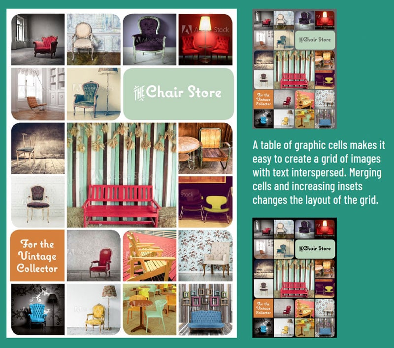
- Choose Table > Create Table, and specify 6 rows and 4 columns. Click near the top margin to automatically fill the page with the table. Select all cells in the table, and choose Table > Convert to Graphic Cell.
- Decide how you want to break up the grid. For the example, I selected the four center cells and merged them, along with two cells in the second row to hold the text. Delete the extra graphic frames before merging to avoid extra returns when you merge.
- If you want to make the rounded corners on each frame as shown in the example, create object styles for each, and apply.
- Create the text frame separately. Use Convert To Text Cell, and paste the text frame, which will be anchored in the cell.
- If you want to increase the space between images, change the insets for those cells.
- Change the background color by selecting the table and applying a fill color.
Change Cell Shapes
Here’s a handy trick for using anchored objects to change the shape of your table cells.
Draw a shape that will appear at the intersection of cell strokes, as in the example. I used a shape that mimics a rounded corner, but you could also use circles, diamonds, or triangular shapes.
The key is to anchor the shape at the beginning of the text in a cell or its adjacent cell. The top and left insets must be the same for all cells in the table, so that you can set the horizontal position of the anchored shape relative to the anchor marker, and the vertical position relative to the baseline.

If the shape falls at the right edge of a cell, anchor to the cell to the right. That way, even if you change the column width, the shape will be in the correct position.
You don’t have to anchor a shape at the cell intersections. You can use shapes anywhere on the cell edge to create the illusion of a nonrectangular cell.
This article was last modified on October 27, 2025
This article was first published on May 1, 2018
Commenting is easier and faster when you're logged in!

Recommended for you

Tip of the Week: Targeting Table Borders and Strokes
How to target table strokes to change their formatting using the table stroke pr...

InDesign Magazine Issue 101: InDesign 101
We’re happy to announce that InDesign Magazine Issue 101 (September 2017) is now...
This Week in InDesign Articles, Number 122
As you have likely heard, PePcon was amazing last week in Chicago. My head is sp...