Fixing Widows, Orphans, and Runts in InDesign
Widows, orphans, and runts may have funny names, but their effect on your layout is anything but a laugh.

This article appears in Issue 38 of InDesign Magazine.
Typography has a rich and colorful language—ligatures and dingbats, bowls and crotches, baselines and x-heights—with which to describe the way our words and letters look on page or screen. Few terms arouse as much curiosity as widows, orphans, and runts ( Figure 1). Exact definitions vary, but I define them as follows: A widow is the last line of a paragraph, stranded at the top of a column or page. Widows should always be avoided. An orphan is the first line of a paragraph that occurs at the bottom of a column or page. While not as bad as widows, orphans are best avoided where possible. A runt is the last line of a paragraph that ends with a short word or, worse, a single syllable of a hyphenated word (which you can prevent by turning off the Hyphenate Last Word checkbox in your Hyphenation Settings). A single word on the last line may not be a problem if it’s a long word. Ideally, the last line of a paragraph should be about one-fifth of the column measure.

Figure 1: From left to right, a widow, an orphan, and a runt.
heads and subheads from being divorced from the text that follows them); and Start Paragraph, which can force a page, frame, or column break. If you don’t need your columns to bottom out (i.e., share the same last baseline), you can use Keep with Next to specify a number of lines at the end of the paragraph to be kept together. However, this approach won’t work when you have text across multiple columns or facing pages that you want to share the same last baseline. Keep with Next carries the widow or orphan to the next column or page, leaving you with a visual hole at the bottom of the previous one. That leaves us with two approaches that both adjust the letterfit of your text. The first is to apply a modest amount of tracking (the adjustment of space between the words and characters) to the problem line or paragraph. While this can be either negative tracking (tighter) or positive tracking (looser), in practice it is almost always negative tracking. To do this, select a range of text within the problem paragraph, possibly the last line or perhaps the whole paragraph, and apply tighter tracking with the keyboard shortcut (Option-Left Arrow or Alt-Left Arrow). So that you can apply a light touch, make sure your Kerning/ Tracking increment is set to a low number, preferably 1/1000 em, in your Units & Increments Preferences. Tracking is a flexible and fast way of improving the look of type, but it is a compromise: It goes against the golden rule of consistency, and consistency is all-important when it comes to achieving a good type color or even density of your type on the page. Your reader shouldn’t notice that the spacing between the words gets a little tighter here and there. The aim is to pull back a line by (imperceptibly) tightening the letter spacing across the range of words (Figure 2).
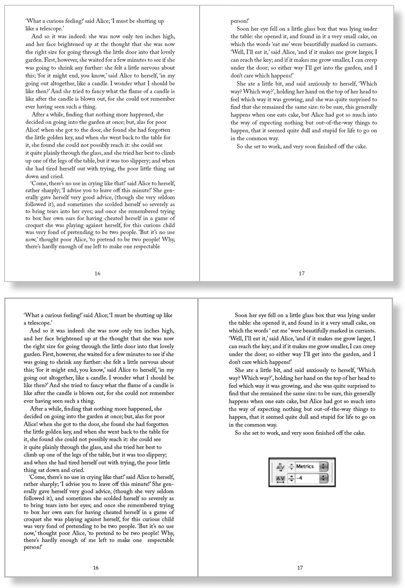
Figure 2: See the widow at the top of the right-hand spread (left)? I fixed it by applying -4/1000 em tracking to the last paragraph on the left-hand page of the spread (below).
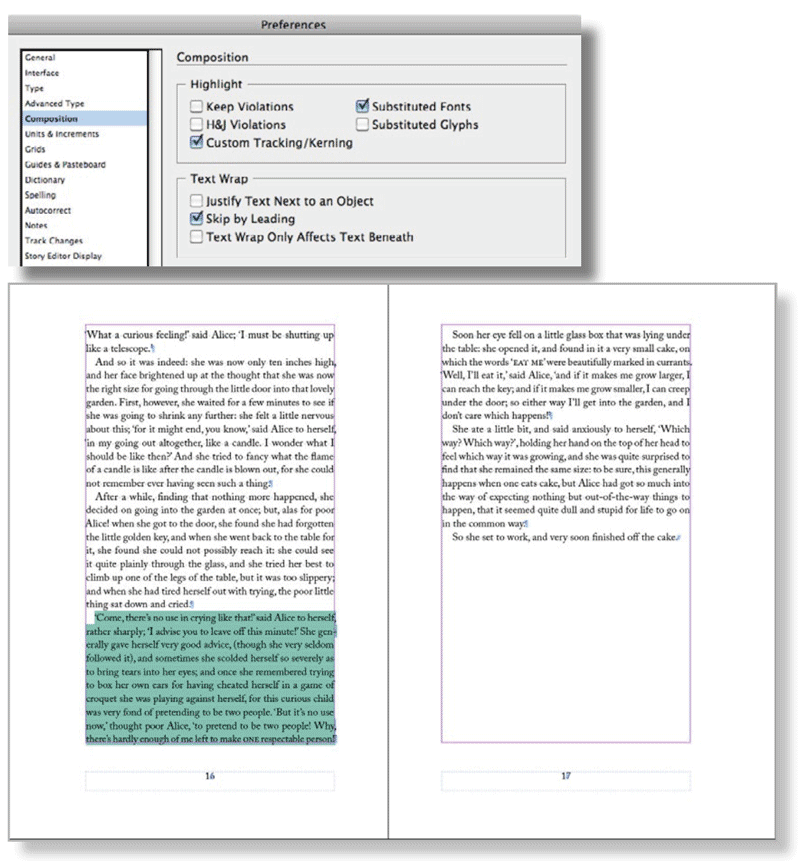
Figure 3: When you turn on Custom Tracking/Kerning in Composition Preferences (above), InDesign highlight where custom tracking or kerning has been applied (left).
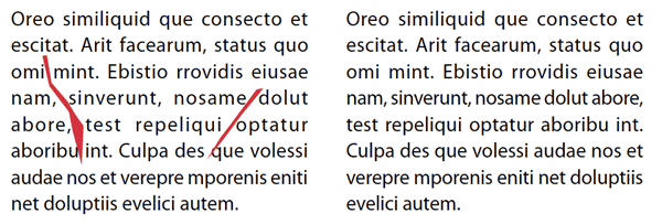
Figure 4: The text on the left has horrible word spacing and rivers caused by justified text set in a narrow column. Applying a modest amount of tracking (-5/1000 em) to lines 4 and 5 does at least fixes the rivers (right).
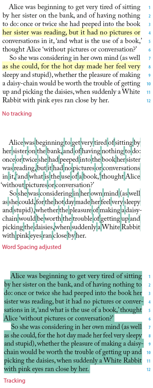
Figure 5: These examples show the effect of adjusting word spacing. The paragraph to the left has no tracking applied—the yellow highlighting shows H&J Violations. The paragraph below left shows the result of decreasing the space between the words only—subtly different from adjusting the tracking as, I did to the paragraph directly below this caption. The green highlighting shows where I applied custom tracking/kerning.
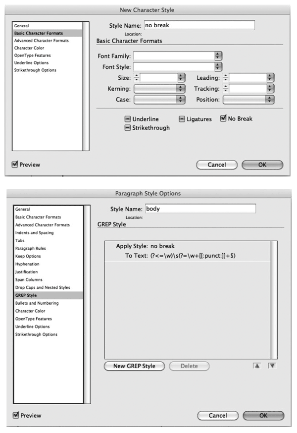
Figure 6: You can apply No Break manually to keep two or more words together. Alternatively, you can use a GREP Style to apply a No Break Character style to the space between the last two words in a paragraph-automatically preventing the possibility of a runt line.
(?<=\w)(?=\ w+[[:punct:]]+$). Note that this applies the Character Style to just the space between the last two words. Revise the copy. This may not be an option, depending on the kind of document you’re working with, but if you have license to rewrite, then go for it—often a subtle rewording will do the trick. While they may not quite live up to the drama of their names, widows, orphans, runts, and rivers can nevertheless scar a page. Thankfully all it takes is a light touch with InDesign’s flexible composition tools to fix these problems on a global and local scale and significantly improve the look of your type.
Commenting is easier and faster when you're logged in!
Recommended for you

This Week in InDesign Articles, Number 19
Oh, there's a whole lot o' goodies in today's issue... scripts, articles, and gr...

3 Ways to Fix Runts in Your Text
In typography, a “runt” occurs when the last line of a paragraph end...

Tip of the Week: De-Runt Your Paragraphs With a GREP Style
This InDesign tip was sent to Tip of the Week email subscribers on June 20, 2019...


