Members Only

Fixing CMYK Images Over Your Ink Limit with Photoshop

Learn how to lower total ink in an image and still get the best results for your output conditions.

Here’s a prepress problem: You have a CMYK image in which the Total Ink Coverage (TIC) is over the press limits for successful print. What does this mean? If you somehow piled up the combination of C100-M100-Y100-K100, that adds up to 400% ink. Even in a very dark image (think: darkest outer space), I doubt you’d ever encounter that. But if you know your image’s destination, you should find out your current TIC to see if it’s satisfactory. In Photoshop, you can use the Info panel (Window > Info) to view TIC. I like to start by using the Color Sampler Tool (hidden behind the Eyedropper Tool in the Toolbar) to place a static sampler. Click in the image to set a sample point. You can drag it to move it, or hold Alt/Option and click it to delete it. Once you have the sample point where you want it, click the teeny, tiny arrow by the sampler icon and choose Total Ink from the menu. Then you can see what’s really going on.
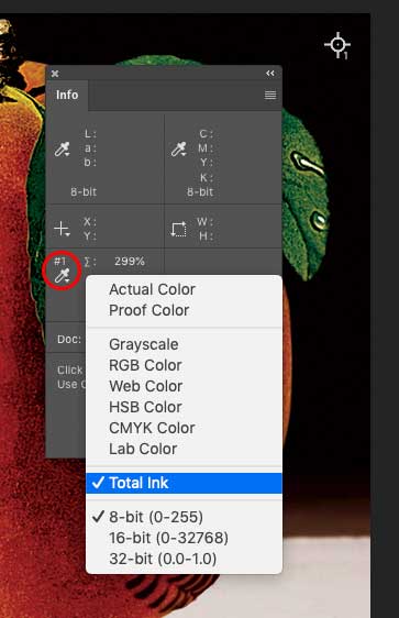
TIC option in Info panel

Viewing Total Ink in the Info panel

But let’s say you have a very dark night scene with deep shadows approaching C80-M60-Y60-K100, for a total of 300% TIC (also called TAC—Total Area Coverage, or Total Ink Limit). That’s viable on a sheet-fed press with coated stock, but would turn to a soggy mess on, say, newsprint, which supports a maximum TIC of about 240%. Before we go further, keep in mind that if only tiny, isolated areas of an image (just a few pixels) violate the desired ink limit, it’s not a big deal. But I’d say that if, say, 10% of the image is soggy, it’s time for a fix.

Here are two options.

Method One: Convert Directly to Another CMYK Profile

Here I have an image with a dark black background, which maxes out at C85-M78-Y77-K100—a TIC of 340%.
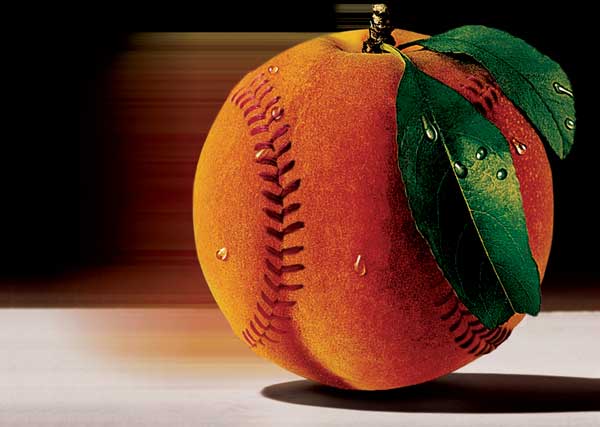
Peachball CMYK 340

Original: 340% total ink

The quickest way to solve this is to do a CMYK-to-CMYK profile conversion.

  1. In Photoshop, choose Edit > Convert to Profile and pick a suitable profile. In my example, I need this image for a job running on a web press on newsprint, so I choose the US Newsprint (2007) profile.
  2. Poof! My max ink pile is now C55-M45-Y48-K71, for a TIC of a svelte 219%. However, some areas of the image now look sort of anemic; the color is really washed out.
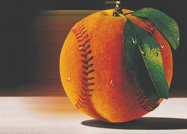
Peachball CMYK Convert to SNAP

CMYK-to-CMYK: Convert to Profile: 219% total ink

Some of this will be plumped up when the ink hits porous newsprint, but I’d like a better outcome. So, on to Method Two.

Method Two: Convert to Another CMYK Profile via LAB

This method forces a re-separation of the image. But don’t be tempted to go to RGB, then back to CMYK. Instead, use Lab (or L*a*b*, or however you like to express it) as the intermediate color space. Why? Well, it’s Photoshop’s internal “mental color space.” Going through Lab (I’m tired of typing asterisks) is lossless.

  1. Duplicate the image for safety’s sake (and to have a reference for comparison).
  2. Convert the new image to Lab: Image > Mode > Lab Color. You’ll see no change in the on-screen appearance.
  3. Create a custom separation setup. Again, in my example, I need to convert a heavy-duty image with a TIC of 340% into an image suitable for newsprint, with a TIC of 240%—quite a color diet. Here’s my recipe: • Choose to Edit > Color Settings. • In Working Spaces, click the CMYK pulldown menu, push up to the top, and choose Custom CMYK. • For Ink Options, I chose SWOP (Newsprint) and Standard Dot Gain. • Because my image has a lot of solid black areas, I chose Medium Black Generation, a Black Ink Limit of 100%, and a Total Ink Limit of 240%, and clicked OK. Note that your choice of inks will be based on the press running your job.
  4. Now just choose Image > Mode > CMYK. Your new custom separation setup will be used as the recipe.
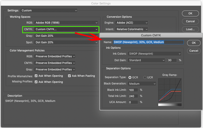
Create custom setting

Creating the Custom CMYK for Method Two.
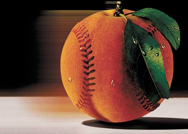
Peachball CMYK Lab to SNAP 240 2

CMYK-to-Lab-to-CMYK: Custom Profile: 240% total ink

Why use this longer method? Because you may find that it gives you more control over the conversion. See the images below comparing results of the two methods side by side. Side by side While the Convert to Profile option (Method One) did the job, the color is anemic. Color will be a bit heavier when ink hits paper, due to dot gain, but I like the results from my custom profile better (Method Two).

Using Separations Preview in InDesign to spot ink limit problems

InDesign can tip you off to potential ink limit problems with its Separations Preview Panel (Window > Output > Separations Preview). In the panel, choose the Ink Limit from the View menu, and set the value to your desired max TIC—in this case, 240%. Remember that a little “peppering” of heavy ink isn’t a problem, but large areas (as the original image would have produced) would be unwieldy on press. Limit comparison This article is for CreativePro members only. To continue reading, please log in above, or sign up for a membership today! Thanks for supporting CreativePro!

Bookmark
Please login to bookmark Close

Not a member yet?

Get unlimited access to articles and member-only resources with a CreativePro membership.

Become a Member

Comments (9)

Leave a Reply

Your email address will not be published. Required fields are marked *

  1. Paul Nylander

    The problem is that most profiles people are likely to select for CMYK conversion during InDesign’s PDF output do not honor a TIC/TAC limit. It would be nice if we had this knob we could turn during output for non-critical conversions. Without that, a way to be sure your images are compliant is to pre-convert to CMYK.

  2. David Blatner

    As Jim and David pointed out, this article is not necessary if you keep your images in RGB. Claudia and I wrote about this some time ago here: https://creativepro.com/import-rgb-images-indesign-convert-cmyk-export/
    However, sometimes we’re not so lucky and images have already been converted to CMYK. In those cases, this article is gold!

  3. You can solve excessive TIC in a CMYK image by not using a CMYK image. Use color-managed RGB images and address the output intent further down the workflow, in the page layout application. That’s why the same color profile settings are in InDesign too.

    Instead of manual adjustments to many images in Photoshop, use InDesign to do this all at once. You can output US newsprint (2007) or SWOP from the same InDesign document using the same placed RGB images.

    1. david cardillo

      this is a very effective workflow when you’re unsure of the destination color space. We primarily work in GRACoL 2013, but we deal with printers in different countries, and often they’re in different flavors of Fogra. Being able to convert to the destination profile on the fly is helpful.

      Where this falls down is with designers who don’t appreciate the limits of the CMYK gamut.

      The single most common issue that comes across my desk with regard to profile conversion is the complaint that the art now looks “flat” compared to the more vibrant, larger gamut RGB. Most of the time they’re not seeing this conversion until after they’ve made color proofs. Yes, you can preview gamut warnings, but you can also preview density warnings, and we’re still trying to get designers to check that.

      This article is about Under Color Removal (UCR), but the other really big issue is GCR, Gray Component Replacement. The standard conversions of RGB to CMYK leave almost no data in all but the darkest ranges of the Black channel. All the grays in the highlights to midtones will have no black at all, made up of only CMY. When these values fluctuate on a press (and they always will) you end up with pink and green “grays” that make your designers very upset.

      There are several ways to do GCR, and for accurate printing they’re necessary. But if your art remains in RGB up until export it is difficult to manage.

      1. “Where this falls down is with designers who don’t appreciate the limits of the CMYK gamut.”

        That’s why I would prefer articles like this would train those less-experienced designers in softproofing with color management skills, rather than this color conversion triage at the prepress level.

        This article appears to be addressing prepress techs. Imagine the fewer headaches these techs would have if this article was aimed higher upstream, to the designers that need to learn color management.

  4. Shawn Girsberger

    This is very helpful, Claudia. For example, IngramSpark/Lightning Source has a 240% TIC spec for all printing, so knowing how to make these adjustments makes “getting it right the first time” easier. But as you also mentioned, if the areas affected are small, a project will go through without incident.

  5. Peter Spier

    Since when I convert an image to CMYK it’s in the correct profile for the output conditions I would hesitate to do a profile conversion.
    My preferred method is to add a curves adjustment layer and lighten the shadows until they are under the ink limit.

    1. david cardillo

      Manual adjustments are usually best. Every image is different and there is no one-size-fits-all approach.

      Converting profiles is an easy, quick-and-dirty solution. When you don’t have time to do each one individually, or you’re dealing with someone who maybe isn’t as skilled in their selection masking, it’s the best tool for the job.

      As Claudia says, converting to Lab and then back again to the correct space shouldn’t result in a loss of color data.

      You would not want to convert from a space with a higher ink limit (GRACoL) to one with a lower limit (SWOP, uncoated) and then try to go back up, as that image data has been removed.

  6. Sheila Perkey

    To fix this problem, I use selective color, choose blacks, then remove CMY in even amounts, and bump up the black….UCR (undercolor removal) with GCR (grey color replacement).