
Why Fixed-Layout EPUB From InDesign is a Big Deal for Designers

by Gerald Schmidt
From a very early glimpse (just a table with a few splashes of color) at the start of 2014, to the big unveiling earlier this summer at PePcon and the Creative Cloud launch, the new fixed-layout EPUB export feature has been, for me, the year’s main event in the InDesign world.
Selecting Export and seeing the bold pinks and expressive fonts of the title Chris Kitchener demoed at PePcon pop up in iBooks was an amazing experience. Mike Rankin covered Chris’s demo for InDesignSecrets; Laura Brady was the first to publish a detailed review on ePubSecrets.
Adobe’s Chris Kitchener revealing new fixed-layout EPUB capabilities
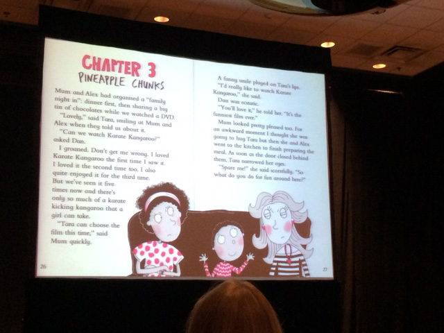
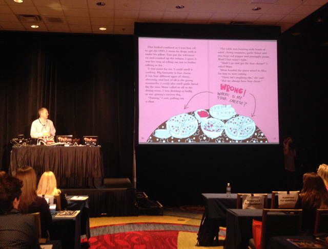
A fixed-layout EPUB exported from InDesign
After the big events, reactions went two ways: some people loved the ease with which beautiful books could be teleported from InDesign to iBooks (and remain beautiful!), but others worried that the lure of fixed layout would become too strong. And there was also a concern that the code inside the EPUB was hard to read and even harder to edit.
What we have to remember is that this new feature didn’t invent fixed layout EPUB; it shares the strengths and weaknesses of the general approach. If there are improvements to be made (Matt Garrish proposes a few in his notes on the accessibility of the export) there is a good chance that they will be made in a future release.
As these discussions took hold, I started to wonder if we are missing the main point of the feature, which is that it returns control and ownership to the designers. The technologists (and I have to include myself here) are taken out of the loop, and I want to argue that this is a good thing.
Since Apple added fixed layout to iBooks, many companies large and small have created workflows that take InDesign or PDF input to create fixed layout EPUB for publishers. Last October, at a conference focused on the future of EPUB in education, we had a room full of companies offering workflows just like that.
The problem, I thought, as I looked despairingly at my slides about another such workflow, was that none of us should have built anything: PDF is not suitable, and InDesign markup language is too complex for this approach to yield the quality required at an affordable price. This work had value and it needed to be done, but it had to be done by Adobe.
The reason for this was not just that Adobe was best positioned to create this export in a technical sense, but also that fixed-layout EPUB bridges an unfortunate gap between designers working in InDesign and the finished digital product. Digital teams were pressing designers to choose fonts that work well in digital contexts, but the intervening transformation from InDesign to EPUB made iterative enhancements difficult and expensive. Now, designers are back in control and can see for themselves, at the press of a button, if a particular font works well in the finished EPUB. The InDesign document is once more the master document.
Where does that leave the technologists among us? We finally have high-quality markup to play with. We can start by making the export work beautifully outside iBooks, but then we should start exploring what happens when we unpin the spans that hold the text in place and watch the paragraphs unfurl to form liquid layouts. The InDesign team has played its part. It’s up to us to rejoin our design teams to decide what the next step will be.
***
Gerald Schmidt has spent far too much time on all things ebooks over a number of years, first at The Open University and then at Pearson Education in the UK. Gerald is a Senior Consultant at Cassini Consulting in Hamburg, Germany.
This article was last modified on July 8, 2021
This article was first published on August 25, 2014
Commenting is easier and faster when you're logged in!

Recommended for you
Using the EPUB Interactivity Preview Panel
One of the coolest developments for InDesign in 2014 was the news that interacti...
Tip of the Week: Automatic Article Arrangement
This tip was sent to Tip of the Week email subscribers on July 24, 2014. Sign up...
Combining Animated GIFs with InDesign Animations
One of the best things about fixed-layout EPUB as a digital publishing format is...