Find Spacing Problems by Displaying Spaces Instead of Text

Our friend and colleague Nigel French (author of the book InDesign Type) reminded us recently that sometimes you need to pay attention to the words on your page, and sometimes you need to pay attention to the spaces between the words. The problem, of course, is that it’s hard to see what isn’t there!
For example, look at this page… which stands out more, the words or the spaces between the words?
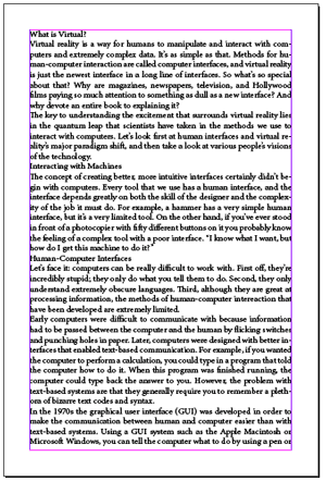
So here’s a quick method he devised to show the spaces, and hide the text.
The trick is to add two GREP styles to your paragraph style:
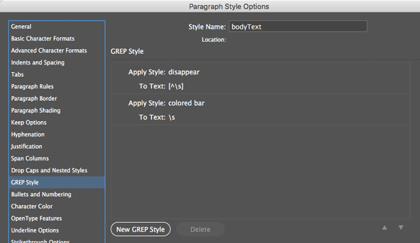
If that image is hard to read, here’s what it shows: One GREP style that sets a character style called “disappear” to [^] and a second GREP style that applies a character style called “colored bar” to
Here’s what those character styles look like:


See how “disappear” sets the fill and stroke color of the text to None? That makes it disappear! And the colored bar applies a thick underline on the space. (Blue in this case, but you can choose whatever color you want, of course.)
When you apply these two grep styles to the body text paragraph style, here’s what you get:
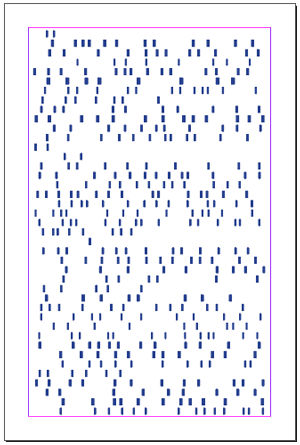
What’s great about this is that you can quickly see the worst offenders in “rivers” (when space seems to trickle down from line to line) and also when there’s just too much space between words in the middle of a paragraph.
Here’s what the page looks like after I changed the Hyphenation and Justification settings in the paragraph style, to offer a bit more flexibility:
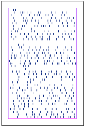
If you compare the two you can see that the second one is smoother… less radical shifts from big spaces to little ones.
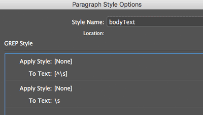
Later, when you want to see the text again, just delete the GREP styles in the paragraph style… or edit them so that they point to “None” instead:
Here’s the final page:
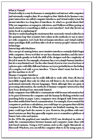
In design, the negative space — the forms created by what’s in-between the words and lines — is important!
This article was last modified on July 20, 2021
This article was first published on January 1, 2018
Commenting is easier and faster when you're logged in!
Recommended for you

Script of the Month: What the GREP?
This month’s script can help you understand and troubleshoot GREP expressions.

InDesign Magazine Issue 76: Publish Anywhere with InDesign to HTML5
We’re happy to announce that InDesign Magazine Issue 76 (August, 2015) is now av...

Find All Headings Based on a Pattern
Here's a short and easy GREP pattern you can use to find one-line paragraphs


