Filling Type Counters With Colors and Photos

If you spend any amount of time designing with type, you’ve heard the term “counters,” which refers to the partially or fully enclosed spaces in letters like a, b, d, e, g, o, p, and q, and the numbers 0, 4, 6, 8, and 9.
And you can use those counters to jazz up a bit of type, by filling them with colors, gradients, or photos, or by adding strokes.
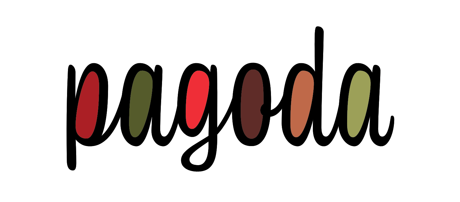
Separate outlined counters, each filled with a different color
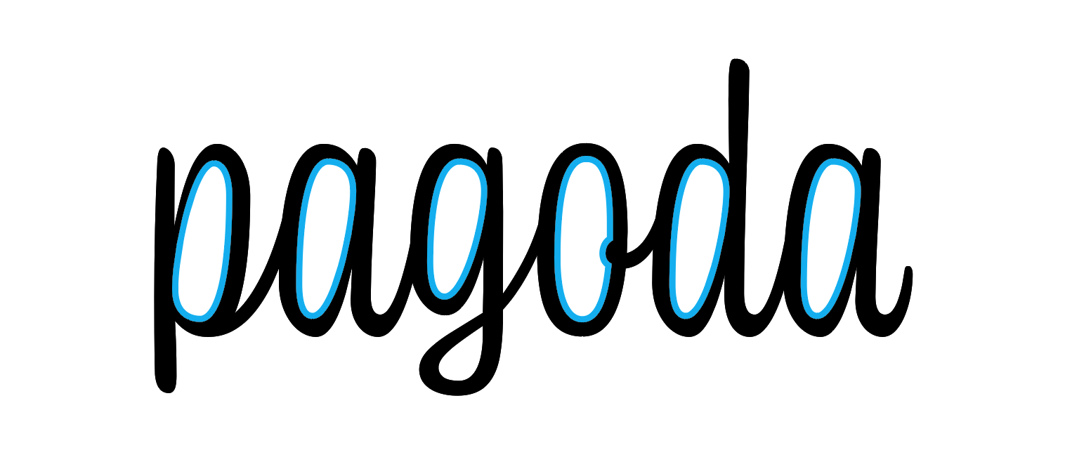
Outlined counters with a simple stroke
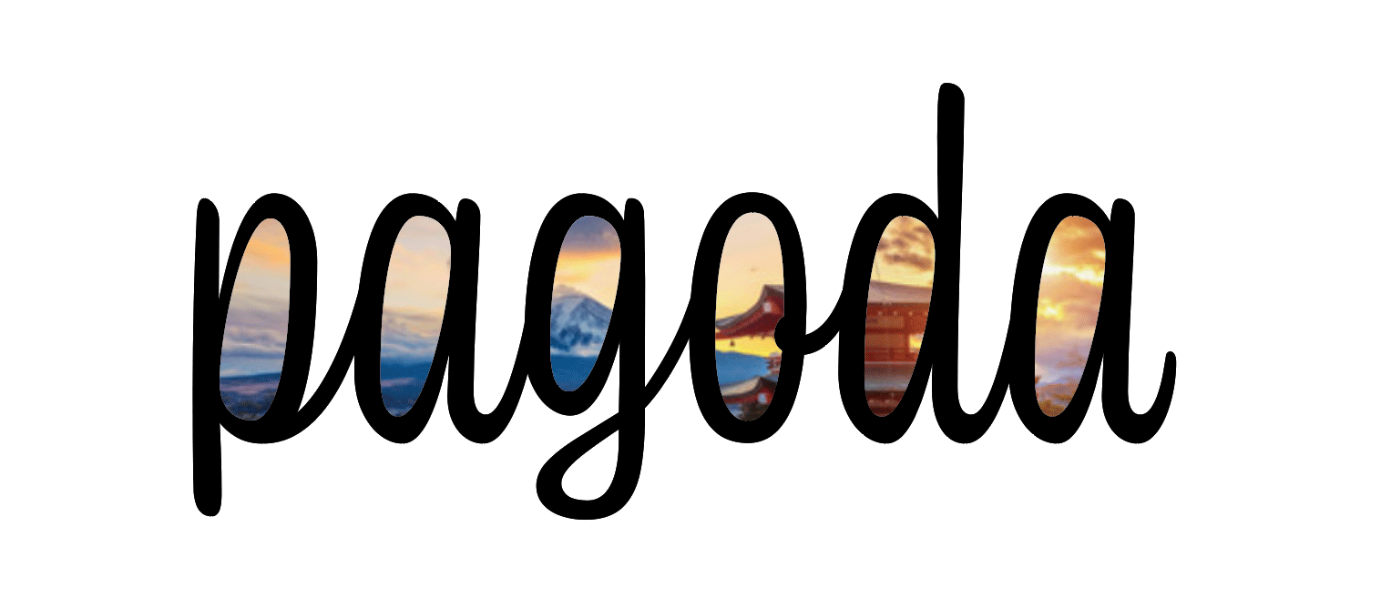
Outlined counters saved as a compound path and filled with a single image

Outlined counters saved as a compound path and filled with a gradient

Separate outlined counters, each filled with a different placed image
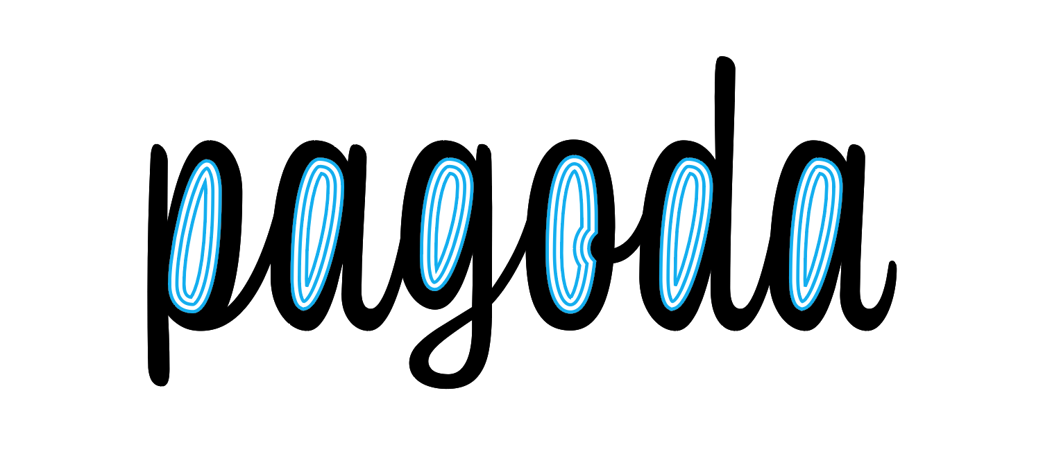
Outlined counters with a triple stroke style aligned to the inside of the path

Outlined counters filled with the same color as the text
To create any of these effects, you first have to make a set of type outlines, which you can do by selecting the text and pressing Command+Shift+O/Ctrl+Shift+O. If you want to preserve a copy of the live text positioned directly behind the outlines, add the Option/Alt key.
Then, to select just the paths that make up the counters, take the Direct Selection tool, move your cursor over a counter and hold the Option/Alt key while you click on the path. With just that path selected, you can now copy and paste in place (Command+Shift+Option+V/Ctrl+Shift+Alt+V). Repeat the process to copy and paste the other counters in place. You can then format each one separately.
Or, if you want to fill all the counters with the same photo or apply the same fill or stroke, select them all and save them as a compound path. Start by selecting the first counter, (by Option/Alt-clicking it with the Direct Selection tool), then move your cursor over the next counter and Shift+Option/Shift+Alt-click it to add it to the selection. Repeat as needed to select all the counters at once. Then copy and paste in place. You’ll end up with a new compound path made up of all the counters and you can fill it with a single placed image, etc.
Also, don’t be afraid to experiment by applying different stroke styles, or paste in place multiple copies of the counters and apply different strokes/fills to each. The “soda pop” example below uses two copies of the counters with the Japanese Dots stroke style applied both, and different stroke weights and tints of cyan.

Here’s one with two copies of the counters and the Wavy stroke style.

Here’s one with an inner shadow added to the counters.
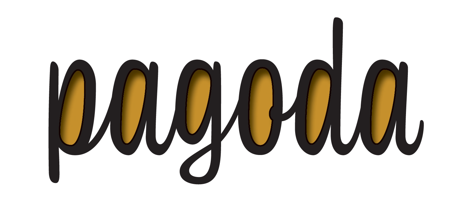
Here’s one with a rotated text frame pasted into the counters.

You get the point. Once you have the basic technique down, you can come up with more fun variations than you can…count.
This article was last modified on April 10, 2020
This article was first published on June 10, 2019
Commenting is easier and faster when you're logged in!
Recommended for you

Ten Essential Books on Typography
Ilene Strizver shares her list of must-have books to inspire and inform you.

Redesigning a Magazine
An interview with designer Pam Sparks reveals the process used to redesign InDes...

Tip of the Week: Turning Off Typekit
How to turn off Typekit font synching in the Adobe Creative Cloud app if you don...


